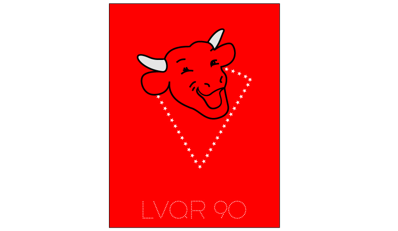
a pop icon by guyard christian from france
designer's own words:
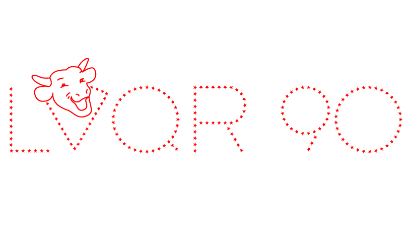
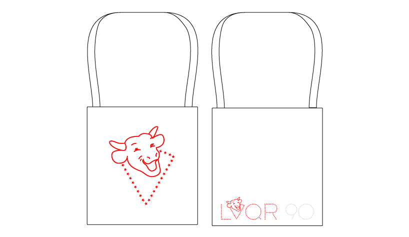
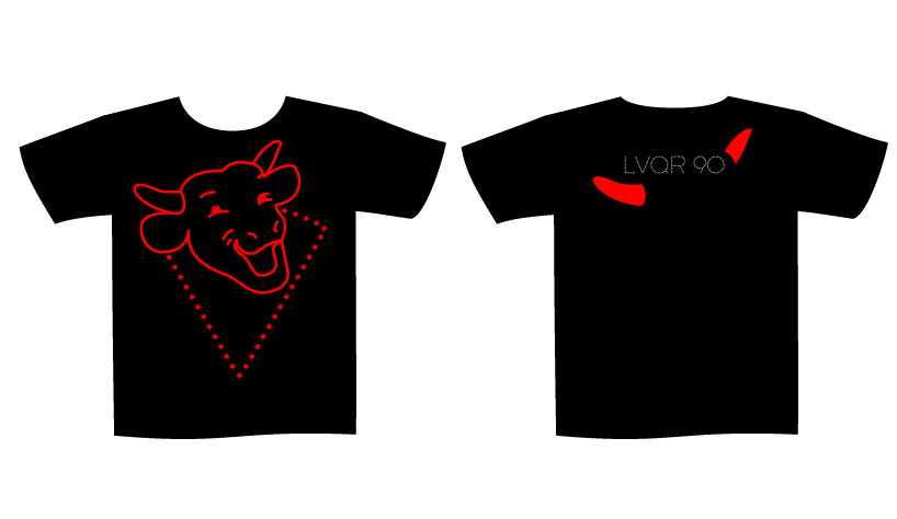
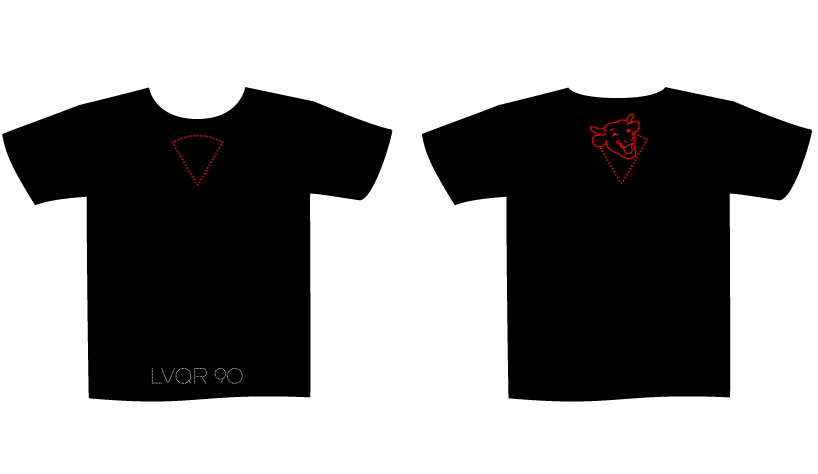
how would look the lvqr representation in the future ? this is what i was thinking starting this competition. the logo should be modern. simple, memorable, flexible, funky for all generations and easy to use on any kind of support analog to digital.
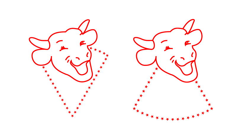
i have taken the original logo, redesigned it by drawing it with thin lines, left the ear rings, the neck and some details. i have changed one eye to a smiley ;) and finally turned the head to the left.
from the cheese box i have chosen the triangle and ornamented it with stars as symbol for the 90s years birthday. i also have used the stars for the letters and numbers.
for colors, i have chosen a bright red to remember the original brand and silver from the
aluminium foil.
the result is a modern quite futuristic image, minimal, funky and friendly,
a logo with pop appeal...
