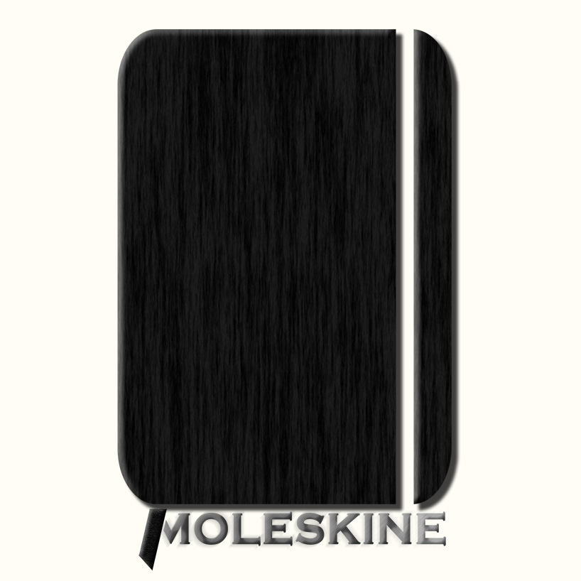
simplicity by martino milanese from italy
designer's own words:
I’ ve ever thought moleskine is an example of simplicity.
And it’s extremly hard to semplify.
an ancient Chinese proverb says: “if something cannot be said in few words it can neither be said in many”..
my proposal is a simple mark that represents Moleskine.
in first sight I represent the notebook as a global black rectangular, in second step
I had to add the elastic and the bookmark.
in abstract the elastic is just like a cut, because it is an interruption of complete leather.
I’ve thought it’ s important represent black version and red one.
black logo
 red logo
shortlisted entries (2162)