Moleskinerie stylish by antonio ares from spain
designer's own words:
i've chosen a neutraface titling, instead of their original typeface, in order to transmit a sense of elegance, as well as modernity, while sticking to tradition. i slightly modified the typography to create a simpler monogram. the monogram, assembling toghether the capital 'm' with the 'o', represents the naming of the brand, as well as the values of tradition, design, modernity and style. i suggest an archer ligth italic for the claim: 'legends & stories'. The palette chosen is quite sober and stylish, according to the brand values.
Moleskinerie logo
 Moleskinerie sizes
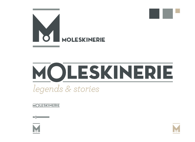 Moleskinerie colour
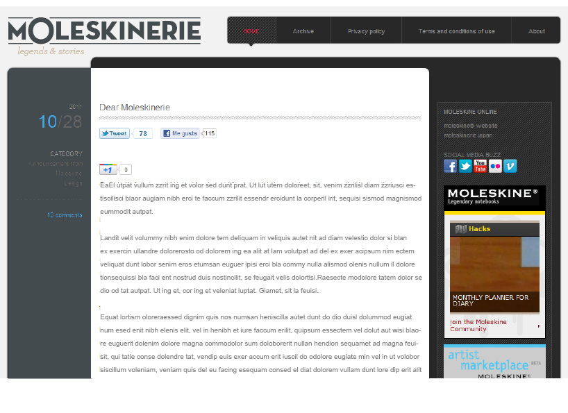 Moleskinerie blog version 1
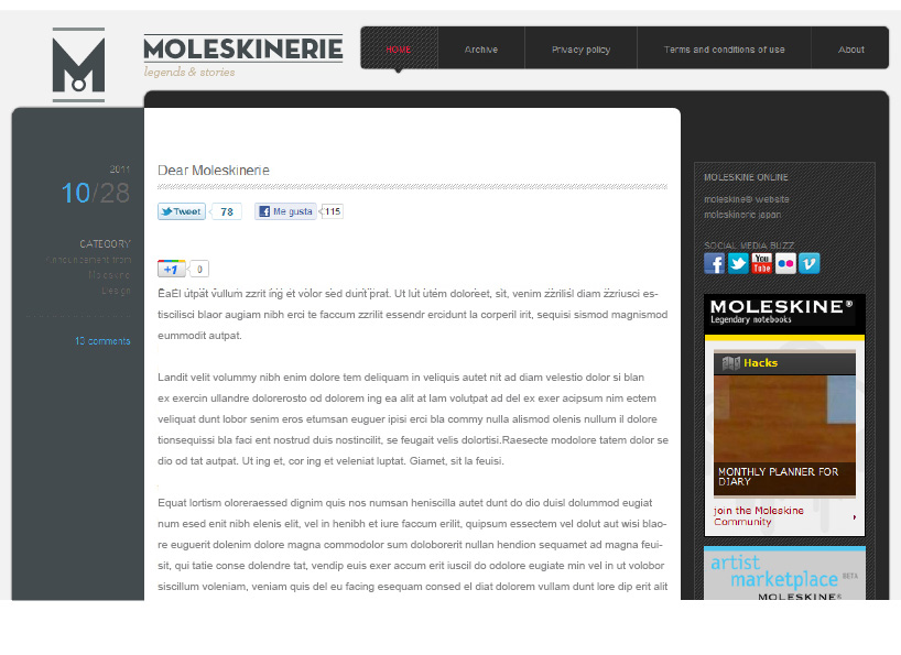 Moleskinerie blog version 2
shortlisted entries (2162)