happy birthday to moo! by paul oliver from uk
designer's own words:
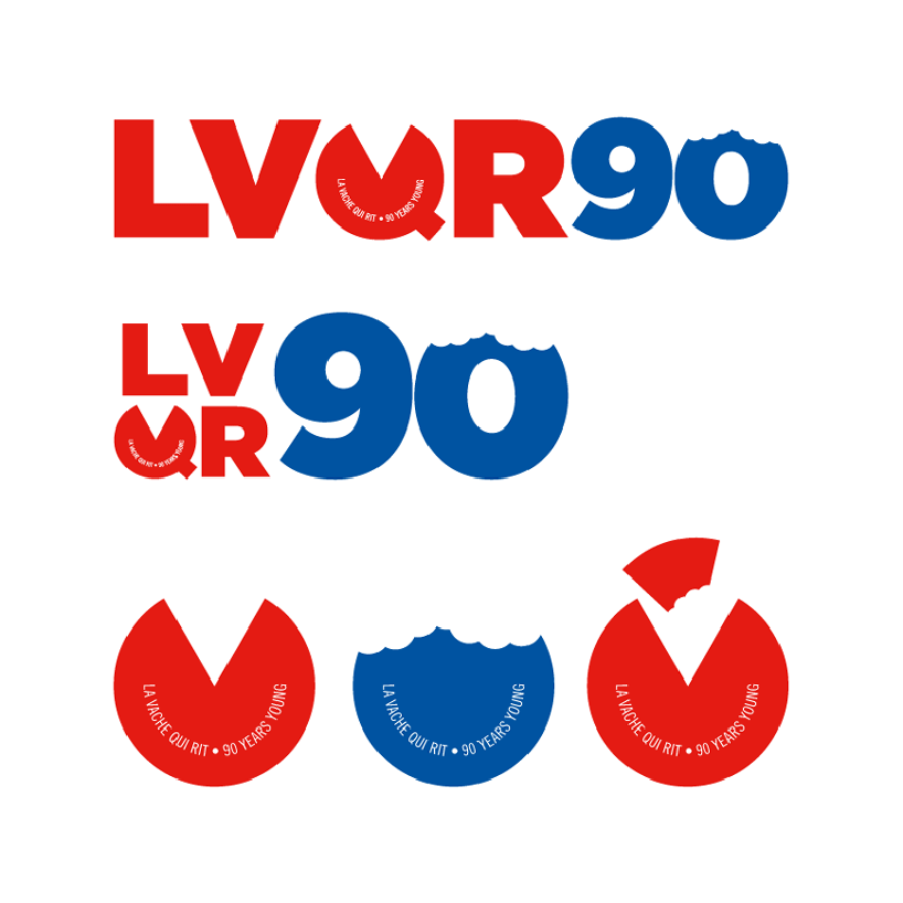
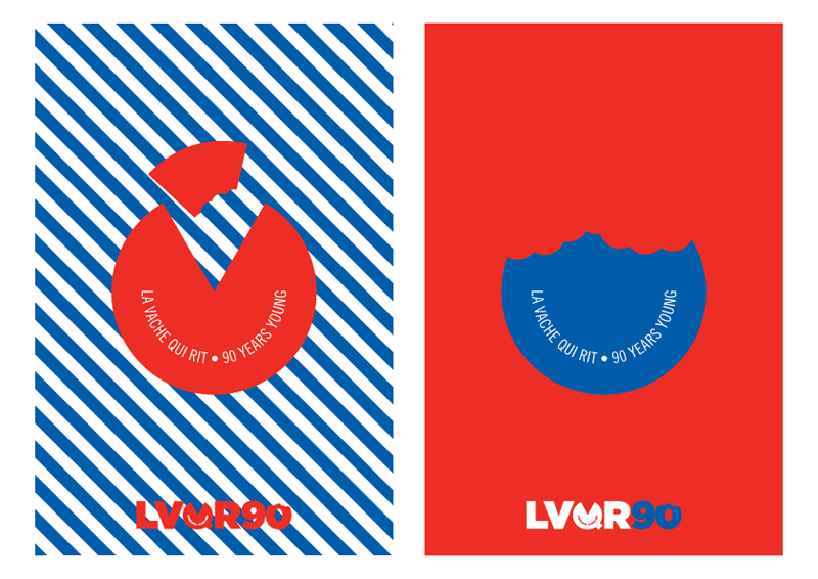
the idea was to keep the process clean and simple, using a logo and various icons. i used a basic and legible font and added a twist with the 'q' acting as a block of cheese. the text in the 'q' acts as a smile referencing the laughing cow. the chunks taken out of the '90' show the edible nature of the product. if the logo/icons were to be used i'd suggest silk screening the final products. silkscreening adds a character, an age old process much like cheese making.
shortlisted entries (405)