Vache O Vision by david lomax from uk
designer's own words:
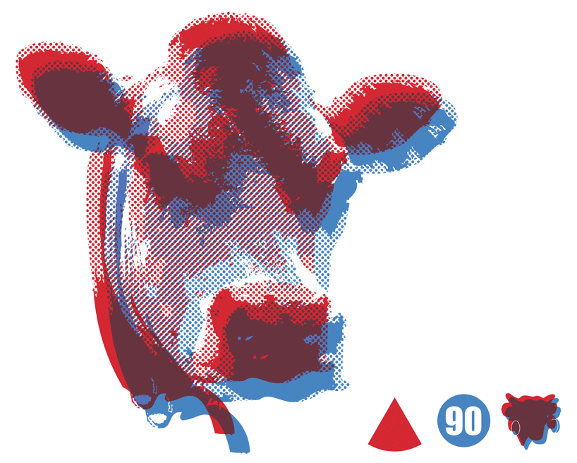
vache-o-vision. the y/n studio proposal for the lvqr 90th anniversary graphic is a witty take on the staunchly 2d cartoon cow that has traditionally been the logo for the laughing cow brand. the inspiration comes from the similarity between the brands key colours of red and blue and the ‘retro’ 3d glasses we all recognise from cinemas in our youth. this combination of nostalgia and a notion of 3d technology once thought of as futuristic seems apt for a 90th anniversary celebration. using an image of a real cow reminds us of the natural, healthy product whilst it’s mediation via the colours, values and shapes associated with the brand bring it back in line with the core identity, using the 3d to 2d theme. using a two stage screen printing process laying the red over the blue also allows us to add a depth and richness to the graphic, both through the 3d effect and through the mixing of colours, without straying from the brief to use only 2. the product mock-ups provided show how the different components of the graphic can be rearranged to suit the different types of application effectively whilst maintaining the key concepts. y/n studio projects always seek to question and subvert standing rules, norms or suppositions. this simple proposal has brought up questions for us about where yearnings for the past and the future meet when thinking about a 90 year legacy. it also raises a train of thought about the consumption of a natural product mediated by a manufacturing process – going from 3d to 2d and back again via the platonic shapes and primary colours of the brand. making a simple graphic can’t ever answer these questions, but spending some time thinking about drawing one can at least lead us to ask them.
the proposal
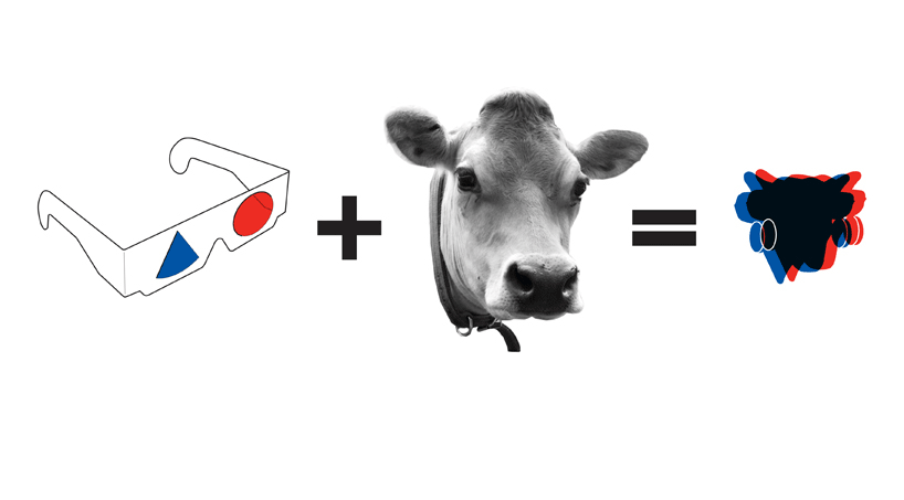 the process
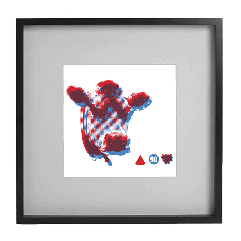 the image as a print
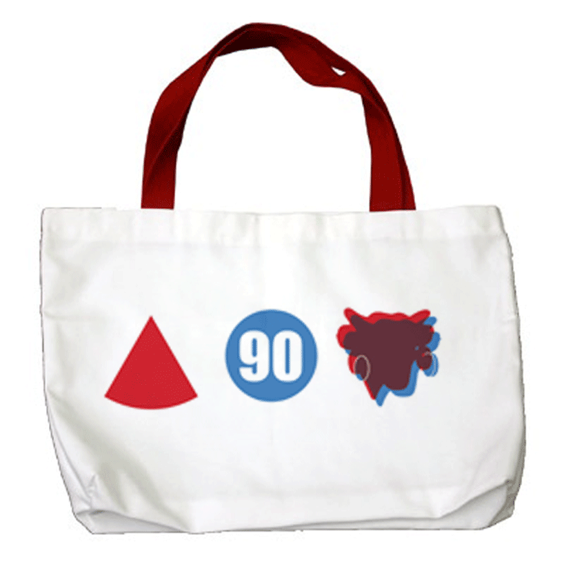 a variation printed on a tote bag
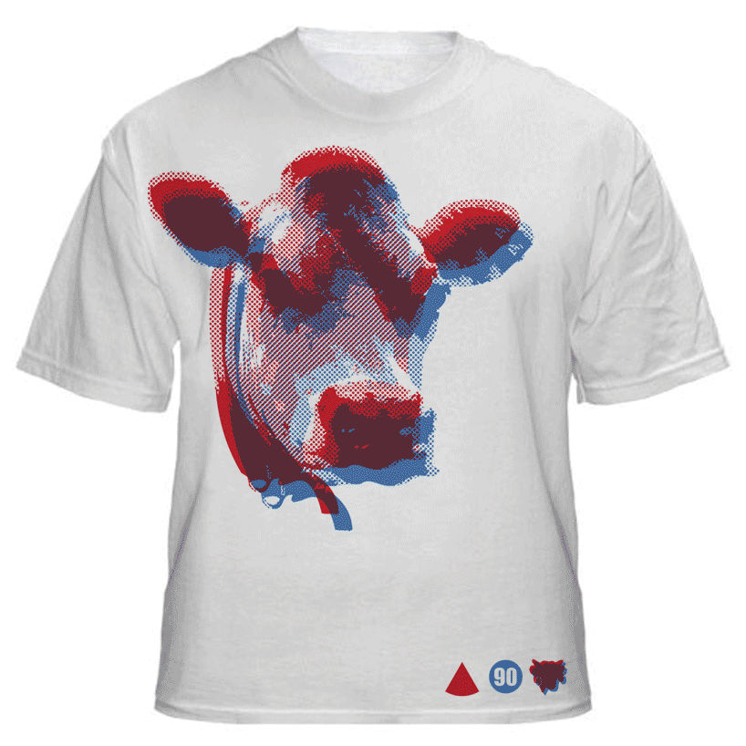 a t-shirt print