Moleskine Ratio by linda latino from italy
designer's own words:
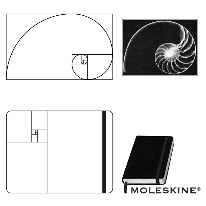
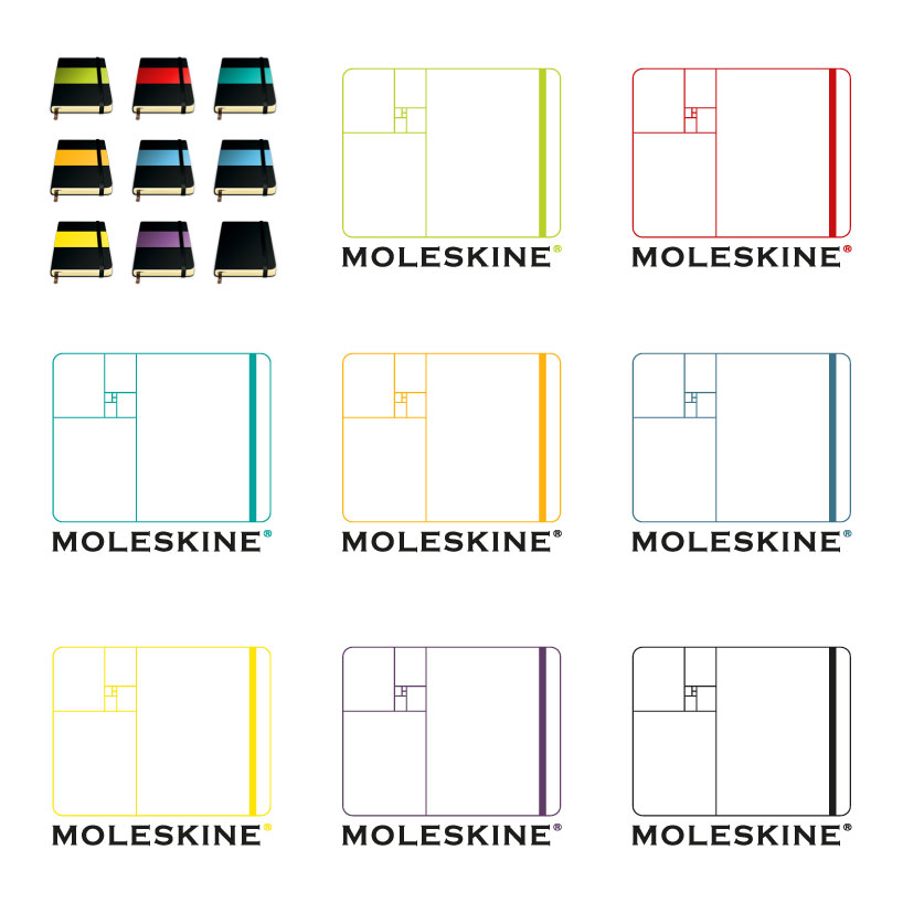
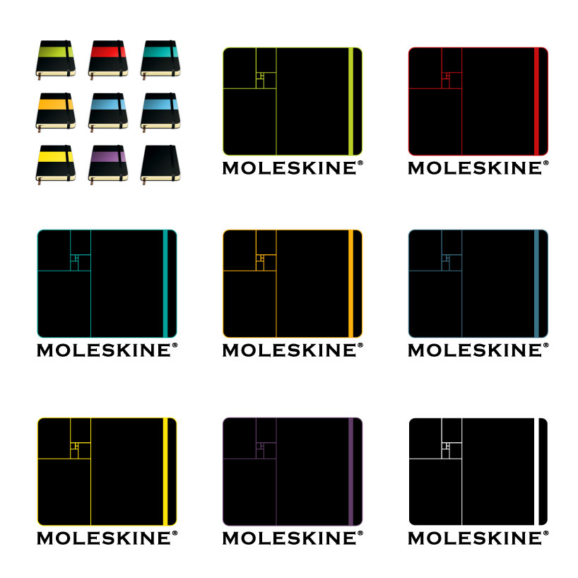
The logo’s concept recalls the idea of the Sezione Aurea(Golden Ratio)’s layout . It's like behind the size and proportions of the moleskine there is a mathematical logic which determines its perfection.
So logo it is very simple.
It’s made from a grid of lines that create the outline of a Moleskine.
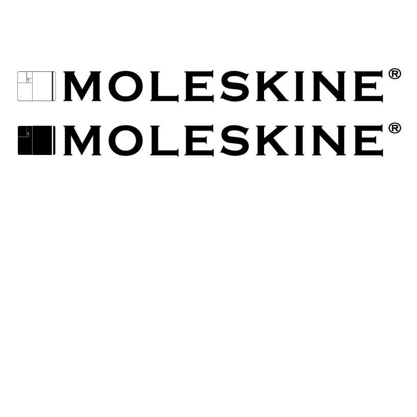
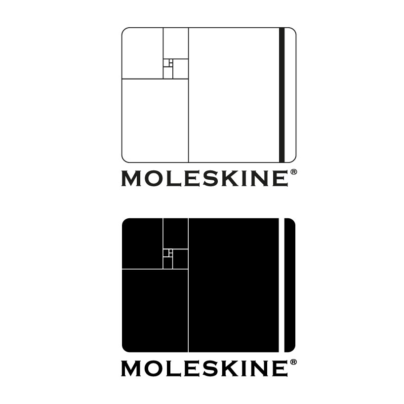
It’s available in two colors.
It can be combined with the moleskine written in the classic fonts.
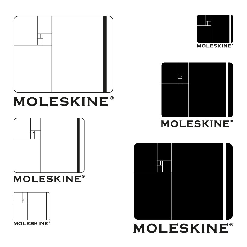
form evolution
 horizzontal
 vertical
 zoom
zoom
 positive
 negative
shortlisted entries (2162)