What is moleskinerie.com? by barbara perretta from italy
designer's own words:
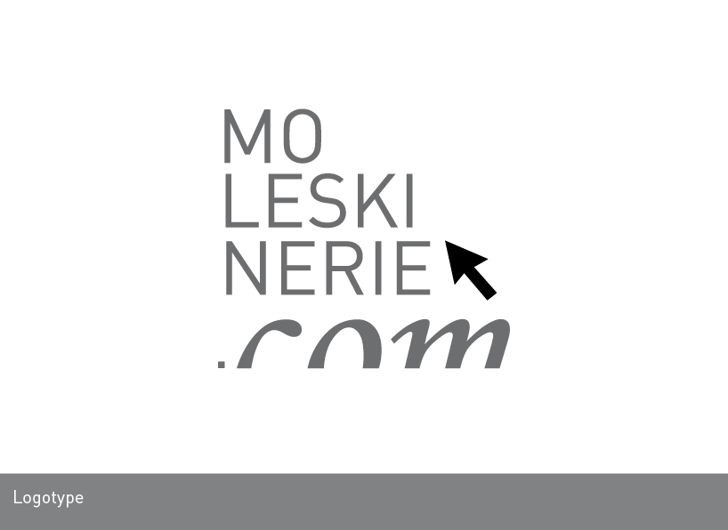
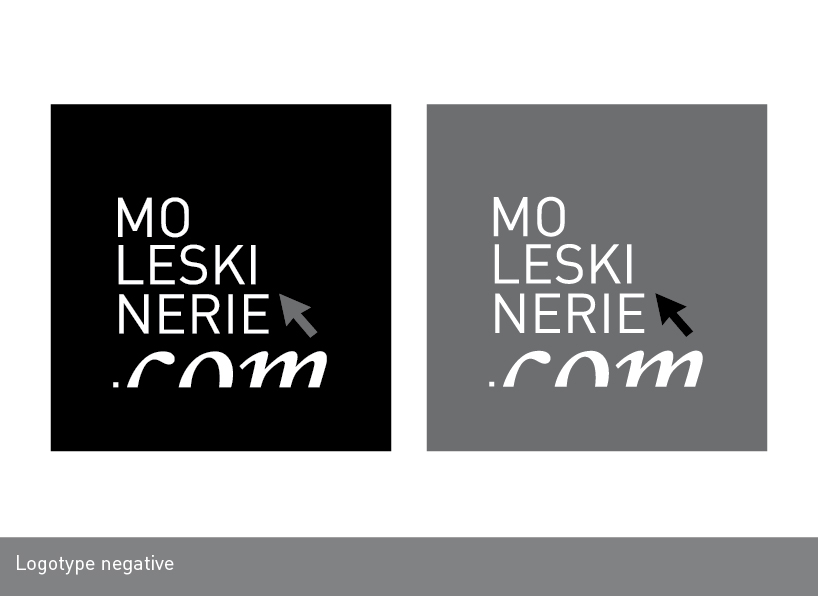
the file was created with adobe illustrator so it's a vector, the naming was studied in line with the mood of moleskine, i wanted to create a logo that it's simple to remember and recognize and that it could be the main theme between internet and writing. in fact i choose two different fonts for underline the parting between what is more technological from what is more near to handwriting, so you can see the use of regular font for the first and the italic for last. i preferred use a font that was similar to moleskine logo but i decided to add .com for point out that we talk about a blog, a site dedicated for people that love writing and moleskine's world.
considering that, the logo is designed for web so i add a recognizable symbol, the internet cursor, and about the shape of logo, i choose to keep the type setting like this, so it could look like an internet button.
