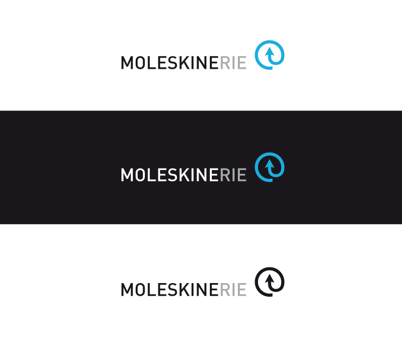
Moleskinerie logo by francesco callegher from italy
designer's own words:
This proposal wants to draw a new typographycal “at” (@). Instead of "a", I drew an arrow in the graphic symbol inscribed in the circle. The computer arrow cursor that we all use. A new and unique pictogram, for people who visit the Molekine website to be able to recognize the blog.
The lettering is made up of Din Medium character. The color blue (cyan 71% and magenta 11%) resumes the color of Moleskine Sore Internet.
shortlisted entries (2162)