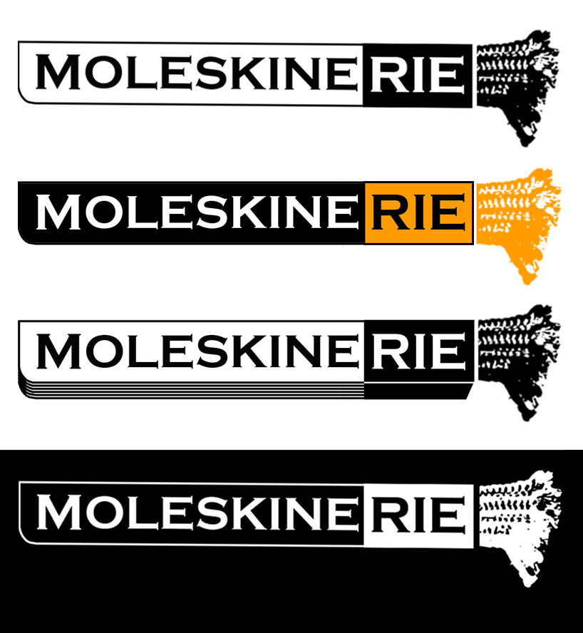
www by kosh kar from uk
designer's own words:
using the iconic branding of moleskine and highlighting the 'rie' with the familiar coloured strip of a new purchase: the design graphic concentrates on the idea of a blog; constant use and updating, the most recent entry at the forefront of the website and easy to find information. Using my own moleskine as inspiration, the well worn, woven (www) bookmark becomes the culmination of these concepts. the strip can be shortened for branding but stretched out for toolbars, scrollbars or actual merchandise as shown in the attached images. the logo reads from left to right; a crisp, new curved corner becomes well fingered frayed thread- a transformation well known by all moleskine users. the logo can remain coloured or simplified and stencilled onto any surface: a sticker, a pencil, an arm...
logos
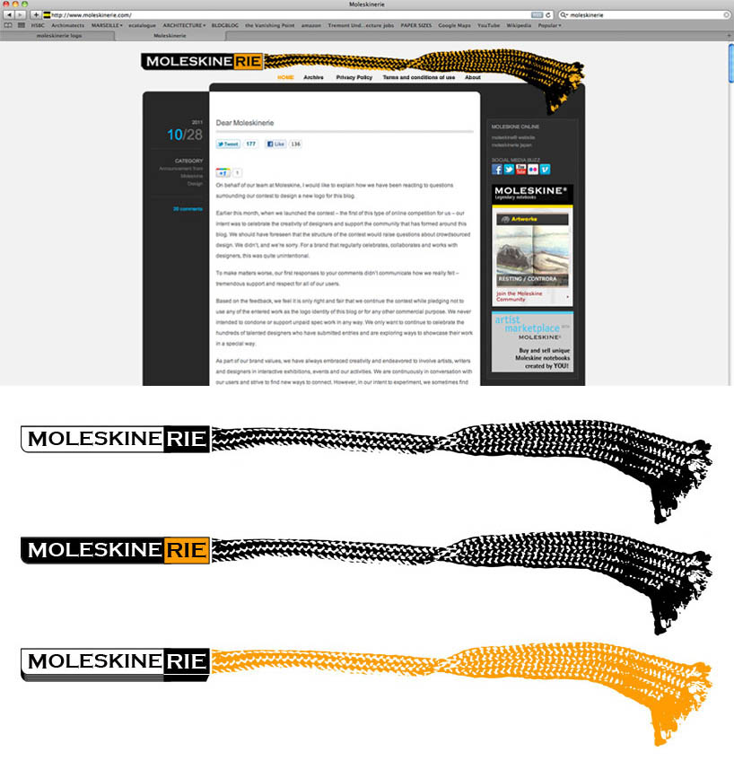 website strips
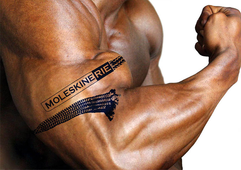 branding
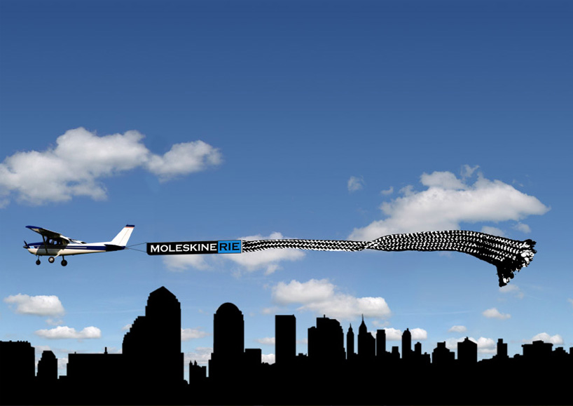 advertising
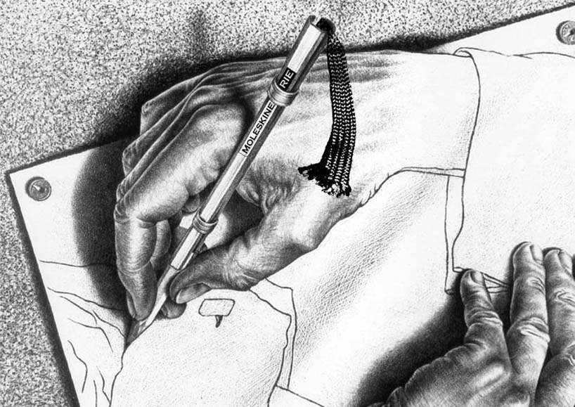 merchandise
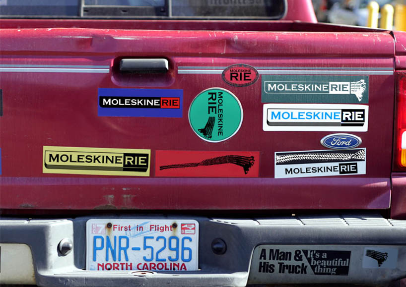 adaptation