S² by anthony songbandhit from france
designer's own words:
dark textured background is an evocation of the original notebook's cover (it is just for a better understanding of the ideas behind the designs).
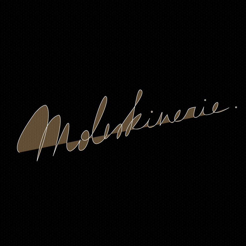
font's fluidity emphasizes the close connexion between moleskine and humans : more precisely human hand, by writing, sketching etc. straight diagonal line that cuts the name into two evokes the balance between tradition and modernity, the dynamic of life and a timeless, continuous, deep experience between moleskine and its user.
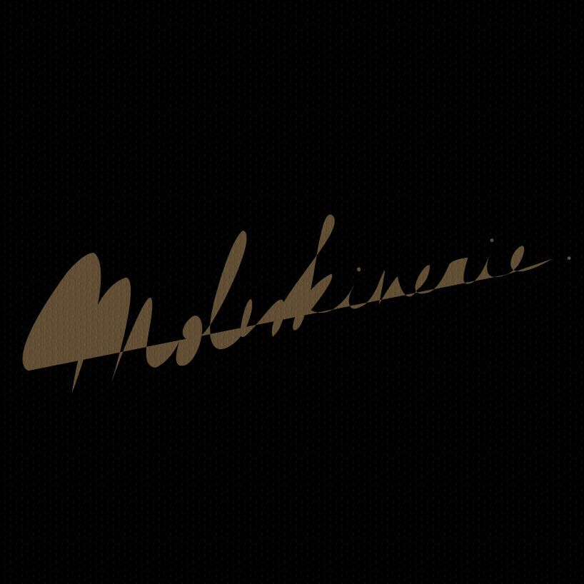
silhouette logo is more conceptual and focuses also on the powerful branding : a very unique notebook immediately recognizable among others. a discrete shadow logo, understandable but mysterious (like moleskine's content which is often personal).
the full stop (dot) at the end is very important, it summerizes everything : there are no or not enough words to explain moleskine's concept, the most important is too feel it, that's all.
(softwares : photoshop, illustrator)
