moleskinerie logo by chris malcolm from usa
designer's own words:
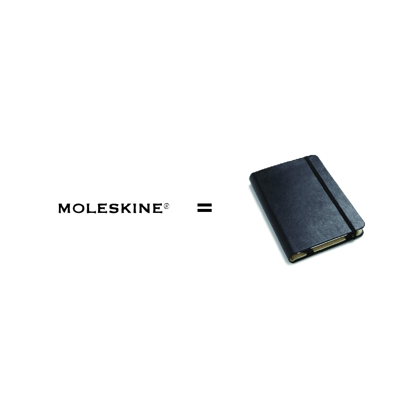
To ask for a design of the moleskinerie logo is almost redundant, because the little black book that we all use stands as a creative icon in itself. THis logo was inspired by the literal physical composition of a moleskine. The leather cover, the binding strap, and the bookmark. the paper or content of these three elements is not defined directly, as it is always up to the moleskine users to define this..so likewise the logo does the same. the logo is simple, pure, fun, versatile, and obvious. Moleskine is the same, leaving convoluted complex design choices behind and shooting for a traditional well made sketchbook/notebook.


shortlisted entries (2162)