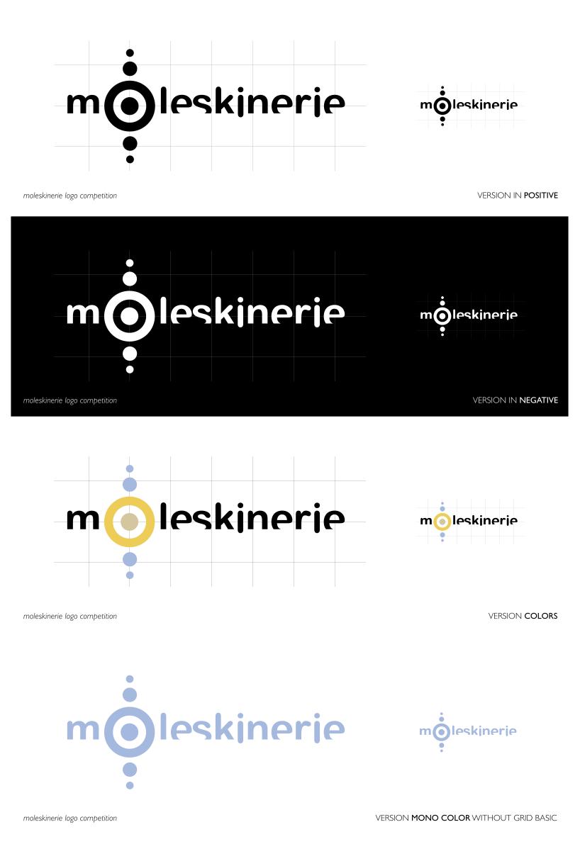
Aspects by antonio riccio from italy
designer's own words:
From the classic note-book moleskin to blog site moleskinerie relationships visually between verticality position and horizontal position is in the notation that in the transcription of notes and designs.
From this observation of base a logotype is born that opposition in it these two aspects. The symbol of the circles concentrates to us arranged actions vertically to represent not for pure case the centrality of the blog place at exchange, debate and argument, united to the written logo disposed horizontally to the characterize this visual aspect.
The logo is completed on the grid with a grid basic in symbolic reference of a note-book.
The colours for print: in positive, black 100%, color pantone solid process 135C ( C0 M19 Y60 K0 ), color pantone solid process 467C ( C9 M15 Y34 K0 ), color Pantone solid process 2717C ( C29 M12 Y0 K0 ).
In Version mono color 2717C.
The colours for web: in positive, black 000000, color in rgb from 135C to rgb 234 197 115, from 467C to rgb 212 198 158, from 2717C to rgb 165 184 222.