Moleskinerie Logo by farwej bhutia from india
designer's own words:
first i started of by looking keywords related to moleskine which would eventually help me frame by logo. the various words that came to my mind were moleskine, popular, dependable, notebook, diaries, planners, bags, books pencils, the right product, elegant, stylish, functional, smooth, lovable and so on.
at the beginning itself i had in mind that my logo should not be too abstract because i personally feel with the increase of abstractness one loses its identity. i wanted my logo to be something that is familiar with people when they hear of the word moleskine. therefore i headed by taking the metaphor of that of the notebook.
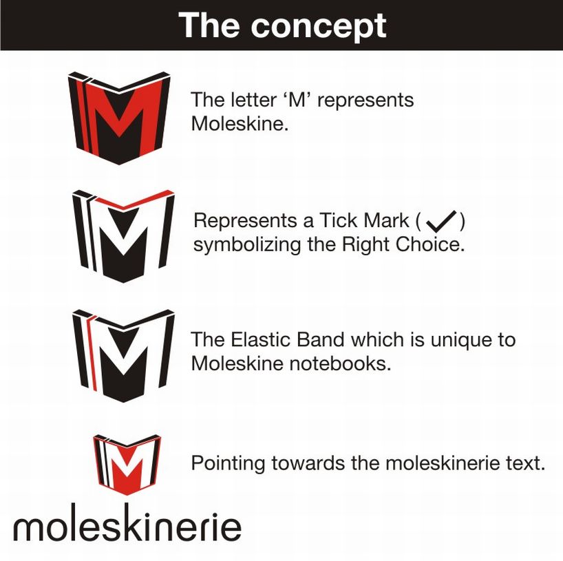
initially i tried positioning the notebook at different angles so as to find an appropriate view for my logo. next step was to include the elements that would together the form the identity of moleskine.the elements that are present in my logo are
a)the notebook metaphor which has been the symbol as one of its main product.
b)the letter “m” representing moleskinerie.
c)the elastic band at the side which is unique to moleskine products.
d)a tick mark representing the right choice for getting moleskine products.
e)an arrow pointing towards the text “moleskinerie.”
the colors that i have used are the shades of black and orange. black because it bold and stands out and to give a feel of warmness i have used orange.
altogether the logo symbolizes “ right choice for the right product.’
Explaining the concept behind the logo.
 Colored Logo
 Black & White Variation 1
 Black and White Variation 2
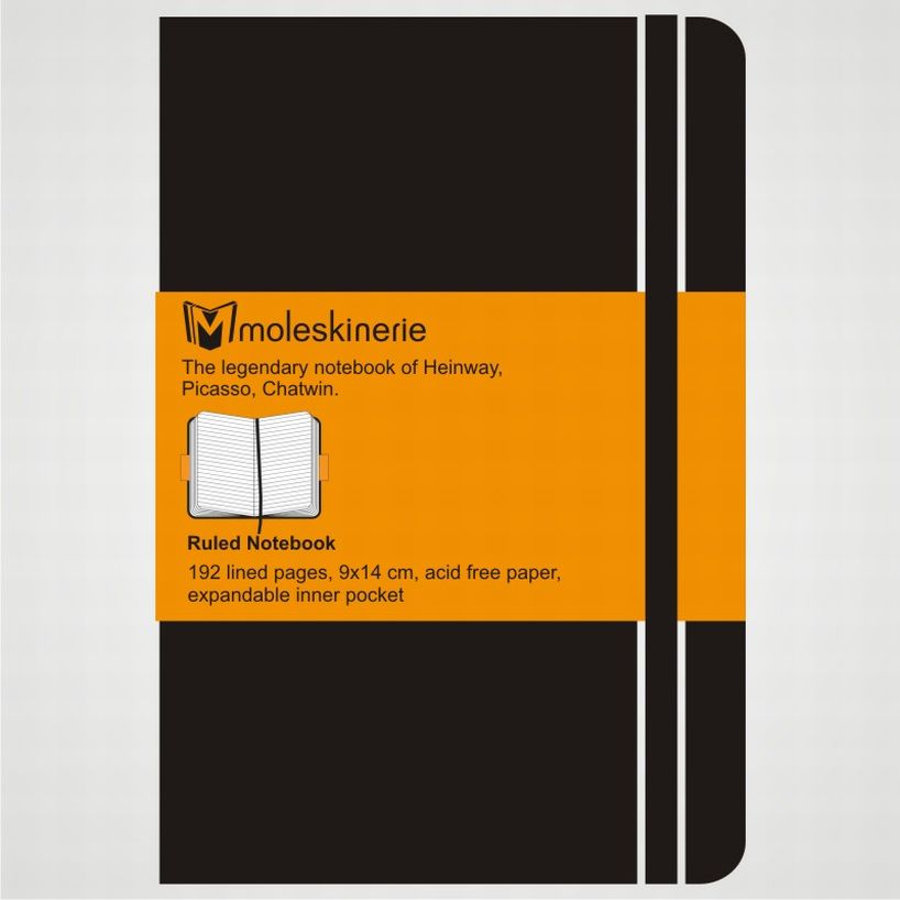 Logo Application 1
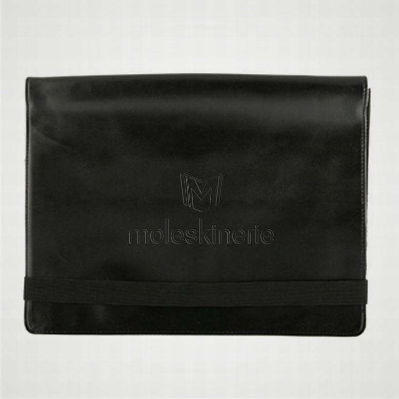 Logo Application 2