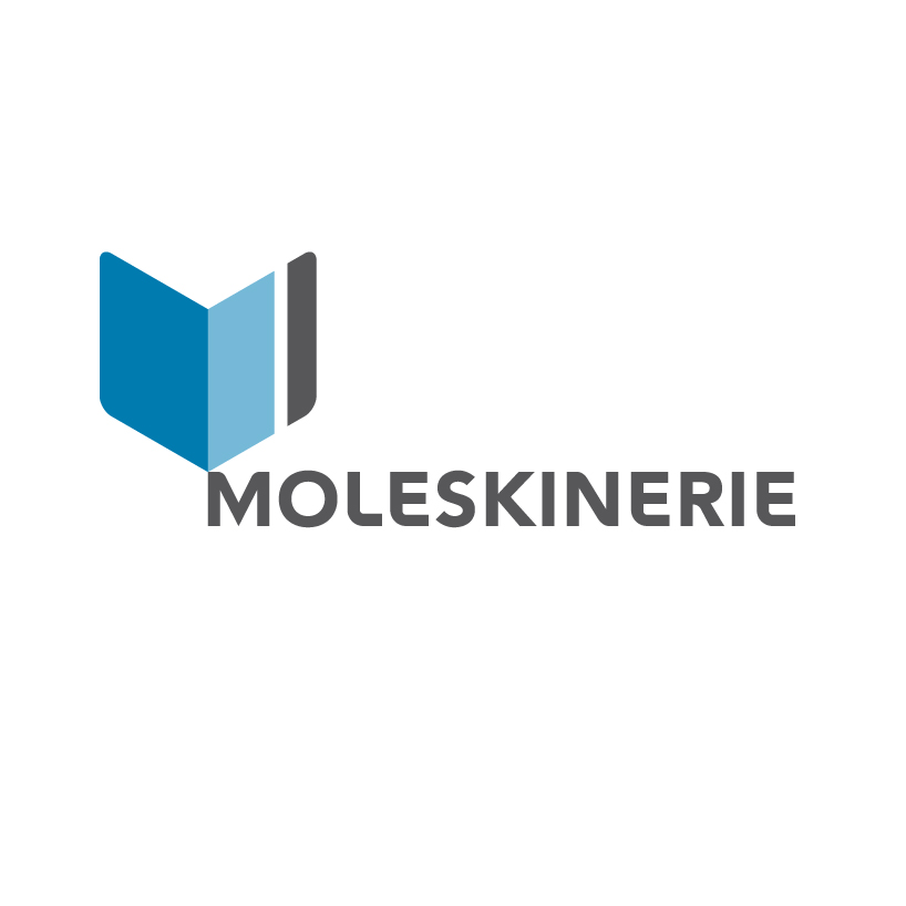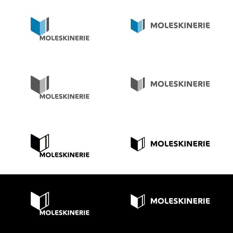
peyablo moleskinerie logo 2 by peyablo * from serbia
designer's own words:
graphic symbol represent an open notebook, with rounded edges, and ribbon as one of the main hallmarks of moleskine products. at the same time it is a slightly indicated, the capital letter m. larger area is projected to be colorize with one of the many colors that are used in moleskin's products scale, while the smaller surface is determined always to be dark gray.
wordmark is simple and readable, without major intervention in the typographic sense and yet adapted to the requirements of a given solution of the competition.
also, the wordmark may stand apart as a separate unit in relation to the symbol.
the whole logo is simple, modern, recognizable, memorable and applicable in various sizes and on various materials.
peyablo moleskinerie logo 2a
 peyablo moleskinerie logo 2b
 peyablo moleskinerie logo 2c
 peyablo moleskinerie logo 2d
 peyablo moleskinerie logo 2e
 peyablo moleskinerie logo 2f