
stitched and solid by patrick kasingsing from philippines
designer's own words:
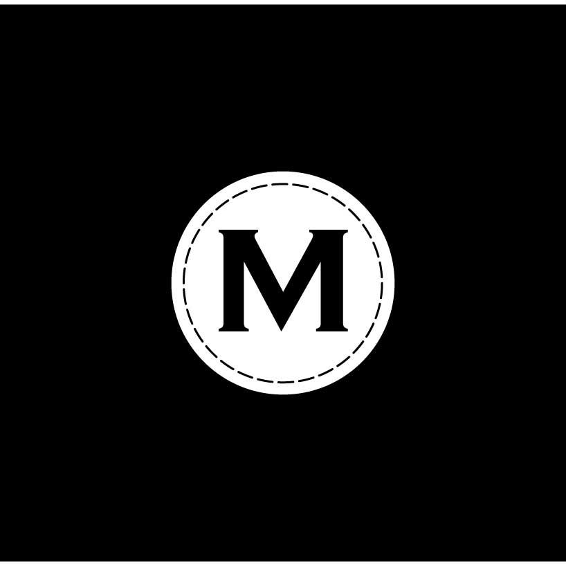
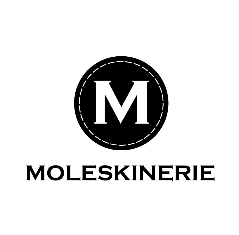
simplicity, quality and versatility are three standout qualities exhibited by every moleskine
product. i decided to mould my logo concept around these qualities and came up with a simple
circular emblem with the moleskine 'm' vectored in the center, surrounded by a circular border with a dashed stroke, emulating the stitching of the leather covers in moleskine notebooks,
set in a monochromatic color scheme of black and white. the logo is simple in execution but
bold and memorable. it evokes the quality of moleskine products through the 'stitched' element
alluding to stitched leather covers that sheathe many moleskine notebooks. the beauty of the
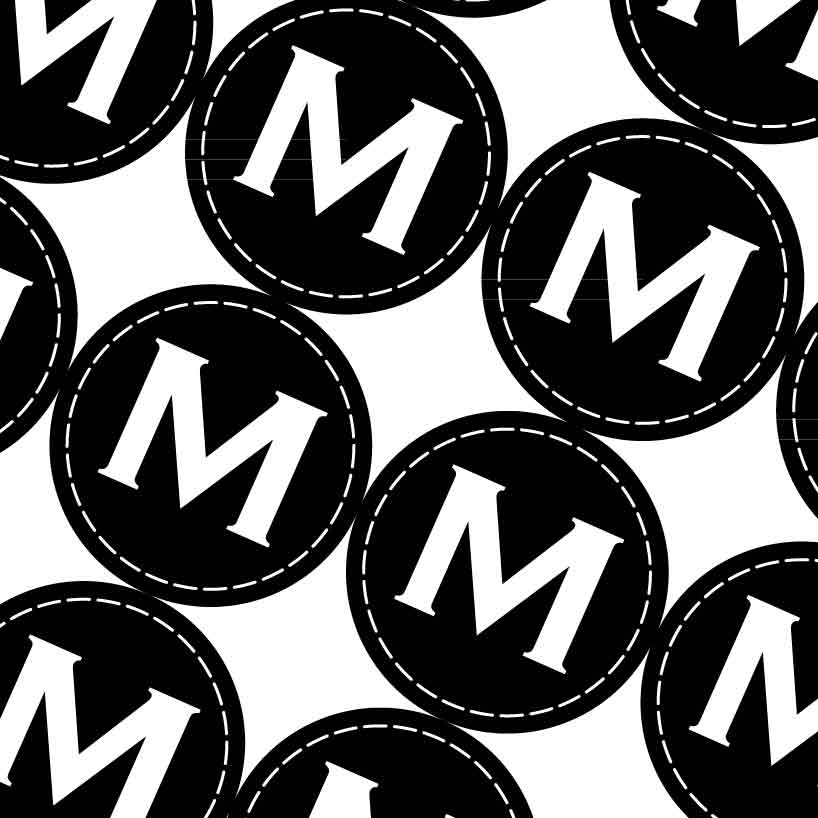
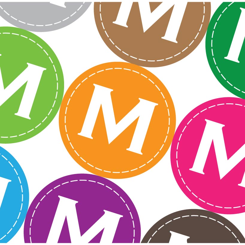
logo is that its bold and simple form is not only memorable but very versatile just like
moleskine's wide range of products, and can be used as a logo with logotype, by itself alone,
or as a monogram. its color scheme is also not fixed and various shades can be applied to suit
the needs of the user. the logo also maintains versatility in that it can be used both for web
and print media aong other uses.
the logo is vectored and created in adobe illustrator, after research on the moleskine brand and merchandise.
as a brand which facilitates creativity with its every product, my moleskinerie logo seeks to embody the same ideals. it wants to represent the brand as well as be an experience of the brand in its versatility, simplicity and quality.
white
 black
black
 pattern
 color pattern
 transparent