2day_2morrow by zeljko hudoletnjak from croatia
designer's own words:
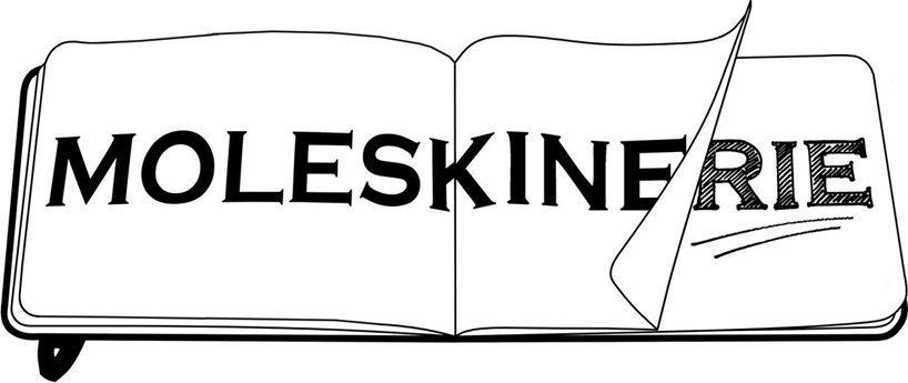
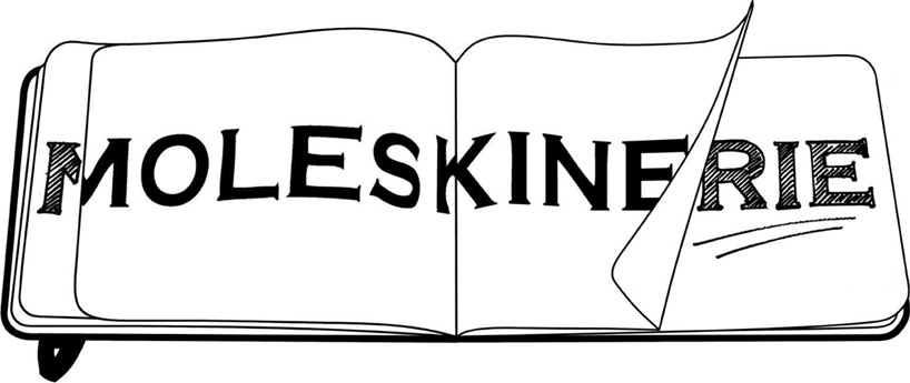
designing the moleskinerie logo i was motivated by a single idea:
“if i was able to say what i want in as little as he can, and not lose a single point on the matter, but make it even stronger“ i will send the design.
my proposal of the moleskinerie logo is based around :
-a moleskine notebook silluette = a framework for the logo
-moleskine logo= written on a blank centerfold, with the logo slightly distorted because of the page typology, telling us that moleskine, even though a firmly based company is flexible enough to encounter new ideas, and provide a wide array of products.
-sketch= what moleskine is all about for me...a collection of sketched ideas, brainstorming, notes, art and expression.
-page turning= depicts an idea...that eventhough moleskine is here (today), he is looking towards tomorrow and what it brings. may it be with the moleskinerie project or something different ,as it most certanly depicts progress, better yet a clean sheet of new ideas that are yet to come.
