supra exposed moleskinerie by matei radu from romania
designer's own words:
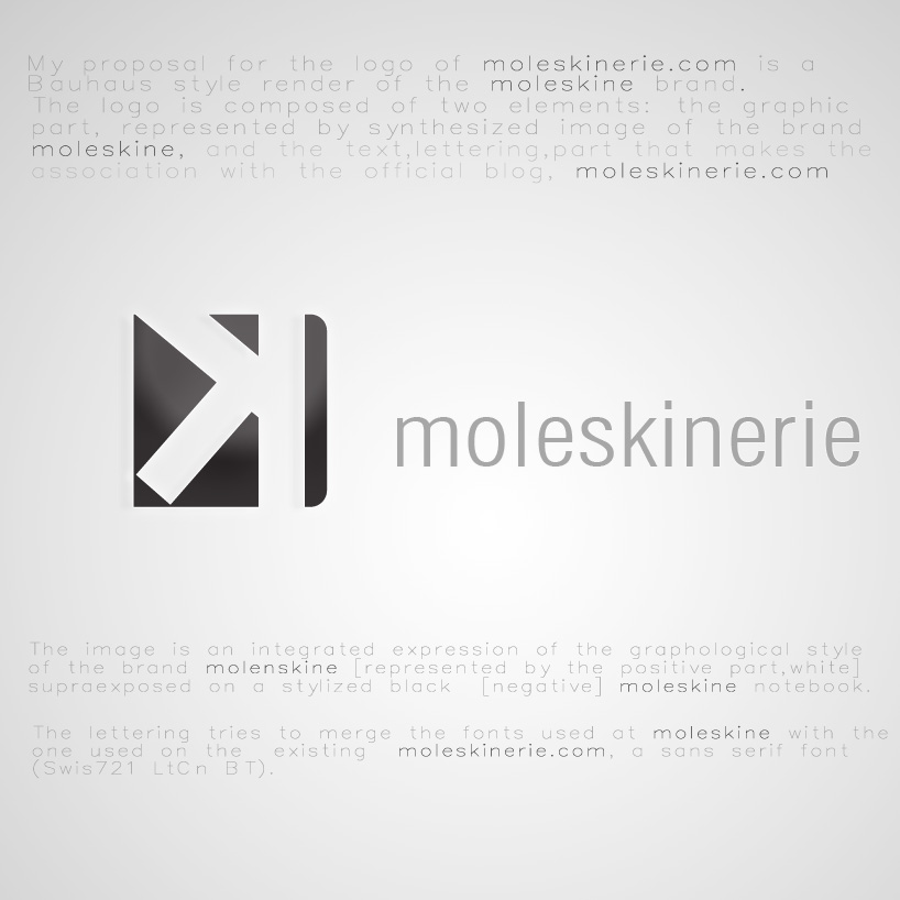
The logo is composed of two elements: the graphic part, represented by synthesized image of the brand moleskine, and the text, lettering, part that makes the association with the official blog, moleskinerie.com.
The image is an integrated expression of the graphological style of the brand molenskine [represented by the positive part, white] supraexposed on a stylized black [negative] moleskine notebook.
The lettering tries to merge the fonts used at moleskine with the one used on the existing moleskinerie.com, a sans serif font (Swis721 LtCn BT).
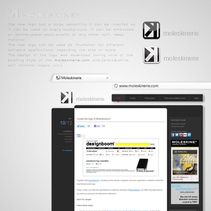
The new logo has a large versatility it can be inverted so it can be used on every background. It can be embossed on leather, paper, wood, plastic or any other soft, deep material. The new logo can be used as thumbnail for different software applications, regarding the size or scale. The design of the logo was developed taking note of the existing style of the moleskinerie.com site.[black&white, soft chamfer edges. etc].
intro
 situations