Moleskinerie minimalist logotype by thomas tourral from france
designer's own words:
The object that best represents the Moleskine brand, is undoubtedly his notebook. A book that can express themselves, create, travel, discover ... The Moleskine blog is a bit like this book.
I worked on a minimalist logo, a logo that represents brand perfectly and can be declined in any medium, for any reason. A logo just like the brand and its products.
Moleskinerie logotype
 Size
Size
 White on black
 Color declination
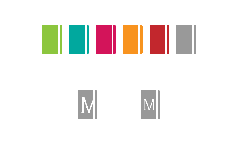 Other declination
shortlisted entries (519)