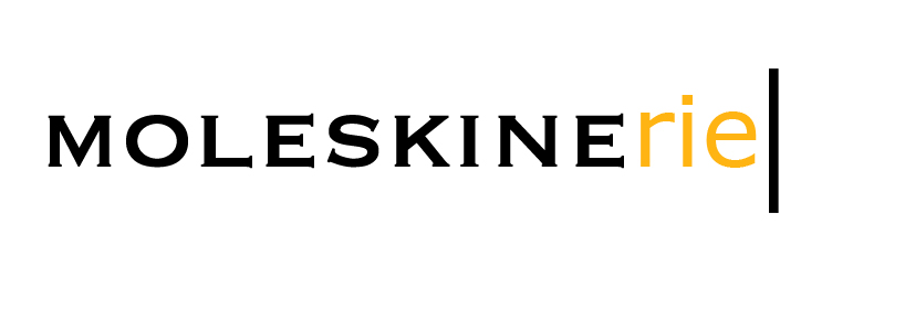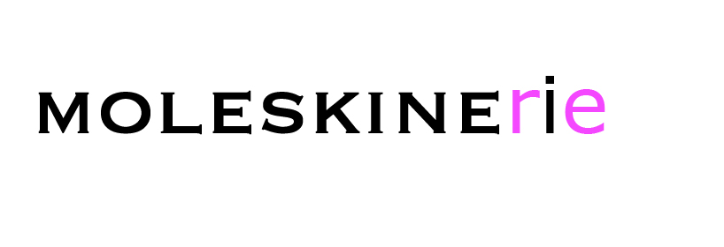
less is mole by thomas perkas from greece
designer's own words:
the idea was to combine the three main moleskine characteristics that came to mind: pure black text, an indication of the band and a part on the logo that could vary in color (green, pink, orange, etc.). i enclose my two first attempts by the titles of “try1” and “try2” and my final proposal by the title “moleskinerie_logo”. on all three images you can clearly see the pure text, an indicator of the black band and the way that black indicator "covers" the colorful surface, either as a line or as a letter. on the main proposal logo "moleksinerie_logo" the concept was to keep the classic moleskine font and change the last three letters in a lowercase verdana, a font widely known and used on the internet, indicating the new relationship of classic moleskine notebook with the new information/internet era. lastly, these three different-font letters seemed ideal to bear a vivid color that could change according to the occasion or the background and remind of the colorful covers.

