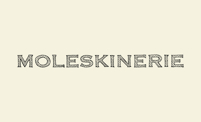
made in moleskine by davide aquini from italy
designer's own words:
moleskine is the place where ideas are quickly formed: words, drawings, notes, colors. this is the starting point to design the moleskinerie logo. maintaining the connection to moleskine is vitally important. why shouldn't the logo itself be like artwork on a moleskine? the idea behind this concept is to present the final logo in a frozen state, which is derived from draft sketches typically drawn on a moleskine: hand-drawn outlines, doodle-style filling. thanks to the vector format, the logo is easily scalable and can be used in prints, websites, videos and gadgets. it can also be used as watermark on artwork to create different logo compositions (e.g. - advertising).
the logo
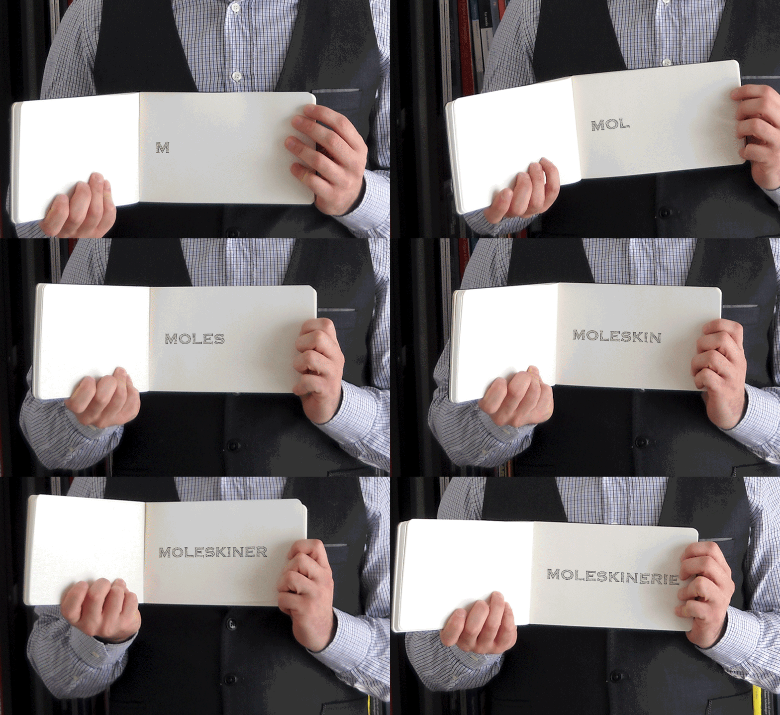 logo stop motion
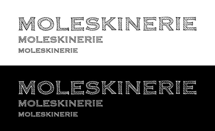 white and black backgrounds
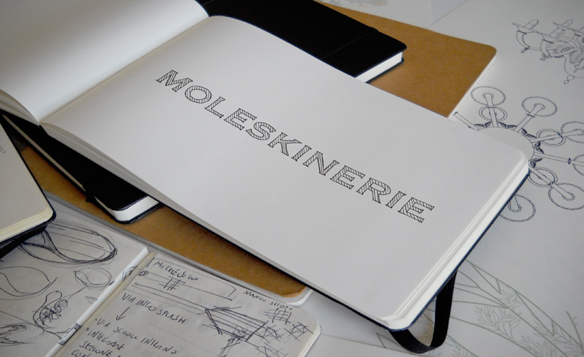 logo on a moleskine
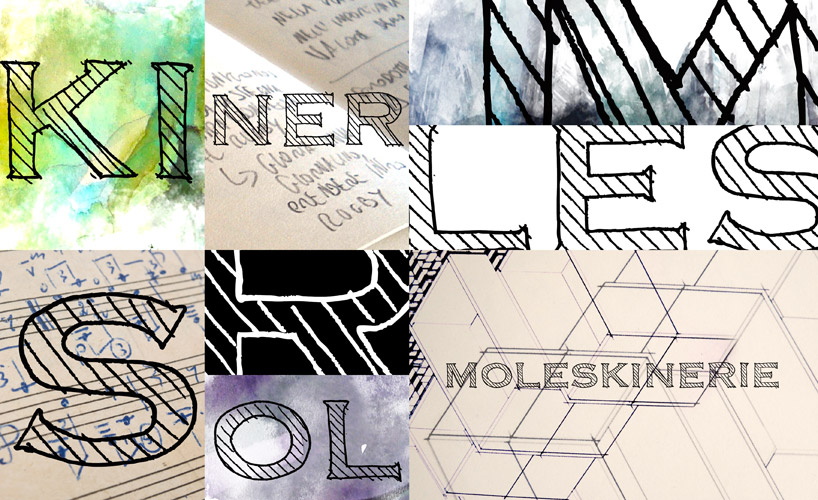 watermark examples