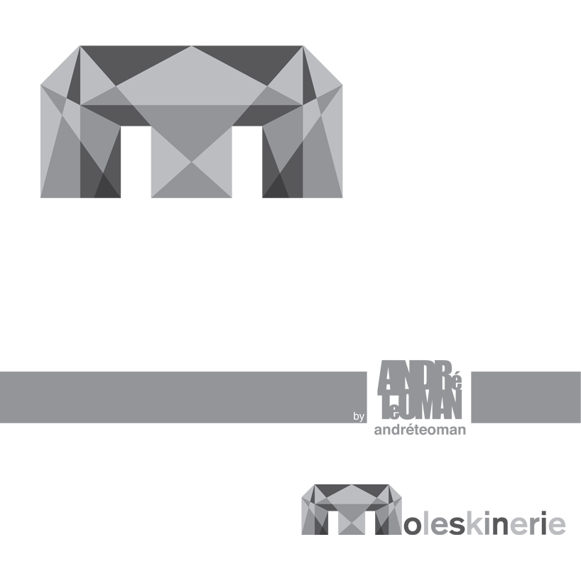
'moleskinerie logo "m" all the angles by andré teoman ozguler passos from portugal
designer's own words:
this logo, can be classified as a "monogram", it explores the initial of the company name helping the client to get to the full name. an example of this kind of logo can be seen in the abc of american broadcasting company. but this cant only be seen as a monogram because it explores the symbol factor too. Using an elaborated "m" so ti would be unique and always easy to spot.
the concept behind this idea is the exploration of all the angles in the "m" like moleskinerie explores all the angles in they area and share with their users.
with this proposal the image of moleskinerie would be seen as a dare to creativity with is contemporary an still emotive form.
cover
 logo
logo
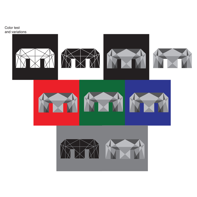
 color test and variations
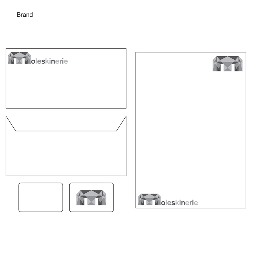
 brand
brand
shortlisted entries (2162)