MOLESKINERIE by AlexanderBell by alexander bell from uk
designer's own words:
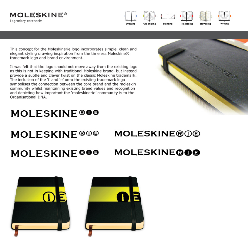
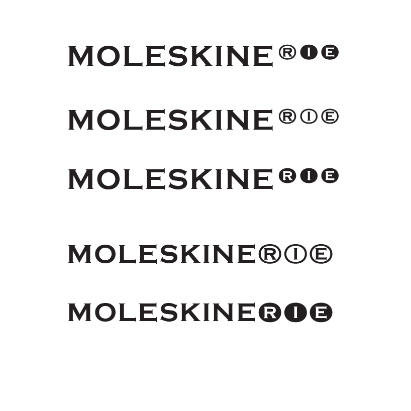
produced in his remote studio in deep northumberland countryside, alexanderbell drew inspiration from a decade of admiration towards the moleskine brand and product line. drawing the conclusion that the brand is so timeless and classic that it should not be meddled with, he uses a subtle creative twist on the registered trademark symbol to produce the 'moleskinerie' logo.
the design fits into the moleskin brand and blends with its environment as if it had been there all along. with a concept utilising the 'i e' in a product sleeve design, alexanderbell showcases how the new branding would seamlessly work across the organisation.
it was felt that the logo should not move away from the existing logo as this is not in keeping with traditional moleskine brand, but instead provide a subtle and clever twist on the classic moleskine trademark. the inclusion of the ‘i’ and ‘e’ onto the existing trademark logo symbolises the connection between the core brand and the moleskin community whilst maintaining existing brand values and recognition and depicting how important the ‘moleskinerie’ community is to the organisational dna.
Logo concept and explanation
 Logo concepts in black
 Logo concepts in white on black