moleskinerie logo "o" creativity, explosion of ideas. by andré teoman ozguler passos from portugal
designer's own words:
this logo, can be classified as a "symbol", it explores more the image and less the typography following the concept, "an image speaks more than words". Some examples of this kind of logo are the symbol of nike, the bitten apple from apple or the eye from the cbs. all this symbols start growing in everyone's mind until they were recognizable in every corner of the world, and they still keep they'r image active. to explain my proposal i need to ask you guys one question... how can we illustrate "creativity"? how many shapes or colors it would be necessary? all your products and even your blog are "tools" to help creativity burst out. and that is the main message that i tried to capture with this logo. the use of "o" is because its one of the words that most stresses out and the one that causes a more "explosion of idea" impact. with this kind of logo "symbol" you will be able to use it in every kind of stuff from internet site to stickers.
with this proposal the image of moleskinerie would be seen as a dare to creativity with is contemporary an still emotive form.
proposal cover
 logo
logo
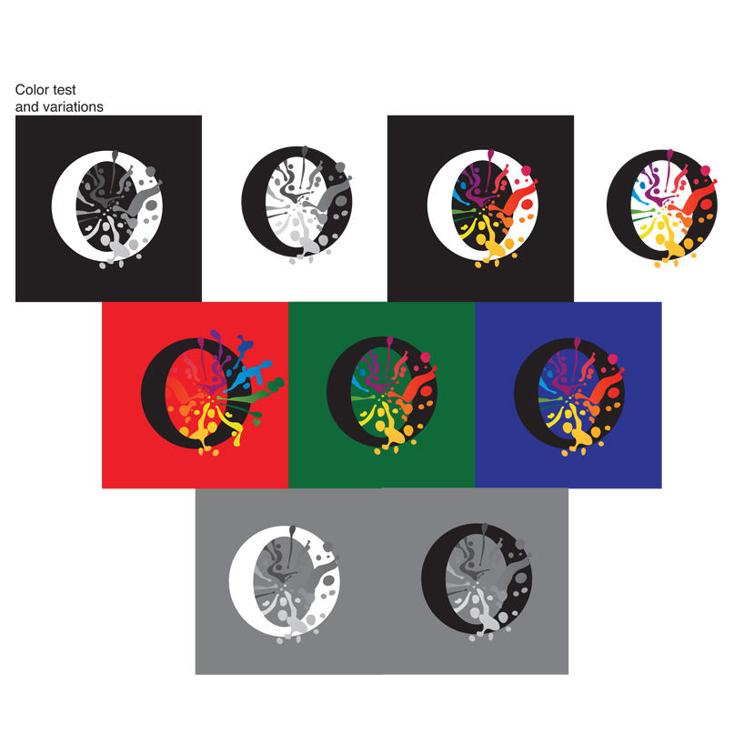 logo color test/variations
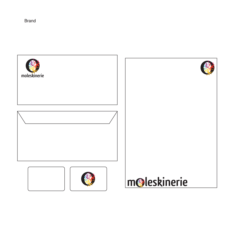 brand
brand
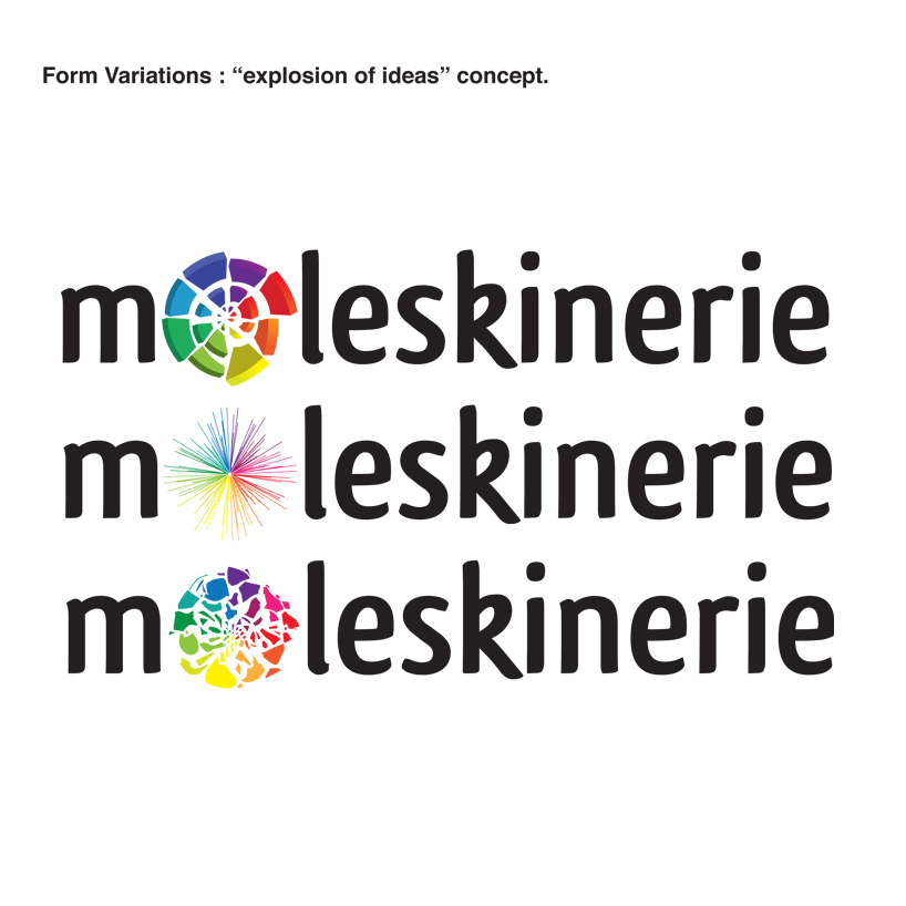 concept variations