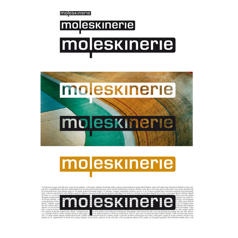
it couldn't be anything else. by chabeau anne laure from france
designer's own words:
hello ! my logo comes from the observation of the product (i've got many of them at home) : simple, sober, classic and modern through the ages, basic and unic to who uses it. and of course with its famous bookmark ! you can find all of that in my logo : in the typography (i worked with the eurostile, that i found perfect because of its simplicity, quite square but very smooth), in the color (one color only, but you can make it live different ways on different backgrounds as you can see on my samples file), in the shape of the logo (left square, right smooth) and the "l" that slips into the bookmark under the other letters. i've been working alone at home, first drawing, then on my mac. and, hum, please excuse my english...
my logo.
 some examples of enduse.