papo by liana alonso from cuba
designer's own words:
with this project is intended to recreate an image at the same time heavy and light of the general way so that who use it do not find limitations to select someone.
is marked a style focused on the luxury and good taste, on specific for the accuracy of the time, minutes, hours and seconds until the smallest detail. this is the type of user that is looking for this design, one at the same time concise and dynamic.
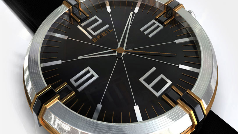
the dimensions and the form designed are focused on improving the visibility and the use of the space. the lines generated evoke continuity in all its parts so there is no visual break and all the shape is communicated. is used also a particular union between the handle and the top of the watch so the whole perception seems less heavy due to the dimensions worked.
are mainly used materials such as glossy stainless steel on the top. this same metal was used as well in the other parts with a copper colored, is also located inside the graphic treatment (numbers, hands, etc.) with a smooth finish. the handle is made in a flexible plastic with a roughened texture to facilitate the use. this combination of materials also allows to the user the employ this product in any context.
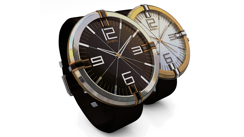
this design should be part of a remarkable collection also used by men and women. with this proposal was studied a variant of this.
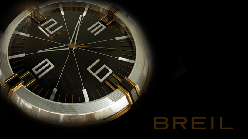
general
 top view
 variants view
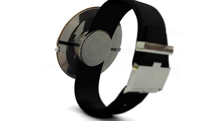
 back view