
BREIL chroncentric by Nick Lendon by nick lendon from uk
designer's own words:
the chroncentric is based around a stainless steel body and links, accented with details in aluminium and rubber. it's form is inspired by - and based around - the revolution of the hands, echoed in the three independent discs that move independently. these are exposed with a striking angular cut into the rubber fascia that displays the current time in a different format alongside the traditional hands. this is an analog method of providing the time in a typically digital format.
the theme of revolution is continued in the "rippled" effect that starts from the centre and continues through to the links of the watch with their contoured surfaces. designed to fit effortlessly into the breil range, it looks to the future albeit with a respectful nod to the past. innovative, but feasible. elegant, but bold.
chroncentric by nick lendon – intro
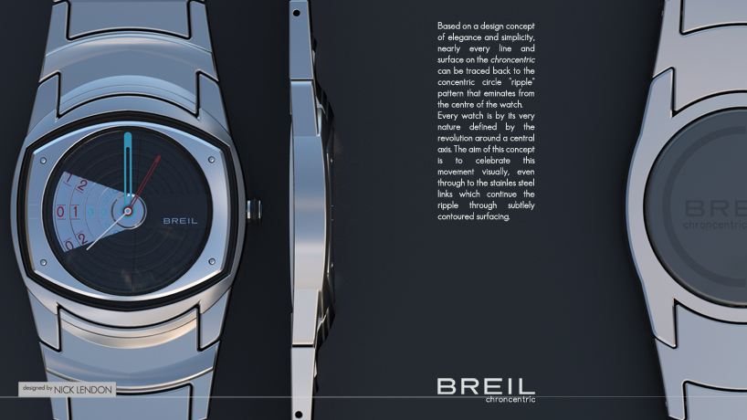 chroncentric by nick lendon – in profile
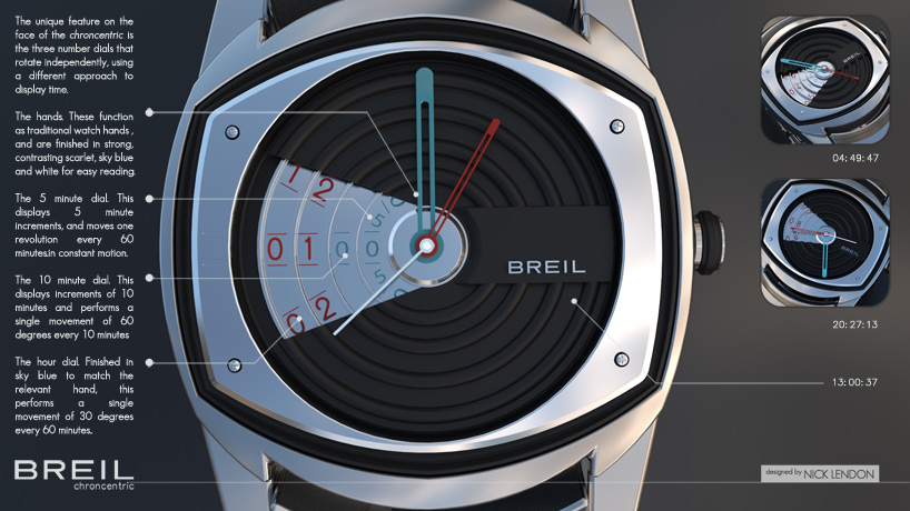 chroncentric by nick lendon – function
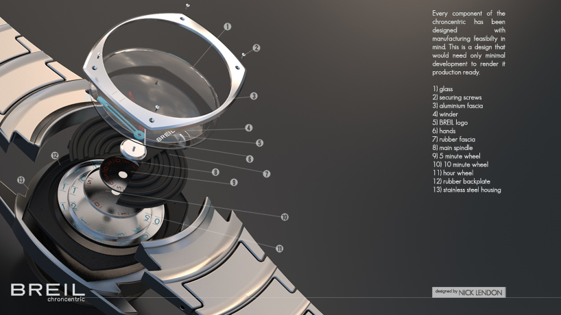 chroncentric by nick lendon – exploded
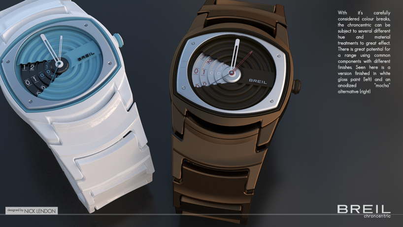 chroncentric by nick lendon – range