simply by stefano soave from italy
designer's own words:
SIMPLY: sImple is better than compLicated!
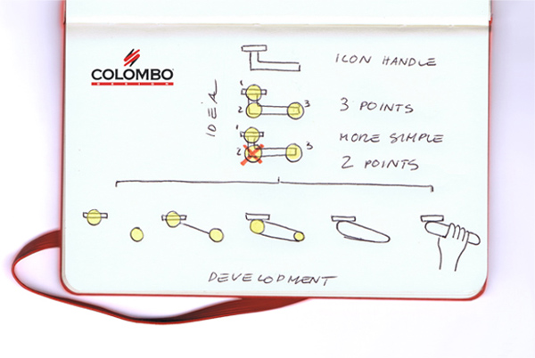
The project starts from a simple concept, that of simplifying even more the archetype of the handle known by us all and interpreted unconsciously as the shape of a "L" (with the orizontal bar longer than the vertical bar).
The aim of the project is not to cover the archetype "L" with a more or less ergonomic shape but to reinterpret it by transforming the "L" into an oblique "I".
One straight line is simpler than two, isn't it?
" the first iillustration shows better what you have just read"
drawing concept
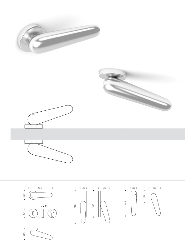
 handle
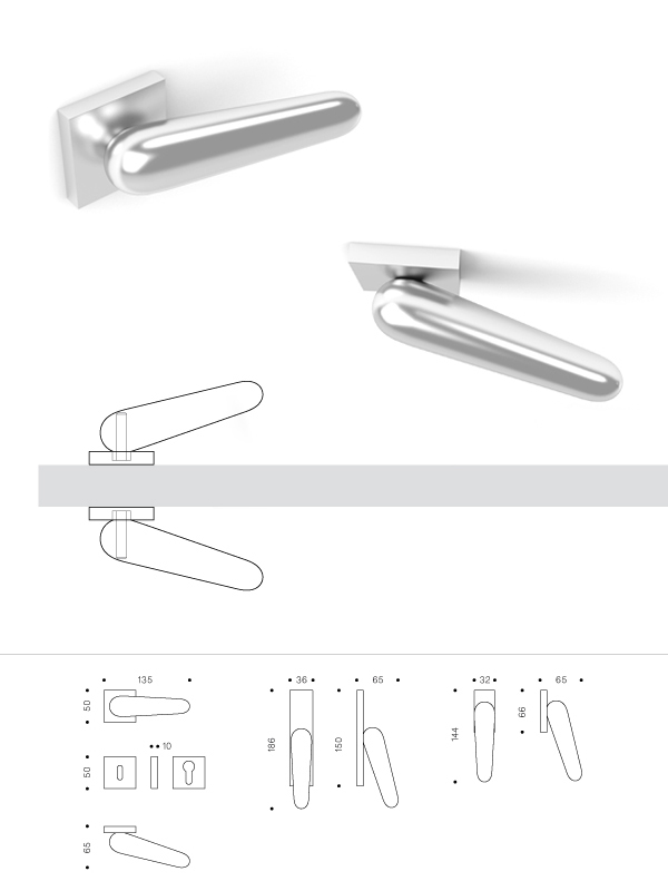
 handle
shortlisted entries (4078)