Warning! by Fidel Hernández from mexico
designer's own words:
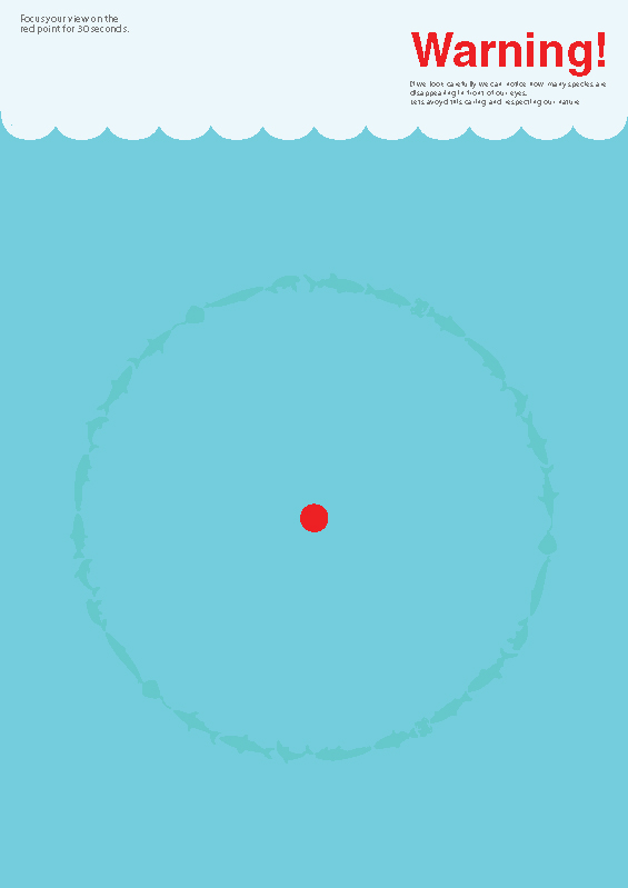
The poster aning is about making concious of the pollution factors that are damaging to our nature, specially in this case aquatic fauna.
This is the best way to comunicate this issue, making use of visual effects, looking at the red point in the middle of the circle, this red point represents POLLUT ON , which is the real problem, if the viewer watch this point by 30 sec. the rest, in this case
the fishes, will disappear, because that's what we are trying not to see, but if we look carefully, it's what is really happening.
shortlisted entries (108)