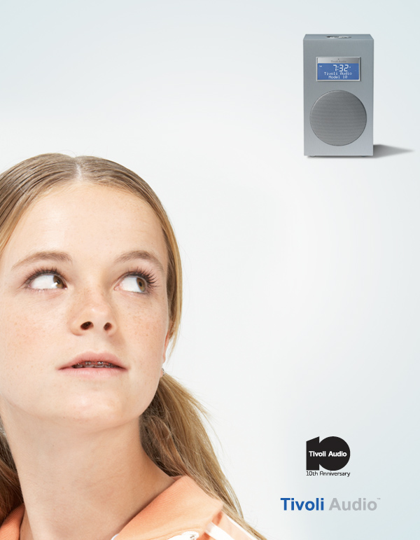
tivoli audio_eye catching design by sudon choe from usa
designer's own words:
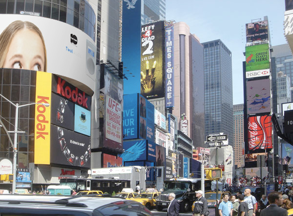
this poster represents the tivoli's eye catching 10th anniversary edition design. Also the design considers the bended shape of the actual banner at time square. I placed the girl on very left side and the audio on the other side. so audiences from left side will be really interested in what is on the other side.
poster01
 ad01
ad01
 billboard scene01
shortlisted entries (317)