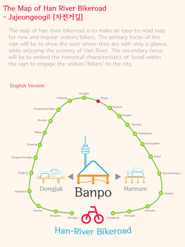
the map of han river bikeroad by yoonshik lee from korea
designer's own words:
The current Bike Road Signs do not enhance the experience or the communication with the visitors/bikers. The visitors/bikers always lose track of where they are and nothing seems to be connecting the river with the rest of the city. Our proposal of the design is to make an easy-to-read map for new and regular visitors/bikers. The primary focus of the sign will be to show the user where they are with only a glance, while enjoying the scenery of Han River. The secondary focus will be to embed the historical characteristics of Seoul within the sign to engage the visitors’/bikers’ to the city. To ensure these two focus points, we borrowed from the subway-map style and made powerful icons that the people can instantly relate to: the bridge and the city landmarks. We also separated the sign into three different levels of understanding as the human brain works differently for different paces. These three levels are: the Glance (the middle main graphic, which informs the user where they currently are located), the Stare (the two subsidiaries graphic at both hands of the Glance, which informs the user of their next and former location) and the Scrutiny (the encompassing subway-like graphic, which informs the user of any future or past locations they can reach to). This design method allows the human brain power to fill the gaps. For example, the Glance graphic clearly portrays the bridge icon being related to the text through size. At the same time the background landmark relates to the Scrutiny graphic in color, which narrates to the brain that it is a distant monument nearby the current bridge. Another example is the subway-map reference of the Scrutiny graphic, in which the regular visitors’/bikers’ brain clearly can connect the sign in being a location map.
english ver.
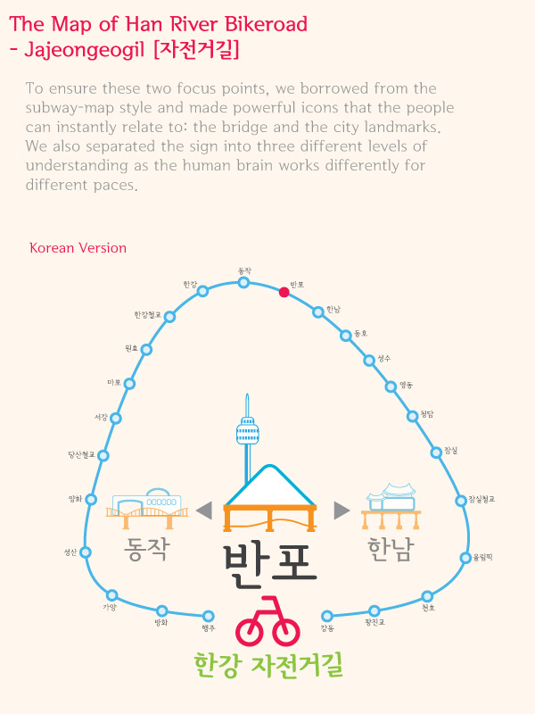 korean ver.
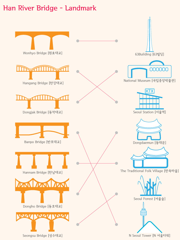 bridge-landmark