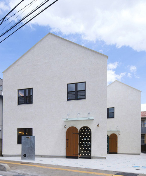
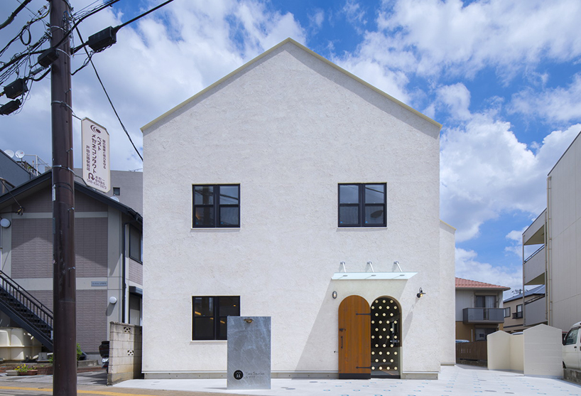
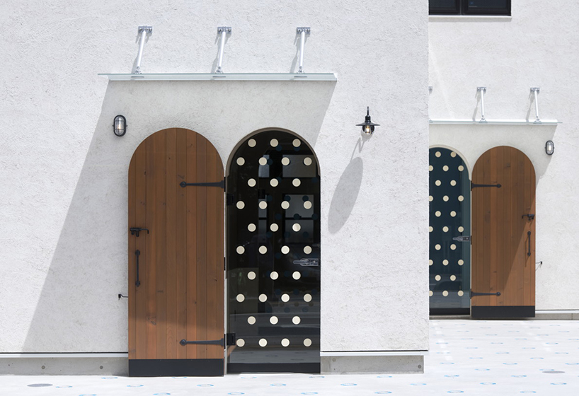
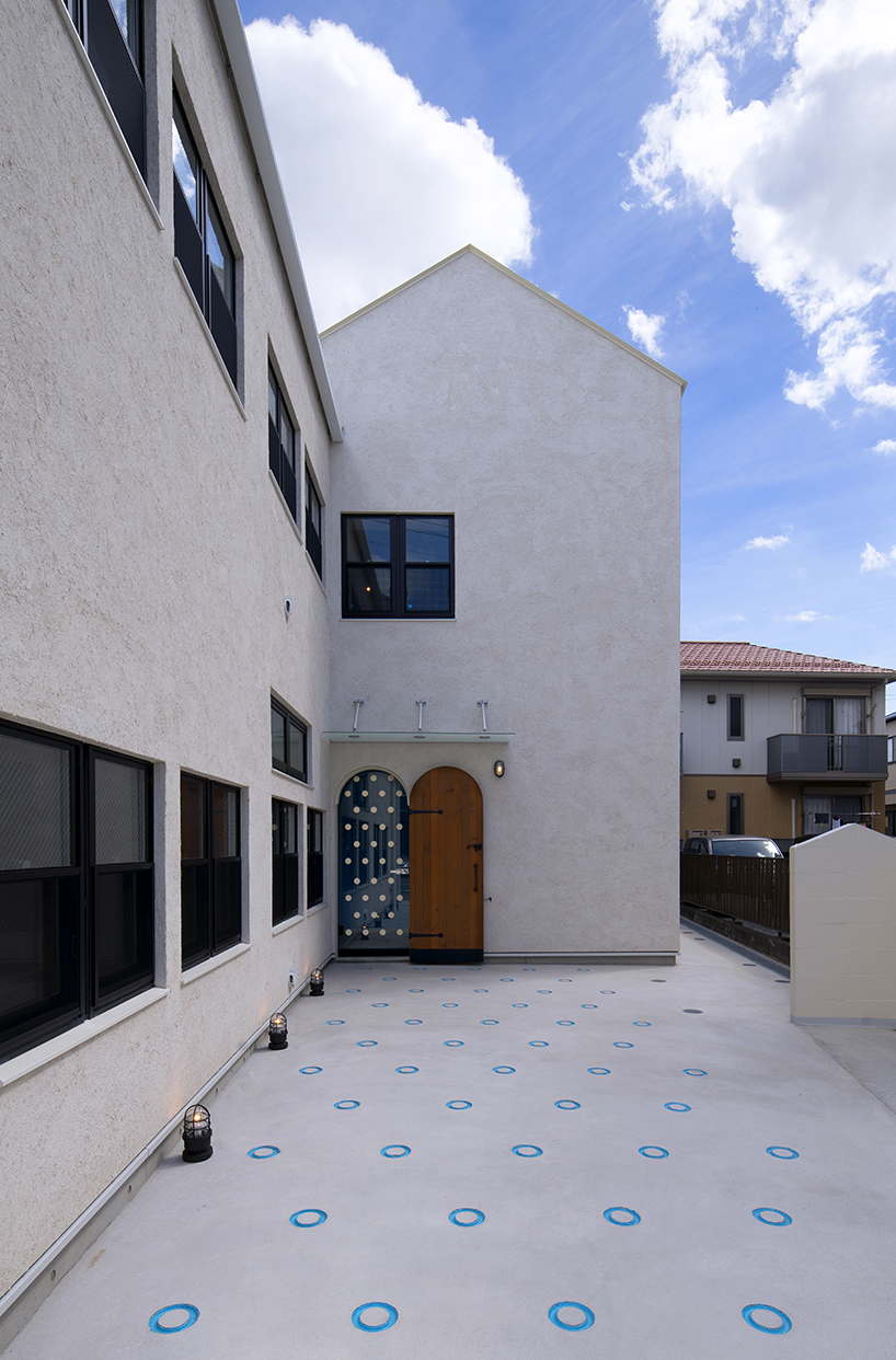
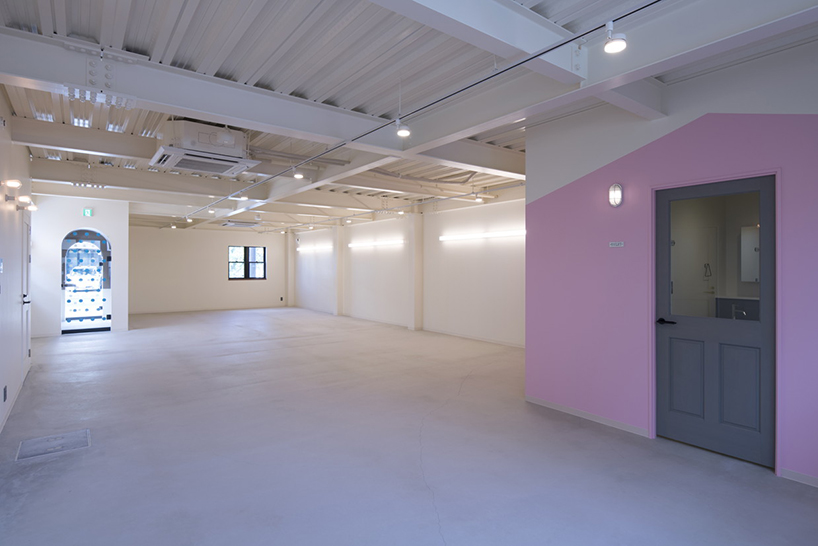
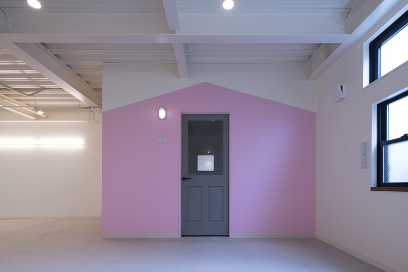
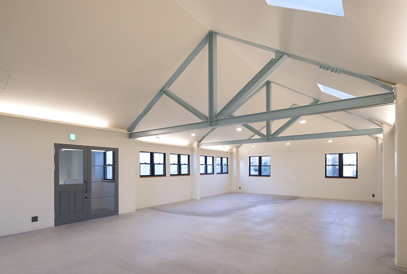
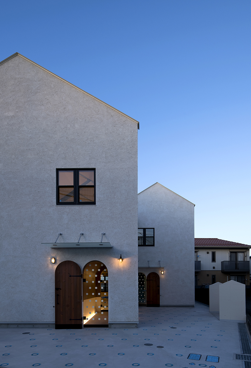
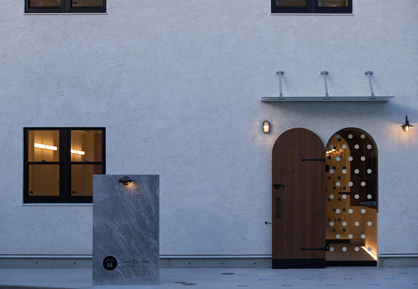
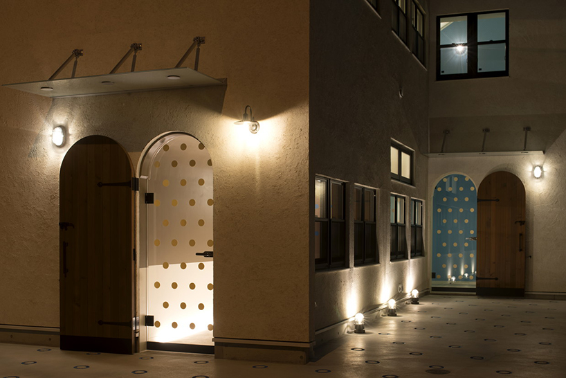
located in a largely residential area, organic design’s commercial tenant building features a homelike appearance, less reminiscent of a business and more of other houses in the neighborhood. the japanese studio has developed the ‘two stories building’ with gabled roofs that integrate well with the surrounding structures, while a dotted pathway attracts passersby’ attention towards the inside.

gabled roofs and a dotted pathway add homelike feel to organic design's commercial building
photos by yukinori okamura


at a time when cities are flooded with commercial buildings developed to emphasize economic efficiency and profitability, organic design sought an economical project which also introduces qualities that resonate with the community. during the creative process, the studio considered two main themes: how the design should relate to the neighborhood, and how to arrange a visitor’s approach from the street to the businesses inside.

gabled roofs and a dotted pathway add homelike feel to organic design's commercial building


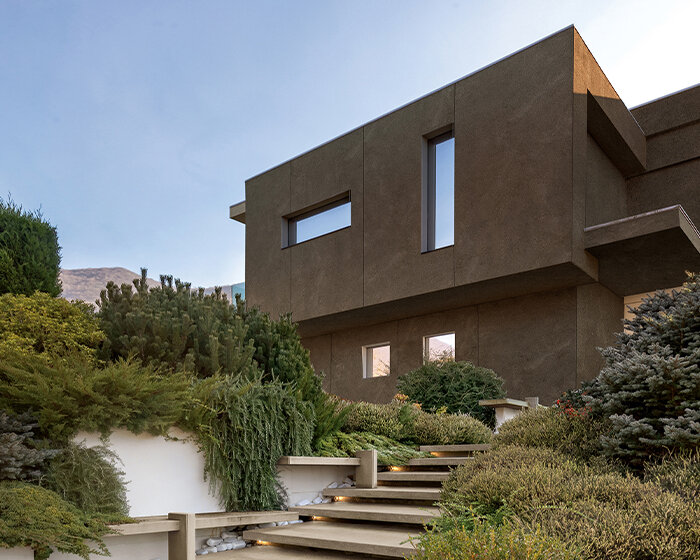
‘the existing cityscape, until around the 1990s many buildings in this suburb featured conventional low gable roofs, hip roofs, or pavilion roofs,’ explain the architects, ‘flat roofs appeared in the past 15 years or so as condominiums, apartment complexes, and commercial buildings popped up here and there. now these flat-roofed office buildings and condos are becoming more common here.’ the decision to design the building as a gabled-roof, low-rise volume that does not stand out from the skyline of its block aims at introducing it as something familiar to the mix of generations of the area.

gabled roofs and a dotted pathway add homelike feel to organic design's commercial building


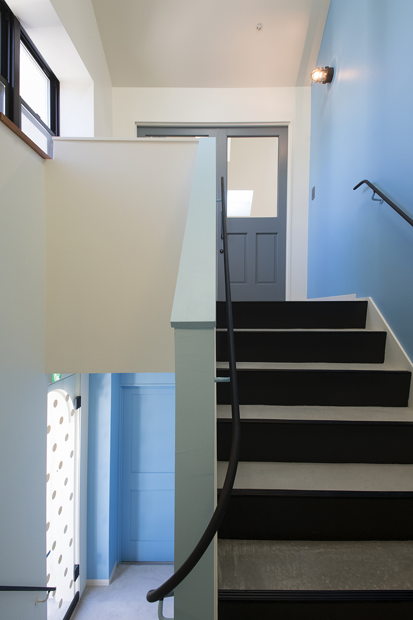
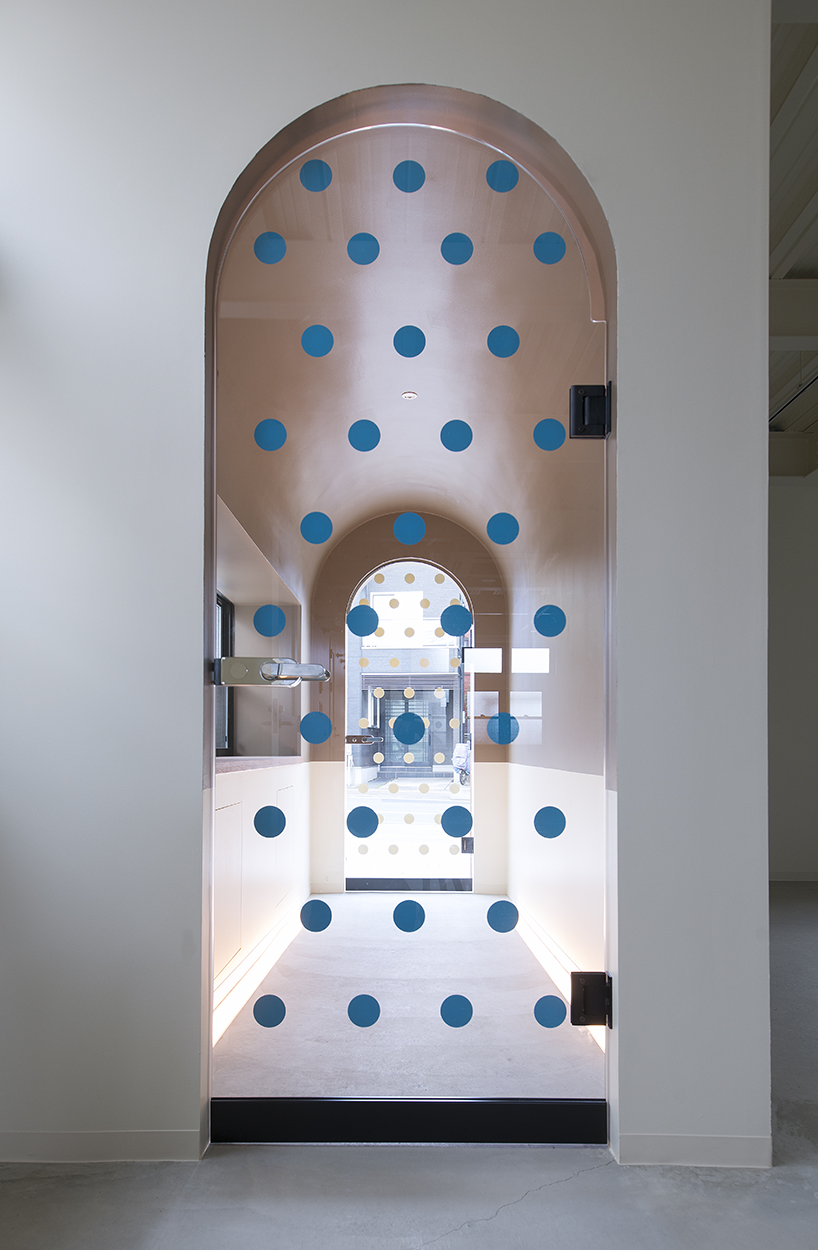
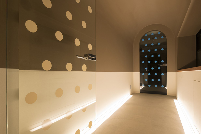
while developing the visitors’ approach theme, organic design explored ways to act on psychological mechanisms as they pass in front of the building, and from the door to the rooms inside. first, people’s latent desire for new experiences is roused from the street in front as they notice the dotted pathway, which spreads onto the two entrance doors. before entering the different rooms, visitors briefly pass through buffer zones which the designers call ‘experience chambers’, developed to reset their mood. similarly, a staircase leading to the second floor also serves as a mood-altering chamber, shifting their perspective the same way, through a dotted, blue-colored static space before they enter the business area.

gabled roofs and a dotted pathway add homelike feel to organic design's commercial building

gabled roofs and a dotted pathway add homelike feel to organic design's commercial building

gabled roofs and a dotted pathway add homelike feel to organic design's commercial building

gabled roofs and a dotted pathway add homelike feel to organic design's commercial building

gabled roofs and a dotted pathway add homelike feel to organic design's commercial building

gabled roofs and a dotted pathway add homelike feel to organic design's commercial building

gabled roofs and a dotted pathway add homelike feel to organic design's commercial building

gabled roofs and a dotted pathway add homelike feel to organic design's commercial building

gabled roofs and a dotted pathway add homelike feel to organic design's commercial building


designboom has received this project from our ‘DIY submissions‘ feature, where we welcome our readers to submit their own work for publication. see more project submissions from our readers here.


edited by: sofia lekka angelopoulou | designboom