illuminating the beck's experience by phil smith from uk
designer's own words:
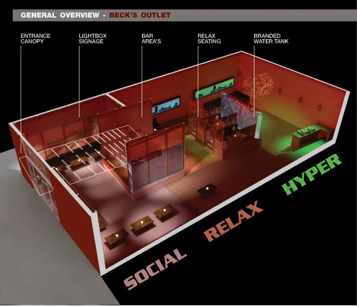
The Beck’s Outlet is split into three zones representing the different levels of social behaviour and mental attitudes of the Beck’s drinker. Anyone who enjoys drinking out will find a welcome place within this bar.
Throughout the Beck’s Outlet the ambience, branding and function is reinforced by the use of a variety of coloured lighting onto neutral surfaces. A strong contrasting colour scheme of green and red - the recognisable calling card of Beck’s – is used to highlight the distinct Zones within the space. A muted palette of materials - timber, concrete and glass – puts the emphasis on the social activity within, with variety giving way to quality.
AREA ONE – SOCIAL ZONE
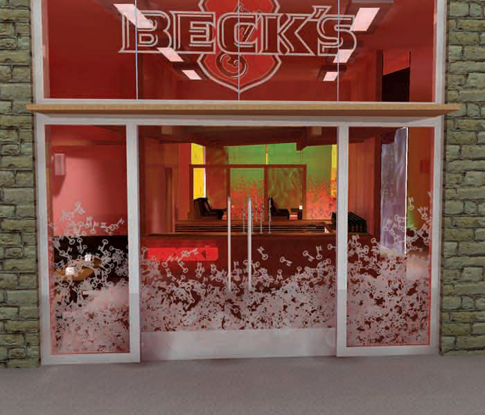
The simple glazed entrance is discretely littered with the Beck’s key motif at low level. A timber canopy draws customers into the Social Zone.
The central bar, fixed seating and tables provide a meeting point for friends to gather and socialise. Interior branding is created by screen-printed graphics onto the diffuse light-boxes which line the entire social zone. Rather than applying graphics as a surface decoration, they from part of the physical environment.
AREA TWO – RELAX ZONE
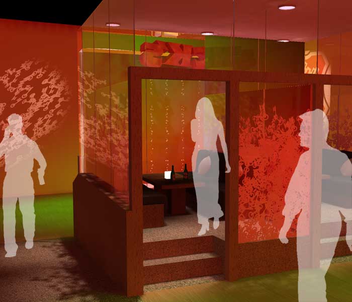
Past the floor-to-ceiling water tank (complete with bubbles and Beck’s paraphernalia) that separates the bar from the social area, the tempo relaxes. Situated in the centre of the Beck’s Outlet, the Relax Zone gives customers the opportunity to sit, relax, drink and enjoy each other’s company. Another dedicated bar/servery helps to separate the space from the bustle of the Social Zone – and a raised seating area, complete with glass enclosures decorated with the key motif, plush sofas and subtle lighting emphasises the intimacy of the Zone.
Beck’s has a history of being associated with art, from its advertising campaigns to its early development as the beer for the refined drinker, the link with art is strong within the brand. To display this within the Beck’s Outlet, two long lightboxes are situated in the Relax Zone and are used as focal points to catch the eye and entice the bar goers to sit and relax in that area.
The first bespoke pieces feature two panoramic cityscapes in silhouette; the urban feel to the image contrasts the warm and natural feel of the bar and creates a mix of influences in one space. The skies of the cities are brightly coloured to stand strongly behind the tall towers and buildings and feature tiny elements of the Beck’s shield emblem, reinforcing the strong bond between Beck’s and art.
AREA THREE – HYPER ZONE
When the mood is right, customers might like to move to the dance floor. The Hyper Zone is dedicated to self expression, where the most spontaneous Beck’s drinkers can interact. Separated from the Relax Zone by another large scale water tank, the Hyper Zone is fully equipped with effect lighting, overhead projectors and DJ booth.
overview
 entrance
 relax
relax