beck's max by markus hudert from netherlands
designer's own words:
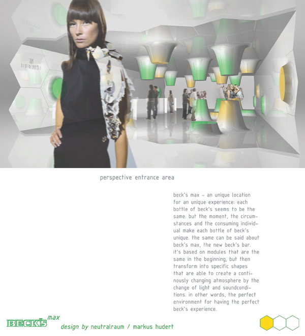
beck’s max - an unique location for an unique experience: each bottle of beck’s seems to be the same. but the moment, the circumstances and the consuming individual make each bottle of beck’s unique. the same can be said about beck’s max, the new beck’s bar. it’s based on modules that are the same in the beginning, but then transform into specific shapes that are able to create a continously changing atmosphere by the change of light and soundconditions. in other words, the perfect environment for having the perfect beck’s experience.
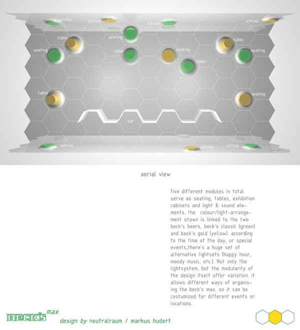
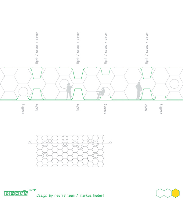
five different modules in total serve as seating, tables, exhibition cabinets and light & sound elements. the colour/light-arrangement shown is linked to the two beck’s beers, beck’s classic (green) and beck’s gold (yellow). according to the time of the day, or special events,there’s a huge set of alternative lightsets (happy hour, moody music, etc.). Not only the lightsystem, but the modularity of the design itself offer variation. it allows different ways of organising the beck’s max, so it can be costumized for different events or locations.
entrance view
 aerial view
 section