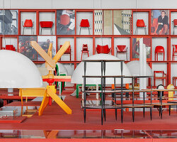
a major monographic exhibition dedicated to achille castiglioni (1918-2002) on the occasion of the centenary of his birth has opened in milan. following last year’s sensational ettore sotsass: there is a planet, la triennale di milano continues its celebration of great masters of italian design. for the special occasion, designboom met patricia urquiola and federica sala during the building-up process to present you with a walk-through of the exhibition ‘a castiglioni‘.
urquiola was joined by sony design who reinterpreted the stories behind some of castiglioni’s most influential pieces. ‘I appreciate sony design’s intuitive approach in interpreting the curious and experimental attitude of achille castiglioni. the team’s brilliant mindset is reflected in a project that is able to present achille through playful and clever solutions.’
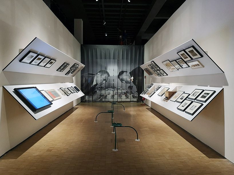
the exhibition examines castiglioni’s work in a transversal manner, ranging from design to architecture and displays
image © designboom
‘the title of the exhibition – a castiglioni – is like a dedication to when he did his own exhibition, ‘alla castiglioni’, which here we simplify,’ patricia urquiola, who curated the exhibition in collaboration with federica sala, tells designboom. ‘we know it’s a centenary but we didn’t want to go that way and do it in a chronological order, with a timeline and so on,’ the two continue, ‘his concept and ideas are very free and they move very loose, and so we created a kind of rhizome, or what we call ‘the castiglioni mind’, a sort of map, a geography, where you can get -in his brain- and follow different parts of his thoughts.’
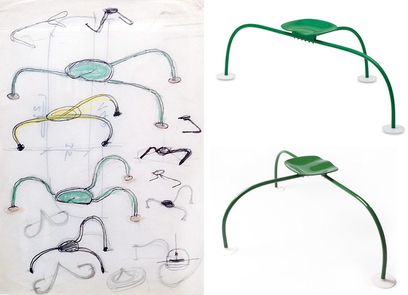
at the entrance, visitors take a seat on ‘allunaggio’, designed by achille & pier giacomo castiglioni for zanotta in 1966 original drawing, courtesy of fondazione achille castiglioni
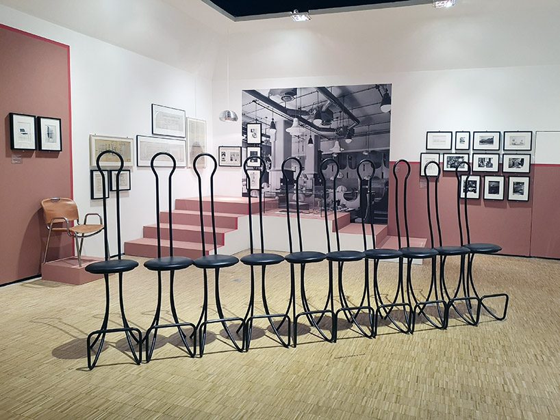
‘spluga’ bar stools by achille & piergiacomo castiglioni, for splügen in 1960
image © designboom
the two curators have divided the exhibition space in 20 clusters, what they call ‘parts of his brain’, developed around the fundamental elements of his work – such as ‘the void’, ‘ready-making’, ‘playfulness’, …
to give a clear picture of this highly active and, in a sense, timeless figure, it has been decided to show the work by means of a series of often overlapping and intersecting aggregates of content. the idea is thus to create a map of recurrent macro and micro concepts in his designs, in a non-hierarchic, non-linear, ramified manner.
‘his more architectural work is emphasized, because it is a topic rarely celebrated. usually his product designs get most of the attention.’ points out patricia urquiola.
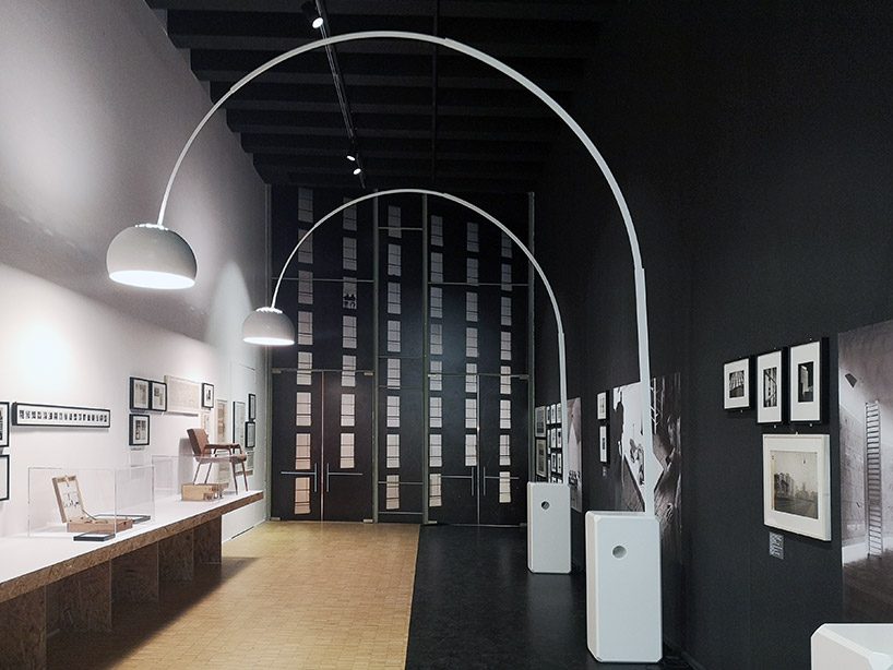
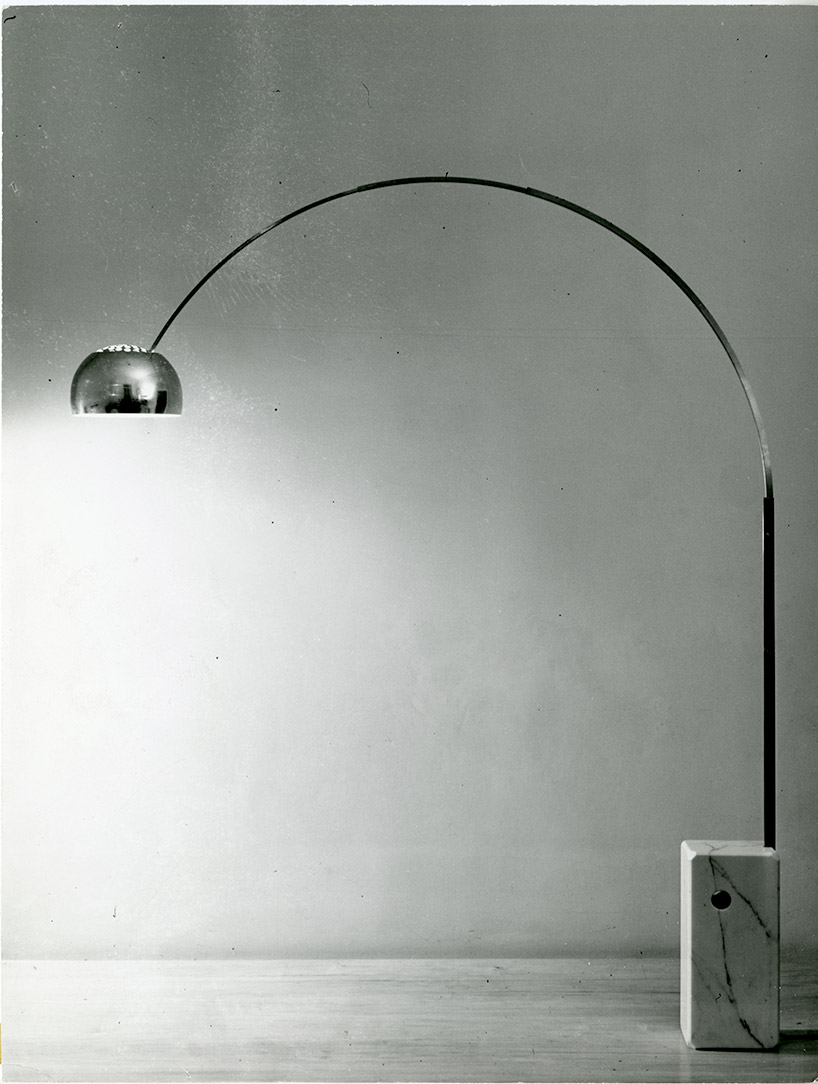
first floor display is illuminated by ‘arco’ lamps by achille & piergiacomo castiglioni, 1962
image © designboom
‘a castiglioni‘ occupies two levels of la triennale, displaying a total of 200 works. on the ground floor there are seven clusters, starting with one dedicated to the city of milan and its architecture. ‘this cluster is about achille’s relationship with his family and brothers, livio and piergiacomo, and also shows three buildings he designed for the city,’ note urquiola and sala, ‘accompanied by historic images. castiglioni’s own story-telling is then explaining what you are seeing’.
‘we’re thinking about castiglioni from today,’ urquiola points out, ‘today the path doesn’t exist as a concept – it’s a more rhizomatic set of relations. you are browsing the net and you follow a link which takes you to another page,’ adds sala.
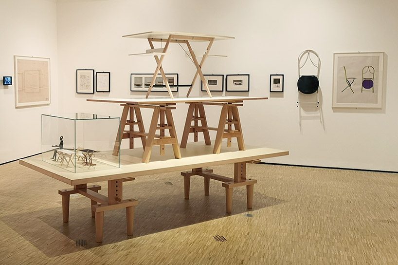
tables ‘leonardo’, 1950 for zanotta and ‘scrittarello’, 1996 for de padova, ‘rosacamuna’ folding chair for zanotta, 1983
image © designboom
‘we are trying to map the connections between his different works,’ note the two curators, ‘but it’s not a closed system. for achille and his brothers the idea of surprise was very important. when they created exhibition designs, a moment of surprise was injected and people were not getting bored. another important aspect was that an individual, crossing the work, could be part of it. here, each cluster is always related to the person viewing the work’.
‘we would like that people have a critical attitude towards the exhibition,’ urquiola concludes, ‘visitors might say – I would not put arco in the geometry section, I would put it in the part entitled void.’
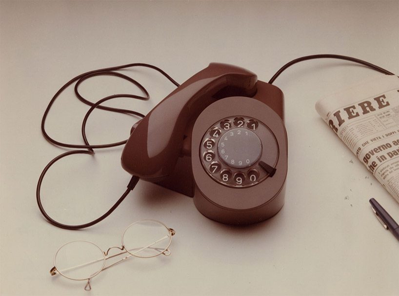
SIT siemens telephone, prototype developed by achille castiglioni in collaboration with paolo ferrari, 1977
image CPF publifoto, courtesy fondazione achille castiglioni
similar to a brain, these areas don’t have a particular standardized dimension – some are smaller, and others are bigger. the ground floor is also dedicated to castiglioni’s passion for the phone, ‘every time he was doing a restaurant or an interior he was putting very visible a telephone inside’ sala explains.
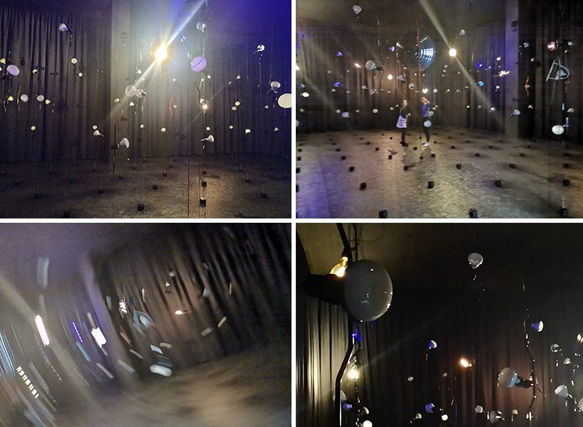
dark room castiglioni party
images © designboom
the last part, before heading upstairs, is a black, ‘magical’ room filled with 100 parentesi lamps, designed for flos in 1971. symbolizing 100 candles in commemoration of the centenary of his birth. ‘it’s the only moment of celebration’, notes urquiola, ‘the only party moment in the exhibition. the lamps are interactive and people can play with them. some of them have a sensor, others are re-composed with parts of different castiglioni lamps…’
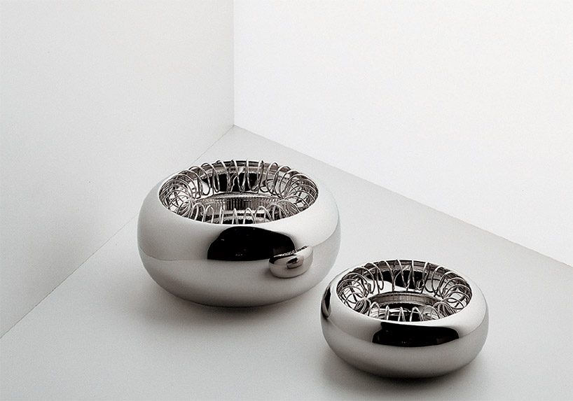 ‘spirale’ ashtray, 1970 – this design was originally produced in silvered metal by bacci in bologna, and was adopted by for alessi in 1986 with a number of modifications to its shape and size
‘initially we were given only the ground floor gallery with all these small rooms and we felt that we needed to do an act of subversion. so we asked the president of la triennale to use also a part of the building that rarely is connected within exhibitions. an empty room, a white cube on the upper floor, where we had more freedom and actually daylight. so, after going through the dark party room, you go upstairs and feel the energy of light.’
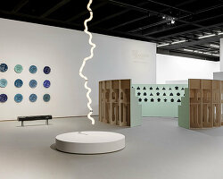
visitors go up the stairs with daniel buren’s glass work, part of a cluster in itself that is called ‘the void’. filled with smoke, the void is dedicated to castiglioni’s passion for smoking, with a round table displaying a few related items.
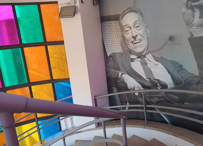
going to the upper floor
image © designboom
the upper gallery features 13 sections, including one cluster dedicated to playfulness, one to castiglioni’s relationship with technology, and one to his geometric designs.
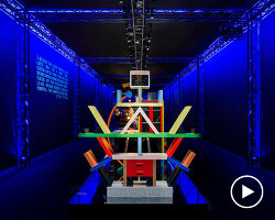
when presenting the ready-made series, the curators joined sony design to create a showcase that exhibits a bold approach while portraying castiglioni’s timeless sense of humour. in it, the stories behind some of the designer’s most famous pieces were reinterpreted and conveyed into experiences that utilize technology. as seen on the video above, the dynamic installation shows, for example, a bicycle saddle and a milking chair blend into stella, castiglioni’s chair designed for talking on the phone. another example is ‘lampadina’ which sees a film reel rolling the electric wire.
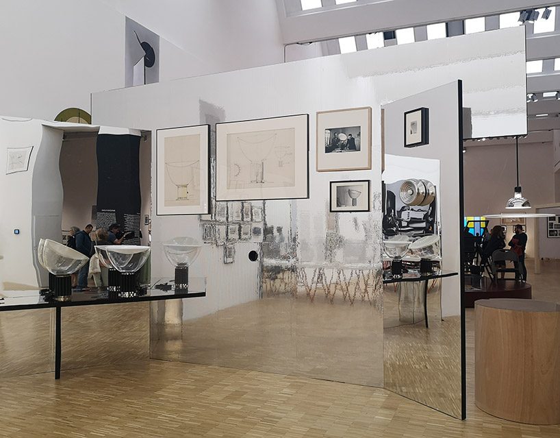
in the ‘reflection’ cluster – ‘taccia’ lamp, designed by achille & piergiacomo castiglioni in 1958 for flos
image © designboom
a big element coated in mirror sheets concentrates all the projects that have to do with reflection – the accompanying text here is written backwards, and only legible via a mirror. in this structure, visitors are invited to peek through a hole to see various models of the ‘gibigiana’, the penguin-looking-lamp that achille castiglioni designed for flos in 1980.
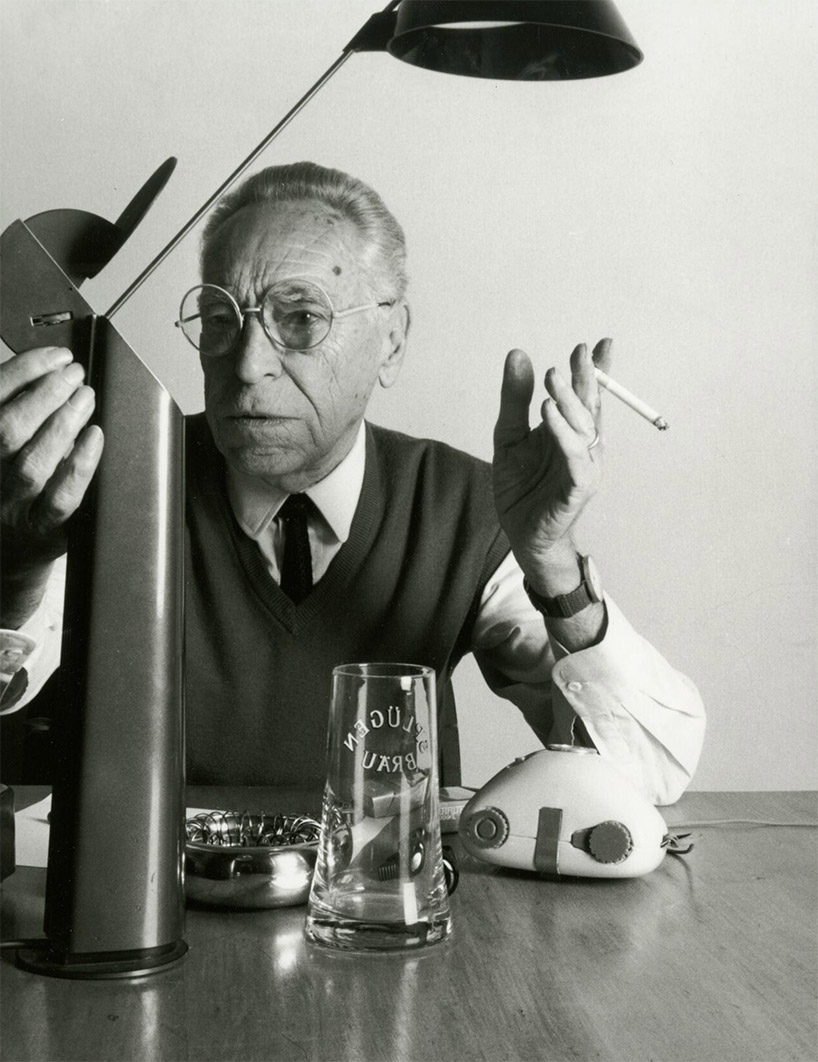
achille castiglioni with the ‘gibigiana’ lamp
image by monzino, courtesy fondazione castiglioni
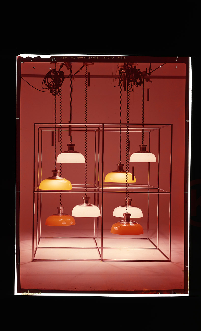
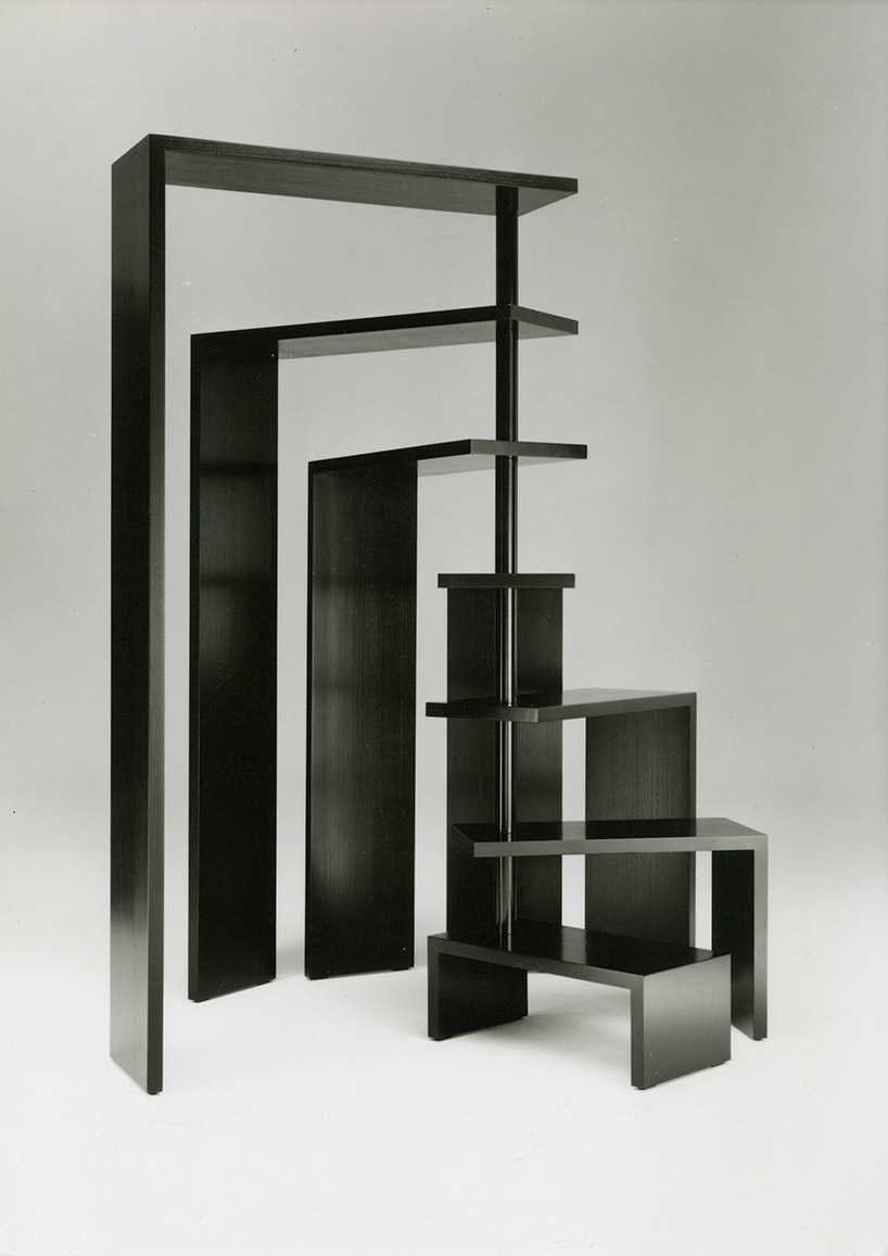
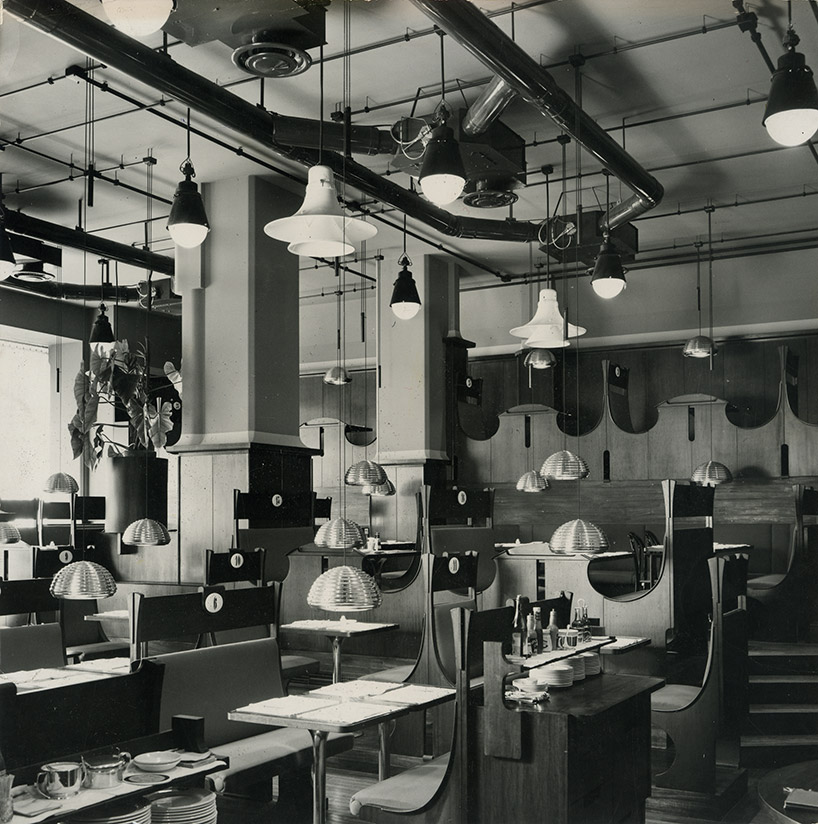
castiglioni’s approach was simple and direct but with a wealth of inquisitiveness and irony, and it became the method he used to train later generations of designers. the items he designed – most of which are still in production today, and among their manufacturers’ bestselling products – took inspiration from the everyday world and transformed it into something new, adopting a wry approach to the relationship between form and function.
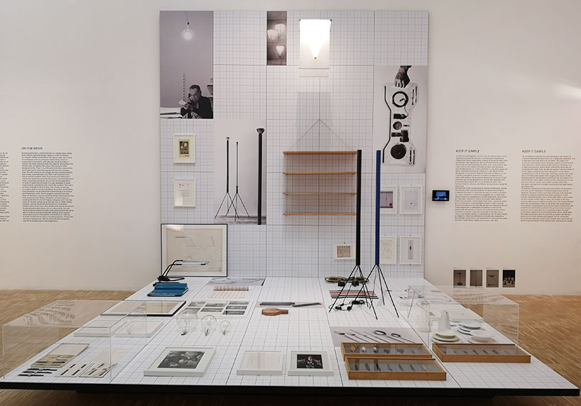
image © designboom
‘he was a man who taught a lot not only to my generation but also to the younger,‘ explains urquiola, a former student of castiglioni at the politecnico university of milan, ‘he introduced a lot of lines of interpretation, always emphasizing the value of simplicity – and reflection.‘
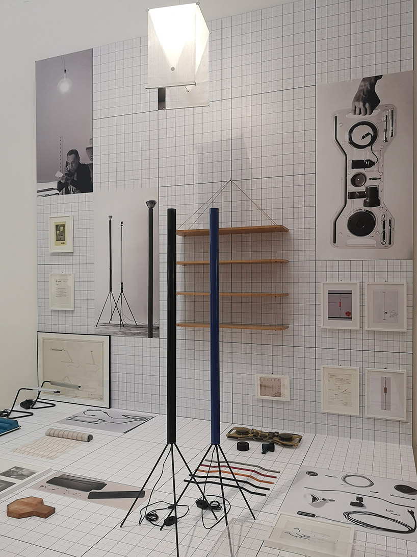
lamps ‘luminator’, 1955 and ‘parentesi’, 1970
image © designboom
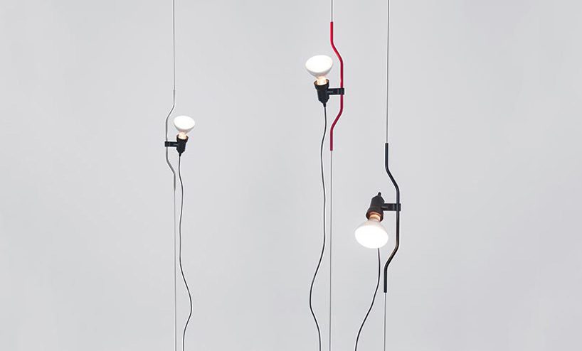
parentesi lamp by achille castiglioni & pio manzù, 1971
image courtesy flos
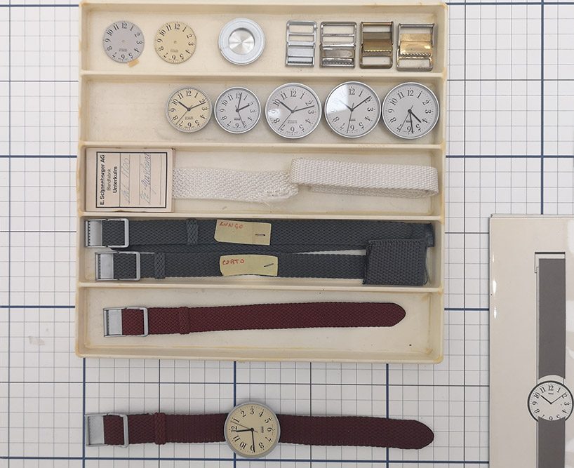
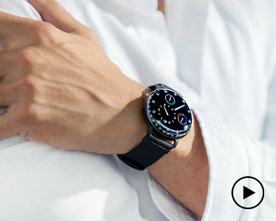
alessi ‘record’ watch, design by achille castiglioni, graphics by max huber, 1989
image © designboom
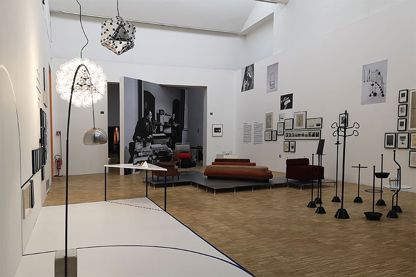
a view into the exhibition
image © designboom
‘there is an audio of his voice in every space, in this case he is talking about the arco, referring to the big street lights in the city. achille castiglioni himself is guiding you through the exhibition, next to the text and information that we have elaborated.’ patricia urquiola
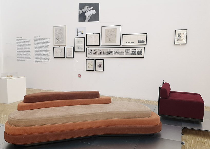
‘hilly’ 1992 for cassina and ‘cubo’ easy chair, designed in 1957 by achille & piergiacomo castiglioni for arflex
image © designboom
achille castiglioni, born 16 february 1918 in milan, was undoubtedly one of the founding fathers of the profession and of the italian design system. his legacy is kept very much alive today by the fondazione achille castiglioni – in the historic studio in piazza castello – dedicated to catalog, sort and archive, the digitization of projects, drawings, photos, models and videos: the whole world of achille castiglioni, in which he has worked during more than 60 years of activity, first with the brothers livio and pier giacomo, then, since 1968, alone.
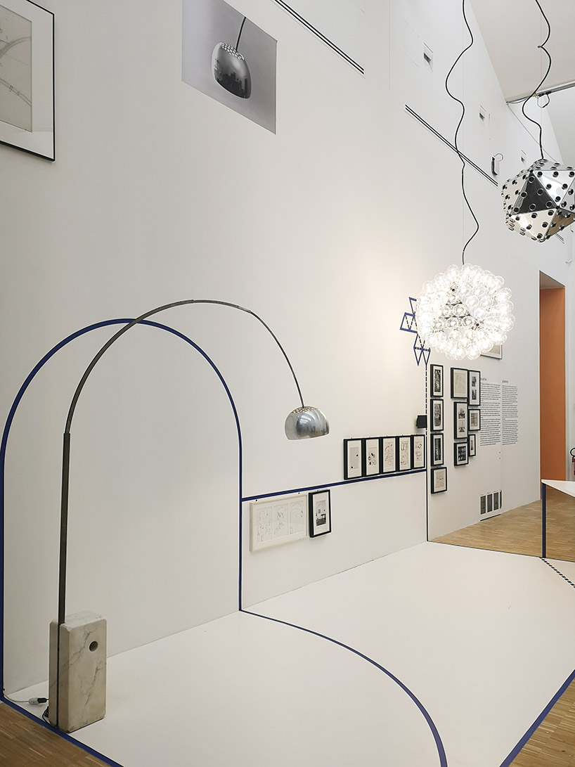
‘arco’ and ‘taraxacum’ lamp, 1988
image © designboom
with pier giacomo until 1968 and with livio until 1979, achille was in a total creative symbiosis. the brothers represented the seriousness of rigour, achille the brilliance of experimentation. with their death, the castiglioni lost fundamental opportunities for the exchange of ideas and for a long time the pace of things had slowed down at the studio.
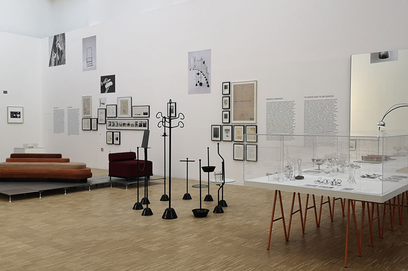
exhibition view
image © designboom
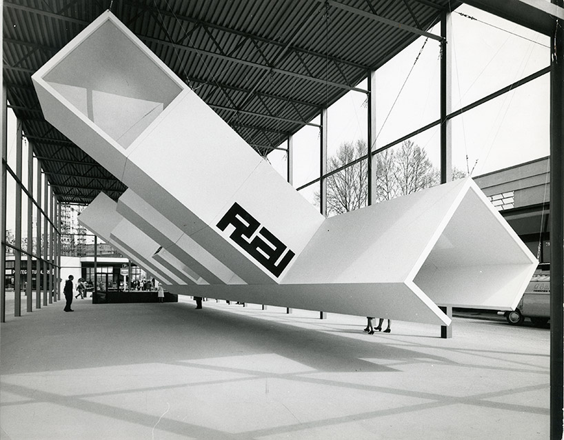
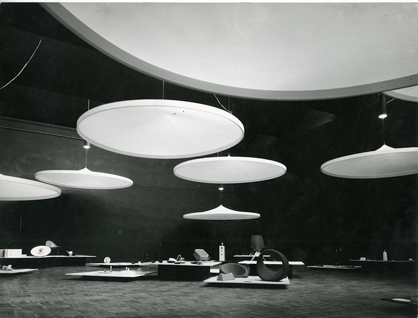
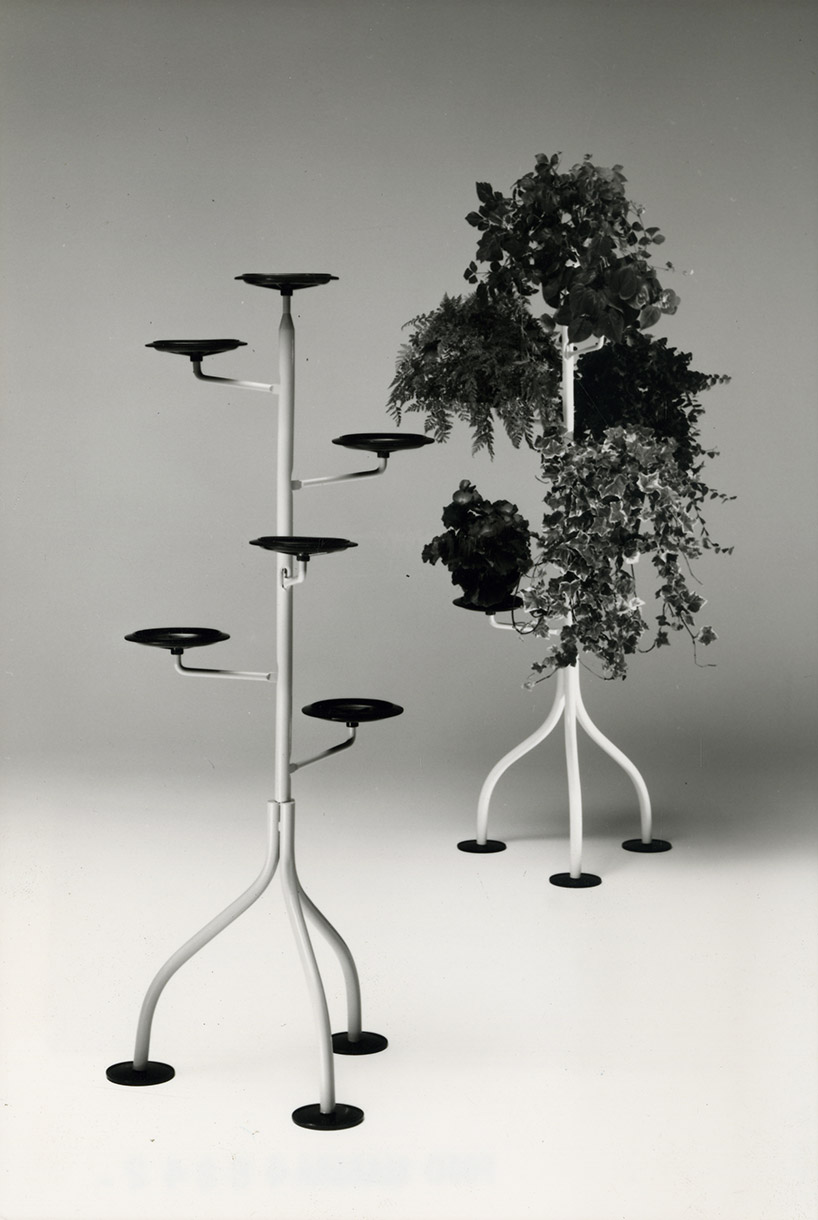
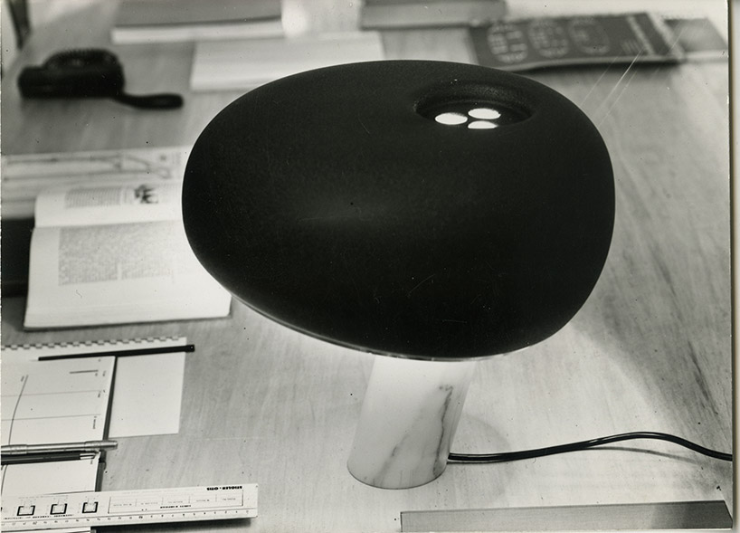
achille castiglioni designed over 400 temporary exhibitions and collaborated with a myriad of companies and italian design factories, including alessi, brionvega, B&B italia, BBB bonacina, cimbali, danese, driade, de padova, flos, cassina, knoll international, kartell, moroso and zanotta.
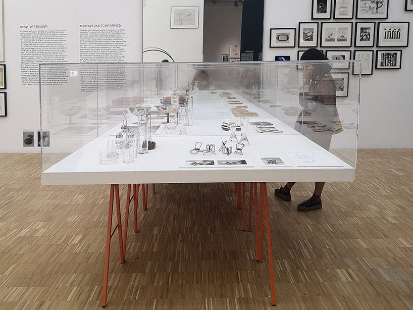
‘to serve and to be served’ cluster
image © designboom
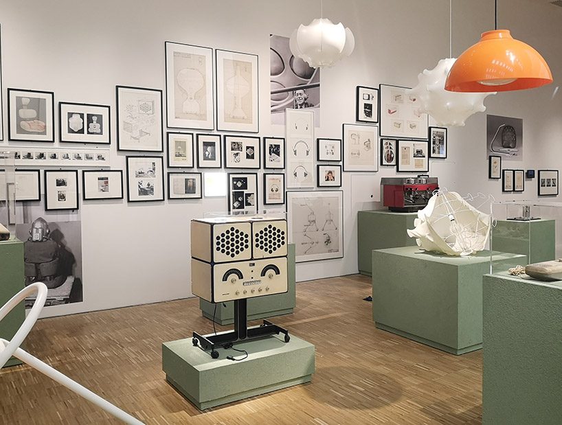
the ‘innovation’ cluster is showing ‘RR126’ by achille & piergiacomo castiglioni for brionvega, 1965
image © designboom
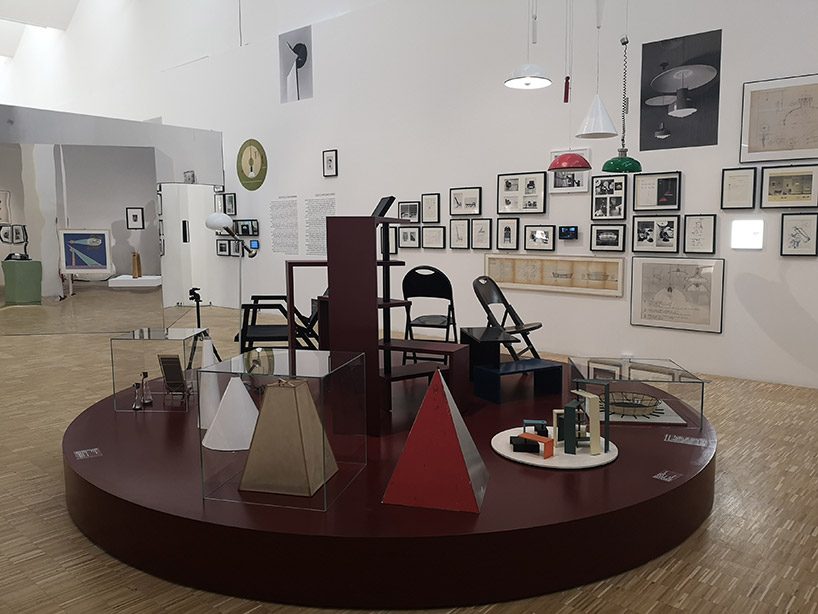
a view into the exhibition
image © designboom
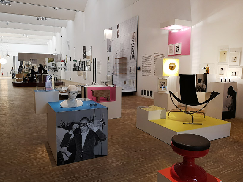
exhibition view
image © designboom
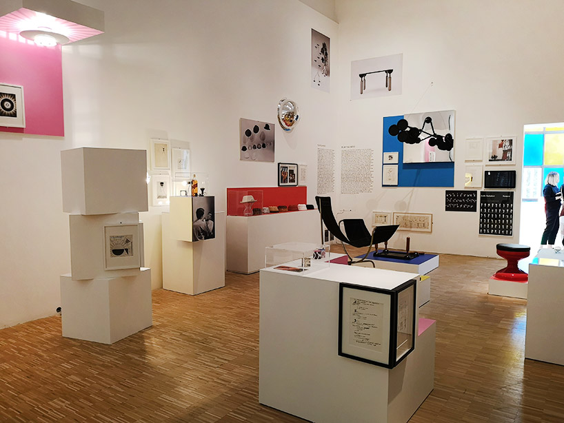
exhibition view
image © designboom
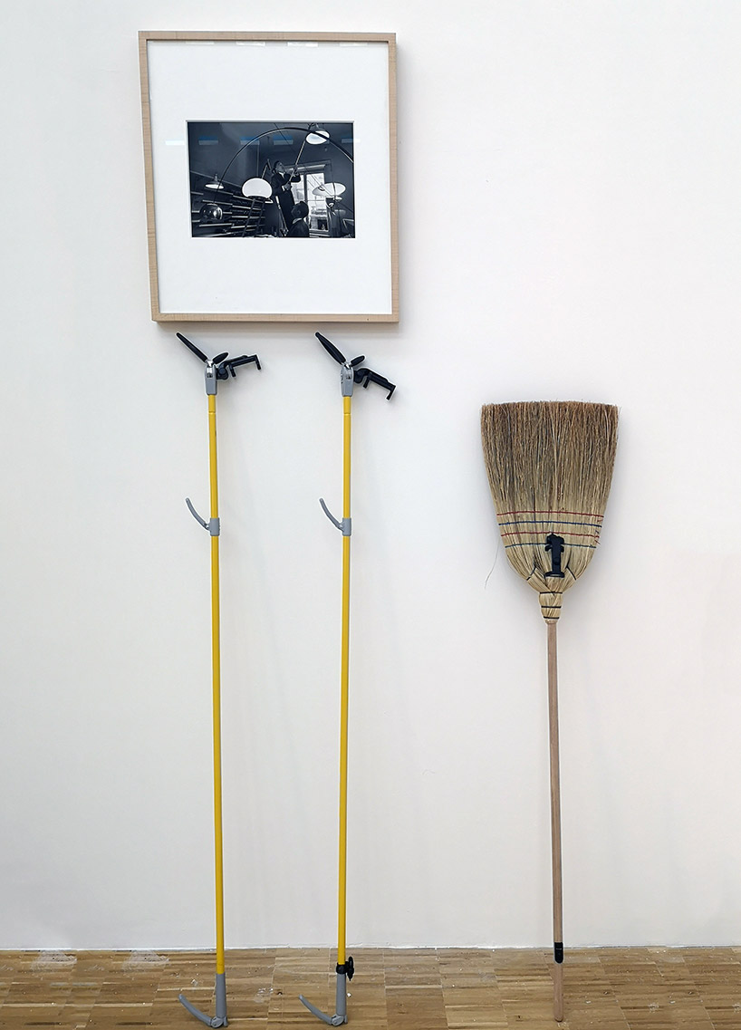
ready making – a combination of a broom and an extension rod that was used by achille castiglioni to reach out for far away objects
image © designboom
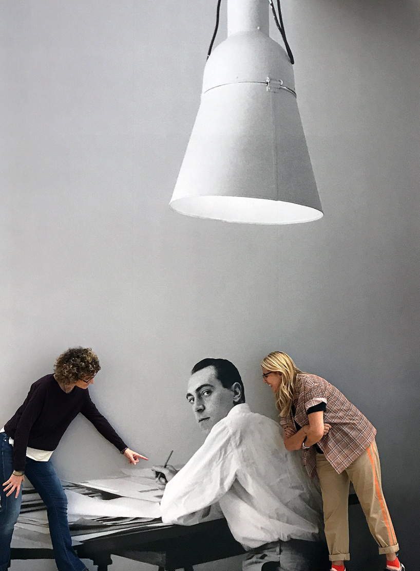
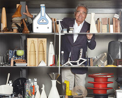
federica sala (left), a young achille castiglioni (middle), patricia urquiola (right) during the building up at la triennale
image © designboom
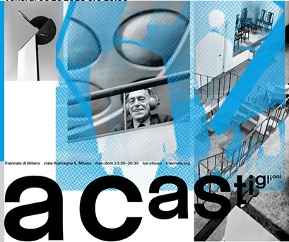
‘a castiglioni’ (to castiglioni), curated by patricia urquiola in collaboration with federica sala,
on from 6 october 2018 to 20 january 2019 at la triennale di milano.
exhibition design is by patricia urquiola, and graphic design by dallas (francesco valtolina & kevin pedron).
the exhibition was made possible by the support of several institutions such as the study center and communication archive (CSAC) of university of parma, the ADI compasso d’oro foundation, the alessi museum, the kartell museum, MUMAC – cimbali coffee machine museum, pio manzù foundation – manzoni art and design foundation, sony design, the archives of flos, cassina, de padova, zanotta, B&B italia, CASVA, caccia dominioni, giovanni sacchi, ugo mulas, and cesare colombo.
happening this week! holcim, global leader in innovative and sustainable building solutions, enables greener cities, smarter infrastructure and improving living standards around the world.
achille castiglioni (6)
patricia urquiola (71)
triennale design museum (20)
PRODUCT LIBRARY
a diverse digital database that acts as a valuable guide in gaining insight and information about a product directly from the manufacturer, and serves as a rich reference point in developing a project or scheme.


