when HW-STUDIO began to work on the mercado ‘cantera’ project, its clients showed the design team an 8 x 40 m warehouse, located two blocks from one of the most visited squares in morelia — las rosas. they wanted to turn that winery into a gastronomic market. the architects admired the idea, but most importantly the silence that was felt, (uncommon quality in the downtown of a mexican city).  it has been a good opportunity to combine the studio’s design language with the archetypes of the past, exploring the relationship and the dialectic between both.

HW-STUDIO's mercado 'cantera' in morelia presents a balance between old and new
all images by bruno gomez de la cueva


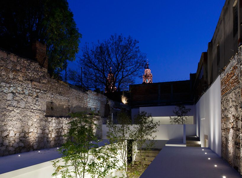
during the 16th century, the old cellar was the backyard of a wealthy family’s residence. over time, some modifications have taken place due to reforms, ownership changes and different uses of the place, causing the space to lose its essence. the roof has been covered with aluminium sheet, the quarry walls have been flattened with cement and a marble and resin floor has been placed — very characteristic of the 60’s. mexican based firm HW-STUDIO thought the place had lost its soul.

HW-STUDIO's mercado 'cantera' in morelia presents a balance between old and new
HW-STUDIO’s mercado ‘cantera’ is located a few blocks away from one of morelia’s most important squares


the design process began by identifying the most popular food places in the area. public squares were the places where people concentrated to eat; either in a nearby restaurant, on the terraces or simply on a bench in the square itself. from there, HW-STUDIO identified some compositional elements: the axes, the axial routes, the volumes, the sky, the trees and the use of natural materials, incorporating each one into the project. in the case of the walls, the architects redesigned it to configure a similar atmosphere to one of morelia’s squares so that the market attendees felt in a familiar and natural place.

HW-STUDIO's mercado 'cantera' in morelia presents a balance between old and new
the architects admired the silence that was felt, uncommon quality in the downtown of a mexican city


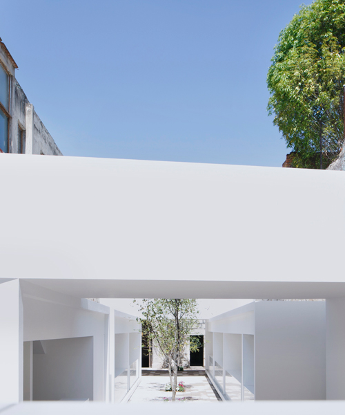
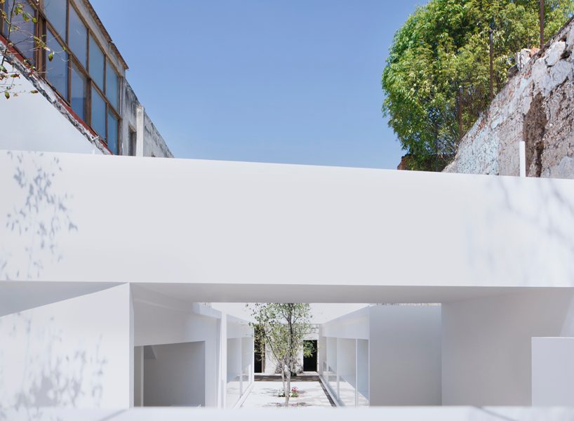
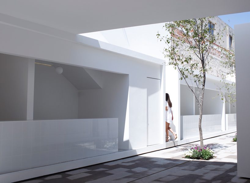
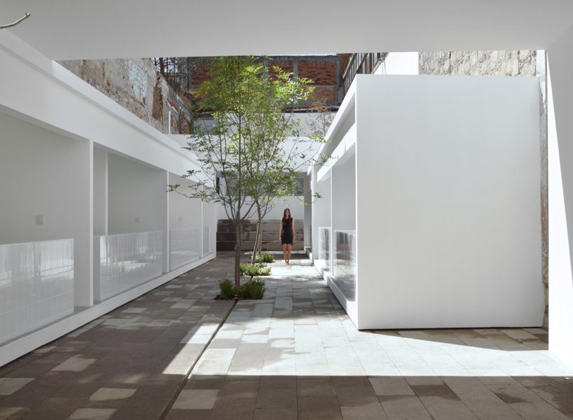
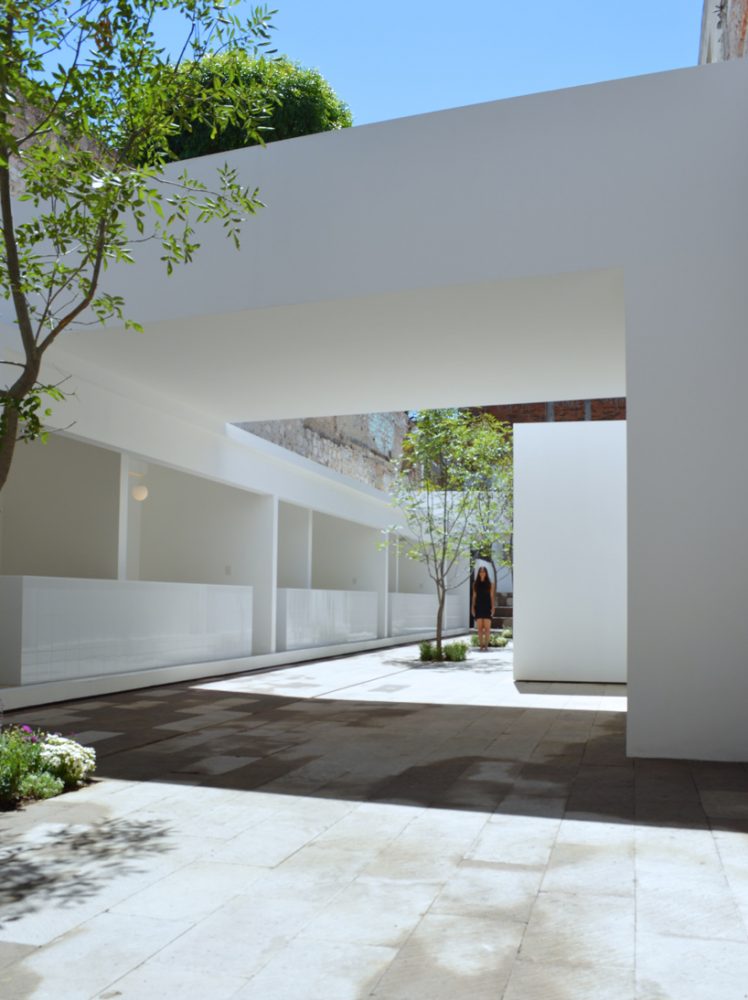
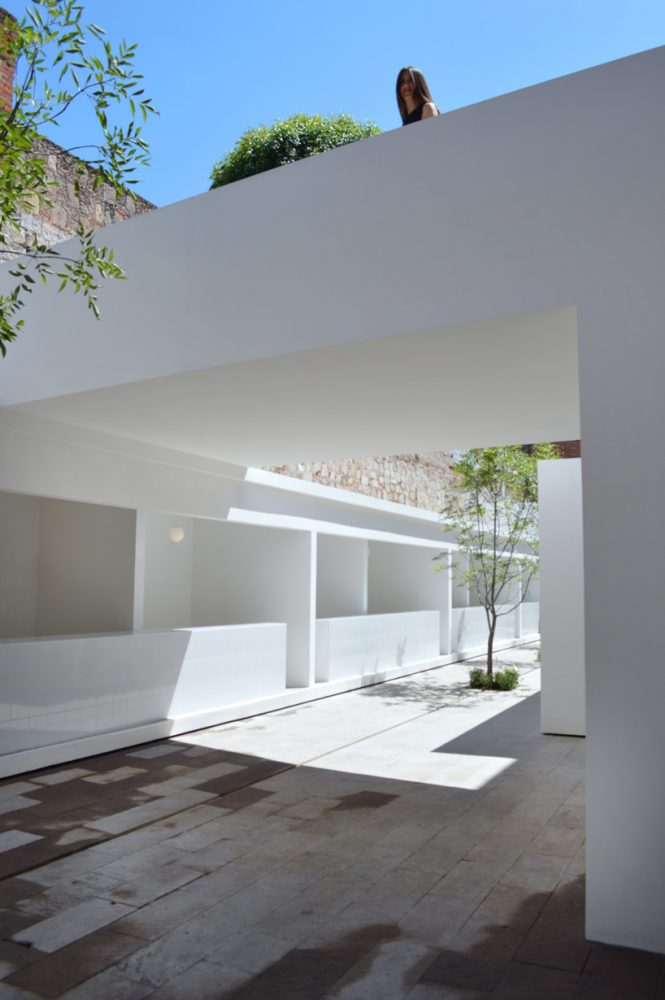
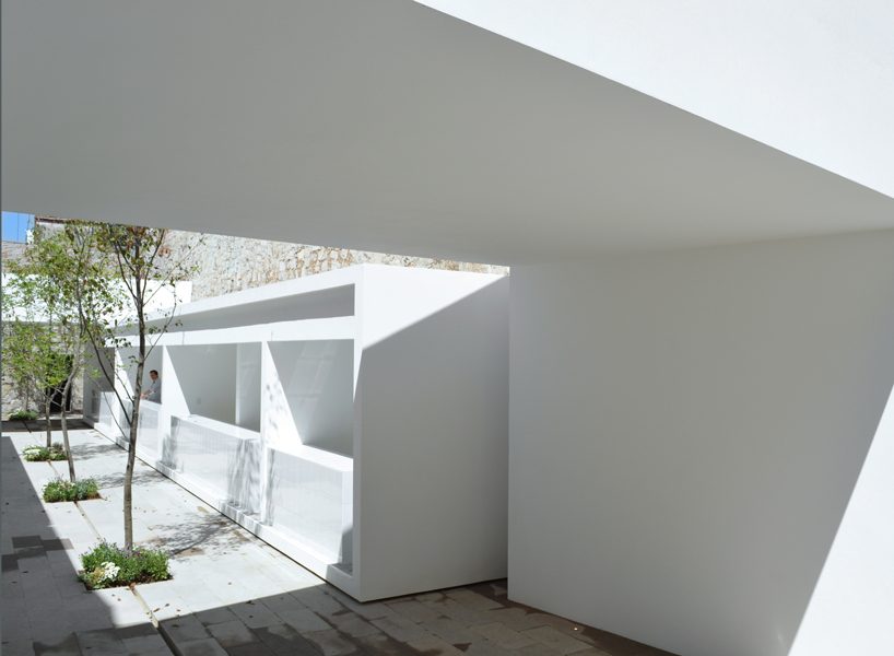
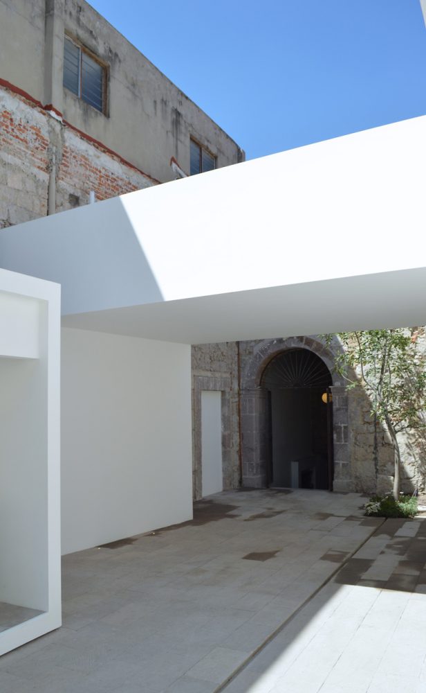
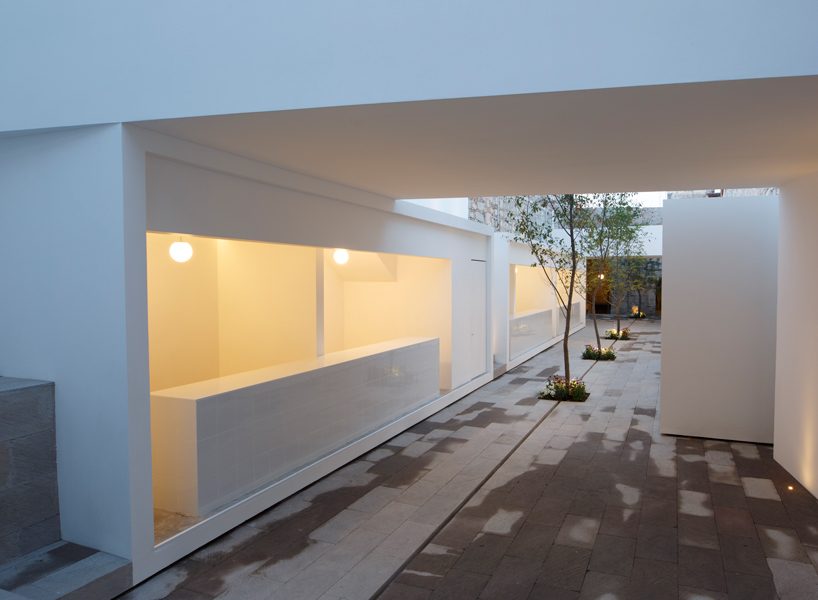
every outdated element with architectural value has been rescued, while the new features present a formally and materially different nature. a white and defined environment that demonstrates its own presence and historical moment. with this, the design team would try to achieve a balance between the new and the old. a tree-lined central avenue has been drawn, flanked by two white longitudinal volumes. on each of these, two other transversal volumes have been assembled in the form of an inverted ‘L’, which serves to cover an area of tables at the bottom and create terraces at the top. however, its most important function is to frame, without exclusion, the different layers of architectural history left over the centuries. also, it is meant to intersect light and space in a way that their presence is emphasized and become intangible protagonists of the place.

HW-STUDIO's mercado 'cantera' in morelia presents a balance between old and new
a good opportunity to combine the studio’s design language with the archetypes of the past

HW-STUDIO's mercado 'cantera' in morelia presents a balance between old and new
every outdated element with architectural value has been rescued

HW-STUDIO's mercado 'cantera' in morelia presents a balance between old and new
while the new features present a formally and materially different nature

HW-STUDIO's mercado 'cantera' in morelia presents a balance between old and new
the design team achieves a balance between the new and the old

HW-STUDIO's mercado 'cantera' in morelia presents a balance between old and new
a white and defined environment that demonstrates its own presence and historical moment

HW-STUDIO's mercado 'cantera' in morelia presents a balance between old and new
its most important function is to frame the different layers of architectural history left over the centuries