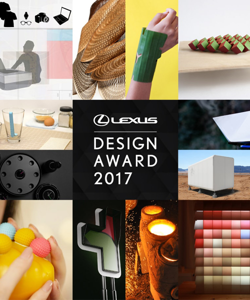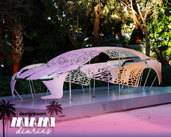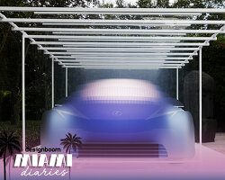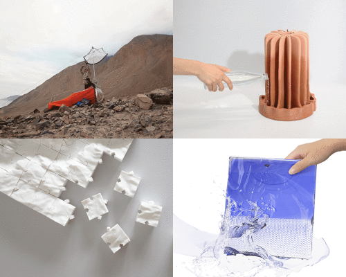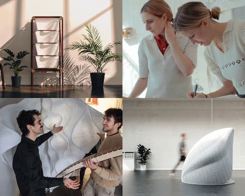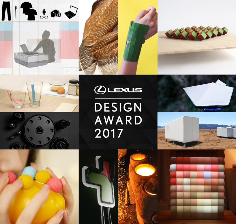
LEXUS design award 2017: following the success of last year’s winner ‘agar plasticity‘, designboom has co-organized for the fifth time the LEXUS design award — the leading mentored awards presented every year during milan design week (see formafantasma’s installation here.)
the LEXUS design award provides an opportunity for young innovators to showcase their works while receiving feedback from world-renowned professionals in the area of design. through this initiative, LEXUS intends to nurture and support world-enriching creators. for 2017 edition, more than 4,000 people participated via the call published on designboom which comprised the period from august 10 to october 16, 2016. see the call for entries here.
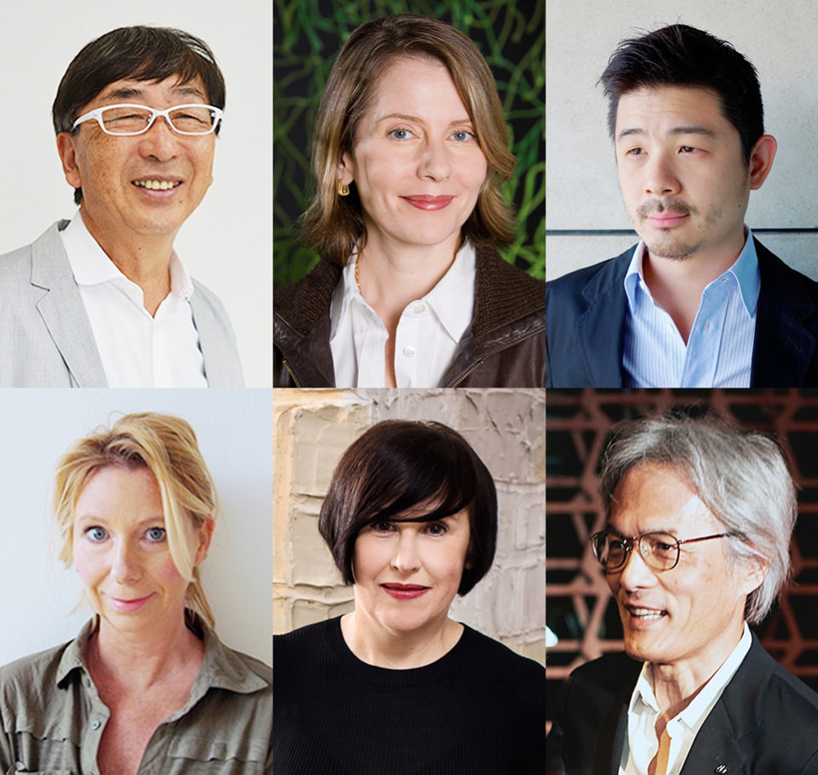
LEXUS design award 2017 jury: toyo ito, paola antonelli, aric chen, birgit lohmann, alice rawsthorn, yoshihiro sawa
after careful consideration twelve winners have been selected by the six judges: toyo ito, architect; paola antonelli, curator; aric chen, curator; birgit lohmann, designboom’s editor in chief; alice rawsthorn, design commentator; and yoshihiro sawa, executive vice president of LEXUS international. four prototype winners received a mentorship by an acknowledged professional to develop a prototype of his/her submitted work. the sponsor will cover the prototype production costs up to 3 million yen (*includes tax, customs duty, construction fee and part of a packaging fee).
prototypes were developed through sessions with the mentors: neri & hu, architects and interdisciplinary designers; max lamb, designer; elena manferdini, designer and architect; and snarkitecture, artists and architects.
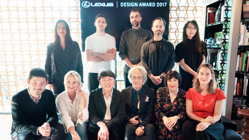
finalist screening session in tokyo with juries and mentors, november, 2016
the theme for the LEXUS design award 2017 is ‘YET’:
YET is the core thinking that goes behind the creation of every LEXUS. It encourages us to push the boundaries of creativity by fusing seemingly incompatible elements. in doing so, we don’t compromise; we harmonize. it’s synergy effect enables breakthroughs and the unexpected to happen.
exhilarating performance YET environmentally conscious, cutting edge technology YET user-friendly, emotional YET rational.

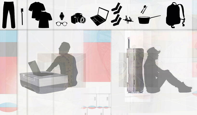
HAVING NOTHING, AND YET POSSESSING EVERYTHING
designer: ahran won (korea, residence: USA)
mentor: neri and hu
a capsule for mobile living, having nothing YET everything.
what is the meaning of objects in our lives? the moving capsule enables simple and minimalist living through its mobility and functionality. (one object has more than one function; like a smartphone, the capsule goes beyond its function as just a container.)
designer ahran won believes in the power of loving minds and the potential of design to be a positive element for our future. she is currently a studying landscape architecture at harvard graduate school of design. she previously studied architecture at the school of the art institute of chicago (saic), and international law at ewha womans university.
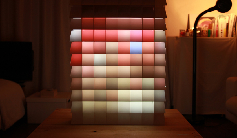
PIXEL
a structure to experience the existence of light YET shadow
designer: hiroto yoshizoe (japan)
mentor: snarkitecture
in this world that we live in, everything is mirrored in our eyes with light and shadow. a chandelier sparkling beautifully, mobile phones and cinema screens, morning sunlight pouring into a dark room, a child’s smile reflecting the candles lit on a cake. light and shadow exist as contrasting elements that compose scenes of your daily life.
pixel is a device that lets you experience the existence of light and shadow with your full consciousness. it uses a configuration of visors to create a range of light and shadow effects. through repeated internal reflection, input images are averaged into square outputs. by converting light and shadow into a clear, sensible form, you can experience this beautiful fundamental phenomenon.
‘I have aimed to design between the light and shadow, believing that when designing the borderline between the two contrasting elements, they can resonate with each other to move the viewer. through this, you will find that in fact the contrasts are intertwined with each other. light and shadow, inside and outside, one side and another _ this screen existing between these two contrasts can be a device for dividing, transforming and ‘connecting’ at the same time.’
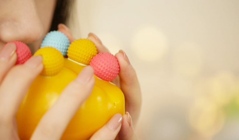
PLAYER’S PFLUTE
vegetable YET a musical instrument provides fun and learning experience
designer: jia wu (china)
mentor: max lamb
‘player’s pflute’ helps every child explore music. it is a modular music toy system for a child to connect everyday objects using imaginative invention and musical creativity. by encouraging improvisation while playing, this toy helps a child experience music as a familiar and enjoyable activity. this creative musician kit consists of different mouthpieces, hole punchers, and connectors. simply by connecting them with various everyday objects, children can assemble their very own instruments and explore different musical tones. this design allows hundreds of different possibilities in music and instrument creation and enables children to learn music essentials while having fun, in a spirit of playful creativity.
player’s pflute is a work of design as a catalyst for change. by creating a unique process for learning, player’s pflute sheds light on how we might rethink and design a nurturing environment for every child and family.
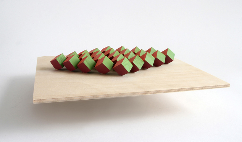
STRUCTURAL COLOR
static YET changeable structure depending on viewpoint
designer: jessica fügler (USA)
mentor: elena manferdini
structural color is a phenomenon occurring in nature, where color is not the result of pigments but instead is created when light is bent by optical phenomena such as interference, refraction or diffraction caused by microscopic structural features such as the cells of bird feathers or butterfly wings. my project “structural color – static yet changing” looks to abstractly manifest the sensation found in nature by creating large-scale structures whose surfaces alter based on the viewer’s perspective.

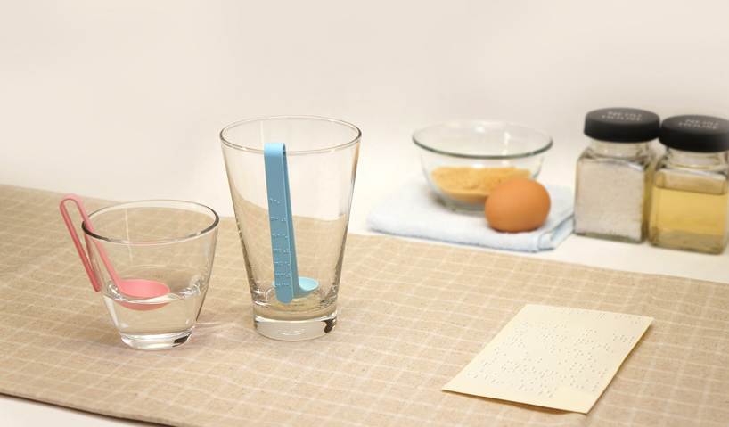
BUOYANT MEASURING SPOON FOR THE BLIND
a measuring spoon with unseen YET visualized tactile graduations for the blind
designer: eunjin park (korea)
the sense of touch can be the eyes for blind people who can’t read measurement scale markings. so for those people, I’d like to suggest a special measuring spoon which has tangible graduations. the buoyant measuring spoon has braille which lets blind people measure correctly by touching it.
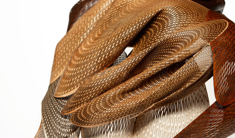
THE LANDSCAPE OF PAPER
disposable YET upcycled material using traditional and modern technology
designer: kuniko maeda (japan, residence: UK)
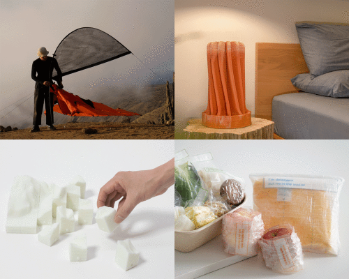
when it comes to recyclable materials, people usually don’t question their behavior of throwing things away. consumers have a positive perception of “recycling” but lack consideration of the material’s value, overlooking the root cause of the world’s environmental crisis. wasted paper interested me because paper is a large part of daily life and is overconsumed. I focused on upcycling paper to make it last longer, rather than recycling it. I also came across traditional japanese kakishibu paint made from persimmons. this natural coating makes paper waterproof, repels insects, has a shiny finish and is durable. I applied kakishibu to wrinkled used paper, creating an effect similar to the traditional use on japanese washi paper. moreover, flattening the wrinkled paper revealed attractive patterns, despite wrinkles generally being considered a defect. combining this traditional application with digital technology and laser cutting, I created a stronger 3d structure from delicate paper by making slits to minimize waste. by harmonizing opposites, I turned waste into a precious material. applying traditional craft technique and merging digital technology, I discovered a new application for paper.
MASS PRODUCTION TO UNIQUE ITEMS
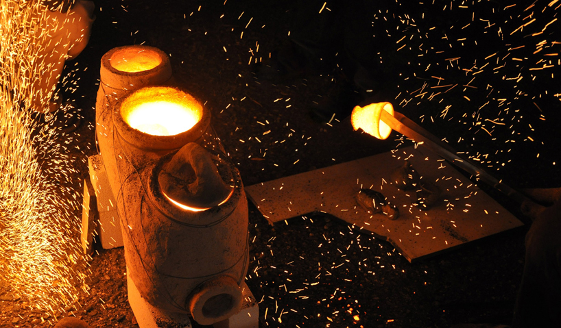
mass produced YET one-of-a-kind ceramics created using a portable kiln
designers: TAKEHANAKE: bungorogama takehana yoshifumi, bungo okuda, akira okuda (japan)
in japan alone, 58,344,424kg of ceramics are made yearly, and even more are produced worldwide. most of these mass produced ceramics are destroyed without even being used. our device is a kiln which enables mass produced ceramics which have been destroyed or unused to form a new unique ‘one-of-a- kind’ item. the kiln is portable and can be used by anyone under the guidance of a skilled potter. the kiln can be used for 2 to 3 hours when fueled with charcoal or wood. over the temperature of 1300℃, the charcoal and wood begin to melt, settling on the ceramics to create a new design through the power of nature. there is a new value to the item unique to the individual who has made it. these ceramics, which had been mass produced and discarded, can be reborn by re-firing them. mass production and one-of-a- kind items are contradictory things. however, this kiln bridges the gap. this kiln has been made by many pottery beginners. an experimental event has also been held.
PAPER KETTLE
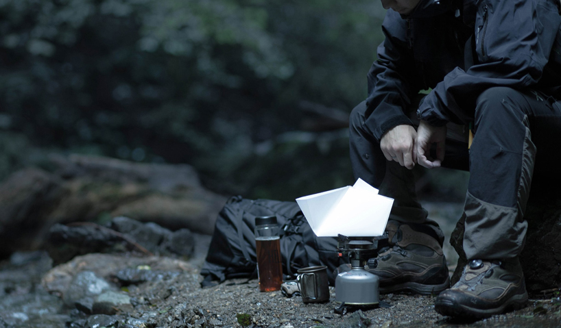
combustible YET fire-resistant paper kettle
designer: ryo katayama (japan)
paper and fire are two opposite substances and cannot coexist. however, through research, I have discovered a cooking pot made of paper used in japan from around 1732. this pot is made entirely of paper and is used for cooking. this is possible because paper‘s combustion temperature is generally around 300º, which is higher than water’s boiling point of 100º. thus paper containing water does not burn. I realized that paper is flexible and light, yet can also be used to boil water, making it ideal for outdoor applications. for these reasons, I decided to construct the lightest kettle in the world.Ii made several designs and selected the best one, then made a variety of models all of which were made of only paper. I continued to add and subtract pieces to polish the form and function, succeeding to make it not only functional but also beautiful in design. paper kettle can be produced at a low cost, making it affordable. paper kettle will be ideal for camping or hiking. after use the kettle can be put in the fire to burn, leaving no trash behind.
PLATANACEAE
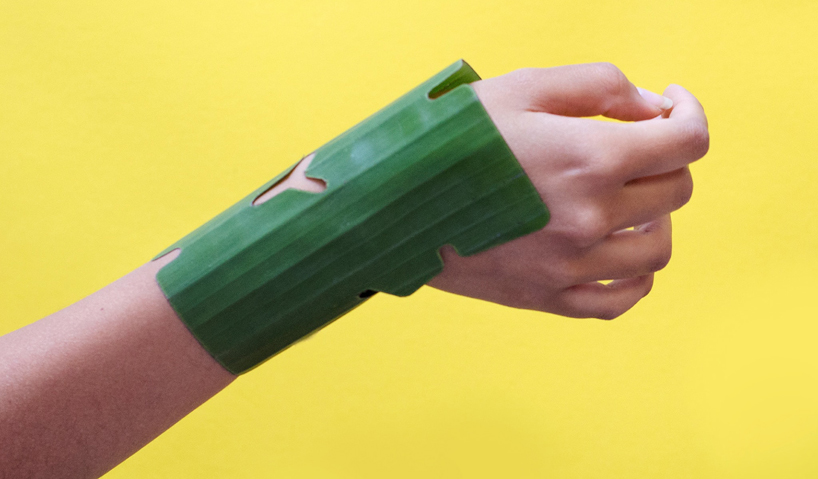
banana leaf bandages that outperform synthetic YET are biodegradable and soothing
designer: paula cermeño (peru)
platanaceae is a series of first-aid bandages for burn wounds that occur in the home environment. they are designed to fit different parts of the arm, wrist, palm, and fingers: common places for domestic burns. the hydrated texture of banana leaves is refreshing when in contact with burned or scalded skin. the bandages’ shapes allow them to wrap around different parts of the hands and arms without direct contact between skin and any adhesives. burn bandages are ordinarily replaced within 24 hours. after this time, a banana-leaf bandage would naturally peel away from the skin on its own. the banana leaf is an abundant resource in tropical areas of our planet. while researching applications of banana leaves, I came across the use of this material as a wound dressing for burn patients. studies show that the effectiveness of banana- leaf bandages is equal or better than synthetic bandages. this proposal has been developed by researching and analyzing the needs of the user (medical, ergonomic) and the properties of the banana leaf material (fabrication and conservation).
POD
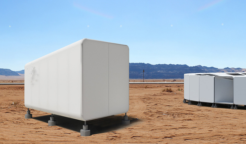
temporary shelter for displaced populations. homeless YET home
designers: MODlabEric / schwartzbach, benjamin ward (USA)
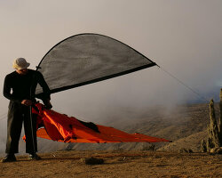
pod is a modular, medium-term housing solution for displaced populations. it can be deployed quickly to locations around the world. once delivered, the pre-assembled pods are easily erected by the local people. the shared experience of working together to erect pods, will help foster a sense of community among fellow inhabitants during these often precarious times.
designed as a series of telescoping square frames, the pod can create both a larger area to accommodate groups and a smaller area for sleeping. inhabitants are protected from the elements by a durable fabric skin which is integrated with the structural metal frame. in order to increase the adaptability and durability of the pod module, structural support footings raise the pod off the ground, minimizing physical impact on the site while providing greater stability and security in various environments.
the assembled pod modules can then be connected and arranged in a wide range of formations creating new communities of a more familiar urbanism for the inhabitants. this flexibility restores to individuals a sense of basic human dignity and feeling of respect for human basic rights, which are often treated as an afterthought when dealing with those in displacement crises.
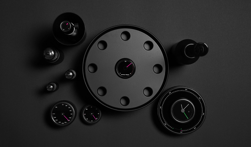
RETROSPECTION PROJECT / TIME TUNE RADIO
hi-tech YET retro radio tunes in programs from past and present
designer: takuro sanda (japan)
this innovative radio shows how our material culture’s desire for “efficiency” can be balanced with the lost values of “taking time” and preservation. it provides three forgotten characteristics of tools from the past: enjoyable effort, positive feel, and ergonomic analog operation. the form is evocative of early wireless receivers that required patient fiddling with dials and antennas.
this retrospective radio enables users to listen to any radio program from the past to the present. the tuning dial is linked to archived programs stocked on the internet. generally speaking, the limited nature of radio transmission encourages imagination and communication more than tv or other media that provide more packaged information. early radios brought users the miracle of encountering faraway people. after the japan earthquake and tsunami of 2011, radios became the most convenient tools for disaster victims to access information.
retrospective and technological aspects of this radio bring back times from the past, while serving as a model for tomorrow. radios transmit only sounds and words, but for this very reason they engage our imagination and engender a sense of time. this radio, enhanced with technology, allows access to not only history but also our ancestors’ life stories and values.
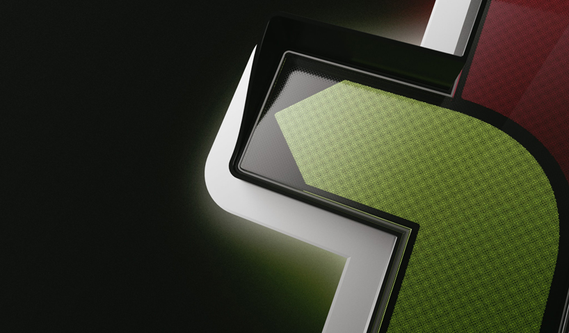
TRAFFIC LIGHT SYSTEM
simple YET sophisticated traffic light
designer: evgeny arinin (russia)
despite the rapid speed of innovation today, a product as important as the traffic light has hardly changed in more than a century. I questioned whether there wasn’t room for improvement. during this project i realized how intricate, complex and non-trivial it is. the concept of the traffic light has become fixed in people’s minds. my main task for this project was to rethink its interaction with people. at first glance it has a simple form yet is actually complicated in function. in the traffic light’s lack of innovation in design, I saw the opportunity to make a successful product. the formula would be to achieve harmony between function and aesthetics by implementing a simple yet elegantly modern system. it would improve quality of life in terms of better safety, a friendlier driving experience and improved view of the cityscape. the result is a simple solution yet complicated in the interplay of details and the potential scenarios for interaction.
