see designboom’s TOP 10 stories archive:
TOP 10 READER SUBMISSIONS OF 2016 – PUBLIC SPACES
for countries worldwide, public spaces play an undeniable role in the growth of cultures and societies. this year, architects and designers have taken it one step further by maximizing people’s awareness when experiencing public dwellings. whether they affect the immediate surroundings, environment, religion, or local culture, the projects become powerful tools of influence.
we believe that maintaining an open dialogue with creatives is extremely important, and we are happy to showcase the high level of original projects of our readership. from dynamic water pavilions to countryside resorts, we put together 10 of the most impactful public spaces from our 2016 readers submission.
WATER PAVILION PROPOSAL BY DANIEL VALLE ARCHITECTS
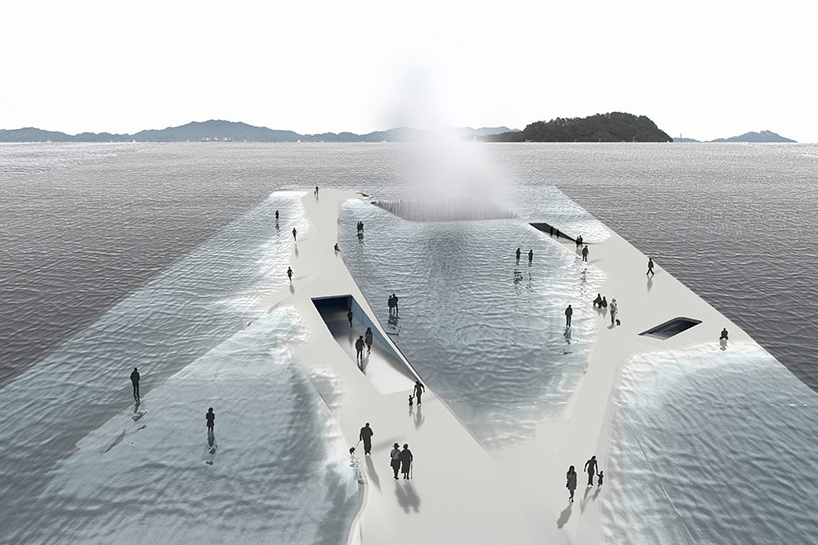
image courtesy of daniel valle architects
as part of the ‘thematic pavilion’ of expo 2012 yeosu in south korea, this surreal proposal by daniel valle architects endeavors to be constructed upon water movement and to represent the significance of life. the pavilion is not an architectural object in relationship with the water but rather a nautical construction shaped by the movement of water. the design aims at raising people’s attention on the environmental crisis affecting oceans and coasts. the relationship with the water is intentionally solved in an unstable equilibrium. the structure is between a submerged and emerged level –as submarines do- defining a sensible state of equilibrium between dry and wet. this intends to represent the real risk that many coastal areas around the world will face by the rise of the ocean level consequence of global warming.
read more about the project on designboom here.
ANTIROOM II FLOATING PAVILION BY ELENA CHIAVI
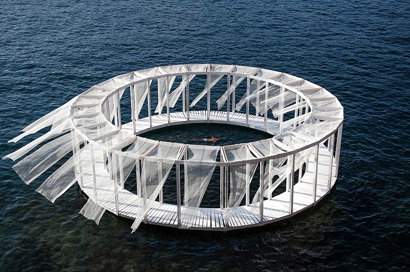
image courtesy of ahmad al mad
‘antiroom ii’ is a self-built pavilion by elena chiavi, ahmad el mad, and matteo goldoni, in collaboration with students from different european countries during the EASA links 2015 workshop in valletta, malta. the floating structure is unreachable from the ground and can only be accessed by swimming or by boat, persisting as a man-made island that can slowly drift away, as a new isolated world.
read more about the project on designboom here.
FLOATING OBSERVATORY ON THE DUTCH FLAT SANDS BY MARC VAN VLIET
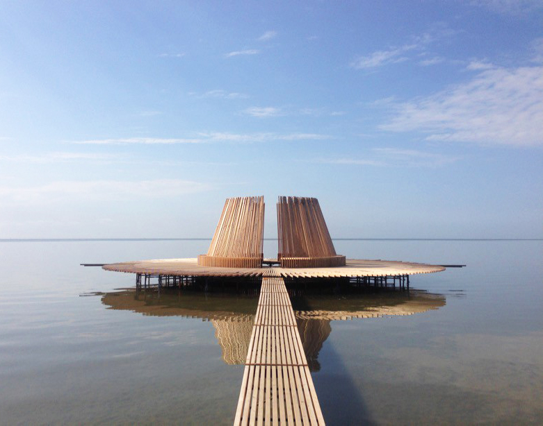
image courtesy of marc van vliet
located in the north of the netherlands, ‘de streken’ is a floating wooden observatory by marc van vliet that draws on the breadth and openness of the wadden landscape. anything placed here is lost in the void, making the horizon a determinant, because depending on how the object is placed, its form will change with the tide. placed in the center of zeven streken (seven illuminated points of the compass), observers find themselves in the middle of a large entity that occupies the landscape out as far as the horizon. with each passing hour of the day, the observatory reveals different aspects of its sand flats location, that serves as a meeting location illuminated by the sun.
read more about the project on designboom here.
VINEYARD OBSERVATORY BY CUMULUS STUDIO
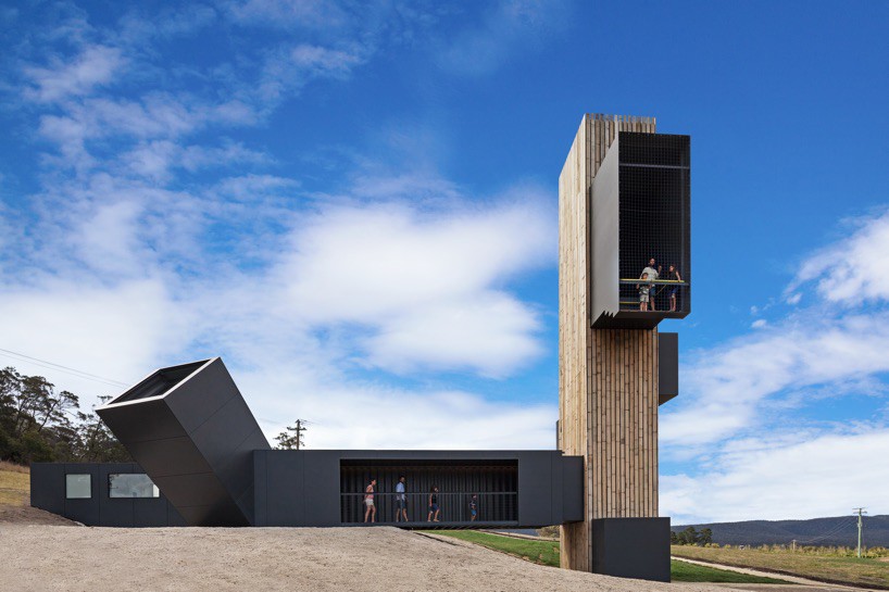
image © tanja milbourne
located on the scenic drive along tasmania’s east coast, australia, the ‘devil’s corner cellar door and lookout’ sits within one of the area’s largest vineyards, with a panoramic view over the freycinet peninsula. reopened in december 2015, the project was designed by cumulus studio for brown brothers, an australian wine company, and it seeks to amplify the experience of this iconic view to create a new tourism experience on the east coast of tasmania. originally a small demountable building, the ‘cellar door’ has been extended and expanded, paired with a lookout and complimentary food experiences, providing a backdrop for seasonal events. the structure was designed as a loose collection of timber clad buildings that, through similar aesthetic and material treatment, form a modern interpretation of traditional farm / rural settlement that gather over time.
read more about the project on designboom here.
DA CHANG MUSLIM CULTURAL CENTER BY SCUT
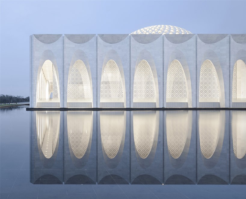
image © yao li
the architectural design & research institute of SCUT has designed the da chang muslim cultural center in the hebei province of china. the building provides a spiritual home for muslims and visitors, by integrating both an exhibition space, theatre, as well as a convention and community center. the project which was initiated by the local government, was put in place to serve not only as a recreation center, but as an essential cultural site for the introduction of local religion and history. principal architect he jingtang, started with a holistic view towards a sustainable living concept, considering the religious and cultural context of the surrounding environment. the structural planning incorporated multiple functions in order to reflect these points as well as a vision of a better life.
read more about the project on designboom here.
JORDANKI AUDITORIUM BY FERNANDO MENIS
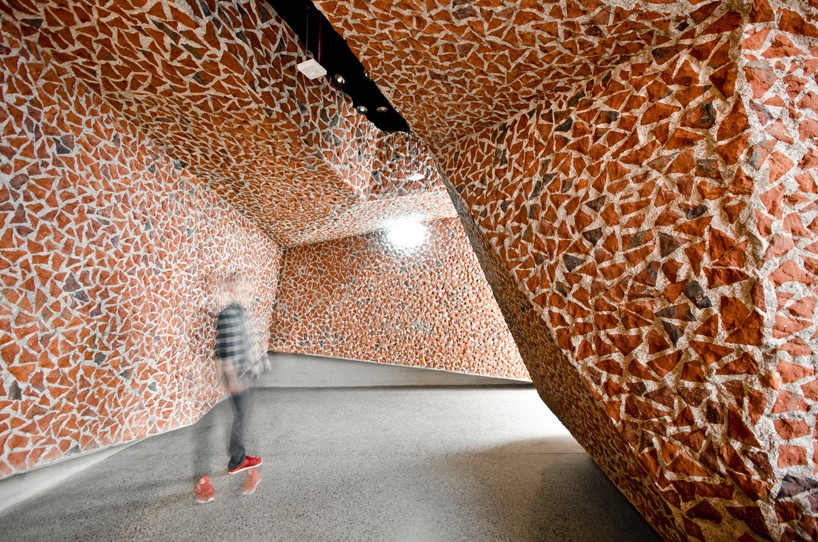
image © patryk lewinski
in december 2015, spanish architect fernando menis has completed his most complex work up to date, an auditorium in torun, poland. the project is set in a green ring around the center of the town, bordering the new development of the city. the building covers only half of the plot, leaving the remaining area to the park. a green arc was created, generating views onto the auditorium as well as to make the park appear larger. the views to the river stay untouched by keeping the building’s height the smallest possible. this also allowed the structure to blend with the neighborhood and the site, achieving a visual effect that makes the construction look like a natural object, a rock.
read more about the project on designboom here.
ESPACE CULTUREL DE HAGUE BY PÉRIPHÉRIQUES ARCHITECTES
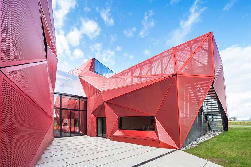
image courtesy of périphériques architectes
paris-based périphériques architectes have built a cultural space in beaumont-hague, in france, where they integrated into and took benefit from the landscape qualities of this part of the peninsula. the cultural center is a compact 43-meter long and 11-meter high block. on the shore, sunken roads are planted with wooded hedges that protect from the win and that become vegetal vaults to filter the light over time. these landscape elements are secular forms from the site culture, but also spaces that can be employed for the sake of the design.
read more about the project on designboom here.
GLAMPING MICRO-CABINS BY LUSHNA
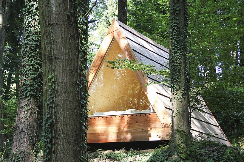
image courtesy of lushna
‘lushna villas’ is a project comprised of micro-cabins, developed by slovenia-based firm lushna that takes simplicity to its maximum expression. the smart-sized huts are reduced to those elements essential for first-row experience of nature contemplation, without compromising comfort. scaled to the human body, the units merge functionality with ecological materials. the tiny triangle rooms almost disappear in its context, being the first step to conquering the most beautiful natural environments.
read more about the project on designboom here.
BAAN SUAN MOOK BY SOOK ARCHITECTS
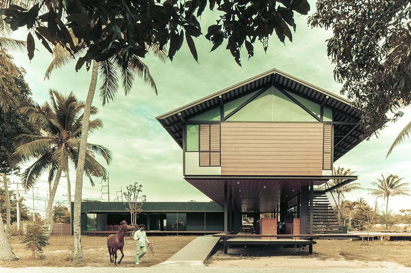
image courtesy of SOOK architects
‘baan suan mook’ is a small resort designed by SOOK architects, surrounded by a countryside atmosphere, in the midst of a pineapple field on the hin lek fai hill, 7 km. from hua hin town in thailand. the owner wanted to build this resort to help preserve the fruit field, and to live after retirement on a plot of a land received through inheritance. preserving the plantation was a key point due to the concern of agricultural lands in the outskirts of hua hin disappearing because the are being replaced by urban sprawl.
read more about the project on designboom here.
GRAPHIC TILE SYSTEM FOR NOTTING HILL SCHOOL BY MAXIMO RECIO
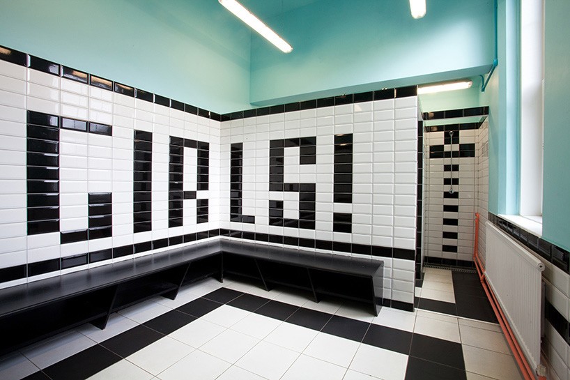
image courtesy of maximo recio
designer maximo recio, in collaboration with architects alvaro fernández and pablo padilla, has completed the renovation of 14 bathrooms and two locker rooms at the ‘vicente cañada blanch’ public school in notting hill, london. the interior uses a bright color palette of black and white tiles to create a cost-effective sense of identity and playfulness within the educational facility. paint significantly lightens the rooms and is used to highlight water and electrical systems. messages, drawings, and patterns composed with tiles encourage children to use facilities responsibly and increase hygiene.
read more about the project on designboom here.
