VITRA work at orgatec 2016: the project aims to foster a holistic vision of office environments with the help of designers; antonio citterio, alberto meda, edward barber and jay osgerby, konstantin grcic, and ronan and erwan bouroullec. dedicated to a whole exhibition hall, the project showcases a multi-layered representation of today’s working world through a range of new products, spatial elements and furnishing concepts. the display at the furniture fair in cologne, germany, will be exhibited from 25th to 29th october 2016, and on the opening day, designboom was present for its exclusive unveiling, private tour, and designer interviews.
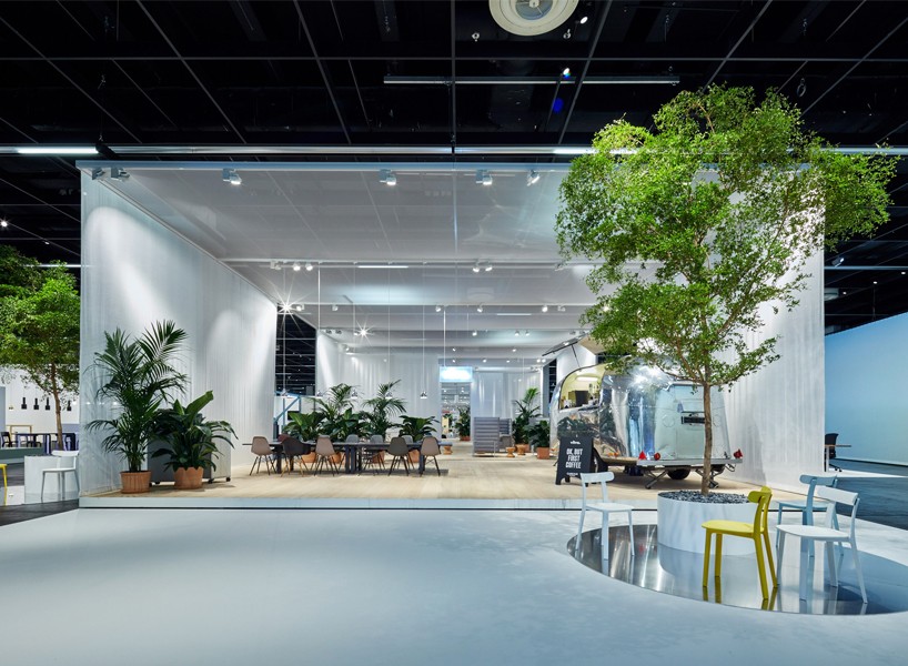
VITRA work – the first ‘collage’ office is integrated with stree-life
all images courtesy of VITRA
‘with new technologies allowing us to work anywhere at any time, the end of the office has been predicted time and again. yet the office still has not disappeared. why is that? because the need for direct, real-world exchanges and interactions remains unabated – and is even on the rise with the growth of virtual applications.’ said nora fehlbaum, CEO of VITRA, to designboom.
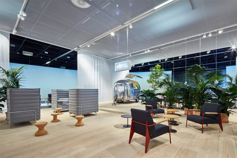
VITRA work – the space is flexible for on-the-go working
the VITRA ‘work’ project, encircled by five meter high fabric panels, offers a creative space for architects, designers and decision-makers. dubbed as a ‘horizon’, these boards act as a backdrop for the exhibition and will illustrate the chronological time sequence of a working day. this projection has been created in collaboration with architecture studio pernilla ohrstedt, most noted for their interactive installations, and the los angeles office of the designer jonathan olivares, whose work bridges over industrial, space and communication design.
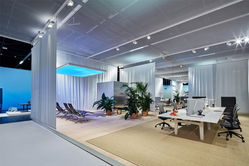
the space finishes with an airport-like lounge that promotes wellness
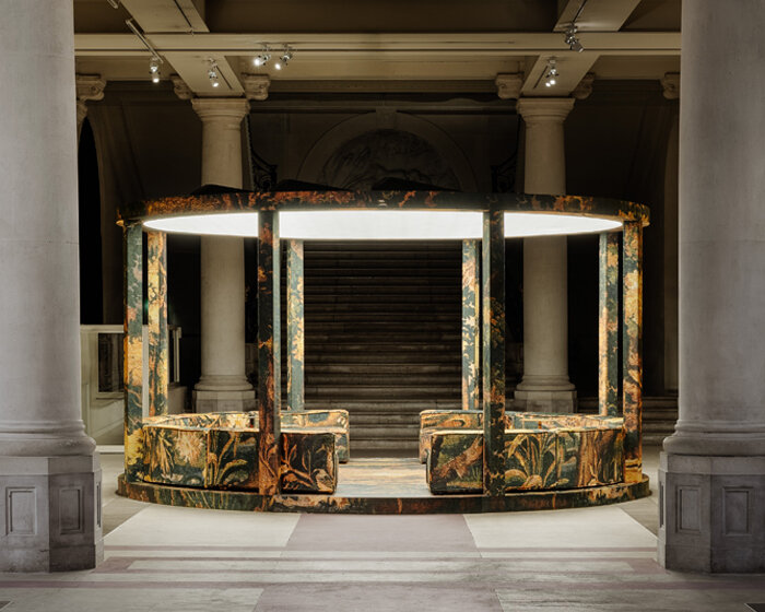
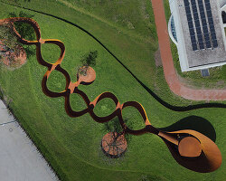
including presentations from selected design, architecture and technology companies, the hall has been organized like a city so that its layout acts as an open marketplace. as a main feature of the space, ronan and erwan bouroullec present the ‘circle benches’ installation among the café and plaza. their design study is situated in the garden of the office zones, and acts as an area that people can meet informally by providing comfortable, circular seating.
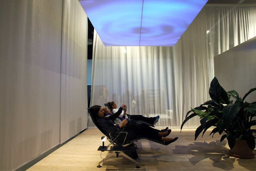
the area is for workers who travel frequently
image © designboom
in the center of the exhibition is where VITRA explores numerous scenarios of day-to-day office life. here, the theme of ‘collage’ office is the core focus, and it includes the mixture of products, shapes, colors and materials. they understand that there are as many different combinations as there are people, and as many various ‘collage’ offices as there are companies. considering this, the furniture brand’s project discusses a variety of interpretations, which address the individual needs of a workplace and displays a business’ identity.
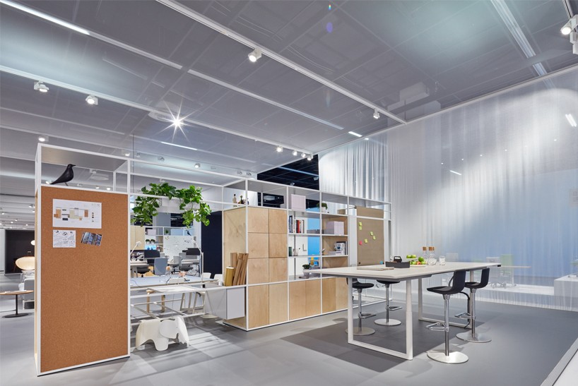
the home-base zone
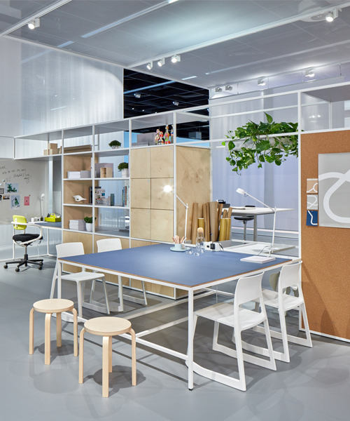
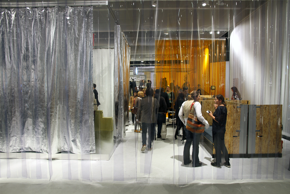
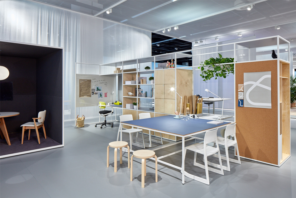
to showcase this idea, the VITRA ‘work’ project presents three ‘collage’ offices; a workplace illustrated by its high flexibility; an office environment for digital nomads who are virtually connected and can work remotely; and a studio-like office which acts as a sanctuary retreat as well as a constant in the ever-changing world of work. named the ‘nomad/home-base’, the ‘unplug’, and ‘garage’ offices, these workplaces provide different needs for different types of users.
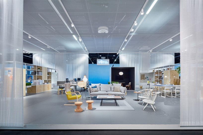
the space combines an intimate and flexible framework
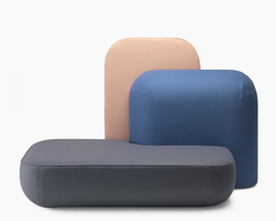
a key feature of the ‘collage’ offices, which is also a characteristic entrenched in VITRA’s history, is that their collections are a ‘work in progress’ and are open to adjustments. the creation of each of these workplaces has led to the production of a line of new products and collaborations. this is why the latest launches of the brand’s work with antonio citterio, alberto meda, edward barber and jay osgerby’s ‘pacific’ chair which was featured on designboom, konstantin grcic, and ronan and erwan bouroullec’s ‘cyl’ system are on display.
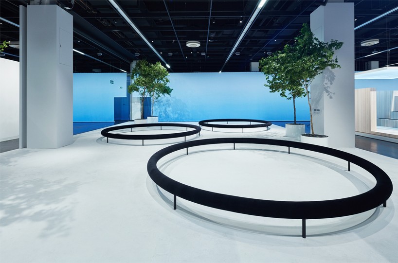
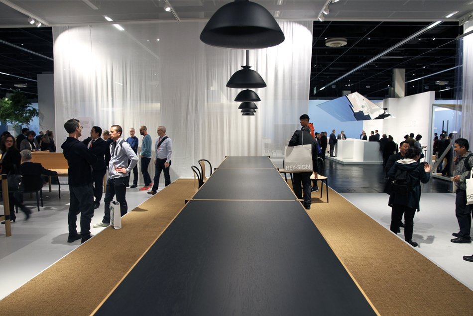
the ‘circle benches’ is located in the center of the hall
at the opening of VITRA’s hall at orgatec 2016, we interviewed the brand’s chief design officer, eckart maise, and discussed the evolution of the ‘work’ project, the designers involved and how the company are showing that the office environment is alive more than ever before.
designboom (DB): first of all, can you tell us more about the ‘work’ project and the ideas behind the concept?
eckart maise (EM): VITRA has been at orgatec ever since it first started in the 1960s. it is a traditional trade show so you have your hall and you rent a space which you are then resigned to. you consider how to best use your space, you come to the fair, you have all your neighbors, but in the end, you’re inside your own space. we were always questioning whether this was the right way to work and to continue. leading up to this year, we were in dialogue with the fair, who mentioned that because orgatec do not use the whole trade ground, there is more space if we wanted it. they offered it in case we wanted to go bigger. this idea of having more space lead us to thinking about how can we approach the theme of the workplace but at a larger scale. this does not just mean having more square meters for our products, but also conceptually, how can we have a more broad view on the office environment today.
there was actually three levels to this idea. one is work in general; where does work happen, does it happen in the car, and what role does technology play? secondly, what kind of elements do we actually need to present a contemporary office? for example, this could be a bathroom or shower because people are on the go, flying, and need a wellness area. it isn’t a classic thing to have in an office but it is important. the third one was how many different expressions can they be or are there as part of a company. going together with these ideas are of course, our products – a more traditional element for us to present at orgatec.
by thinking bigger scale, we had the opportunity to invite other companies to join in with our presentation. these are brands that we know and are from other industries – opposed to furniture.
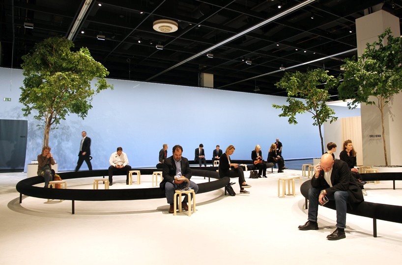
the circular furniture encourages workers to meet up and socialize
image © designboom
DB: including companies such as; laufen, mercedes-benz and samsung, what were the reasons for selecting such a large variety of brands to present alongside VITRA here?
EM: well, what are the elements that make the workplace today? of course, part is the material – things that you need to build the office like the floor and lights for example. however, then there are also other elements like technologies that enable you to plan office spaces in a different way – like how archilogic do. we started a dialogue with certain companies, and in the end, these are the brands that are joining us on for this project. there could have been others, but even though there is a lot of space and it isn’t comprehensive to say that this is all you need for an office, it gives a good variety of elements that you do.
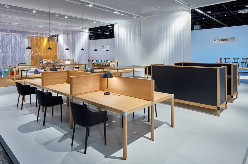
ronan and erwan bouroullec’s ‘cyl’ office system creates the ‘unplug’ space
see designboom’s coverage of this project here
DB: talking about different technologies, it has been said many times that the office environment will soon come to an end, how is this prediction being proven wrong, and how specifically are VITRA showcasing the reasons for this?
EM: we have always had an aspect of both the new digital world and also the analogue world. in the end, humans are from the old world – the analogue one. we like to be together and are social creatures. we like to touch things, feel materials, be comfortable – and we have a lot of different senses to perceive the environment and space. in some ways the office has come to an end because you don’t necessarily have to be in the workplace to do certain tasks. in contrast to this, it has highlighted the irreplaceable qualities of the office. this is as a place that you come together, as a place that expresses the workers’ and company’s identity, and also as a place that gives you a home-base – a center. this is what we tried to show here with the VITRA ‘work’ project.
by showing different offices and different ideas – these are only four ideas but you could have hundreds more – I think that the prediction for the near end of the office has been proved wrong. it is not dead.
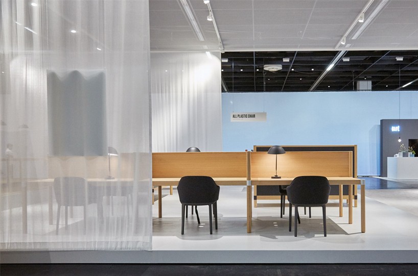
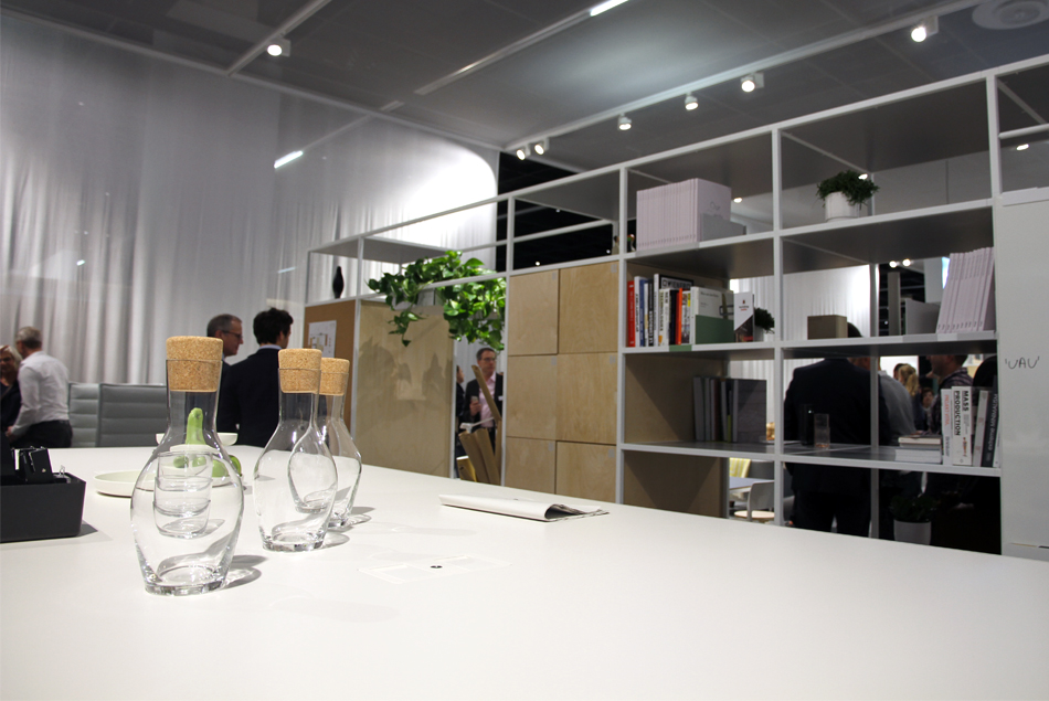
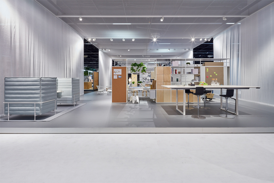
it envisions a home-like atmosphere for the workplace
DB: could you explain the differences between the three ‘collage’ offices in VITRA’s hall, and how each meets different working needs?
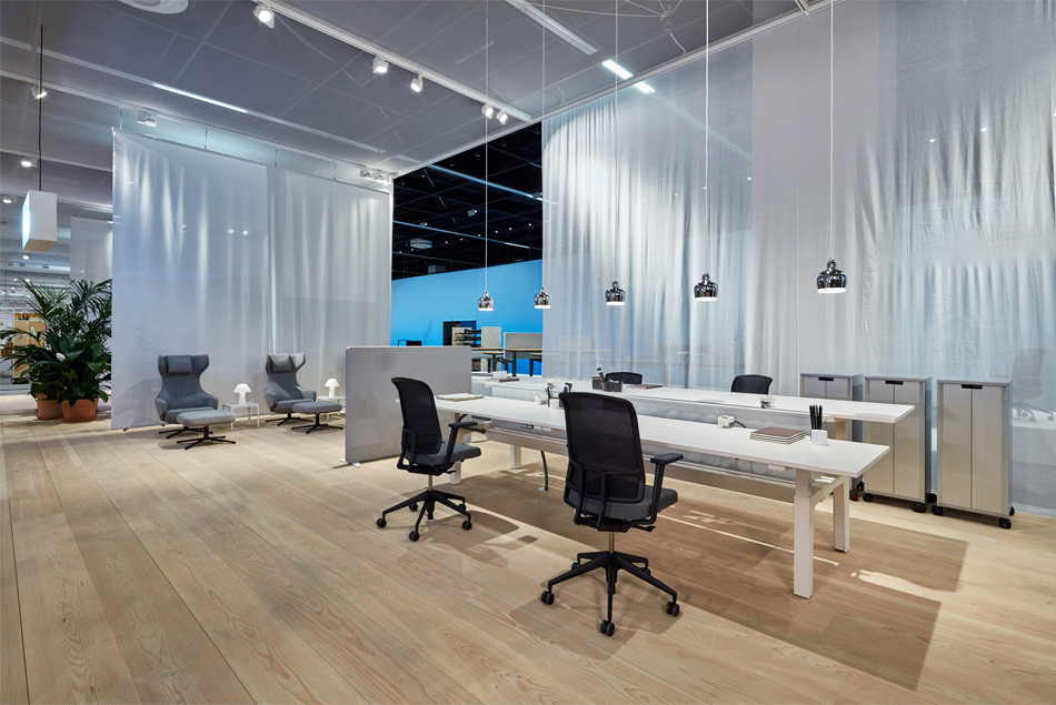
EM: one is basically what we call ‘homebase/nomad’ office. this is a workplace that has a nice integration of functional aspects with more home-like patterns and surfaces. it has one big office at the front, and combines two nuances. the first is more directed towards areas and situations that are most suited for the nomad workers, so those who use the offices less frequently and more on the go. the second nuance is more focused on somebody who works in the office every day. these two ideas within the concept shares very similar materials and style.
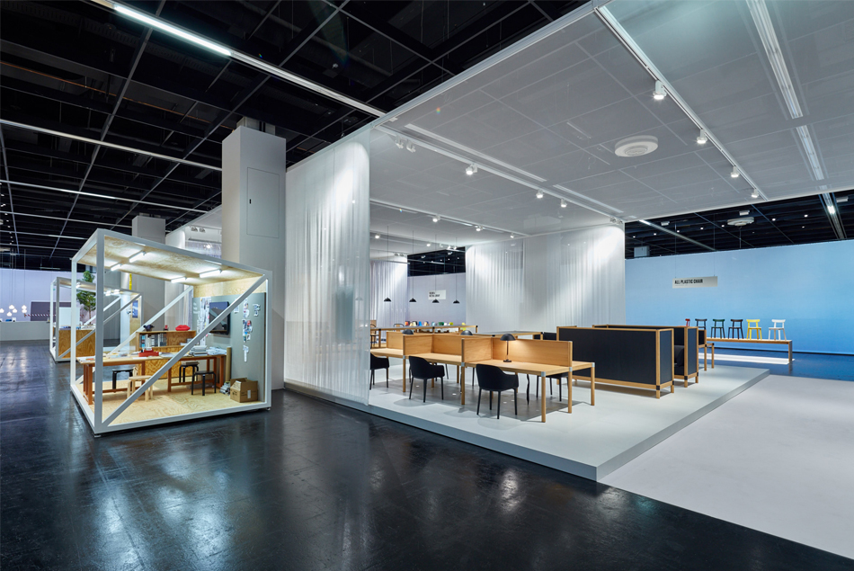
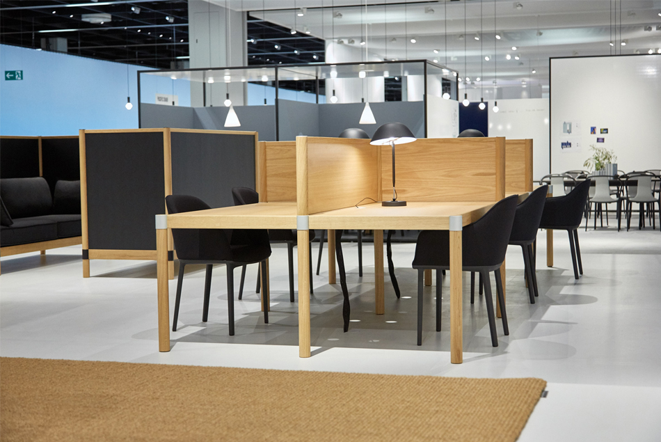
after this, we then have another two quite radical office ideas for the ‘collage’ trio. One is almost like a mono-pod presentation. we call it the ‘unplug’ office as it is a workplace that is very much for the analogue world. it is all about natural materials, it is all about calm lines, it is all about a space for contemplation – like a library of study space. it is an office that you come to slow down and for focus.
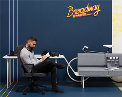
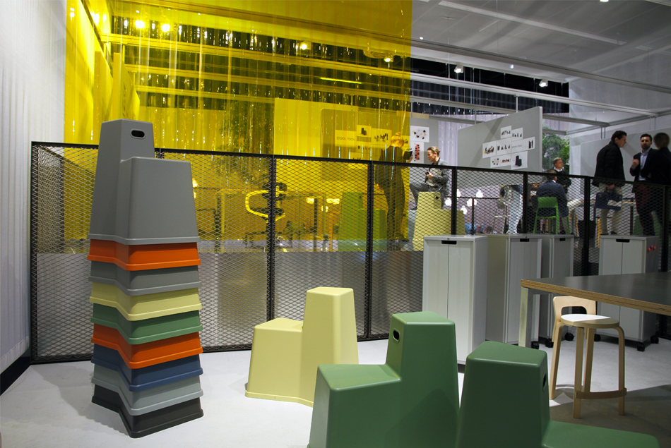
the last ‘collage’ office is the garage. it is a workplace to accelerate. we think it is the right place for start-up companies – those who are super-flexible, have great improvisation, who are very informal and very adaptable. it also expresses the idea that the user will always change, adjust the working environment as they feel. it is not just an installation by an architect. it is an office that no one will be afraid to change themselves. here, it is all about this contrast between offices for calmness, and those to speed up in.
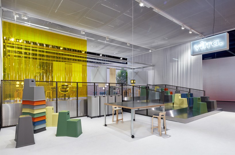
the ‘garage’ conceptual office
DB: the hall’s layout and surrounding horizon installation was designed by pernilla ohrstedt and jonathan olivares, what aspects of their creative philosophies and previous design work made you want them to help create VITRA’s space at orgatec?
EM: we worked with both of them for our main showroom at our factory – see designboom’s feature on this development – and this was the main reason we selected them because we were already in a dialogue. we wanted to give this hall a conceptual and architectural framework, and they were the right team to do that. the idea here is that the whole area is like a city, a big urban space, and there is the horizon going around it. the way they have worked with space has enabled much more open areas and includes a large boulevard as such down the middle. it is almost like an outdoor space. it is very light as there aren’t heavy buildings and heavy exhibition structures throughout. there is also a concept of the day, and right now, we are sitting towards the end of its horizon. there was a lot of conceptual discussion to summarize, but the space represents all our ideas very well. this is a very intricate feature of what we call ‘work spirit’ and office perspective. pernilla and jonathan were integral to achieving this.
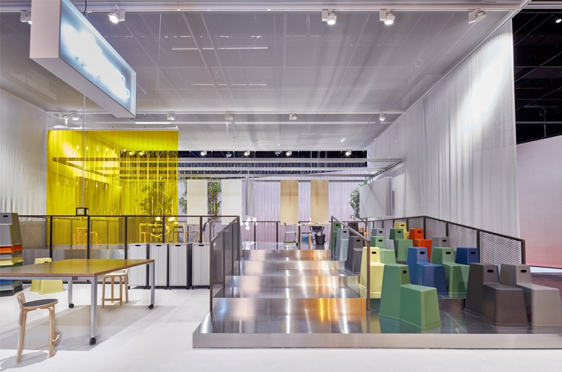
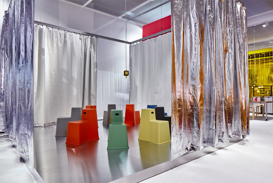
the space utilizes konstantin grcic’s ‘chair table’ and ‘stool tool’
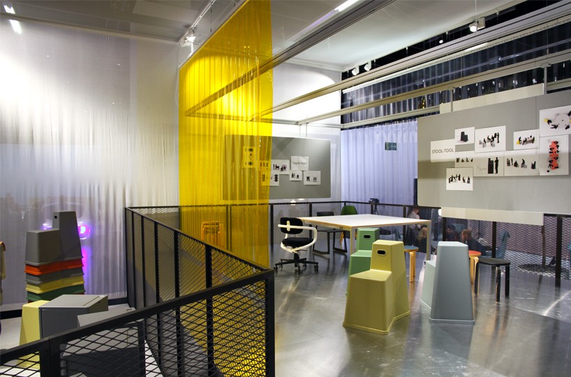
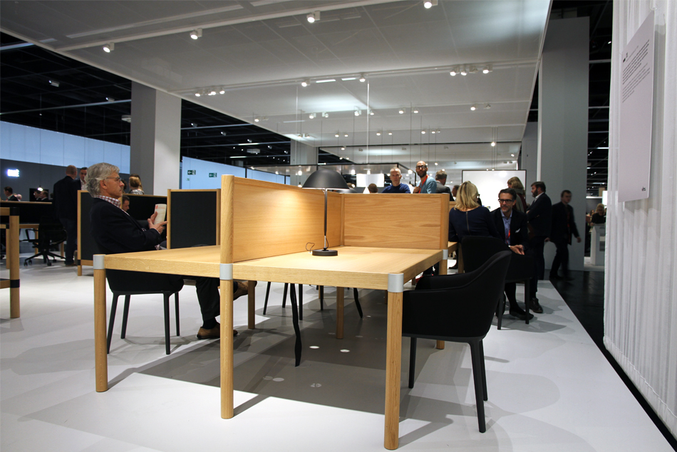
the office offers high flexibility, where the users can adapt the furniture to fit their needs
image © designboom
happening now! thomas haarmann expands the curatio space at maison&objet 2026, presenting a unique showcase of collectible design.
