instagram reveals simplified logo and app design
all images courtesy of instagram
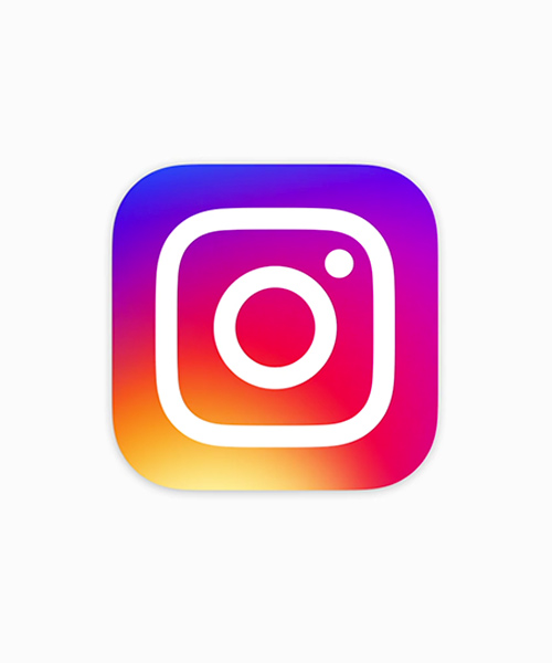
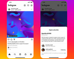
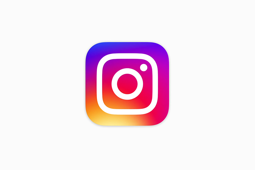
instagram has revealed an updated icon and app design, with a simpler camera graphic set on a graduated rainbow backdrop. the brand has also revealed updated icons for its other creative apps: layout, boomerang and hyperlapse. inside the app, the predominantly monochrome design appears simpler overall, which according to instagram — ‘puts more focus on your photos and videos without changing how you navigate the app.’ with 80 million photos and videos shared on the platform each day, the design is intended to reflect the vibrant and diverse nature of its content. the original logo has been used since instagram’s inception in 2010.
‘thank you for giving this community its life and color,’ says instagram in its recent blog post. ‘you make instagram a place to discover the wonder in the world. every photo and video — from the littlest things to the most epic — opens a window for people to broaden their experiences and connect in new ways.’
for the latest and best in architecture, design, art, and technology, follow designboom’s instagram account here.
instagram’s new look unveiled
video courtesy of instagram

new logos for layout, boomerang and hyperlapse have also been released

the logo in its ‘glyph’ form
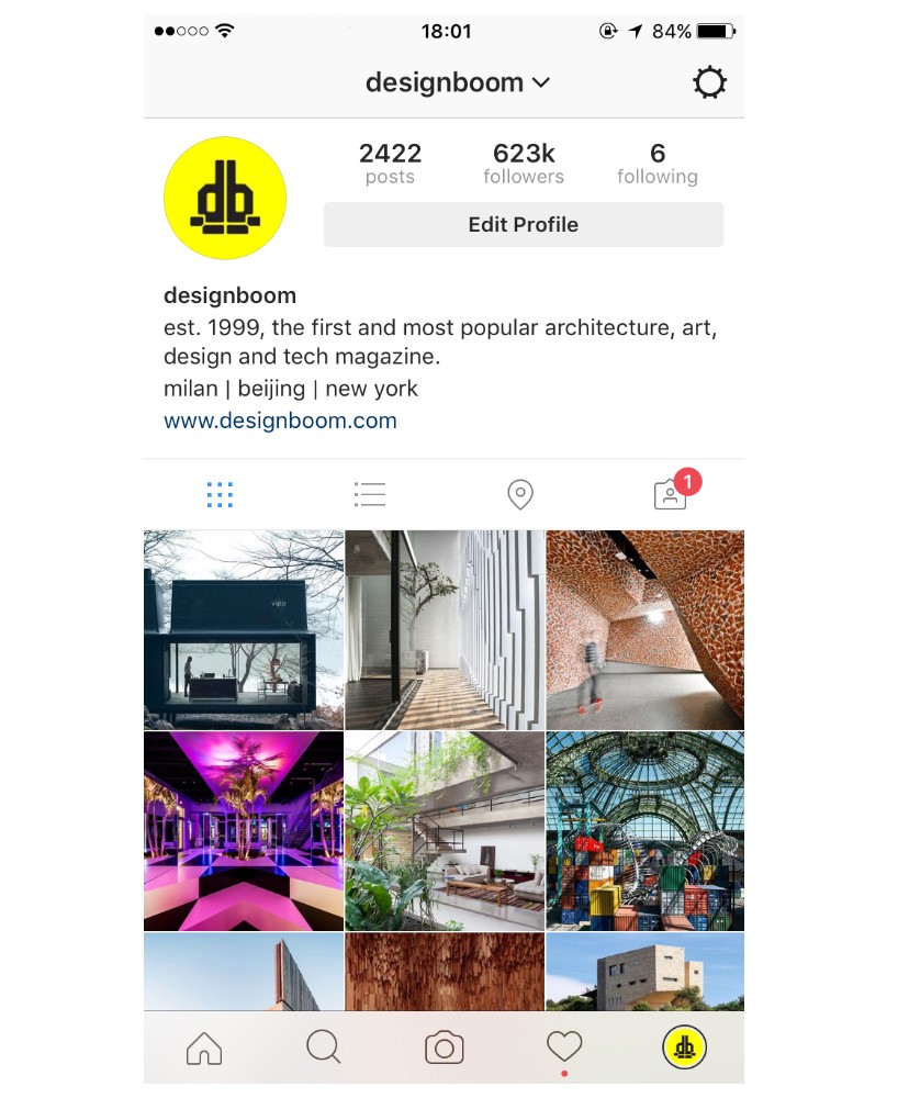
a simpler black and white color scheme has been employed
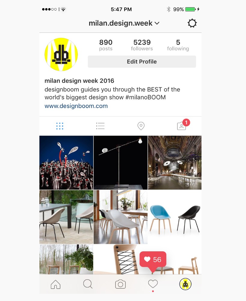
instagram says the change ‘puts more focus on your photos and videos’
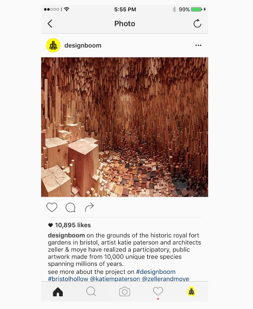
single photo page view
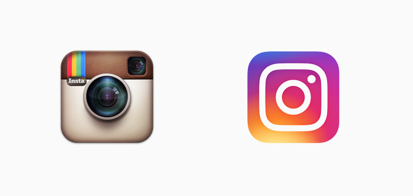
the original logo (left) has been used since the brand’s inception in 2010
