HTC deliberately celebrates everyday metals with latest flagship phone
all images courtesy of HTC


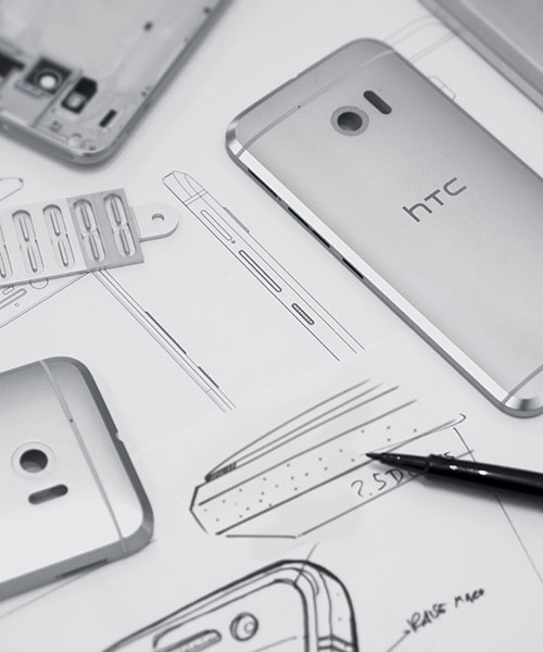
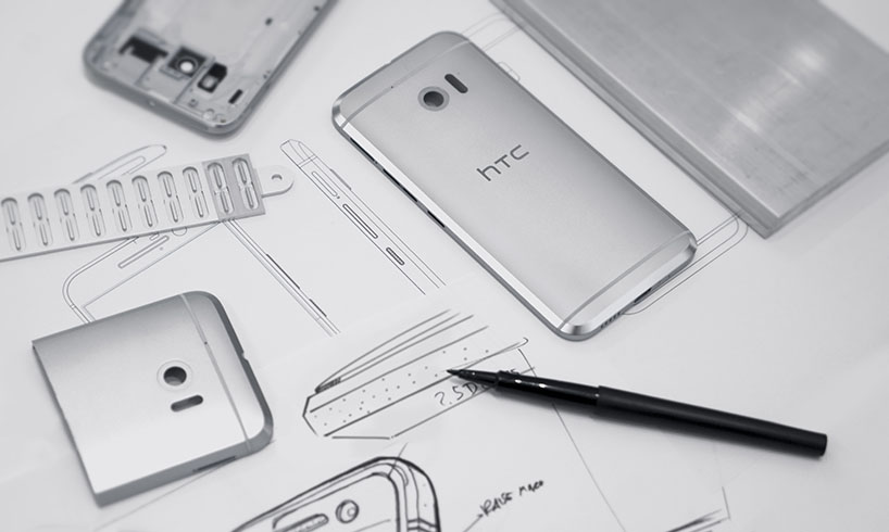
HTC’s flagship phones have established a solid lineage of mobile device design and moved the state of the art further, from the HTC ‘one M7’ to the ‘M9’. for 2016, the company is making its biggest leap forward with the HTC ’10’, a differentiated design informed by years of perfecting the design and manufacturing process. materials dictate people’s first impressions of a product, and in this area the HTC 10 literally shines. wrapped in military-grade aluminum and finished with zirconium bead blasting for a premium feel and appearance, the new flagship is a deliberate celebration of metal. defining the design is the ’10’s’ immediately recognizable and distinctive visual feature: the 3.3mm chamfer that runs around the outer edge and gives the phone a bold new silhouette.


video courtesy of HTC


creating the chamfer required numerous iterations to get it right—not just the visual appearance, but also the process of manufacturing it. a single, precise movement removes the material that exposes the chamfer. controlling tolerances on such a large surface was difficult, so HTC’s design team worked closer than ever before with the company’s engineers. if the cutter is too slow or too fast, it creates unacceptable irregularities in the metal. the raw chamfer surface is then bead-blasted to create a satin finish that catches the light, but doesn’t distract the way a mirrored finish would.

HTC deliberately celebrates everyday metals with latest flagship phone
designing the HTC 10 took much iteration and tenacity


one goal for this new flagship device was to improve the build quality and construction. in order to do that, the design team dramatically reduced the part count to just two pieces, metal and glass. fewer parts translates to smaller tolerances, and therefore a more premium feel. for ’10’, the team reduced the construction to just two parts. HTC’s color specialists worked with resin chemists to closely match the aluminum body and the integrated antenna features with as much subtlety as possible. to maintain the integrity of the silhouette, the team also strived to create a perfectly symmetrical object. the external characteristics that matter most to customers are aligned along the center axis—the headphone jack is centered on top of the phone, and the USB-C port is centered at the bottom—enabling customers to easily find those spots without having to search for them. 

HTC deliberately celebrates everyday metals with latest flagship phone
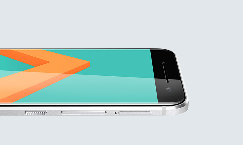
the HTC 10’s tactile power button is easily found by touch


the chamfer gesture continues into all of the ’10’s’ small details. buttons, camera trim, speaker openings and the USB-C port are all treated with a chamfer that complements the phone’s contour. the power button, also made of aluminum, has a purposefully defined surface texture that makes it quickly identifiable at the faintest touch. aside from the screen, the power button is still the most important touchpoint on phones—it’s the beginning and end of each interaction. giving it the right texture that differentiates itself from the rest of the device was especially important. the design team made at least 50 machined samples until the button achieved the perfect tactility. all of those details, combined with the overall contour, create in the ’10’ a silhouette that reflects the design team’s care and craftsmanship, giving HTC’s latest flagship a new and distinctive identity.

HTC deliberately celebrates everyday metals with latest flagship phone
the HTC ’10’ design team


designboom has received this project from our DIY submissions  feature, where we welcome our readers to submit their own work for publication. see more project submissions from our readers here.


edited by: piotr boruslawski | designboom