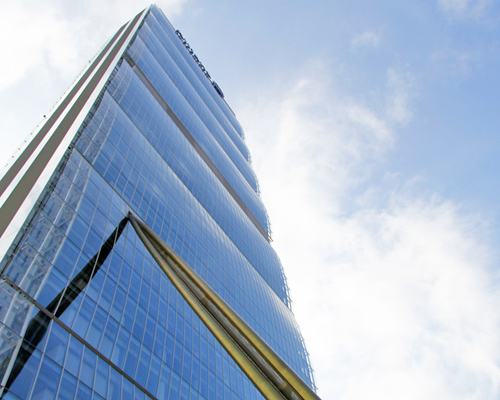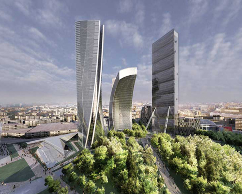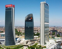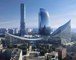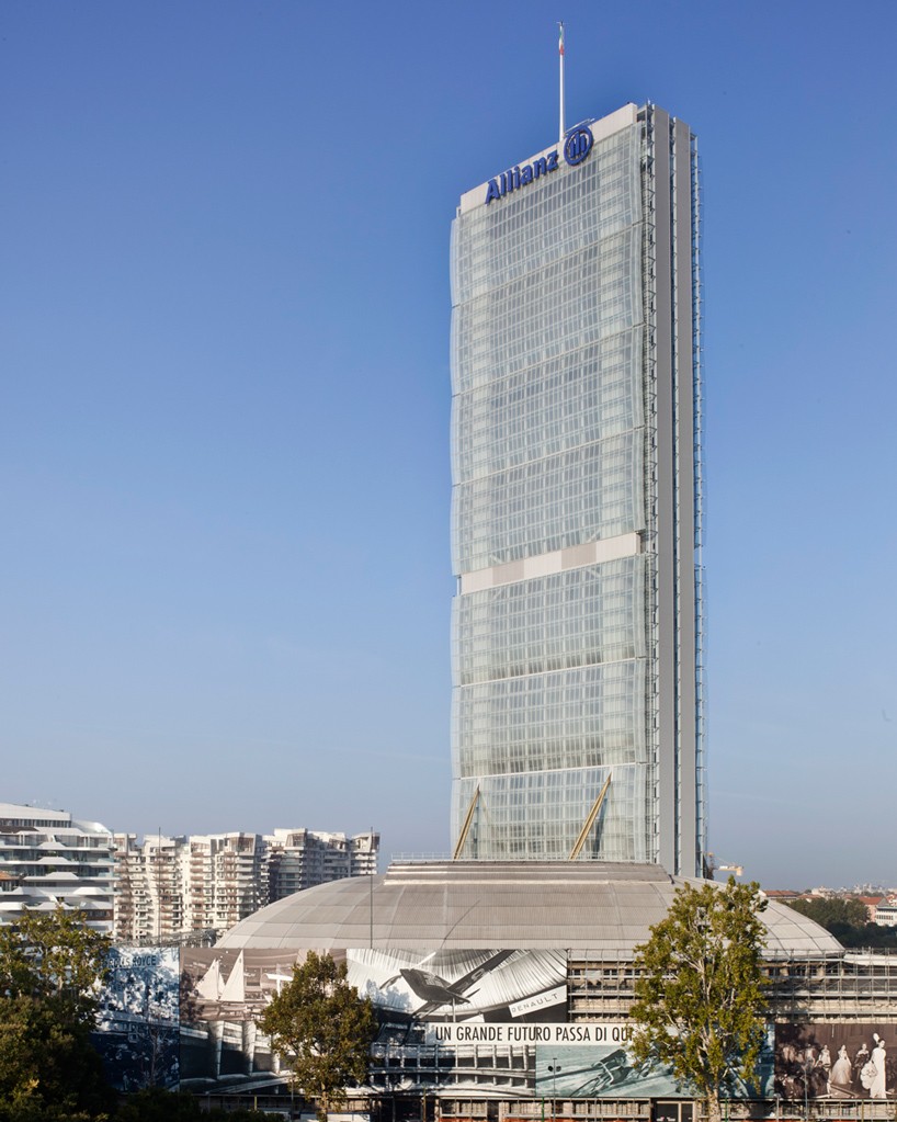
another phase of milan’s vast citylife development has been realized with the completion of the allianz tower after three years of construction. formerly known as ‘il dritto’, (‘the straight one’), the skyscraper has been designed by architects arata isozaki and andrea maffei, and will eventually be joined by highrises from zaha hadid and daniel libeskind. standing at a total height of 242 meters, the allianz tower is considered the tallest building in italy, if you discard the spire of cesar pelli’s unicredit complex, also in milan.
a transparent architectural language reveals the mechanics and functional composition of the scheme. billowing curved façades and golden external struts help distinguish the internal organization of space, with eight modules each containing six storeys. measuring a total of 21×58 meters, the narrow footprint accentuates the building’s verticality, with a slender shape extending above milan’s existing urban fabric.
to understand more about the challenges of completing the project, designboom spoke with its architect andrea maffei, who has been working on the scheme since 2003.
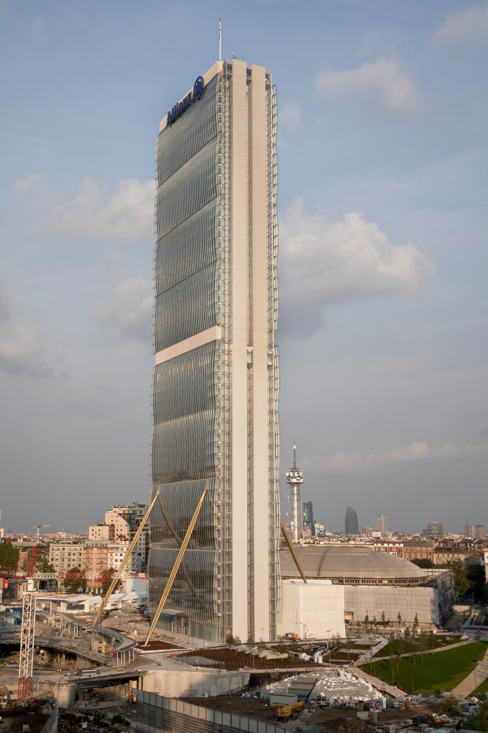
the tower is now complete after three years of construction
image by alessandra chemollo (also main image)
designboom: although milan has a growing number of tall buildings, in general skyscrapers are not so common in italy. how did you begin to design a high-rise building as part of an entirely new development?
andrea maffei: the new real estate development required the design of a large public park. it was a tender held by fondazione fiera to sell the old fiera di milano in order to finance the construction of the new fairgrounds in rho. the city was required to provide a large park, and at the same time incorporate new highrise buildings. as often happens in the city, the only way to be able to meet the needs of the investor and create a great public space is to build vertically.
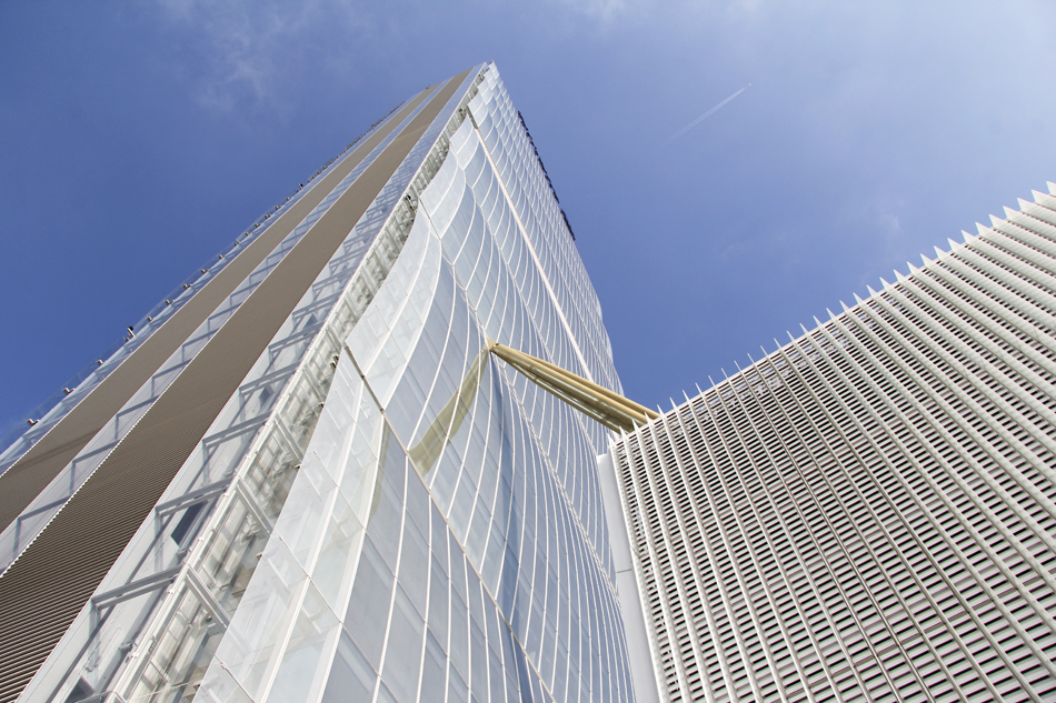
the skyscraper has been designed by japanese architect arata isozaki and italian architect andrea maffei
image © designboom
AM (cont): the goal of the masterplan was to blend the large square lot with the rest of the city. for this purpose, we proposed to continue the lowrise scale of the residential buildings at the edge of the site. this served to establish a dialogue with the context. a large new park with a series of three high-rise buildings would then be placed in the center. in this way, the tall buildings were still far from the surrounding houses, while a new center could have a subway station and a shopping center, as well as entertainment features. in this sense, we can say that milan is beginning to fulfill the needs of the great european capitals — that is to build high-rise buildings because there is less space on the ground, but in return for big public parks.
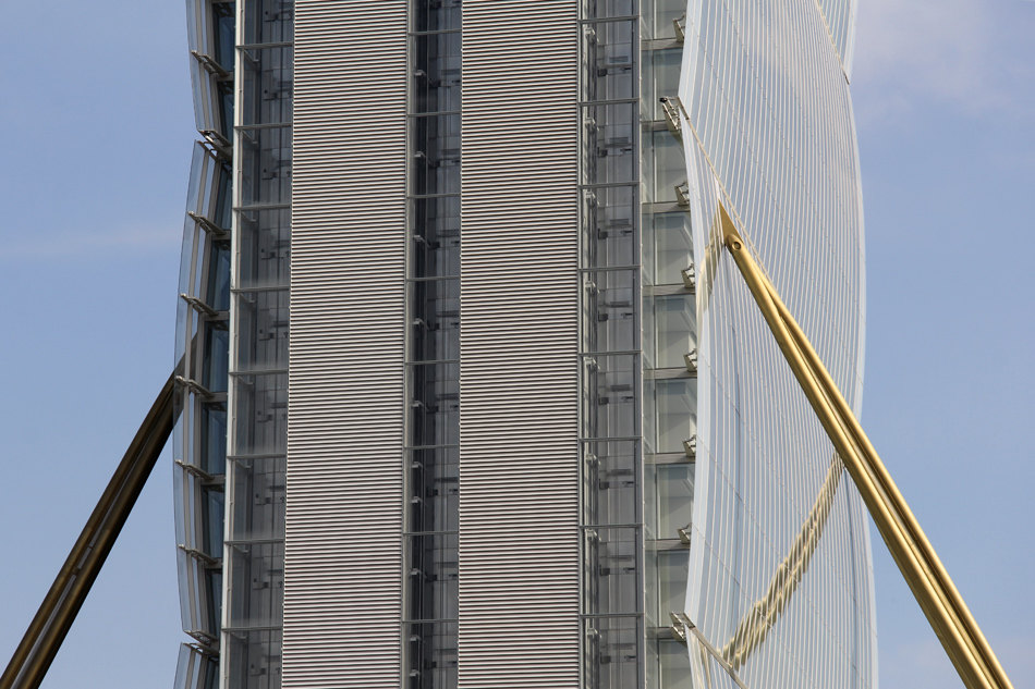
a transparent architectural language reveals the mechanics and functional composition of the scheme
image © designboom
DB: can you explain some of the challenges you faced during the completion of the project?
AM: actually, we have not undergone major changes during the construction of the building, apart from in a few aspects. the biggest challenges were in the design development. the main idea from the beginning was to create a series of modules that were repeated to infinity. the ‘endless column‘ of constantin brancusi (1935) in part inspired this choice. in this work the sculptor had created a slightly curved element that was repeated vertically, resulting in a very slim column. in the same way, we have designed a module of six floors, characterized by a slightly curved façade.
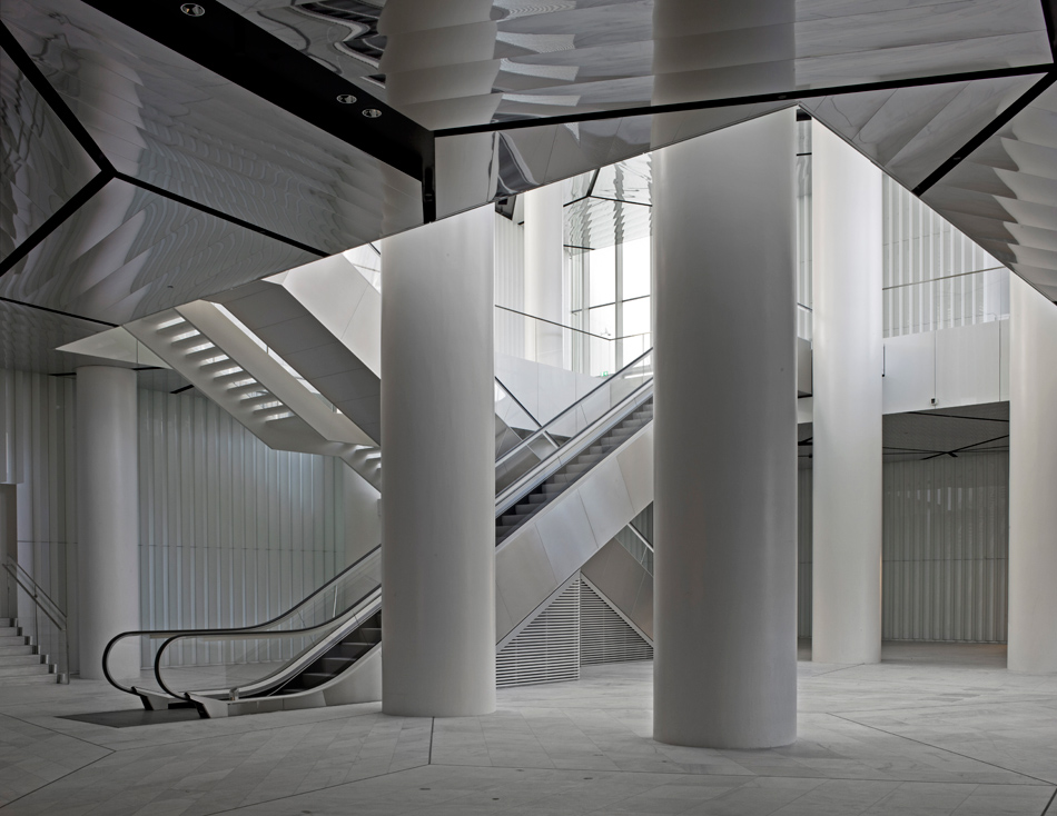
the building is part of milan’s ongoing citylife development
image by alessandra chemollo
AM (cont): in the first version, we had a curved module with greater floor to floor heights. in 2009, we optimized the costs as required by the developer, lowering the height of the ceilings and reducing the number of levels. we also highlighted the technical storeys which were previously masked by glass sails. the elevators were all initially panoramic – seven per part – and they were partially closed to reduce the air conditioning costs of the shafts. the economic aspects led to changes in the design, and at the end the building was realized with a very low cost.
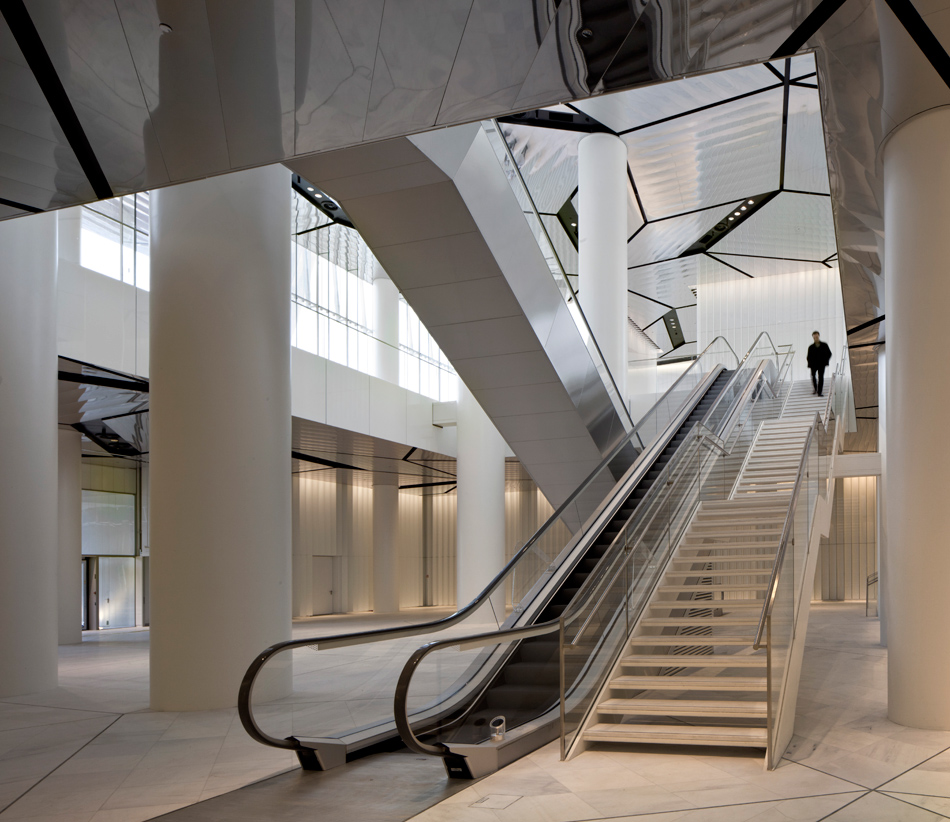
the reception foyer at ground level
image by alessandra chemollo
DB: as one of the tallest buildings in the country, what are some of the main technological aspects of the project’s construction?
AM: in designing the skyscraper we started with spatial planning in order to determine the most convenient form for the offices. we developed a long, narrow building with a large open central plan of 36 x 24 m with two cores at each end. this allows for a very adaptable environment that provides closed or partially open offices, or entirely open plan depending on future needs. this flexibility is the factor that makes the building sustainable over time. the shape of the tower is not defined only by aesthetic choices, but also by its geographical and historical context.
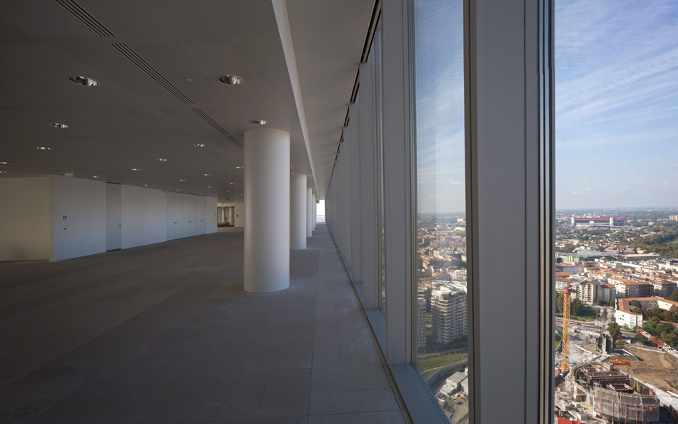
offices have unobstructed views across the city
image by alessandra chemollo
AM (cont): in the two outer cores we placed panoramic elevators with a continuous motion, paying homage to futurist milanese architecture. the implementation of computerized lifts reduces the number of elevators required, and also the average waiting times in the morning, when 3,000 people will have to go up in less than an hour.
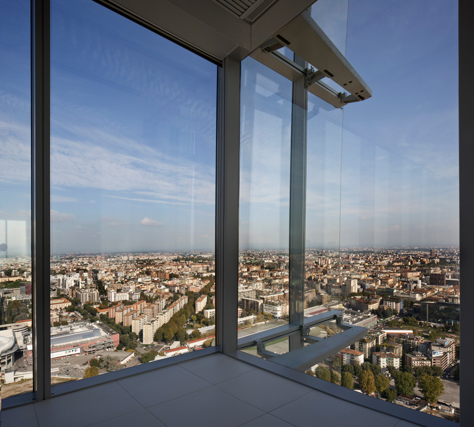
the tower will eventually be joined by skyscrapers from zaha hadid and daniel libeskind
image by alessandra chemollo
AM (cont): given the streamlined nature of the skyscraper we designed four buttresses that bring the stability of the foundation up to the eleventh storey. in this way we have reduced the oscillations of the top floor, carefully checked with wind tunnel tests, and guaranteed comfort. it was possible to use more traditional techniques, but we preferred to emphasize the mechanics of the skyscraper, leaving them exposed and emphasizing them with a gold color.
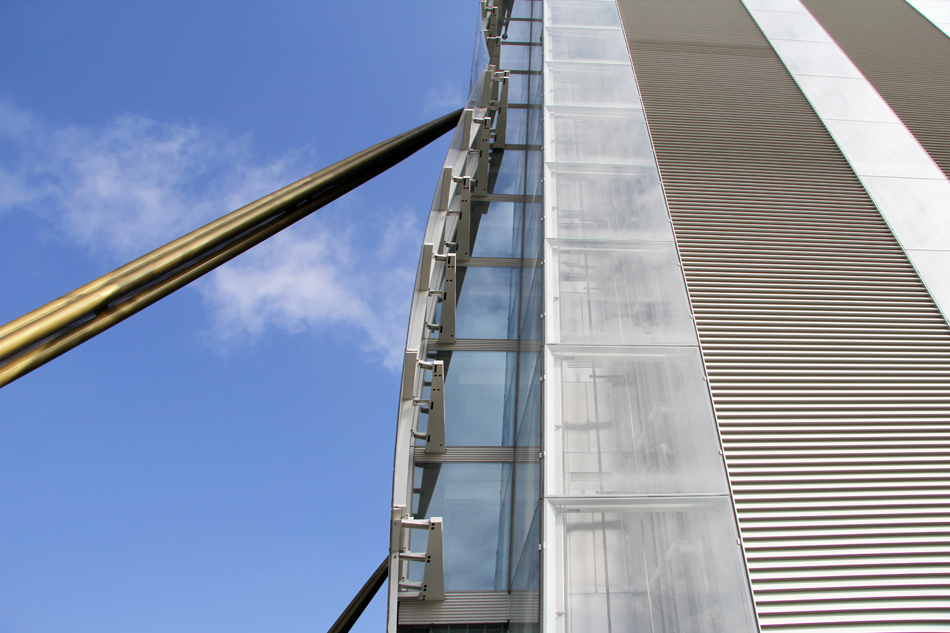
billowing curved façades and golden external struts help distinguish the internal organization of space
image © designboom
DB: rather than a flat surface, the tower’s façade features repeated modules of curved glass. can you expand on this aspect of the design?
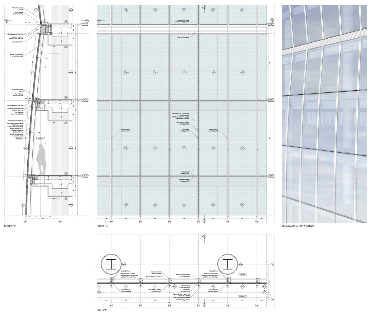
AM: the tower is composed of modules that are repeated endlessly. each module consists of six floors and features a slightly curved façade. in developing the project we planned eight modules in total. the façades are composed of cells in glass TGU – triple glass unit – ranging from finished floor to finished floor. normally the classic curtain wall consists of transparent glass from floor-to-ceiling and then spandrel glass covering facilities and equipment. instead, we have designed a ceiling that tapers towards the front to allow you to have large windows from floor to floor.
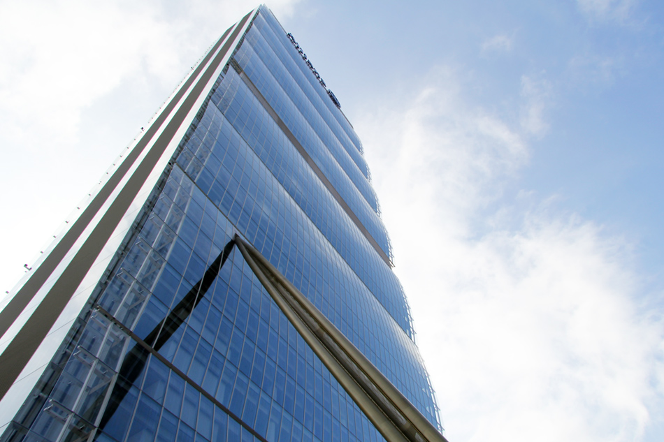
eight curved modules each contain six storeys
image © designboom
AM (cont): we did not want to use flat glass on the façade as the reflection would be unpleasant. we found that in germany some companies use techniques of cold bending to create a curvature in the glass. in our project we have employed flat slabs of TGU and then curved them by bonding with structural silicone to aluminum frames. the outer frames are exposed vertically constituting a further mechanical fixing of security. low-iron glazing was chosen throughout to avoid green reflections and have as neutral an effect as possible.
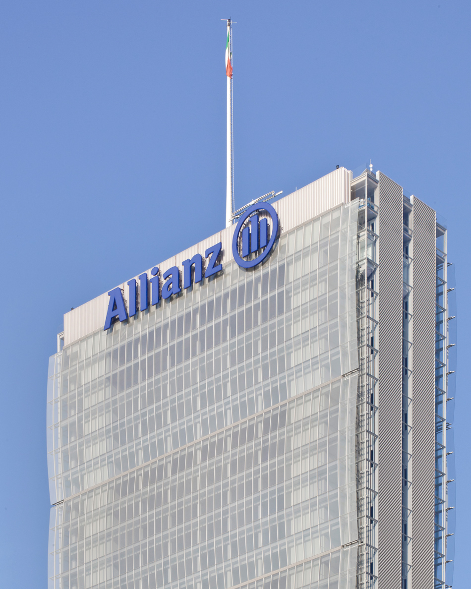
the narrow and streamlined footprint accentuates the building’s verticality
image by alessandra chemollo
DB: which particular part of the project has given you the most amount of satisfaction?
AM: I think we were able to develop an interesting design of façade details. like sails, the large window curves continue outside as thin transparent glass. this solution of the sails seems successful. throughout the building, I chose to use low-iron glass, which minimizes the green reflections of the glass, and this gave very neutral and elegant façades. in particular, the shaft façades are very neutral and transparent with the cabins of panoramic elevators whizzing inside. the structure and the walls were painted light gray to maintain this neutral feeling.
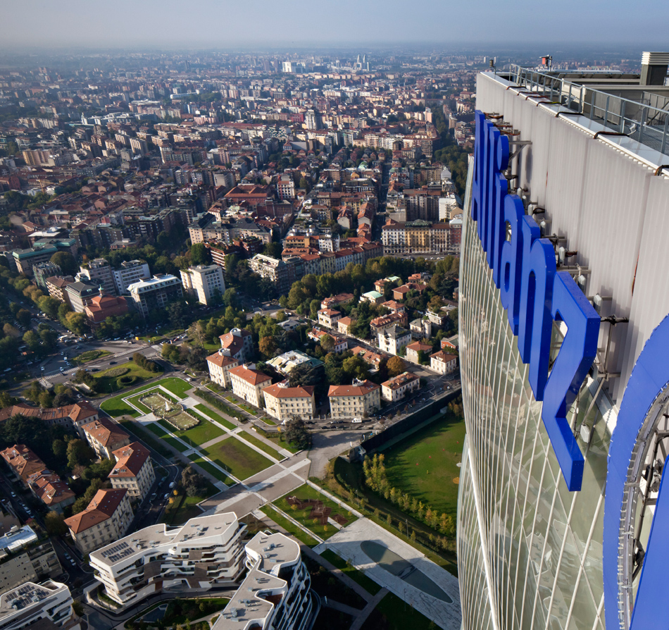
the view from the top: the building is one of italy’s tallest
image by alessandra chemollo
AM (cont): in the entrance hall we conceived a large 7 meter high glass façade. we did not want to see the aluminum frames so we designed structural glass fins that support the glass room outside. the structural glass, creates a sense of lightness and transparency. in the lobby, the exterior façades of the podium continue inside with white panels and slats. a visual continuity transforms the lobby into a kind of covered plaza always in relation with the outside.
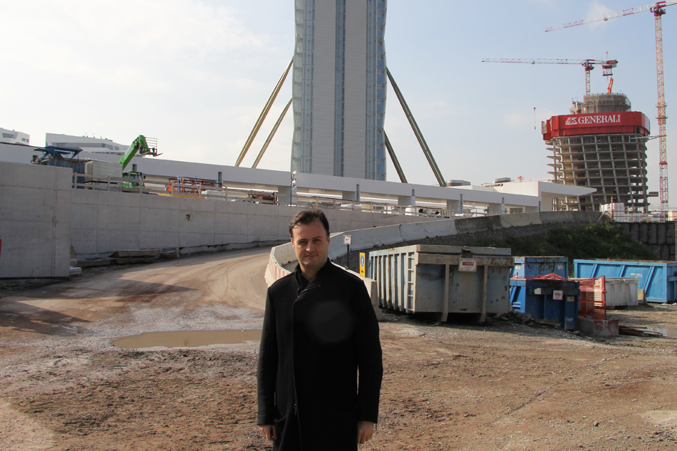
architect andrea maffei has been working on the project since 2003
image © designboom
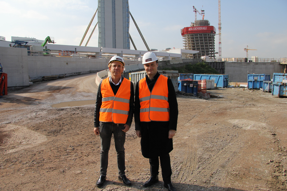
maffei gives designboom’s CEO massimo mini a tour of the site
image © designboom




project info:
name: allianz tower
location: milan, italy
program: office skyscreaper
client: citylife s.p.a. / armando borghi, marco beccati
competition: 2004
design: 2005-2011
construction: 2012 – 2015
project: arata isozaki and andrea maffei
design team: pietro bertozzi, takeshi miura, alessandra de stefani, chiara zandri, vincenzo carapellese, roberto balduzzi, francesca chezzi, takatoshi oki, stefano bergagna, paolo evolvi, elisabetta borgiotti, davide cazzaniga, adolfo berardozzi, hidenari arai, higaki seisuke, takuichiro yamamoto, giuliano godoli, giorgio ramponi, carlotta maranesi, atsuko suzuki, sofia bedynski, antonietta bavaro, mauro mazzali, sofia cattinari, taro hayashi, haruna watanabe, madoka tomita, ayako fujisawa
structure / competition: mutsuro sasaki, hiroki kume, takeshi suzuki / sasaki and partners, tokyo
project: maurizio teora, luca buzzoni, david scott, matteo baffetti, valeria migliori, francesco petrella, angelo mussi / arup, milano and new york
basement structures: holzner bertagnolli, cap engineering
façades: mikkel kragh, mauricio cardenas, matteo orlandi, maria meizoso, carlos prada / arup milano and madrid
plants / competition: P.T. morimura, tokyo,
project: gianfranco ariatta, roberto menghini, riccardo lucchese, sylvia zoppo vigna, andrea ambrosi / ariatta ingegneria dei sistemi, milano
vertical transportation: hans jappsen / jappsen ingenieure, frankfurt
lighting design: LPA – light planners associates, tokyo
LEED certification: fabio viero, gioargio butturini / manens-tifs s.p.a.
project management: giorgio montagna, valentina guagenti, francesca milani, valentina grassi / j&a, milano, alberto ferrari, pietro baccarelli / ramboll, london
general contractors: colombo costruzioni s.p.a. , focchi s.p.a.
construction documents: andrea matricardi / mpartner, franco mola / ECDS, francesco iorio / studio iorio, michele capè / studio capè, ariatta ingegneria dei sistemi
construction management: claudio guido / in.pro s.r.l.
construction security: donato bertoncelli / gestione progetti
gross floor area above ground: 81.615 sqm
gross floor area below ground: 44.485 sqm
height: 242 meters
happening this week! holcim, global leader in innovative and sustainable building solutions, enables greener cities, smarter infrastructure and improving living standards around the world.
andrea maffei architects (6)
arata isozaki (17)
arata isozaki and andrea maffei associati (6)
architecture in italy (579)
citylife milan (18)
PRODUCT LIBRARY
a diverse digital database that acts as a valuable guide in gaining insight and information about a product directly from the manufacturer, and serves as a rich reference point in developing a project or scheme.
