i29 installs colored volumes and mirrors that distort perception
all images courtesy of i29


i29 interior architects designed a pavilion for the dutch magazine eigen huis & interieur during the annual design fair that took place in RAI Amsterdam. with a mirrored architectural installation, i29 strived to create a spatial experience for the visitors that would surprise them; an environment that guided the user through a path letting them discover the installation step by step.

i29 pavilion
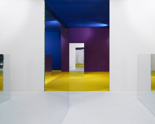
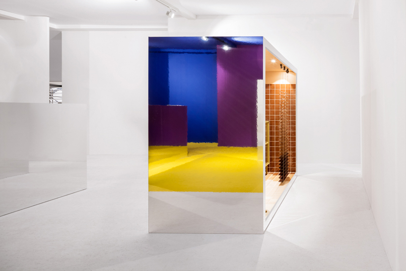
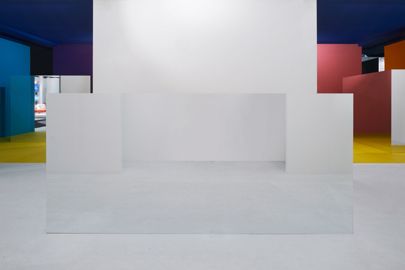
the first view of the pavilion is white walls on the outside, colored walls inside and some mirrored surfaces


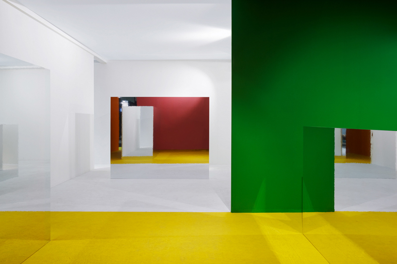
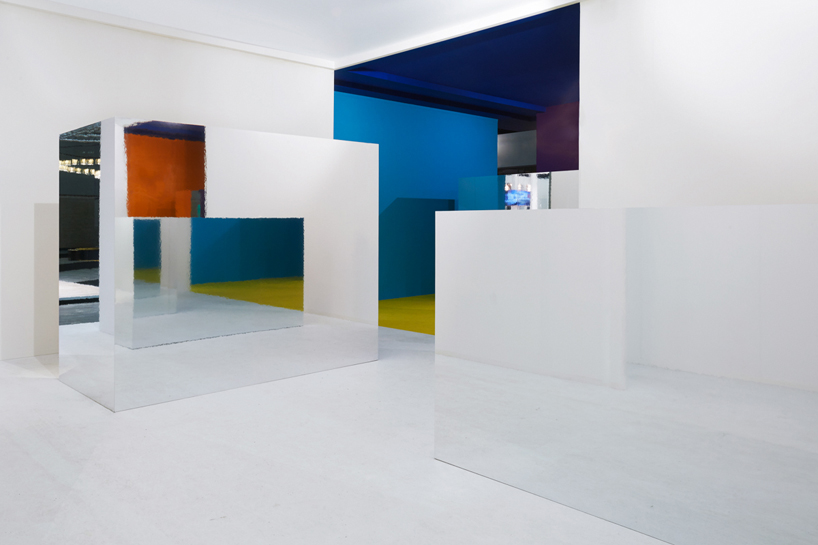
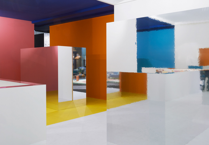
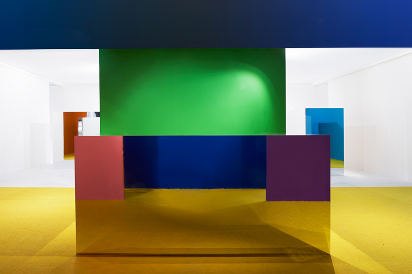
the concept was to reduce the house to its essence and to play with its perception by taking into consideration its open and closed surfaces, the walls and volumes, and the sight lines. to do so, the walls and floors that correspond to the inside were painted with bright colors while outside ones were left blank to create a distinction between these two spaces. the volumes or display cases were all mirrored on the outside and contain the compressed worlds that referred to living. by combining all these elements, the perception of the space changed depending on where the user stood. 

i29 pavilion
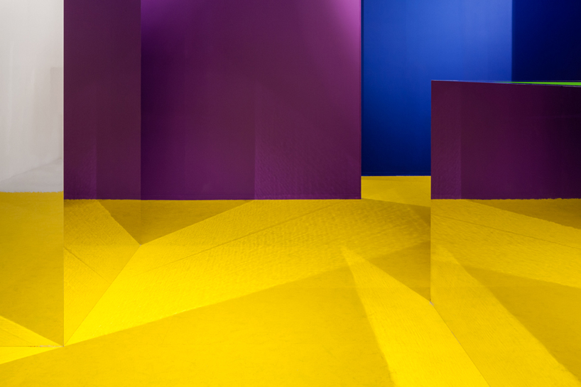
the mirrored surfaces distorted the idea of inside and outside by reflecting the colors


the empty and white pavilion and the richly decorated display cases create such a contrast that they end up reinforcing each other. the power of this installation lies in its simplicity that makes it a place for contemplation amidst the abundance of products that can be found in a fair. 

i29 pavilion
the pavilion starts to distort the conception of space, not knowing what’s real and what’s reflected

i29 pavilion
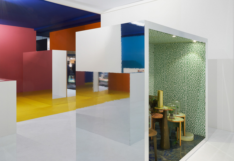
all the living spaces were contained inside the mirrored volumes  

i29 pavilion
color compositions are created, giving the user new views and approaches to space

i29 pavilion
bright colors, mirrored surfaces, lights and volumes are the main elements of the pavilion

i29 pavilion
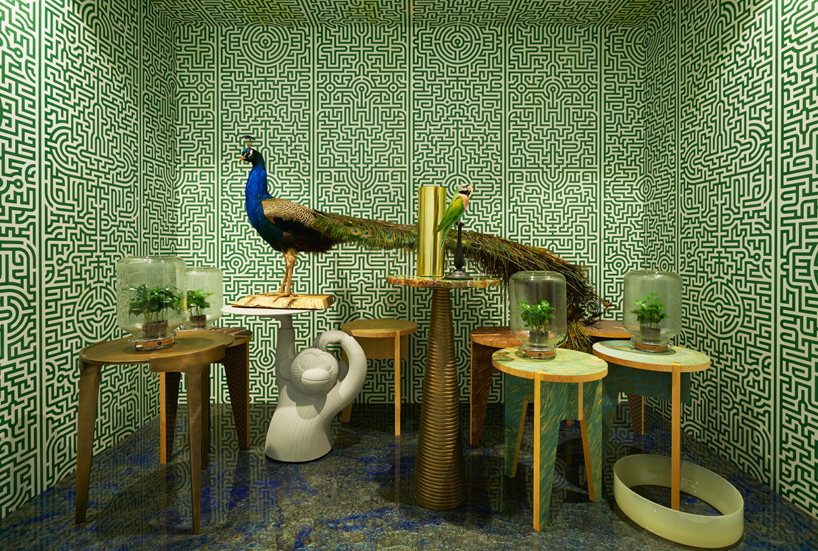
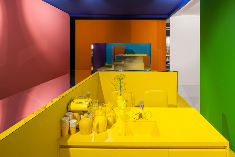
the living spaces also played with color, each one having one dominant one

i29 pavilion
in this living space green was predominant, having a sort of jungle theme

i29 pavilion
the kitchen living space was composed of only yellow elements

i29 pavilion
the white parts of the pavilion give it an empty feeling that is later transformed


designboom has received this project from our ‘DIY submissions‘ feature, where we welcome our readers to submit their own work for publication. see more project submissions from our readers here.


edited by: juliana neira | designboom