KEEP UP WITH OUR DAILY AND WEEKLY NEWSLETTERS
happening this week! holcim, global leader in innovative and sustainable building solutions, enables greener cities, smarter infrastructure and improving living standards around the world.
PRODUCT LIBRARY
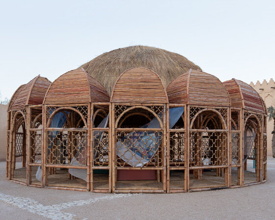
across twelve themed galleries, the first-of-its-kind show at qatar's national museum traces the evolution of pakistan's visual arts and architectural practices over the past eighty decades.
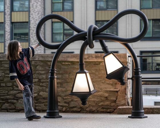
these twisted sculptures now join the artist’s earlier tangled post box installed on cheese lane, which marks its re-opening as a public right of way after a 50-year closure.
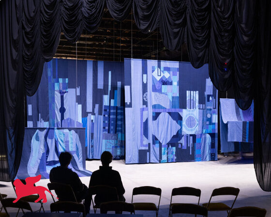
aziza kadyri reflects on modernizing suzani embroidery with AI, amplifying women's voices, and the deconstructed theater backstage.
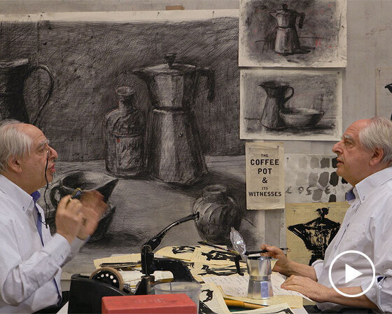
the south african artist talks to designboom about the nine-episode film series, available on MUBI from october 18, 2024.
connections: +160
