KEEP UP WITH OUR DAILY AND WEEKLY NEWSLETTERS
happening this week! holcim, global leader in innovative and sustainable building solutions, enables greener cities, smarter infrastructure and improving living standards around the world.
PRODUCT LIBRARY
broken pieces of soft mirrors are pieced together using medical cotton gauze and 18-carat gold finishing, while the electric components installed allow them to move autonomously.
to top off the recreated design, the studio includes a mcfly punk hoverboard and cap alongside a PEPSI bottle for their custom model.
using a model from 1990s, the trio turns the vehicle into an automotive art piece with boom boxes on the removable roof.
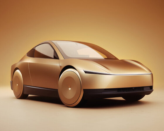
tesla plans to begin production of the fully autonomous taxi over the next two years.
connections: +1180
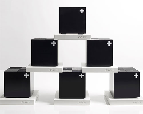
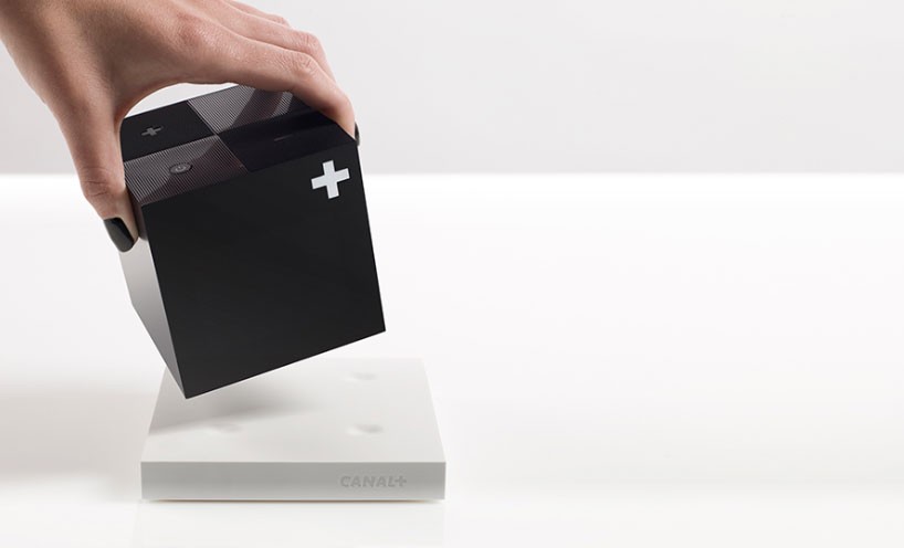 the cube is only eight centimeters by eight centimeters in size
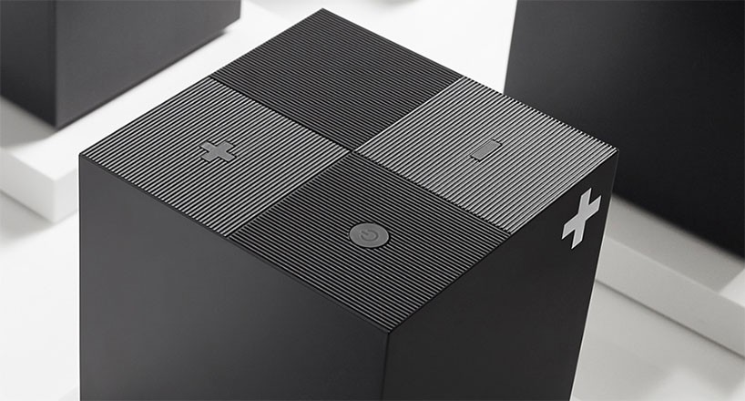 the top of the cube highlights a textured pattern
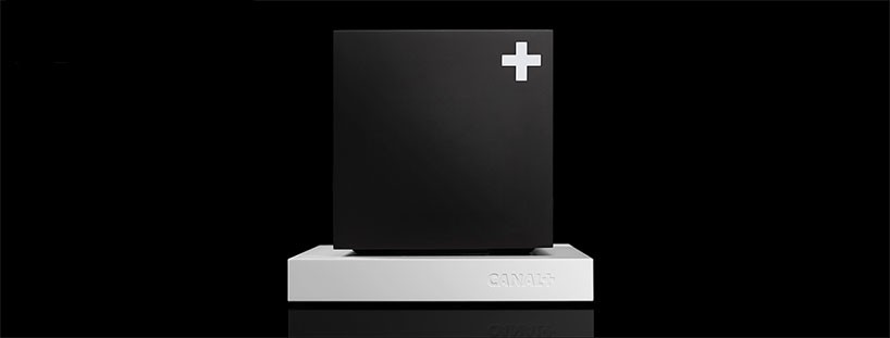 fuseproject kept the white canal+ logo in the corner of the cube
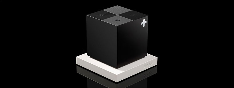 the display is invisibly integrated into its surface
 the cube is matte black to maximize aesthetic discretion and fit in the home
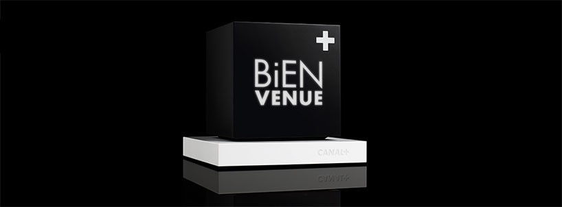 the full color LCD display is 320×240 pixel screen
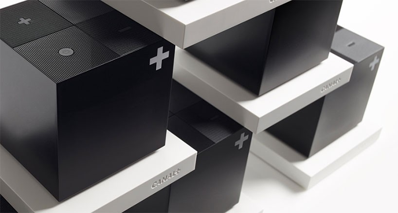 the hard drive was removed and stored it in the corresponding white stand
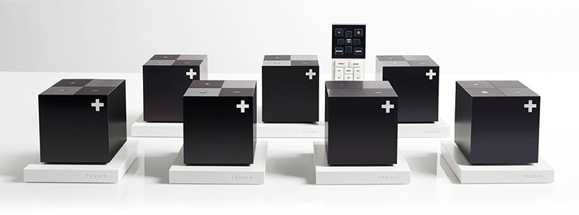 fuseproject textured the lid to match the brand’s existing user interface
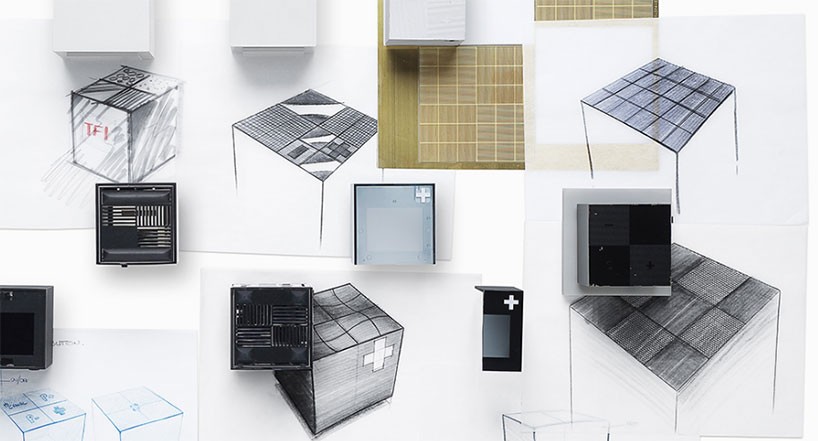 concept drawings of the cube
 the display presents channel logos, and eventually show program notifications to users


