vaughan oliver
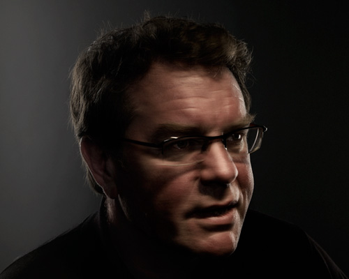
portrait by giles revell
vaughan oliver was born in sedgefield, county durham, UK (1957). he studied graphic design at the newcastle-upon-tyne polytechnic / university of northumbria before moving to london in the late 1970s – where he met ivo watts russell, the founder of 4AD records.
together with photographer nigel grierson, oliver went on to work on the vast majority of packaging and visuals for 4AD through their studio 23 envelope. in 1988 grierson departed and vaughan formed V23, where together with chris bigg and other collaborators he continued to create designs for several music labels.
vaughan’s designs for bands such as the cocteau twins, lush and the pixies during the 1980s and 90s provided a stark contrast to the mainstream music imagery of the time and his distinct approach to graphic design influenced a generation of designers.
V23 closed its doors in 2008, though oliver has continued to work on projects for the likes of the pixies, TV on the radio, the breeders and david lynch in recent years. starting from january 2015 he will be the creative lead at the university of greenwich, he is also a visiting professor at UCA, epsom and an AGI member.
designboom spoke to vaughan about the influences that have shaped his career and much more…
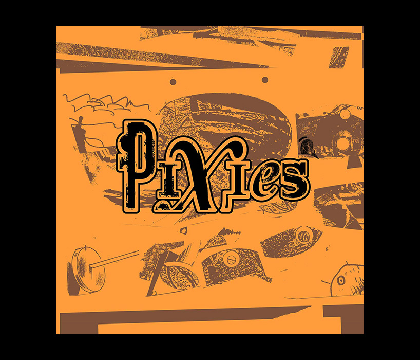
‘indie cindy’ cover for the pixies, 2014
illustrations by ian pollock
designboom: I read that you became interested in graphic design through music?
vaughan oliver: as a youngster me and a mate of mine would show off to each other – reading the NME with a copy of frank zappa, or pink floyd under our arms. I was a working class lad from a dull town in county durham, there was no real culture, my parents were not really interested in anything unusual – everything I was getting was through record sleeves. it was a democratic way of discovering art. the local record shop was an art gallery for me.
it was the seventies, so you had the prog-rock sleeves, the great work by roger dean for yes. his work in particular really stood out to me because it challenged the format. when I was a bit older dean was one of the first artists I went to see give a talk, I still have his book with his signature in it.
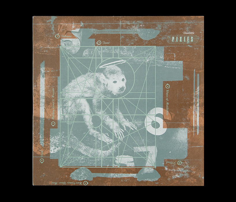
‘doolittle’ cover for the pixies, 1989
photo by simon larbalestier
DB: when did you start to take graphic design more seriously so to speak?
VO: probably through my art teacher at school introducing me to people like salvador dali who I wrote a thesis about… I was fascinated by the man…
those were great days, when you are young and you are hit by something that you have never experienced before. I find it very difficult to have that experience now. I can remember how it felt the first time I read samuel beckett or watched an andrei tarkovsky film – I’d just think to myself ‘fucking hell! wow!’
when you see a masterpiece it makes you feel things that you can’t shake off easily – they’re like powerful a drug. these things touch you in a way you can’t be touched again… it’s like being an aesthetic virgin!
by the time I was at college I was into pop-art, andy warhol and robert rauschenberg – you know, all the textural stuff. I was always looking for my next ‘aesthetic hit’.
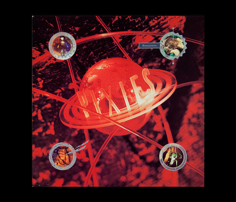
‘bossanova’ cover for the pixies, 1990
photo by simon larbalestier
DB: texture is a big part of your own work…
VO: yes it is, but I can’t say exactly where that comes from – maybe playing in the mud as a kid! what I like about texture is that it has history, it’s suggestive, provocative… I prefer that much more than something pristine.
I was in 4AD’s basement yesterday (trying to steal some product – ha ha!) and we saw this peeling wall… I had to get the camera out and take a picture. it’s been the same sort of thing that’s been turning me on since I started – I should probably see someone about it really!
when I picked up a book on wabi-sabi, years ago now, I found it somewhat reassuring. in one part the ‘new’ aesthetic is described as a perfect white cube and the ‘old’ as being an open bowl. my preference is for the open bowl, every time.
texture and lighting are good ways to convey a mood, and when you’re working within the context of music that’s very useful. it was always my goal to suggest the mood of the music.
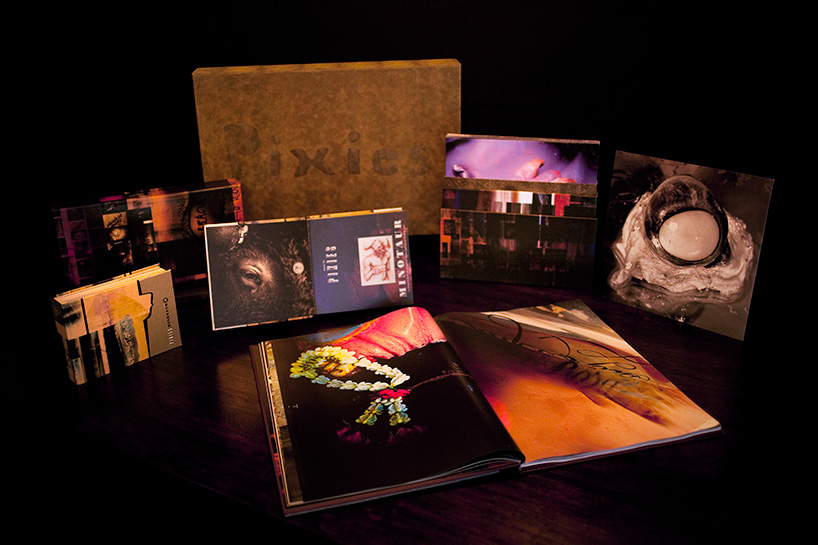
‘minotaur’ box set for the pixies, 2010
project photography by simon larbalestier / above photo by marc atkins
DB: there’s also a surreal quality to much of your work, everyday themes with a strange twist…
VO: I like to elevate the banal through surrealism. mystery and ambiguity are important weapons in a designer’s arsenal. I try to make images where you don’t always get ‘the message’ straight away – but these things leave a hook in you. leaving some space for interpretation is important.
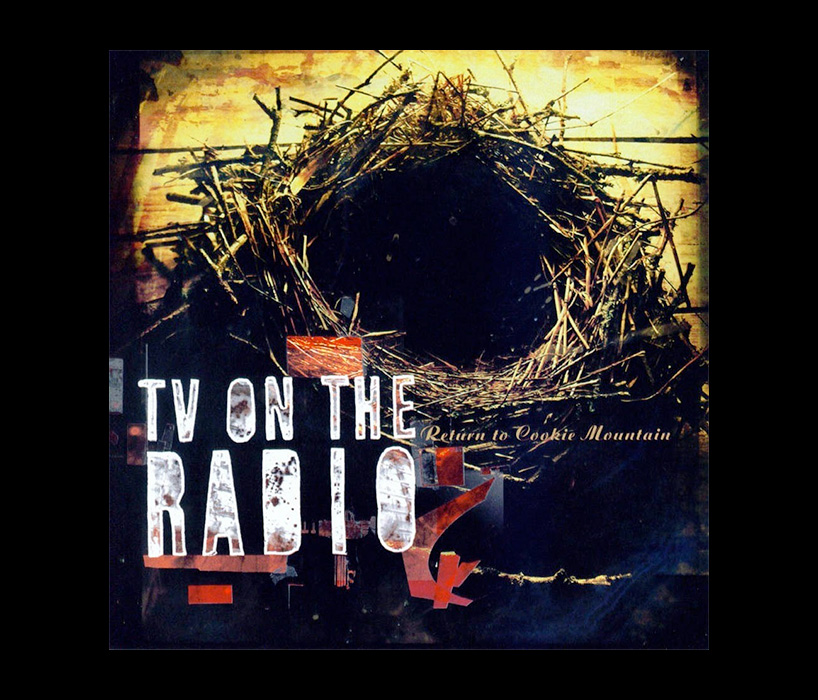
‘return to cookie mountain’ for TV on the radio, 2006
photo by marc atkins
DB: how did you come to specialize in designing record sleeves?
VO: I was lucky really. I met ivo [watts russell] at a party in london and we got on very well. he valued the importance of record sleeves. he supported me massively. I was in the right place at the right time I suppose.
I always wanted to design sleeves as a kid. record sleeves are ephemeral and I always wanted to make them more than that. it might sound pretentious but I really wanted to make a mark. put more effort into them than was I was supposed to and make the artwork timeless. now I realize though that the artwork can’t be timeless because of its connection to music. the music the artwork contains will always take you back to a certain time.
DB: how did you set out to ‘make a mark’?
VO: it was always my goal to be fresh and unlike anything else – to be different. to push boundaries. even if the work was all of those things at one time it’s got lost with time. when I look back at some of the earlier sleeves I designed I find them somewhat straightforward.
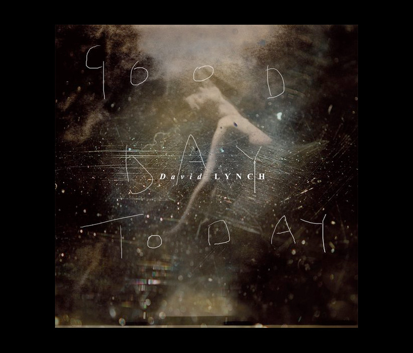
‘good day today’ cover for david lynch, 2011
photo by marc atkins
DB: are you still designing as much as you used to?
VO: no, I still do a bit of design but I spend most of my time teaching now, which I thoroughly enjoy. I’m a visiting professor over at the university of greenwhich in london and at the university of the creative arts here in epsom [surrey, UK] where I live now. after we dissolved the studio in 2008 I started working from home and found it a bit difficult at times. I missed the banter!
DB: do you think it’s easy to slip into a routine working on your own?
VO: yes that’s easily done. you might also start drinking wine a bit earlier in the day than you should! you see I’m a very good boss, I allow myself to do that. but seriously, I love teaching, I slowly did more and more of it and now I’m up to four days a week.
there’s no money in teaching but then there’s not much in graphic design either – money has never been my motivation. it has been nice to realize how much I know and can pass on to the students, things that I completely took for granted. without trying to sound like a wise old man I think it’s important to pass on what you know.
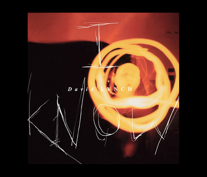
‘I know’ cover for david lynch, 2011
photo by marc atkins
DB: did you have mentors of your own growing up? you mentioned your art teacher earlier…
VO: yes, my school art teacher tony was very important thinking about it now. he was quite young for a teacher, he knew a lot about art and had traveled the world. me and my mates could talk about art, music and football with him – it was great. he encouraged me to go to art school.
when I got to art school in newcastle I studied under a fellow called terry dowling. he would have only been about 32, it was the same thing, he felt like one of us. when your 18 someone who is in their early 30s feels old and I always hoped that when I got to 32 I would still have the same curiosity and enthusiasm that terry had.
DB: do you still have that curiosity today?
VO: I think I do yes. it’s been slightly blunted over the years but people do comment and say that I’m child-like, observing everything around me and pointing out things. a big boost in my curiosity and enthusiasm came from going back into school and teaching.
DB: what have you learned since you started teaching?
VO: to make myself clear. for someone like myself who has worked intuitively you don’t often have to explain yourself with words you’re explaining yourself visually.
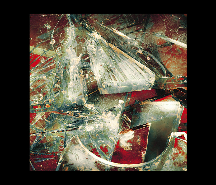
‘mountain battles’ cover for the breeders, 2008
photo by marc atkins
DB: you’ve stressed the importance of collaboration in previous interviews…
VO: collaboration brings more out of me. I tend to find it also brings more out of the other person. collaborating with a musician on the artwork for their music is a bit different, that’s a kind of client / designer collaboration process that I’ve always been used to. what I’m referring to here is the collaboration with other artists, illustrators and photographers – it was a great experience sourcing artists to work with the different 4AD bands. I just think it’s nicer to create things together with other people than to do them on your own.
DB: a bit like sharing the experiences of a journey with someone…
VO: yes exactly. that’s a good analogy… and meeting different people along the way. people from all different backgrounds and levels of experience. it’s a very rewarding feeling to work together with someone on something from start to finish. I also love pushing people to do slightly different things than they would because I can see their potential. I do the same with my students today.
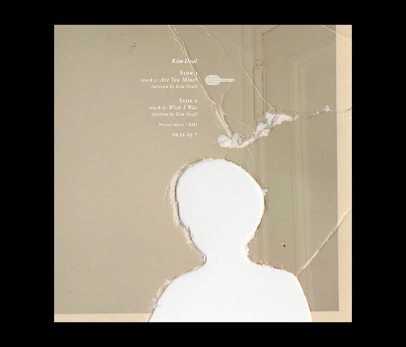
‘are you mine?’ cover for kim deal, 2013
photo unknown
DB: what rules of thumb make for a good collaboration in your experience?
VO: freedom. I think you have to give each other respect and plenty of breathing space. as an art director the majority of the job is done in choosing the collaborator you will work with. there’s no need to micro manage. I would always choose my collaborators based on their recent personal work, that way I knew that if I liked what I saw they’d enjoy working on the project I had in mind for them. I would challenge people to go a bit further as I said, but it’s pointless asking someone to change what they do completely, that just becomes exhausting for everyone involved.
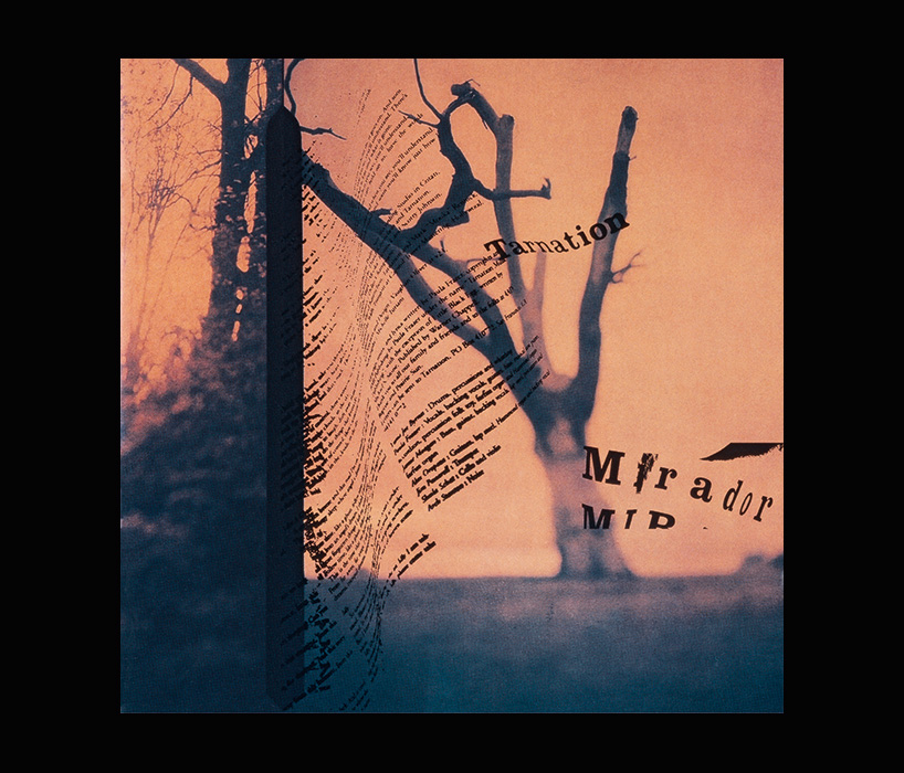
‘mirador’ cover for tarnation, 1997
photo by michele turriani
DB: do you prefer complete freedom over a strict brief then?
VO: it varies. on something like the pixies minotaur boxset it was a totally free brief, of my own doing… I only agreed to take on the project on the understanding that I could throw out all the old artwork and do something new. you see I thought I’d love that, but once I realized I could do anything I wanted to I thought to myself ‘oh fuck!’. complete freedom is the best and the worst thing. some limitations can be good, even if those are as straight forward as time, budget, medium and so on.
DB: what skills would you like to learn in the future?
VO: I have no idea! I don’t have any specific goals really… it might be worth learning some basic typography rules so that I could teach the students. I can’t believe I’m in charge of a typography course! ha ha! only joking… the thing is I approach typography in a different way, a very expressive and physical way. I don’t care if I never know the rules of typography because that means I can work with someone who does. I don’t even know how to use the computer very well to be honest with you, I always need to work with someone who can do that. I’m a bit of a technophobe you see, as are a lot of people from my generation, then there’s other people who have embraced it like neville brody – who tells me to just get on with it!
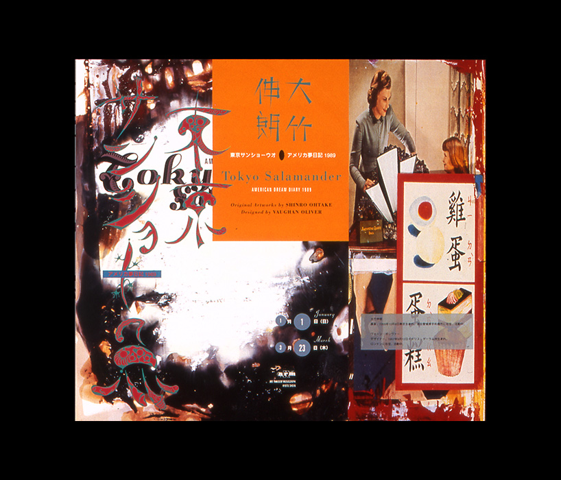
‘tokyo salamander american dream diary today’ book by shinro ohtake and vaughan oliver, 1989
DB: have you ever thought to work on an animation or film?
VO: everyone asks me that! you know it does appeal to me but I’m a perfectionist to a degree and I love film… so I’m nervous that I’d be disappointed with the results. a couple of prominent producers have been on my case now for a while to work with them on something, who knows – maybe I will do one day.
DB: you’re sometimes referred to as an artist, other times a graphic designer, how would you describe yourself and why do you think some people avoid using the title of ‘graphic designer’?
VO: for as long as I’ve been a graphic designer it’s a tag that’s always been poo-pooed in certain circles. some people say ‘oh, vaughan is an artist – go and play in the sandpit over there’ and I fucking hate that. I’m a graphic designer I’ll have you know! the thing is that it’s easy to dismiss people like me who produce graphic design in an emotive way. for some people ‘graphic design’ conjures up a certain style of work from a certain era and any graphic design that falls outside of that look and feel makes them uncomfortable. but it’s a very broad thing graphic design. personally, I really don’t understand the desire to be sterile… you know, I want to move people with my work, to make an impression – through graphic design.
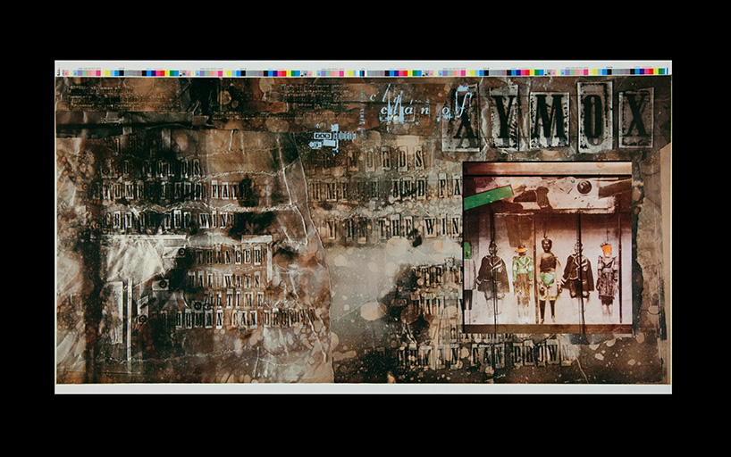
‘clan of xymox’ album artwork proof print for clan of xymox, 1985
photo by terry dowling
DB: do you think it’s important for a graphic designer to be able to draw?
VO: yes. we have life drawing classes on both the courses I teach on. not because we want to produce artists but because learning how to draw teaches you how to look at things differently. to pay more attention to things. it’s not about being ‘the best’ at it but practicing the skill. my teacher at art college told me ‘you’re a crap illustrator but you’ll be a good designer’ which was hugely encouraging!
DB: how do you think online design resources have influenced the graphic design being produced today?
VO: I mentioned I’m a technophobe didn’t I? well, everything is too easy these days! one of my big influences when I was younger was the quay brothers. they came to my university and gave a talk about their work. I was blown away by them. I’ll be damned if I could find anything about them though, after seeing their work I had to memorize it. I couldn’t see their films or illustrations anywhere… you just couldn’t. in turn their legend grew and and their influence on me altered, was what I saw really how I remembered it? you know, you couldn’t just pull it up and reference it. instead you had to reference the memory of it, the way it made you feel when you saw it. if you say to a student today ‘look into the quay brothers’, they just google the name, pull up a youtube video and then they watch half of the video and say ‘oh yeah, interesting’, then ‘bam’ the phone goes back in their pocket. that easy access has stopped people taking their pleasure seriously. availability cheapens the experience in many cases. people have stopped looking properly at things, they don’t look at things for long enough.
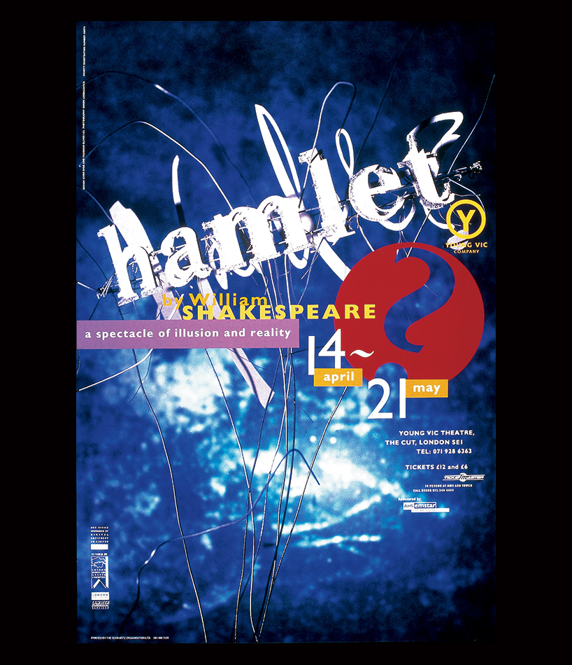
‘hamlet’ poster for the young vic theater, 1991
photo by simon larbalestier
DB: what are you currently fascinated by and how is it feeding into your work?
VO: I wish I could tell you something new and exciting but I’m quite stuck in my ways. I’m still interested in the same things I’ve always been interested in but in different ways I guess. music, football, films, books… I feel it’s quite easy for your enthusiasm to get diluted with time, so I like to go back and revisit the things that made me tick in the old days, to see if they still resonate with me. books like ‘in praise of shadows’ by junichirō tanizaki, which is along the lines of ‘wabi-sabi’. it’s not that I’m not open to new things, I see some things I like, but it has to hit me in the ‘truth’ spot that we talked about earlier… not so many things can make that impression on me, especially because I’m very anti-trend.
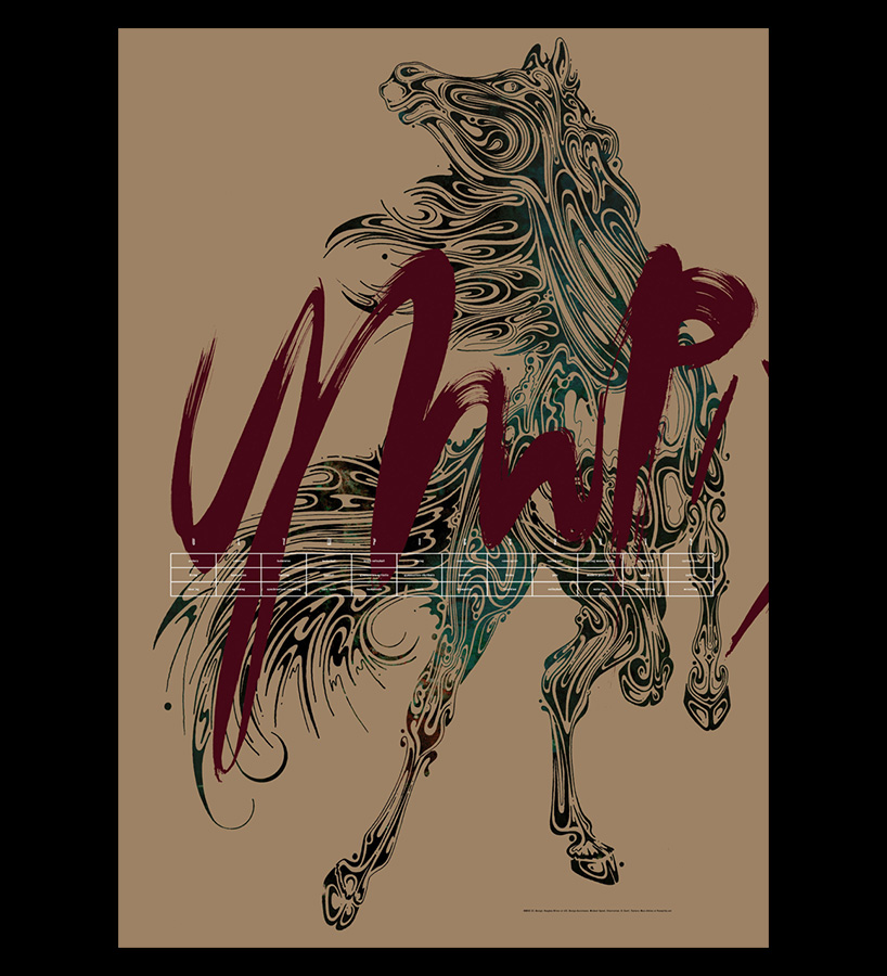
‘fit’ london 2012 olympics poster
illustration by si scott
DB: besides graphic design what are you passionate about?
VO: football. it’s in my blood. I’m an licensed FA coach and coached for many years. as for anything else there’s not much room to be honest with you. it’s football first, graphic design second!
DB: have you ever thought about combining the two passions?
VO: I have, I did a poster recently for an exhibition. I was approached many years ago by sunderland football club to redesign their club crest. but I let the cat out of the bag and told people about the project before I should have, as a result it never happened. it’s probably one of my biggest regrets! they still have the same old crest and I’d love to have a go a redesigning it.
V23 logo, the logo for oliver’s studio (1988-2008)
DB: what advice would you give to young designers?
VO: do your own thing. when you’re young and in your formative years it’s easy to copy what everyone is doing because you often want to be recognized and accepted into the fold. but it’s more important in the long run to find your own voice, do work that’s different, provocative and fresh – people will remember that once a trend has passed.
DB: do you have a motto?
VO: ‘to suggest is to create, to describe is to destroy.’
it’s one of the first things I wrote on a toilet wall – the photographer robert doisneau said it. I’m not sure if he came up with it himself but in any case, I like the balance of the statement and it’s something I repeat to my students.
happening now! partnering with antonio citterio, AXOR presents three bathroom concepts that are not merely places of function, but destinations in themselves — sanctuaries of style, context, and personal expression.
