— french graphic designer philippe apeloig talks to designboom about his typography, the future of poster design and the qualities he looks for when hiring. —
DB: much of your work is related to the arts or to cultural affairs, would you ever consider working on a very commercial project? PA: there is not much room to work outside the arts and cultural arenas for graphic designers in france. of course, I have considered working for commercial projects several times, but I never go looking for it by canvassing corporations or companies, I am simply not into this behavior. I like to be surprised by the business world, and to surprise them.
that said, promoting art and culture has brought profound rewards by providing me with a deeper knowledge of the world. there is always new information coming in, and each project pushes my consciousness a step further. I try never to be tempted by fashion, or influenced by the rules of advertising, or corrupted by the pressures of the marketplace. sometimes the market wants to dictate a particular approach or design language, but i avoid all these things.
one day, though, a company actually did surprise me, approaching me to challenge them with my design. it was a historic parisian silversmith with an international clientele who wanted me to redesign their logo and identity. as I got into the work, I became completely absorbed in their history, craftsmanship, and the artistry they have fine-tuned over many, many generations. I brought them an abstract vision, which, curiously, was more grounded in reality than their old brand.
based in part on original sketches and technical drawings that I found in the company’s archives, it reflected their history concretely, encompassing their iconic, best known work, amazing technique, and exquisite aesthetic. my solution also added the element of emotion, addressing their tradition of quality and service. that extra dimension speaks not only to the company’s historic legacy but its current relevance and vibrancy. so, it was a success on many different levels, and a very engrossing and inspiring project for me.
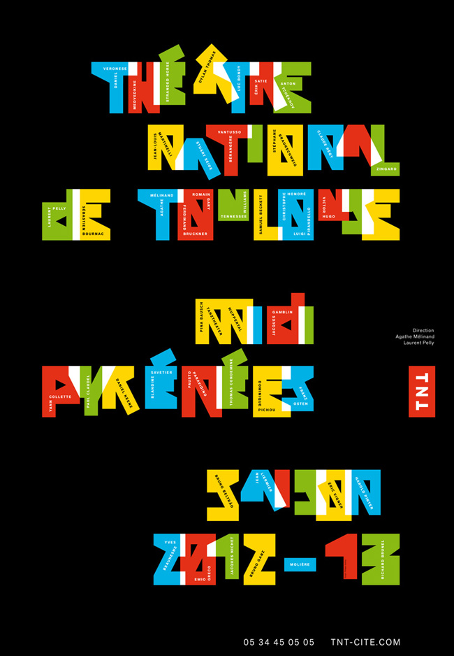
saison 2012–13
2012–13 season
client: TNT, théâtre national de toulouse
poster 120 x 176 cm.
2012
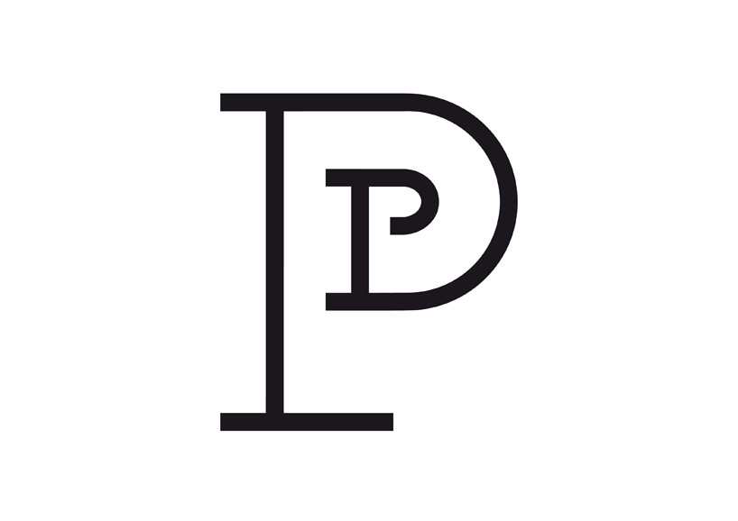 petit palais, musée des beaux-arts de la ville de paris logotype 2012
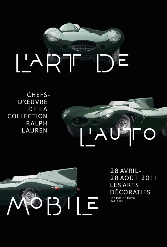 l’art de l’automobile chefs d’œuvre de la collection ralph lauren client: musée des arts décoratifs, paris poster 120 x 176 cm 2011
having designed many posters, how do you see the future of this medium in a time where people increasingly get their news from the screen? the electronic screen will replace the printed poster, no doubt.
maybe the screen itself will eventually de-materialize and images will float in the air. it is all fascinating to think about, but doesn’t have anything to do with my vision for posters. it is much more connected to motion graphic work, which I also do.
whatever the format—print or digital, I hope I will be able to retain my deep concentration on space, shape, typography, color, and form. strong design combines, or fuses, these elements to capture the public’s attention. creating a poster is about distilling a strong message within a condensed visual format… equivalent to writing an abstract or précis of a text.
what is the most important aspect of poster design for you and how do you try to achieve it? to articulate concept, message, aesthetic, emotion, and strength in a single image. the challenge is to be persuasive: like an actor who convinces the audience to suspend disbelief. he has to interpret his role so vividly that he and his character become one.
many of your projects use bespoke typography, do you prefer to use your own creations rather than existing typefaces? I do not refuse to use existing typefaces. I like simple, basic use of perfect type. letters should introduce a subtle, expressive element. they must also project analogies, or serve as metaphors, for technique, functionality, and art.
I did a ‘call for entries’ poster design for an annual design competition held by an organization in new york in 2007, for instance. I selected ‘akkurat’ a typeface designed in 2004 by laurenz brunner that I chose for its simplicity, perfection, and open connotations. my composition employed a grid of four equal columns into which the information about the event was set. the font itself, along with this democratic structure, enhanced the poster’s sense of order tremendously. it was a case in which the typeface’s clarity and eloquence fit perfectly with the subject, an annual event honoring the freshest and most creative new typographic solutions.
nevertheless, there is often a dichotomy between the logical problem of communicating directly to the consumer and emphasizing the experiential qualities of art or of an artist’s vision or universe. in the end, my decision—whether or not to use an official ‘house’ type or invent one of my own—depends on the expectations of the target audience (which can be quite diverse) and the goal of the design project.
creating a new font—or designing just those letters and characters needed for a particular poster—cannot be separated from the global work, or overall concept, of the poster design. sometimes, it is the type invention, with its hazardous experimentation, that carries the design process. this is because the type and typography mediate two communicative ends: universal legibility and the creation of a complex, refined visual solution.
are any of your typefaces available to buy? yes, nouvelle noire, a new swiss foundry, will market a series of ten of my original fonts. one, called ‘Abf,’ will be available in september 2012, the others in 2013 from www.nouvellenoire.ch.
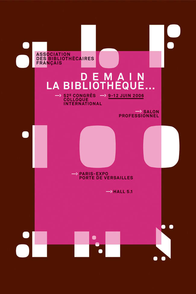 demain, la bibliothèque… tomorrow, the library 52nd congress for the french librarian association in paris client: abf, association des bibliothécaires de france poster 120 x 176 cm. 2006
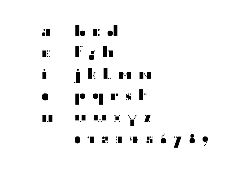
Abf Petit
typographie dessinée pour l’association des bibliothécaire de france
2006
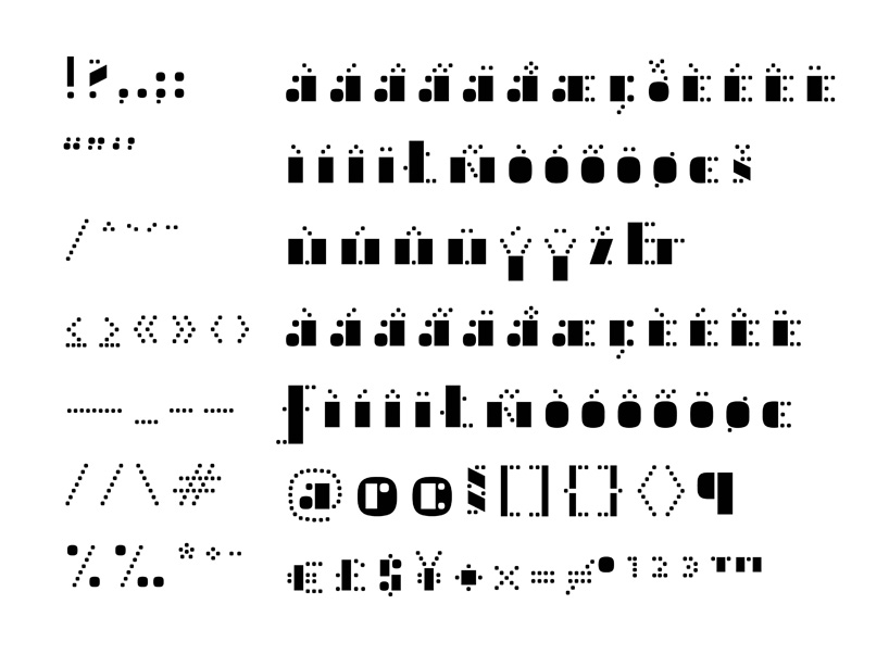
Abf Petit
typographie dessinée pour l’association des bibliothécaire de france
2006
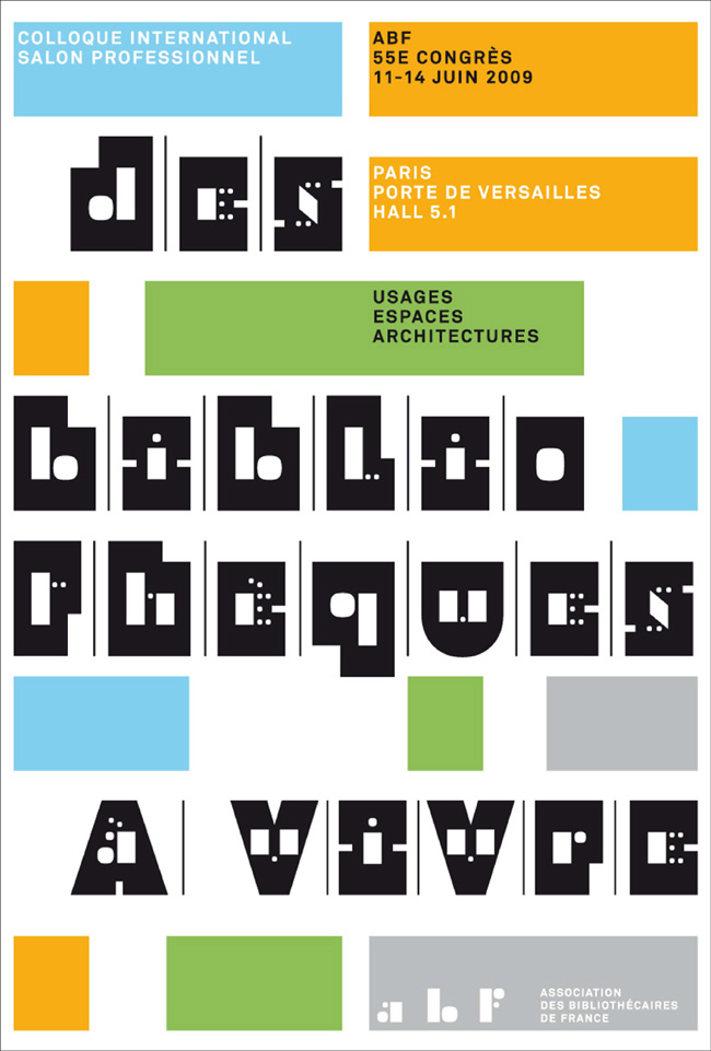
des bibliothèques à vivre…
libraries for living: uses, spaces and architecture
55th congress for the french librarian association in paris
client: abf, association des bibliothécaires de france
poster 120 x 176 cm.
2009
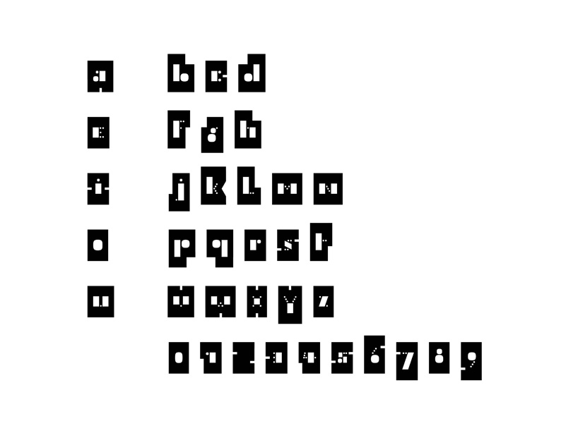
Abf Grand typographie dessinée pour l’association des bibliothécaire de france 2009
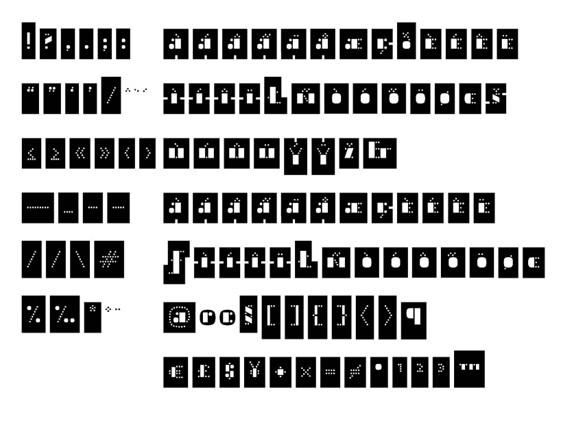
Abf Grand typographie dessinée pour l’association des bibliothécaire de france 2009 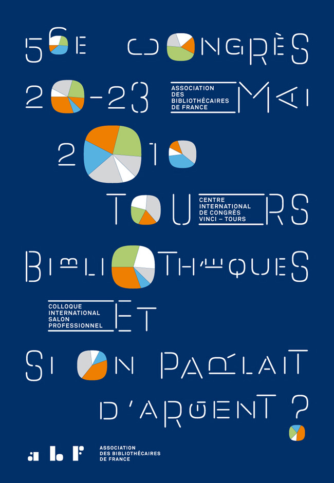
bibliothèques, et si on parlait d’argent?
libraries, and if we talk about money?
56th congress for the french librarian association in tours
client: abf, association des bibliothécaires de france
poster 120 x 176 cm.
2010
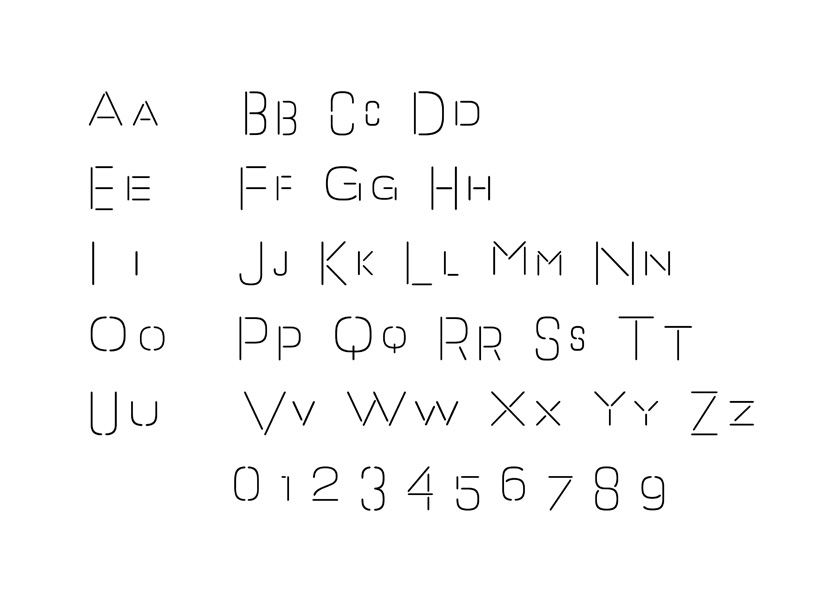
Abf Linéaire typographie dessinée pour l’association des bibliothécaire de france 2010
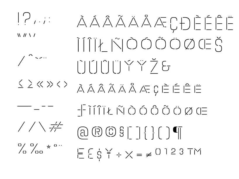 Abf Linéaire typographie dessinée pour l’association des bibliothécaire de france 2010
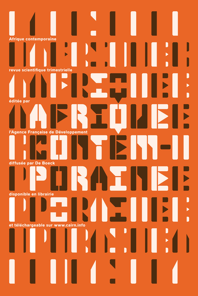
afrique contemporaine
contemporary africa
client: agence française de développement
poster 100 x 150 cm.
2010
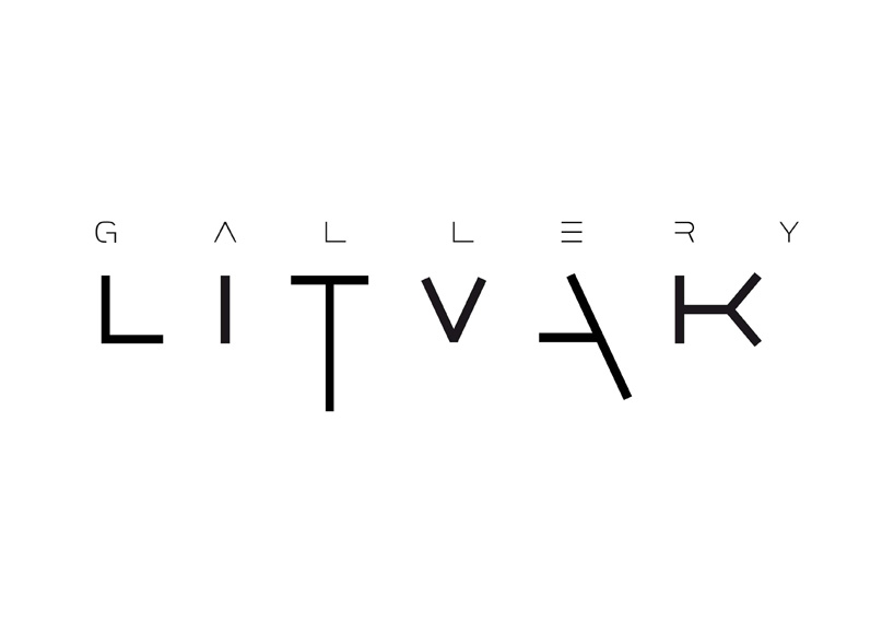
litvak gallery contemporary art gallery, tel-aviv logotype 2009
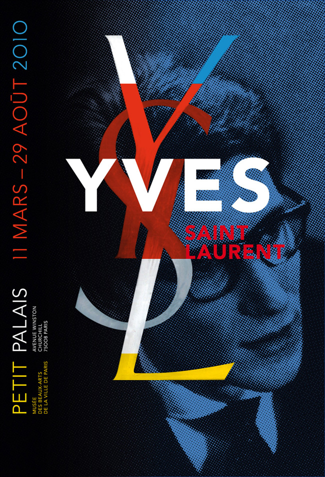
yves saint laurent retrospective exhibition client: petit palais paris musée poster 120 x 176 cm photography by boulat logotype designed by cassandre, 1961 2009
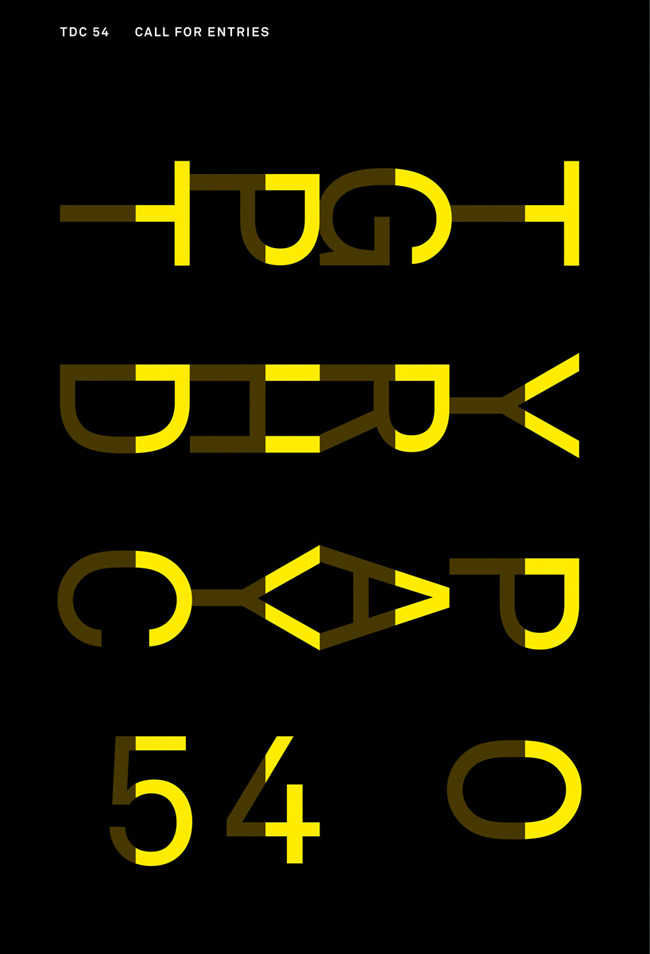 call for entries 54 client: type directors club new york poster 120 x 176 cm. 2007
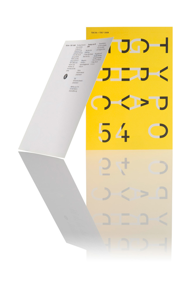 call for entries 54 client: type directors club new york card 100 x 150 mm. 2007
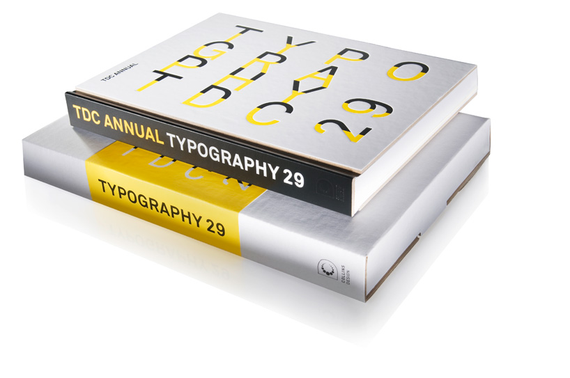 typography 29 TDC annual client: type directors club new york book 2007
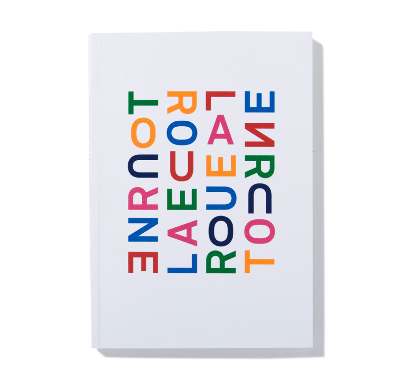 jean de gonet la roue tourne catalog 88 pages, 17,5 × 25 cm. 2011
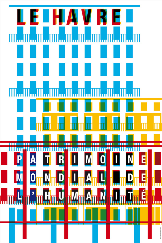
le havre patrimoine mondial de l’humanité poster, 118 x 175cm 2006
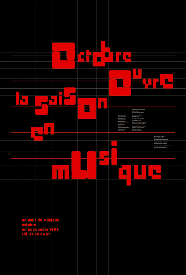 octobre ouvre la saison en musique octobre en normandie, rouen poster 118 x 175cm 1995
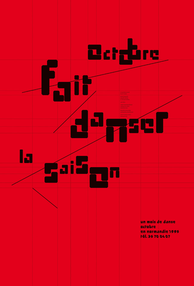 octobre fait danser la saison octobre en normandie, rouen poster,118 x 175cm 1995
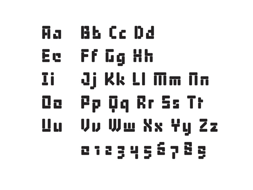 octobre typeface 2006
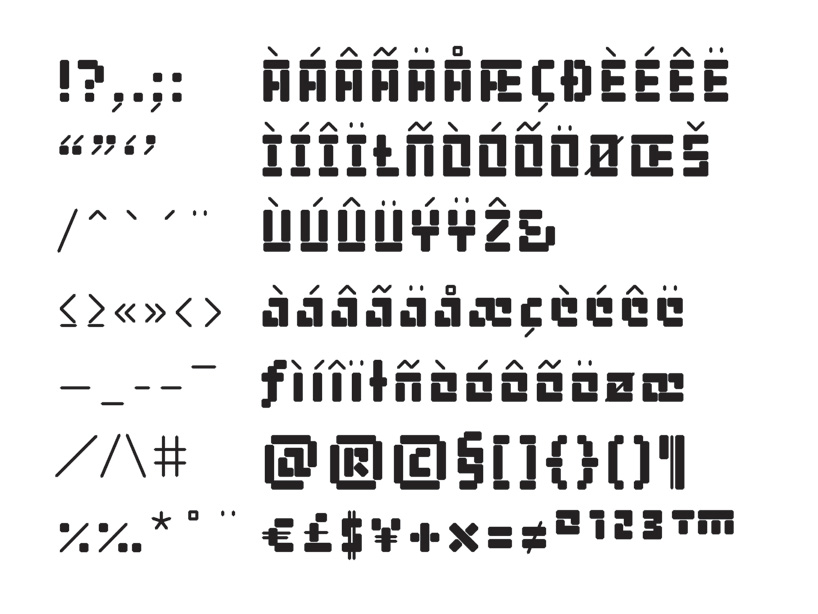 octobre typeface 2006
which project have you learned the most from? many projects are important, but one of my favorites was the poster I designed for the musée d’orsay’s inaugural exhibition in paris, titled chicago, birth of a metropolis, 1877–1922. I did it in 1987 when i was not yet 25 years old… I dream of a second chance at being so innocent!
what qualities do you look for in a new employee or intern? three talented young designers work with me right now: jean-charles bassenne, a graduate of the école régionale des beaux arts de besançon anna brugger, graduated from schüle für gestaltung in basel yannick james, a graduate of the école régionale des beaux arts de valence.
we’re in this together—managing the challenges of transforming clients’ needs into visual and emotional signs. i insist that my team be accurate in every step of the design process. we are always looking for new ways to express ideas through design and typographic form. once we decide on a vision for a project, which is often complex and always has an emotional component, we apply our individual skills and strengths towards completing that goal. and we do so according to standards of excellence that cannot be compromised.
what qualities do you try to teach a new employee or intern? to demonstrate intense curiosity. to have boundless ambition for creating new forms with typography, pushing the boundaries of the discipline and a non-stop hunger to achieve as well as to contribute.
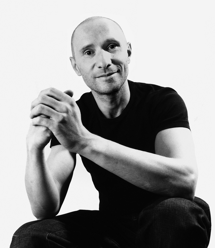
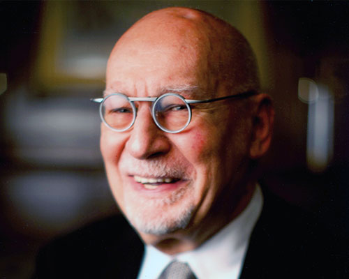
philippe apeloig
portrait © catherine rebois
courtesy of philippe apeloig
philippe apeloig philippe apeloig was educated at the école nationale supérieure des arts appliqués and the école nationale supérieure des arts décoratifs in paris. after graduating and spending two transformative internships at total design in amsterdam, where he realized the extent of his interest in typography and graphic design, he worked as a designer for musée d’orsay in paris from 1985 to 1987. in 1988, apeloig received a grant from the french foreign ministry and left musée d’orsay to work and study in los angeles with april greiman. later, from 1993 to 1994, he was honored with a research and residency grant at the villa medici in rome by the french academy of art.
after returning to paris from los angeles, apeloig established his own studio. he returned to the école nationale supérieure des arts décoratifs to teach typography from 1992 to 1999, and then became a full-time professor of graphic design at the cooper union school of art in new york city until 2002. from 2000 to 2003, he was curator at the herb lubalin center of design and typography at the cooper union school of art, where he organized the ‘graphic cooper’ lecture series and curated exhibitions.
apeloig has produced many acclaimed poster designs, such as ‘chicago’ for the musée d’orsay (1987), and for cultural events and institutions. he designed the annual poster and publication for the new york type directors club, and the corporate identity of the FIAF (french institute / alliance francaise) in new york, where he is art director. he won logo competitions for the instituto universitario di architectura di venezia (iuav) in 2002, les musées de france in 2005, and the châtelet — the musical theater of the city of paris – in 2006.
in 1997 apeloig became a design consultant at musée du louvre, and was its art director until 2008. he developed the visual identity for the recent exhibition about yves saint laurent at the petit palais, for ‘l’art de l’automobile — masterpieces from the ralph lauren collection’ at les arts décoratifs in paris and for ‘type in motion’ at the museum für gestaltung in zürich. in 2011 he was invited by london’s design museum to contribute to a set of limited edition posters celebrating the work of wim crouwel.
apeloig has been a member of the alliance graphique internationale (AGI) since 1997.
![]()
DESIGN-AEROBICS – GRAPHIC DESIGN 2012 ONLINE COURSE
GRAPHIC DESIGN 2012
duration may 17 – july 17, 2012 we will still accept late comers for enrollment until june 15, 2012
make graphic design work for you. with this course you’ll enhance your understanding of the basics and learn more about current and emerging developments within the field.
• brush up on the basics of graphic design such as composition, color, typography and representation • further your knowledge of print and on-screen applications • gain practical knowledge that you can apply to real-world problems • have the opportunity to enhance your portfolio by developing several design projects related to the theme • our instructors will help you verify your ideas so you can optimize them as much as possible during the course • you also have the opportunity to share your work with other participants on the course
graphic studio interviews (193)
logo design (246)
philippe apeloig (3)
PRODUCT LIBRARY
a diverse digital database that acts as a valuable guide in gaining insight and information about a product directly from the manufacturer, and serves as a rich reference point in developing a project or scheme.

