google releases new roboto typeface family for the future of screens
all images courtesy google


along with the material design guidelines, developers at google have released a new version of the roboto type family. changes to the font include tuning to work across more screen sizes and conditions, from watches to desktops, televisions to cars. nearly every glyph from the typeface has been tweaked and updated in some way.


‘we see roboto as an evolving type family and plan to continue to change and update it as the system evolves,’ explains googler louis gray. ‘it used to be that a type family was designed once and then used without change for many years. sometimes an updated version was released with a new name, sometimes by appending a ‘neue’ or ‘new’. the old model for releasing metal typefaces doesn’t make sense for an operating system that is constantly improving. as the system evolves over time, the type should evolve along with it.’

google releases new roboto typeface family for the future of screens


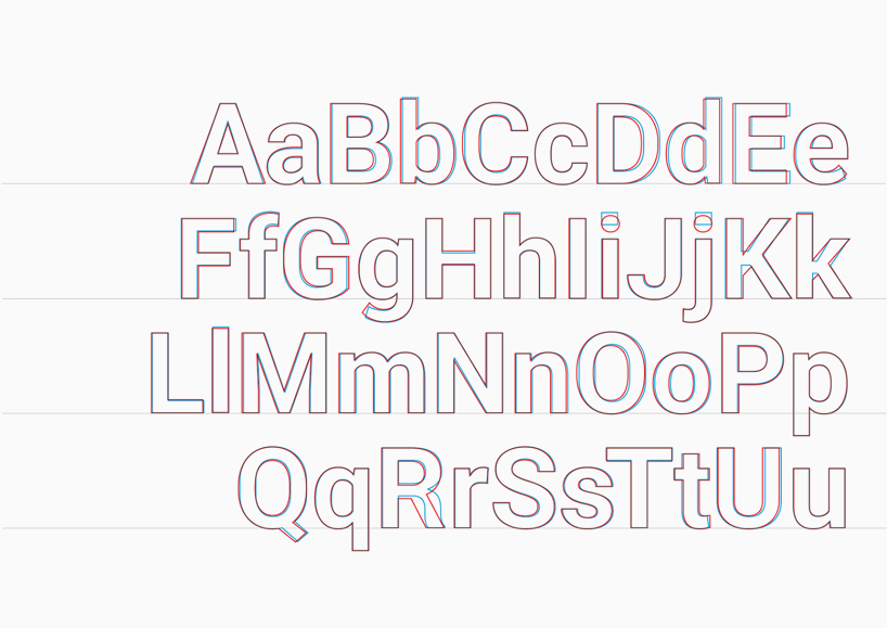
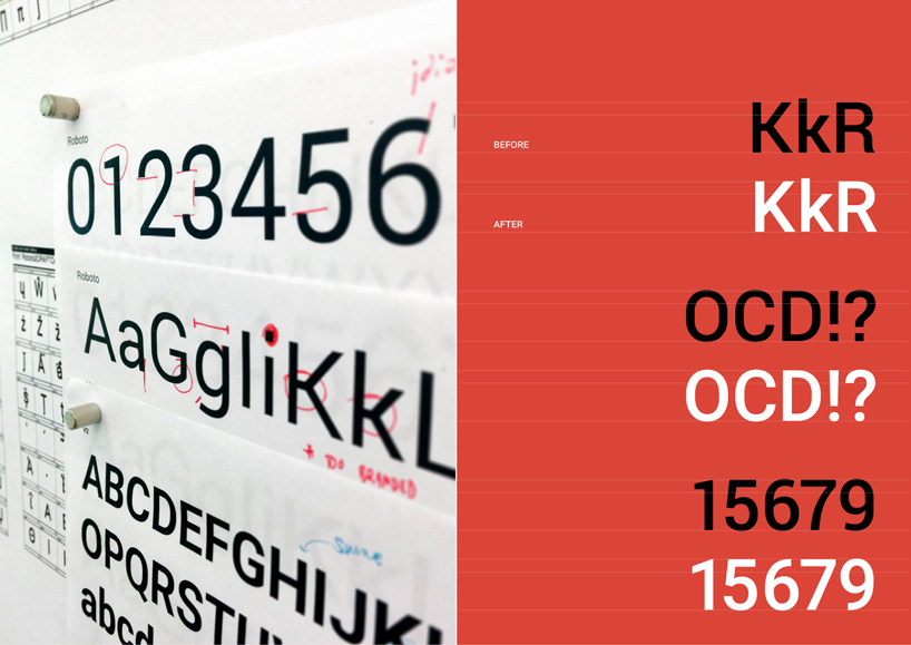
letters such as the R and K have been completely redrawn. dots on the letter i or in the punctuation have been rounded out to make them feel more friendly when visualized from close-up. the sides of the upper case characters like O and C have also been rounded out which makes the font feel less condensed even though it still has a high character count per line. some of the most significant changes are in the rhythm and spacing, especially for the caps, which makes for a better texture on the screen. some of the more subtle fixes balance the weight between the caps and lowercase characters and better correction for the distortions that occur in the obliqued italic characters.

google releases new roboto typeface family for the future of screens


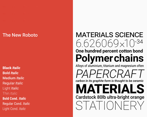
the updated framework offers the new roboto type in thin, light, regular, medium, bold and black weights, along with an italic style for each weight. the framework also offers the roboto condensed variant in light, regular and bold weights, along with an italic style for each weight.