moving brands worked with cambridge design partnership (CDP) to distill its internal culture, articulate its unique story, and communicate its offer through a visual identity and touch points that would cultivate trust from global players and support growth in new markets.


cambridge design partnership creates ‘first of a kind’ product innovation to fuel its clients’ success in consumer, healthcare, energy and industrial markets. passionate, human and open, CDP has a powerful offer and well-aligned culture. however, as it targeted larger, more global clients, and opened its first us office in palo alto, it became clear that the existing ten-year-old brand no longer reflected its ambition or ability.


following text from moving brands


both moving brands and CDP operate simultaneously in the worlds of design and technology. it was from this common ground that a particularly creative partnership emerged. we recognized that CDP’s ability to stretch across design and science spectrum was unique, powerful, and would differentiate it as it grew.


workshops with people across the whole business proved they knew their own strengths, and client interviews supported these findings: CDP was valued as an innovation partner that could combine technology with design, ensuring products and services were created with real human needs at their core.


MovingBrands_CDP_Story_02
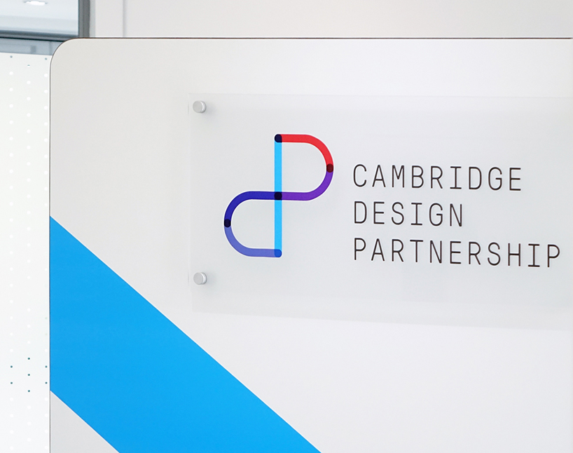
new CDP logo


however, the existing business story ‘think differently’ – although genuine – was almost a replica of apple’s ‘think different,’ an irony that worked directly against communicating its truly innovative approach. we redefined the brand story as ‘potential realized,’ precisely encapsulating the company’s purpose and its ability, through innovation, to realize potential for its clients.


the name and visual identity should capitalize on links to cambridge as a world-leading technology centre, while ensuring it was not perceived as provincial. we retained the name cambridge design partnership as it anchored the business to positive perceptions, but we knew its length would present challenges across applications. we created a symbol to work alongside the wordmark, which in time could be used exclusively to represent the business in all markets. 


MovingBrands_CDP_Story_03
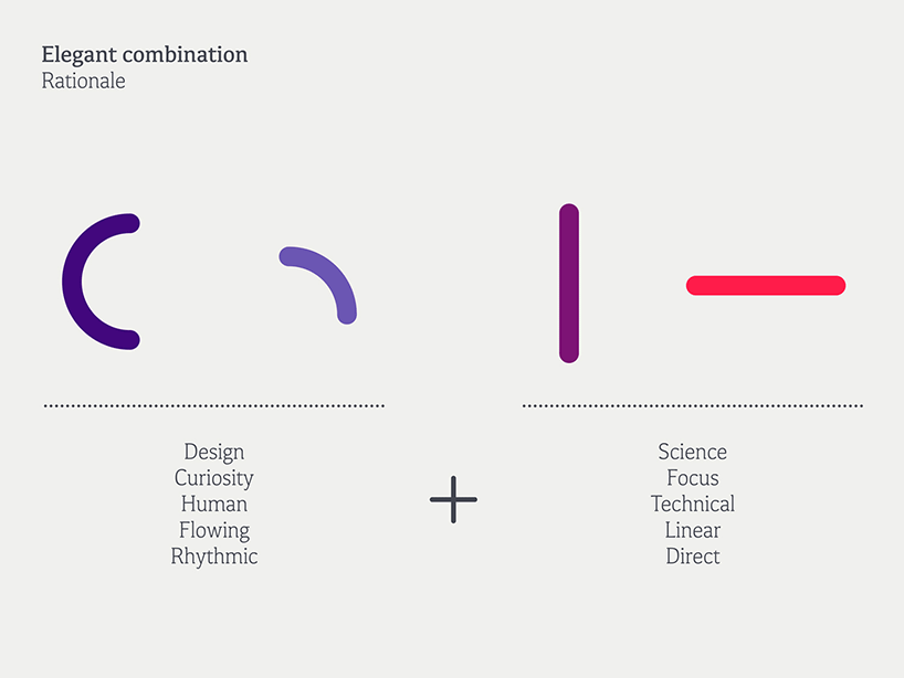
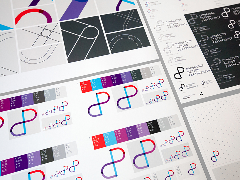
anatomy of the new mark


this symbol and accompanying visual identity system flowed from tensions inherent in the business: between design + science, curiosity + focus, technical + human. a combination of straight and curved components form a mark that feels both engineered yet human.


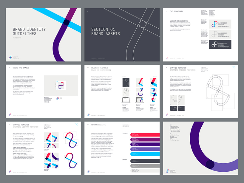
graphic textures are created by rotating and cropping this symbol, to create a range of expressions, from measured and precise to vibrant and expressive. pressura mono is used to deliver prominent information, supported by kefa II pro, a more human typeface, when delivering long passages of text or quotes.


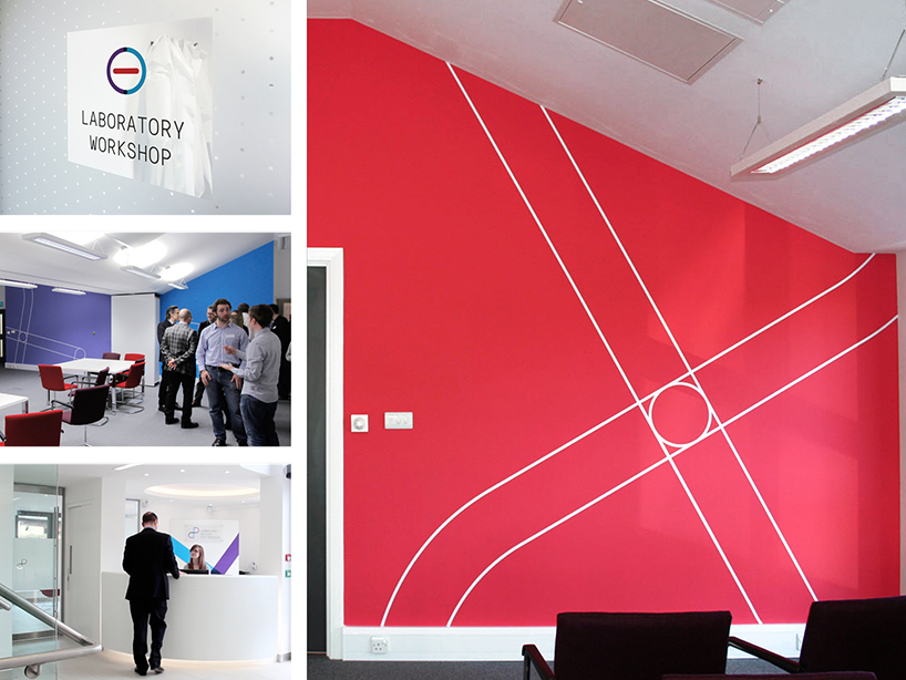
the rebrand coincided with the opening of state of the art facilities, where the identity has been boldly employed: from feature walls in conference rooms to charming way-finding iconography. the new brand has been embraced enthusiastically by all levels of the business. it successfully crystallizes CDP’s powerful offer and vision to support its on-going growth.


MovingBrands_CDP_Story_04
explorations of the branding


MovingBrands_CDP_Story_05
logo and colorways


MovingBrands_CDP_Story_06
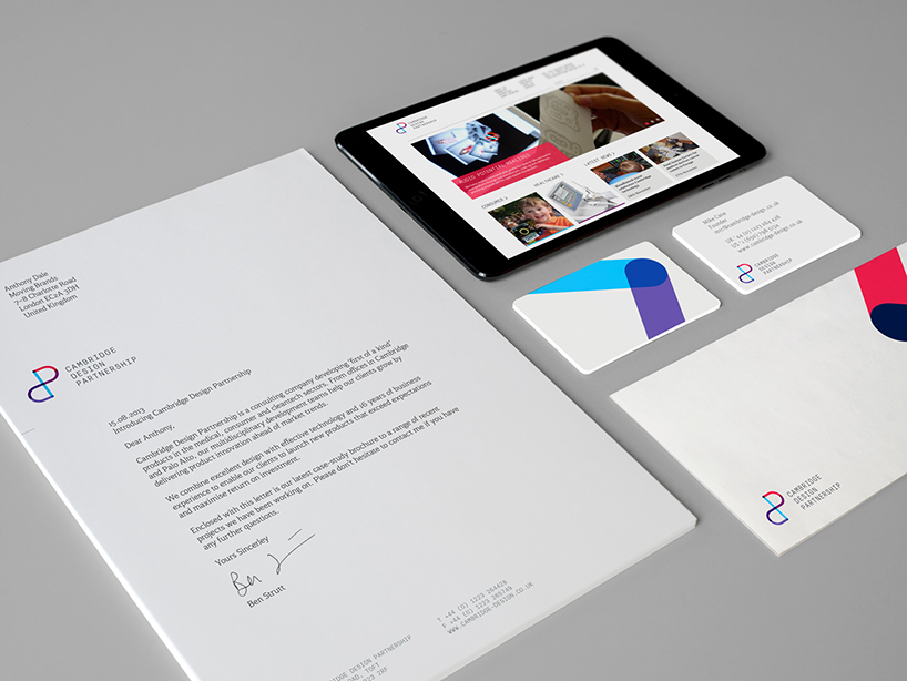
stationery


MovingBrands_CDP_Story_07
signage


MovingBrands_CDP_Story_08
signage and environmental graphics


MovingBrands_CDP_Story_09
three-dimensional application of the new CDP logo


more
read our interview with moving brands co-founder james bull »