‘stairway to heaven’ by studio bertjan pot
the FRAME moooi award 2012 is hosted by dutch furniture company moooi in collaboration with FRAME magazine. it’s the year’s biggest inaugural interior design award and will be concluded in milan during april’s salone del mobile fair.
the award celebrates the 10 years of production and exhibition activities of renowned design brand moooi. designboom has been the exclusive online media partner and a whopping 891 submissions were received by designers in 79 countries. the final winner will be granted with the €25,000 grand prize. participants were responding to the brief which asked designers and architects to submit interior space design along with furniture and lighting objects that were custom-developed in a worldwide context.
the contest has been judged by french designer philippe starck, he selected the shortlist with an anonymous approach, in that he didn’t know the designers’ names or countries of origins. ‘I’m often invited to judge competitions,’ he says. ‘I’m happy to say that the level of this one is clearly higher than average, a very nice surprise.’ the designs and their creators will be featured in the may/june issue of FRAME magazine.
the top ten shortlisted entries have now been selected. the overall winner will be revealed only on wednesday, april 18th, during milan design week 2012, at the FRAME moooi award ceremony and party at magazzini generali venue in via pietrasanta 16, milan (by invitation only). a press preview will take place from 7:00 p.m. to 8:00 p.m., with the ceremony and party set to commence at 9:30 p.m.
the 10 finalists will be presented by designer marcel wanders, and philippe starck will be present on hand to celebrate the top prize. the party is themed celebration to LIGHT! and presents a special installation by artist daniel wurtzel and will be hosted by michele caniato (president, culture & commerce).
here is sneak preview of the shortlist:
the finalists are: – ray – integrated ceiling light for an office, by shl design (denmark) – what’s in your locker? – locker system for a school, by lab 3 (netherlands) – caelum – LED table lamp for a bar, by pablo martinez diez (spain) – kroon – chandelier for an office and apartment building, by ZMIK (switzerland) – shoe box – display system for a sneaker shop, by facet studio (australia) – mist of arch – furniture for public toilet in a department store, by keiko + manabu (japan) – sketch – display for a fashion shop, by ypsilon tasarım, yesim bakırküre (turkey) – stairway to heaven – pendant light for a theater café, by bertjan pot (netherlands) – education trestles and easels – educational table system for an art museum, by studio makkink & bey (netherlands) – decanterlight – pendant light for a bar, by lee broom (UK)
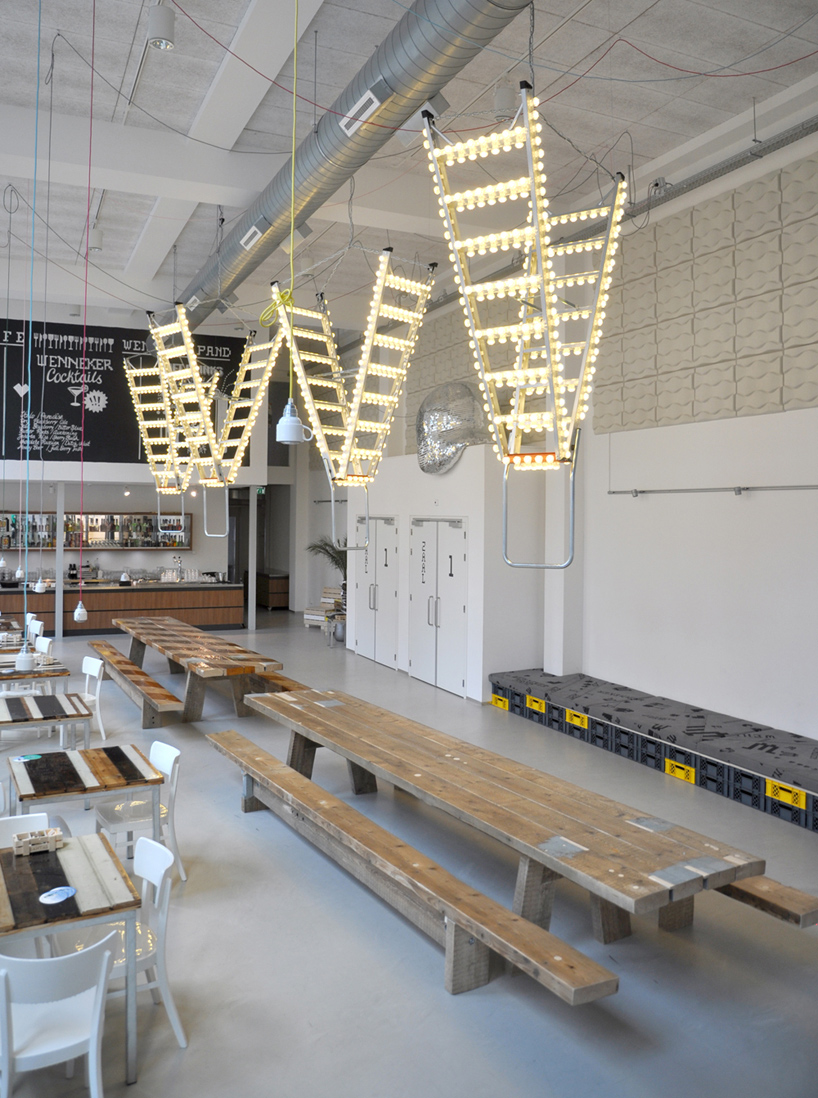 8-step ladders are equipped with 308 multi LED-bults resulting in a hanging lighting object
a safety-ladder lit with carnival lights hanging from the ceiling, ‘stairway to heaven’ conceived by dutch designer bertjan pot is not exactly what you may consider ‘practical’. though the final form may not seem to be overly functional, the choices made during the design process are. as pot explains, ‘it all started with a new safety ladder we ordered for the studio and carnival lights we used for a different project. when they arrived it suddenly seemed like the perfect illogical combination to make. rawness and glitter. ‘stairway to heaven’ became a brilliant and attractive object, there to illuminate an industrial theater-café in schiedam, the wennekerpand. former distillery wenneker is considered to be the new temple of culture of schiedam giving home to a cinema, theatre, centre for visual arts, dance studio and grand café wenneker.’
each heavy duty anodized 8-step ladder is equipped with 308 multi LED-lights , the lighting piece hung upside down by a steel chain. the overall dimensions of the piece are L270 x D 145 x W60cm and weights +/- 15kg.
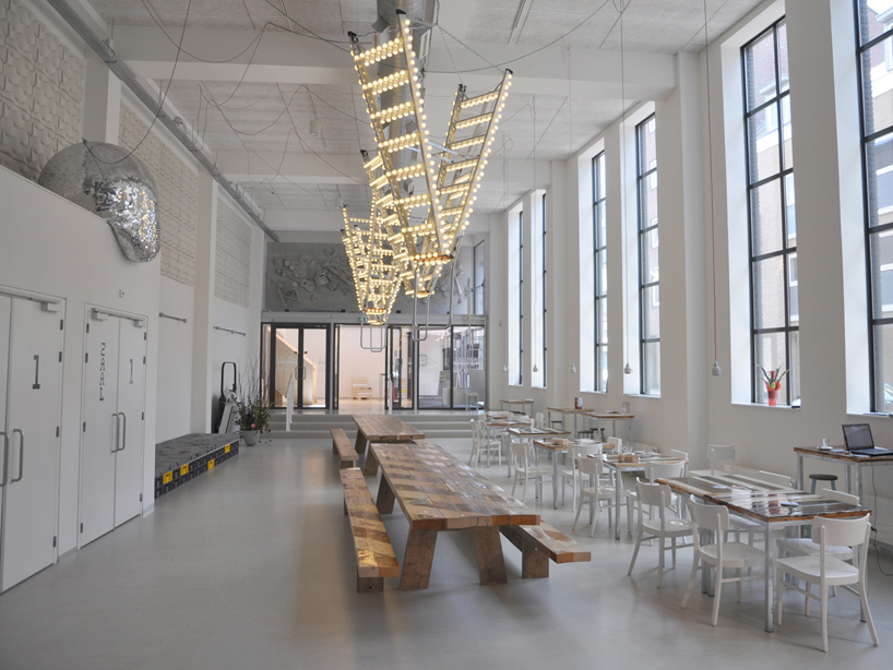 installation view of ‘stairway to heaven’ at wennekerpand / grand café wenneker—
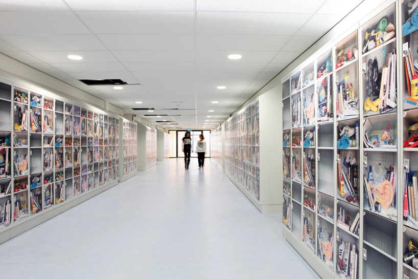 ‘what’s in your locker?’ by lab3
for the newly built school baarnsch lyceum in the netherlands, dutch studio lab3 created prints for 489 (out of 689) lockers within the learning institution, covering the storage units’ exteriors as a means of enlivening the stark hallways.
the designers came up with seven different prints, exhibiting what students might have stashed within their lockers, ranging from text books, to an artificial ear, food, to a bottle of glue, to even completely empty compartments, indicating no use at all. in developing the images, keywords which came up were: curiosity, humour, sports and culture… the school’s management heavily censored the displayed items stating no condoms or energy drinks were allowed to be shown. sublimax, a new way of sublimation printing, whereby the images were scanned and printed seamlessly onto the 1mm varnished steel, was used for production, the result being a hallway that is anything but dull.
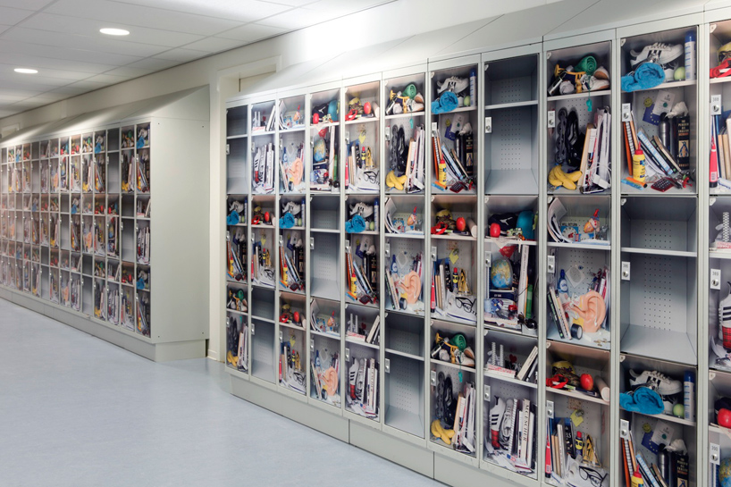 the exteriors of the school’s lockers were covered in seven different prints exhibiting what students might have stashed within their storage space
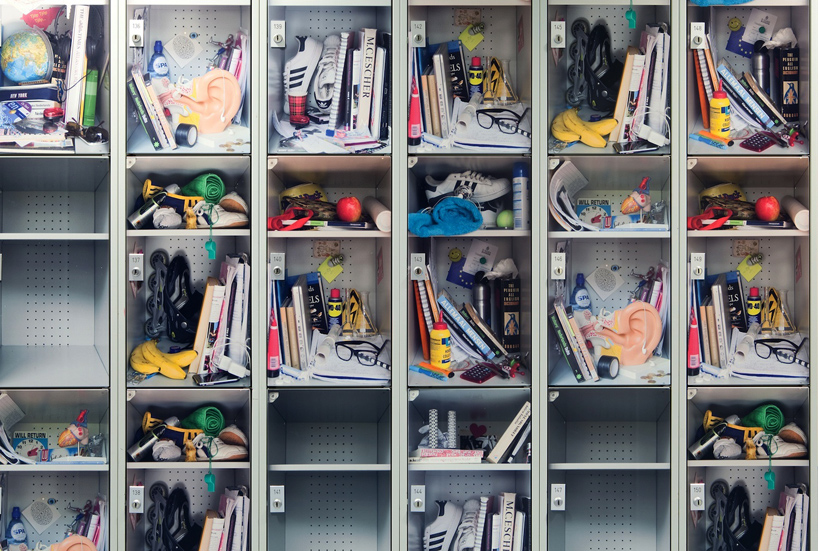 food, textbooks, shoes, glasses etc., can all be found within
—
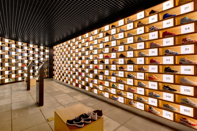 ‘shoebox’ for sneakerology by facet studio
australian design firm facet studio was asked by local footwear shop sneakerology to develop a retail concept in which to display the store’s products. the overall composition of the installation is composed of 200 x 600 mm, 18mm plywood ‘shoeboxes’ which are repeated and offset by half unit on each level. this method is carried through the entire wall, over 281 times, creating a euphoric effect. the merchandise is neatly presented within each cubby, similar in fashion to that of museum artifacts. each individual, box is accompanied by a 200 x 200 mm translucent numbered cube housing a light as a means of illuminating the individual shoe it is displaying. one by one, the shoeboxes are stacked to enclose the shop, simultaneously providing an exhibition of the merchandise, ambient light and spatial definition. the repetition creates a porous interface between the shop and the mall in which it is located, showing a combination of light emitting from the individual shoeboxes projecting a strong sense of presence to the people walking by. the individual units are standardized components, prefabricated off-site to control the quality and speed of production. they can be transported and assembled on sit, similarly to stacking standardized bricks to correspond with different site geometry.
touch panels are centrally located within the shop, one can gain further understanding of the merchandise’s background stories.
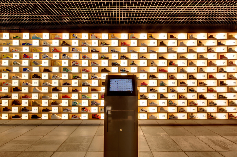 touch panels are located within the shop, providing details about the footwear
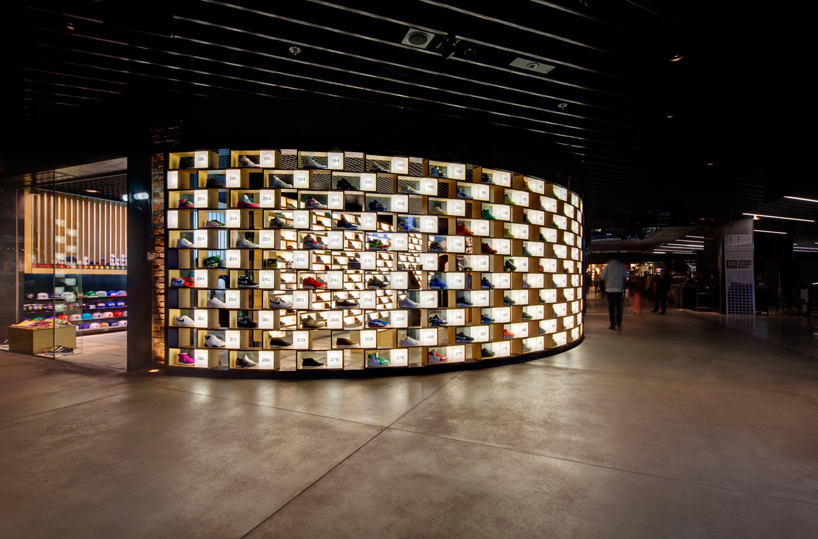 exterior view of sneakerology
—
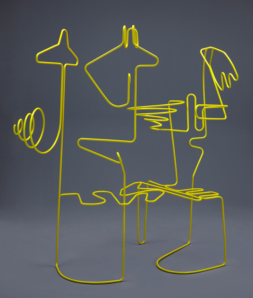 ‘sketch’ bilstore / doodle display by ypsilon tsarim + bakırküre
the basic idea of turkish brand bilstore‘s displays, is a sketch implying the process of a linear search from the beginning to the final function of a clothes hanger. developed by turkish designer ypsilon tasarim and yeşim bakırküre, the unit allows the user to become involved in a creative process while arranging clothes on the vertical hanger. within each of their shops bilstore uses a different unique sketch for its display. the overall design is made from powdered coated steal tubing, finished with glossy paint, and measures 120 x 80 x 180 cm and 100 x 70 x 160 cm.
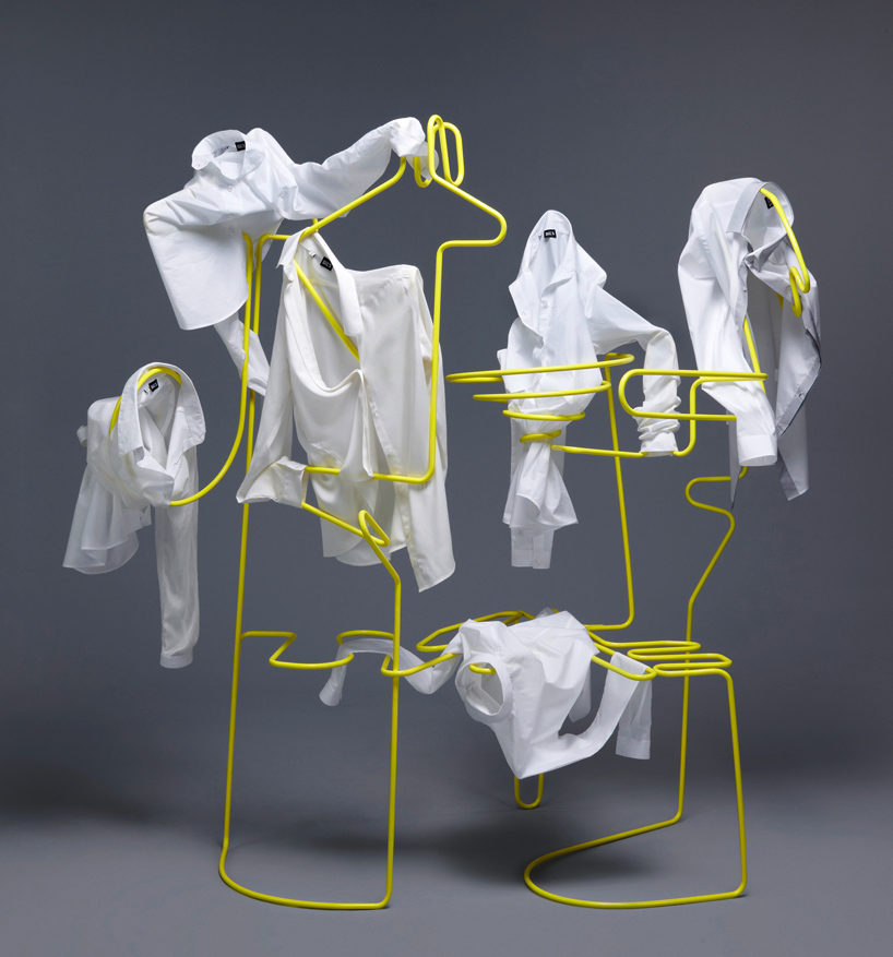 users get involved in the creative process when hanging the clothes onto the display
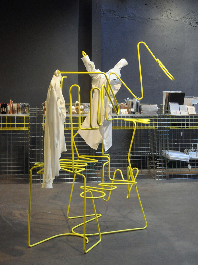 in use within a bilstore shop
—
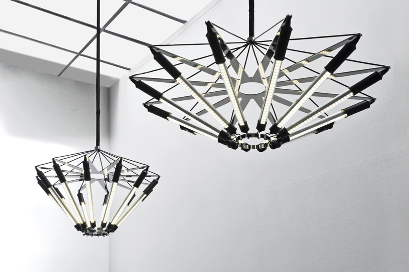 ‘kroon’ by ZMIK
‘kroon’ by swiss studio ZMIK is designed to combine the elegance of an art déco chandelier with a smart contemporary design using standard working lights and polished chrome steel elements. the lamps are tied into an opulent chandelier using a star and two rings which bundle and stretch the lights. equipped with LED-strips, the rough and cheap industrial product contrasts with the high-end polished metallic elements. this refines the overall design and creates a more brilliant expression which is mirrored and multiplied within the polished star form. ‘kroon’ exists in two different shapes and measures either: 1080 x 1080 x 600 mm or 820 x 820 x 800 mm.
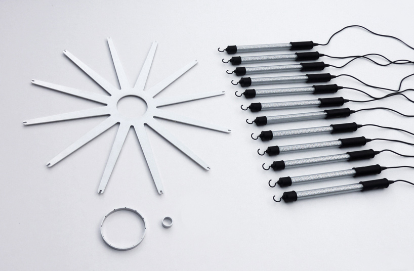 unassembled ‘kroon’ components
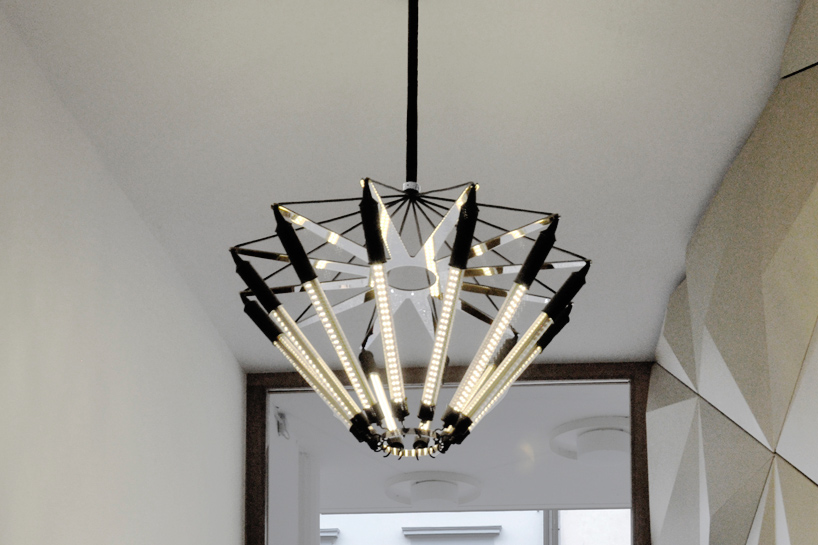 ‘kroon’ has been designed for use in public spaces
—
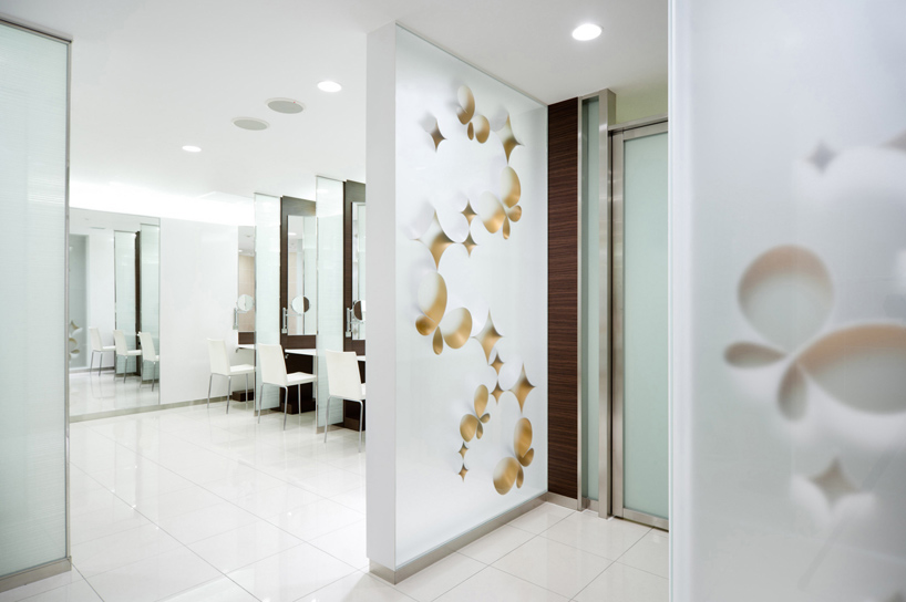 ‘mist of arch’ by keiko + manabu
for japanese department store seibu, keiko + manabu studio developed six seating areas located at the retail spaces escalator circulations along with recently renovated powder rooms and restrooms that welcome customers to have pleasant time while shopping.
within the restroom entrances, custom illuminated walls act as a focal point whereby LED wash lights are placed within making the structural components light fixtures in and of themselves. various tubular shapes made with white acrylic sheets with gold metallic interiors are mounted diagonally between semi-transparent plants at a 45 degree angle. this single tilt gives the sense that the depth to the wall and each shape is gradually fading into a misty haze.
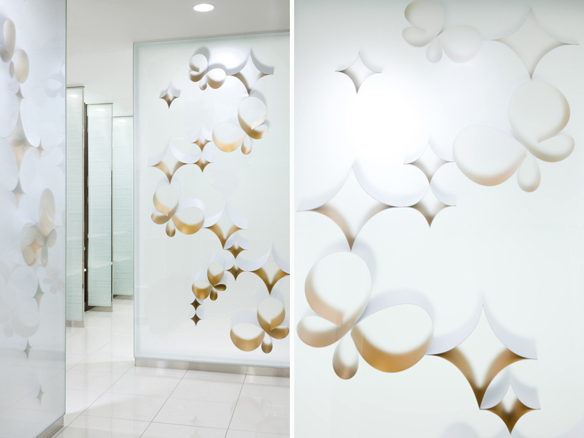 illuminated walls within the department store’s restrooms
seating benches, each 1800 x 800 x 380 cm are situated by the store’s escalators and act as a meeting place for families. designed to be low-maintenance, each unit is made from a new acrylic material called ‘half-clear’ which has a strong finishing surface with an eggshell texture selected for the actual seating surface. curvy motifs which consist of combinations of flower-, heart-, butterfly- and star-shapes are arranged like a field of flowers, providing aesthetic balance as well as support to the structures. combinations of flower-, heart-, butterfly- and star-shaped stools are arranged like a field of flowers. each floor is identified by a unique color and the motifs responding to the characteristics of the levels such as women’s fashion, men’s fashion, and high-end brand shops.
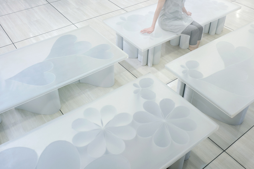 bench seating which is supported by whimsical structures shaped as flowers, butterflies, hearts…
—
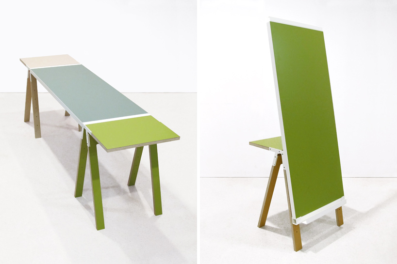 ‘3262 education trestles boijmans’ by studio makkink + bey
in addition to a previous interior design for the boijmans van beuningen museum, dutch studio makkink + bey have designed small trestle tables to join with other tabletops to make a work surface with any desired length or composition. previously, they had designed a group of specialized display tables for the educational space in museum: a combination of a metal table and a transparent showcase to display the institution’s collection. the first series are showcases, whereas the second are trestle tables that are more practical in nature and primarily complement the organization of workshops and studio sessions. the design is developed from the form of a basic trestle and is in fact an extended one that is wide enough to be a table. two trestle tables can be joined with a larger tabletop to form an even longer one. other than being used as desk, it can be arragned as a vertically or horizontally placed easel. depending on theplacement, one or two children can sit and work at one station. the metal ridge that is used to join tabletops, can also act as a pencil or utensil holder. the initial trestle construction has resulted in versatile furniture that allows for different arrangements and uses. the loose table tops, available in various color ways, can be disassembled and stacked on top of an organizing system. this was also designed for the museum and allows the staff to add or remove tables at their convenience. instead of looking redundant, the colorful tabletops still add something to the space with their presence when they’re stacked up.
criteria demanded the tables to be lightweight, easy to store, easy to maintain and to produce at a reasonable price. the design features high pressure laminate (HPL) tabletops and legs in various colorways and varnished metal ridges with a welded spindle. trestle tables measure: L60 x W40 x H75 cm and trestle easels: L60 x W120 x H75 cm.
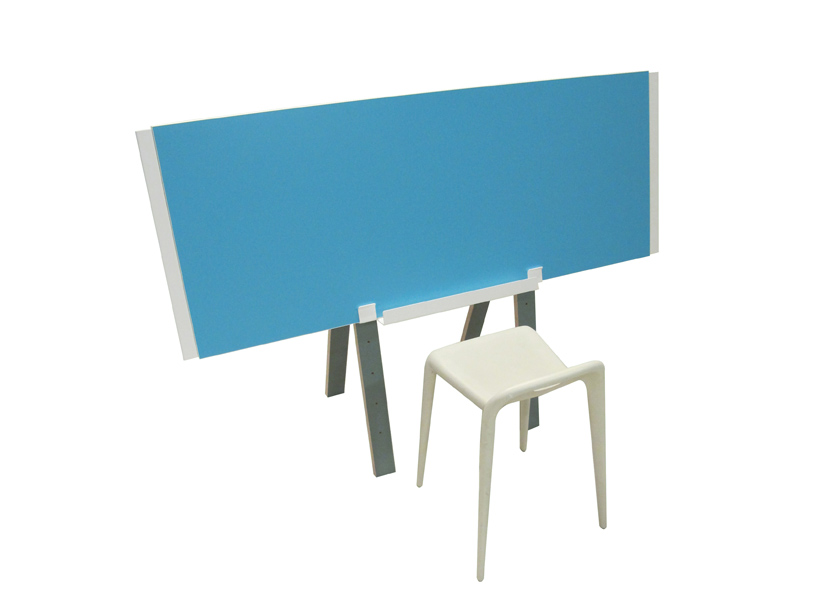 the trestle functioning as an easel
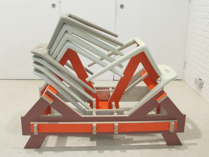 stacking system
—
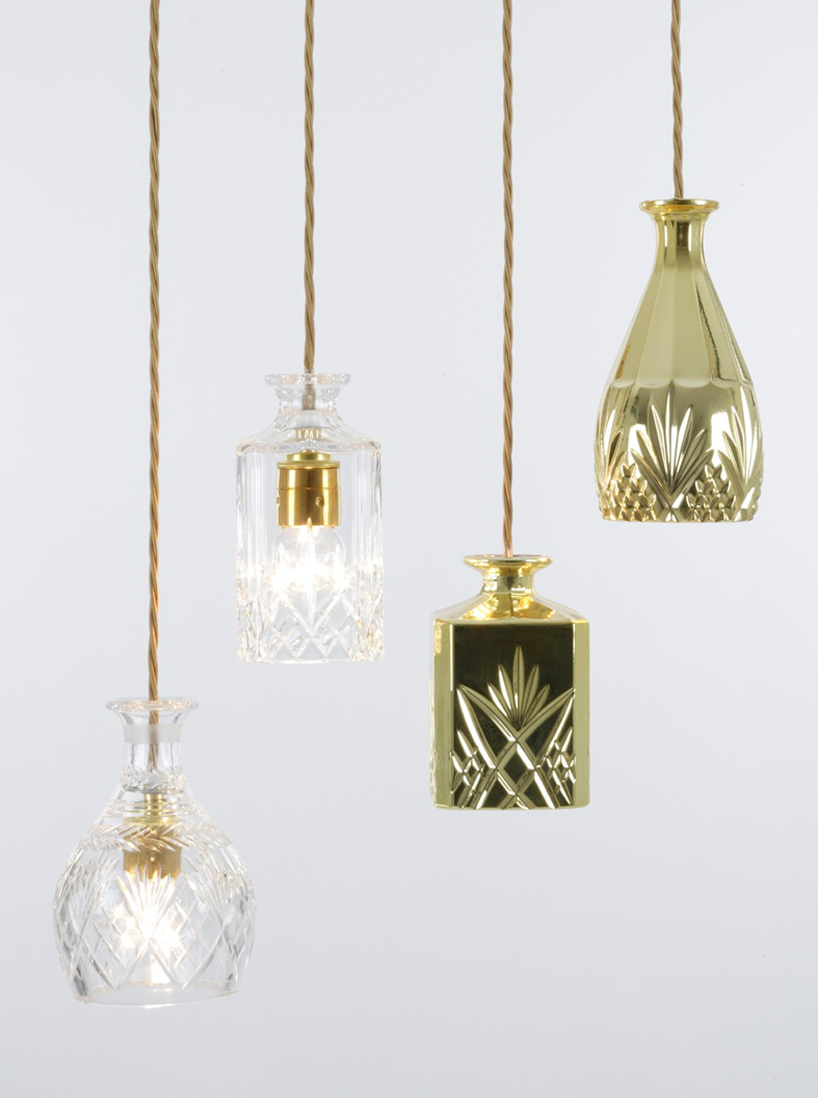 ‘decanterlight’ by lee broom
the ‘decanterlight’ was designed by british creative lee broom for installation at london’s coquine bar. in keeping with the venue’s heritage, the lighting object mixes together their familiar styles of traditional and contemporary design. developed as an alternative light fixture to a traditional chandelier, they glow in clusters creating an eye-catching centerpiece wherever they are hung and are perfect for a bar or restaurant. the lights are up-cycled from vintage crystal drinks decanters, making a new use of something that has always been aesthetically beautiful, but is now rarely used. they are available in a clear or hand metalized in a gold finish and are available in a bell or square shape. however, due to the vintage nature of the decanter, each one is unique.
the lights are up-cycled from vintage crystal drinks decanters. they are available in a clear or hand metalized in a gold finish and are available in a bell or square shape, however due to the vintage nature of the decanter each one is unique.
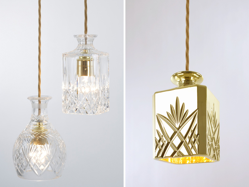 the lights are made from vintage decanters
—
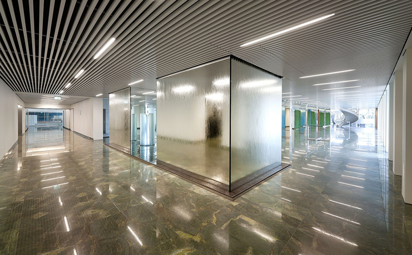 ‘danfoss head office’ by shldesign photo by adam mørk
danish SHL design has conceived a subtle and extremely minimal design created to fully integrate in the interior space of the danfoss head office in aarhus, denmark. the light fixture ‘ray’ has been especially developed for a classic lamella ceiling system. the lamp blends into the simple geometry of the architectural component and is only visible when turned on. by using the exact sectional geometry of the lamella, and by designing every detail and function as a fully integrated and hidden part of the fixture, the ceiling and fitting merge as one.
the light integrates with the ceiling system in perfect balance and can be used in either very strictly or arranged in more playful patterns; wherever you have lamellas, ‘ray’ can be placed. the fine faceted screen covering the illuminated source distributes the light both efficiently and effectively. when shut off, the fitting appears the same colour as the lamella, leaving the fixture almost invisible in the ceiling and thereby to create a visually clean and uninterrupted surface.
‘ray’ has been developed for the most common ceiling types luxalon, dampa and triplan ceilings. it is available in 3 different lengths, with light apertures of 570, 1170 and 1470 m respectively, determined by the T5 tubular fluorescent lamp source in 14, 28 and 35 watts. the ballast, which is 420 mm long, is hidden in the adjacent ceiling profile.
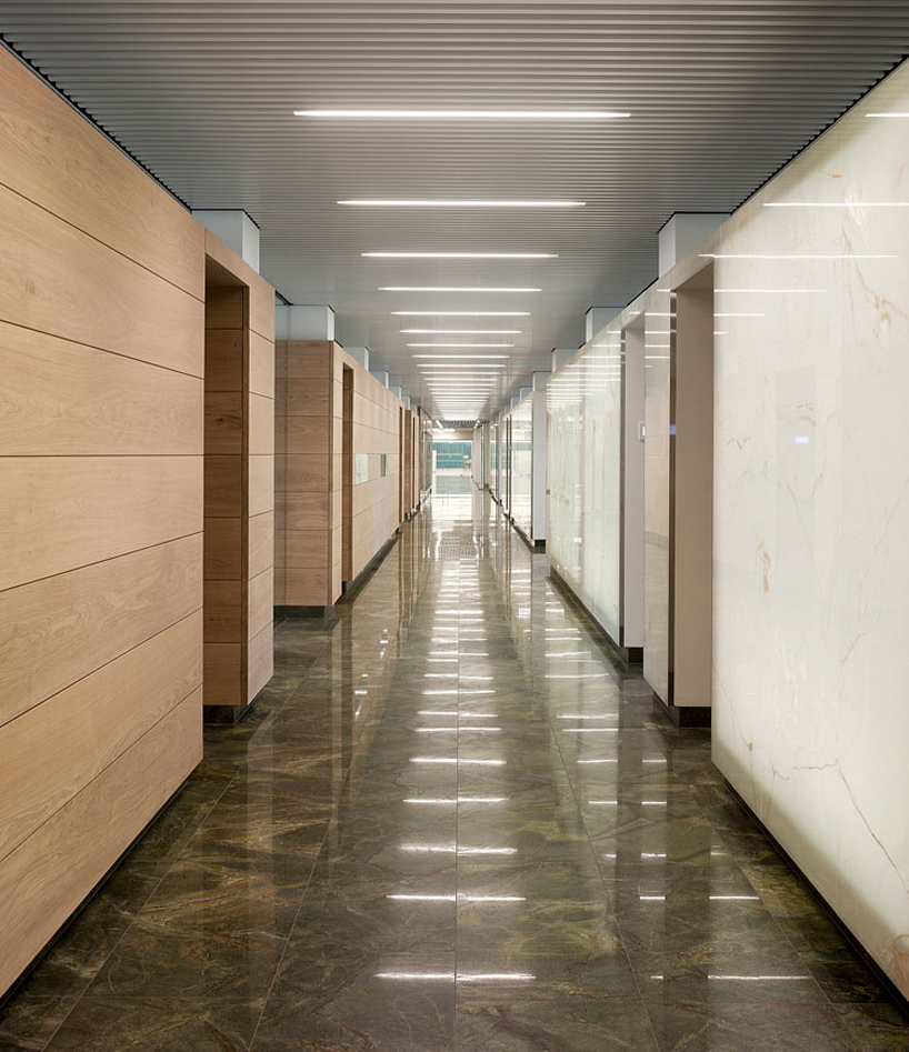 ‘ray’ lamps seamlessly situated within the lamellas of the office building’s ceilings photo by adam mørk
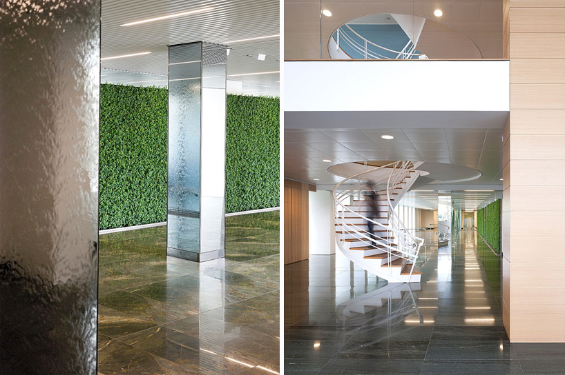 ‘danfoss head office’ photo by adam mørk
—
 ‘caelum’ by pablo martinez diez
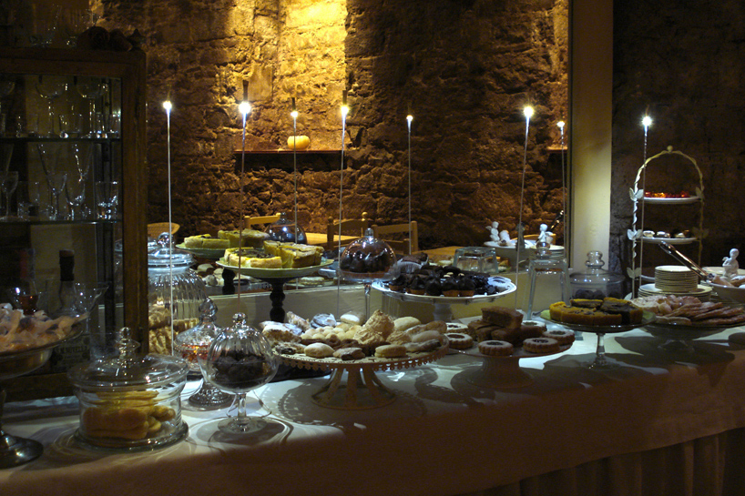
‘caelum’ is a little bar placed at the basement of a sweets shop, where man can taste artisanal cookies, cakes and the architectural feeling of spanish monasteries. designed by pablo martinez diez, there’s a dark atmosphere with only warm lights from the candles of the tables and lamps sited at the ventilation holes of the ceiling. the client asked the spanish designer to light the large central table with the sweets, avoiding heat. the idea was to use little points of cool light (cool for the touch and cool in kelvins) – suspended from the ceiling, but resting on the table where is possible to access to to a plug. LED lights are attached to a large and thin stick resting on the table with a curvature at his end. each delicate structure is made with 3mm wire inox, copper coated to feed the LED lamps at his end, all the covered with white heat-shrinkable tubing. the lamp is a group of three 3mm cree LEDs of 4000ºk, covered with cylinder finished in gold leaf, t hat controls the glare.
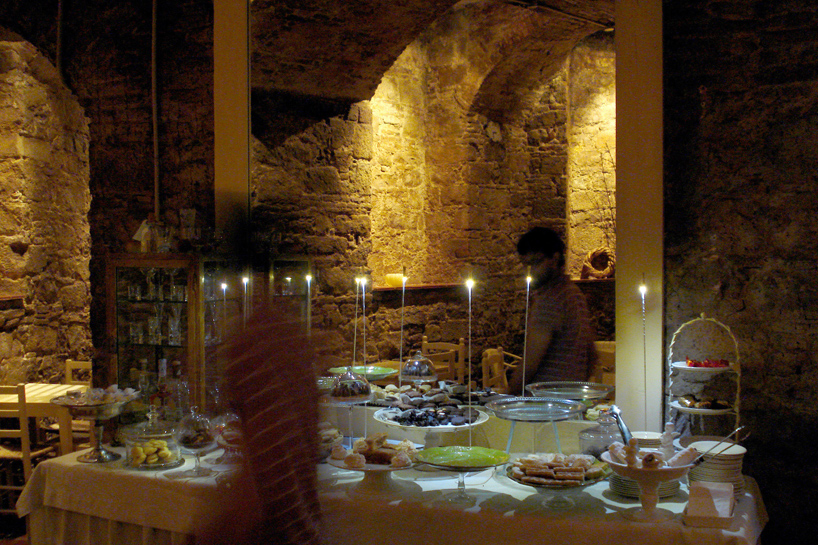 ‘caelum’ view of the central sweets table
—
the FRAME moooi award was launched in 2011 with the goal to unite innovative interiors with equally as innovative furniture and lighting. many high-profile pieces of furniture and lighting have been designed for a specific context, such as mies van der rohe’s barcelona chair, which was created for the 1929 international exposition in barcelona or arne jacobsen’s egg chair designed in 1958 for the radisson SAS hotel in copenhagen. these and many other iconic products eventually experienced large-scale production and appeared in a wide range of interior projects. many proved to be so innovative that they earned recognition and inspired others to design similar models. contextual designs are clearly important for the development of furniture and lighting; they also strengthen the bond between (interior) architects and product designers.
FRAME is the world’s barometer of interior design. the magazine shows what’s happening and where to find it. the latest interiors and products, spiced up with some art, shop windows and sets, is the essence of FRAME magazine. it gathers the most interesting works from around the world and packages it in six tactile issues a year. since the magazine believes that readers appreciate and enjoy the ability to ‘read’ images, it focuses on photos and drawings. however, text is equally as important; FRAME puts a lot of energy in uncovering the story behind each design. loaded with nothing but the best in contemporary design, FRAME is an indispensable reference for professionals in interior design and other creative pursuits. —
for those who cannot await the milan design week to be happening: designboom will not only partner with the FRAME moooi award 2012 party on april 18th, but kicks off the week with its own birthday party on tuesday, april 17th, to celebrate 13 years online publishing! we are the world’s first digital architecture and design magazine and becoming teenagers. this leads us to throw a special dance party in the heart of the city, at vanilla discotheque in via turati 29. please stay tuned – we will follow up with more info soon.
for now, if you are going to visit milan during that time, please mark the two dates in your calendar: april 17th, designboom bash april 18th, FRAME moooi award 2012 party
happening now! thomas haarmann expands the curatio space at maison&objet 2026, presenting a unique showcase of collectible design.

