HAWORTH-designboom editorial collaboration:
grimshaw architects collaborates with poltrona frau on elements
designboom partners with leading office furniture company HAWORTH on an editorial series that investigates the future of the contemporary office environment and new ways of working. our alliance brings forth insights into the workplace and how it has evolved from something more static, into an active and modular condition.
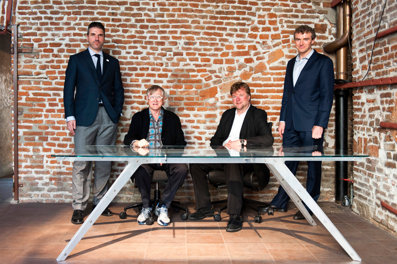
in this fourth feature, designboom interviews grimshaw architects‘s founding partner sir nicholas grimshaw, deputy chairman andrew whalley, head of industrial design casimir zdanius, and worldwide managing director kurt wallner of the HAWORTH-owned poltrona frau group on the occasion of milan design week 2014, where the two parties debuted their collaborative work in an exhibition entitled ‘elements‘. presented at the historic foundry napoleonica eugni, the interactive multi-media show provided an overview of grimshaw’s history and its industrial design unit, emphasizing the firm’s expertise in considering details across a wide range of projects from product design to buildings, thus unveiling design prototypes and contract seating they have conceived together with the international furniture company.
grimshaw architects collaborates with poltrona frau on elements
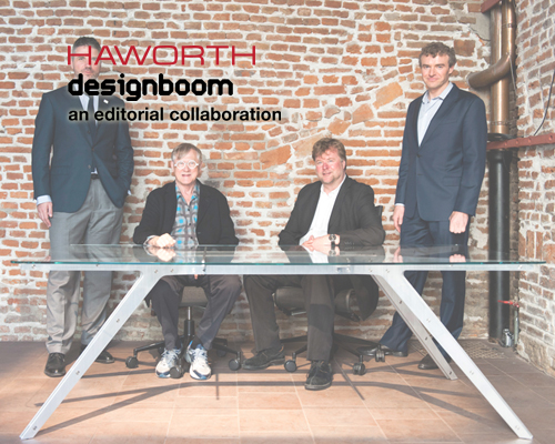
from left to right: kurt wallner, poltrona frau’s worldwide managing director; sir nicholas grimshaw, founding partner of grimshaw architects; andrew whalley, deputy chairman at grimshaw architects; casimir zdanius, head of industrial design at grimshaw architects
image courtesy of grimshaw architects
of the three products highlighted was an executive, also named ‘elements’, milled from a single sheet of material, reducing industrial waste. being manufactured entirely at one factory is rare for a piece of furniture, but true for this working surface, increasing efficiency and speed of production. it has been specifically designed to be flat packed, making shipping more economic. constructed without nails or screws, no tools are necessary for its assembly, facilitating ease of assembly for the end-user. in addition, the reveal of grimshaw’s ‘spine transit concourse seating’ and ‘patricia and phillip frost museum of science planetarium chair’ – their most recent bespoke project with poltrona frau – where displayed, these physical elements supported by 3D-augmented reality technology (the elements app) that can be viewed on a smartphone or tablet which delivered supplementary information about the projects.
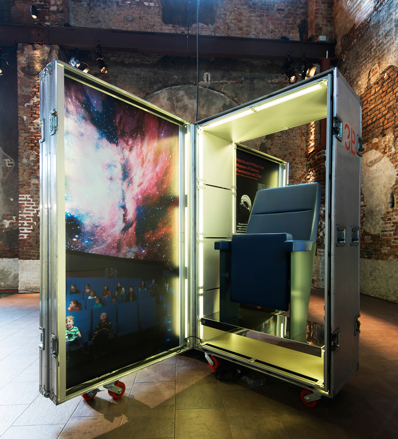
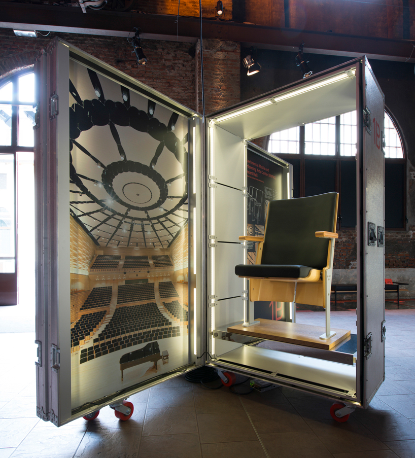
‘patricia and philip frost museum of science planetarium chair’ on display at ‘elements’ exhibition
image courtesy of grimshaw architects
responsible for the design of the ‘patricia and phillip frost museum of science in miami’ which opened in spring of 2014, casimir zdanius (CZ) and sir nicholas grimshaw (NG) gave insights on the scheme for the seating which has been installed within the institution’s planetarium:
CZ: the blue chairs, we designed with poltrona frau: a very simple, wide, monolithic faux leather chair that had to be highly durable and quite wide and generous. we’ve got 250 of them.
NG: you’ve got a one-hour turn-over on the shows, so they’re used quite a lot.
CZ: they’re used about 8-10 times a day. typically such a chair, an auditorium chair, maybe used for one or two shows a day or maybe per week. whereas this is a wide demographic – kids, adults – I’m not sure if they’re allowed to bring food into the planetarium, but they need to be highly durable and tested to withstand a lot more use than typical auditorium chairs. they’re very solid on the underside, easy to clean. this plate, as simple as it looks, is wood veneer, but it’s to prevent kids and restless individuals from kicking it from behind. it’s quite generous. it’s got a partial headrest so people can lean back a little bit. a typical auditorium chair might terminate right here. it’s a little longer. it’s easier to clean because of the faux leather that they’re using. the mechanism is a very basic mechanism that goes up and down.
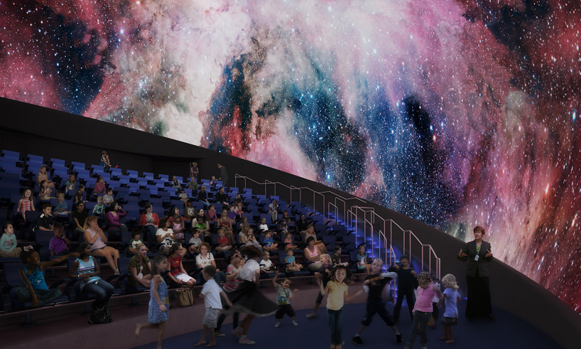
visualization of the planetarium chair in its context
image courtesy of grimshaw architects
CZ: it’s actually wider than a typical auditorium chair. larger you’ve got issues with views because, you’ve got a staging area at the front. if you’ve got too much of a headrest you’ve got issues with smaller kids trying to look over the seats. the planetarium show is the main show in the area, the main attraction, but there will be stage shows for the kids, so we dropped it a little bit; tried to find a balance between a headrest and a high [backed] seat.
they’re on slightly different angles. one’s at 21 degrees, one’s at 30, subject to where it is. at 21 degrees you’re not going to be able to see the top of the show [unless you] really look back. we worked with theatre and planetarium consultants to ensure that all the view lines are correct, and people get a decent aspect of the planetarium.
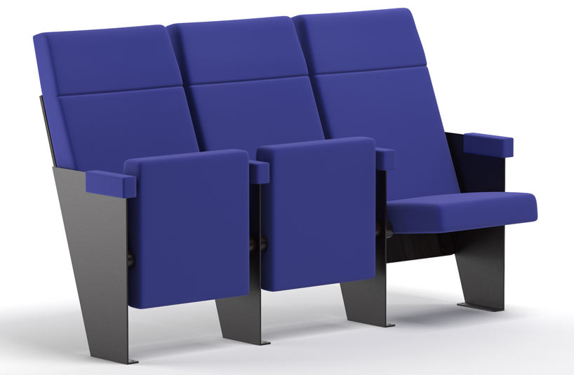
the design of the ‘planetarium chair’ features a steel base with a minimal profile
image courtesy of grimshaw architects
the ‘planetarium chair’ is a custom design that features generous and monolithic forms that do not distract one from the 3D projection technology experienced within the museum’s dramatic space. grimshaw selected materials that would be able to withstand the high amounts of traffic and wide demographic of people using the seating. supported by a steel base structure with a minimal profile, allowing the underside to be cleaned easily, the ‘planetarium chair’ is finished with a highly resistant scratch resistant powder coating. solid backing panels add an unimposing aesthetic that protects the chairs, while the seats and armrests are upholstered in an eco-friendly material called skinflex polaris, that is typically used in the automobile, aerospace and nautical industries, and which is pleasant to touch.
see more about the ‘patricia and phillip frost museum of science’ on designboom here.
auditorium seating for the experimental media and performing arts center (EMPAC) in new york
image courtesy of grimshaw architects
previously, grimshaw architects developed auditorium seating with poltrona frau, for the ‘experimental media and performing arts center (EMPAC) building’ at rensselaer polytechnic institute (RPI) in new york. andrew whalley (AW) and sir nicholas grimshaw (NG) elaborate on the acoustic quality of the seat they designed for the concert hall:
AW: they wanted to have a world class interior to the hall and the acoustics, so every surface element is specially designed, including the seats. with poltrona frau we tried to develop a seat that works the same acoustically whether somebody is sitting in it or whether it’s empty. so in other words, if the hall were quarter full, it sounds the same as if it were full. the absorption is the same whether somebody’s sitting in it, or whether it’s empty.
NG: it’s quite difficult to get the balance right. if you have hard seats you change the characteristic of the building all together. it causes echoes around the place. the whole idea is that the audience is like a sponge, and these firm seats will absorb.
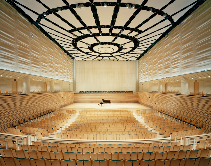
view of the auditorium within EMPAC
image courtesy of grimshaw architects
AW: the seat was designed acoustically and tested, as were all the surfaces. you have this random wood pattern that goes around the edge of the lower bowl, and then we have these random surfaces that basically break up the acoustics, and then there’s actually fabric ceiling that reflects only a certain frequency range of sound. so, the whole thing’s been designed like a musical instrument.
NG: and there’s a big volume above that ceiling that you can’t see, but it gives the concert hall resonance, and a longer vibration time. it gives you the early reflections, and then you get the volume and depth of the sound. because it’s a university it’s not used for grand concerts, except occasionally. so it hasn’t had the time to establish its reputation. we think it’s one of the best 6 halls in the world.
AW: and the new york times music critic put it as one of the best acoustically designed halls; we can defer to him.
see more about the ‘experimental media and performing arts center (EMPAC) building’ on designboom here.
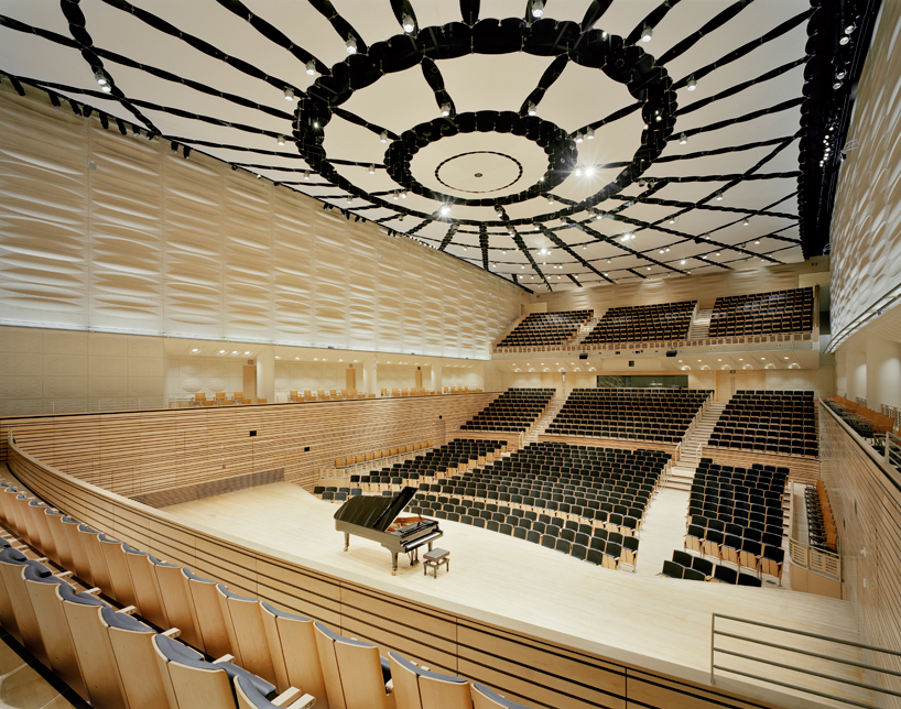
alternative view of the EMPAC music hall
image courtesy of grimshaw architects
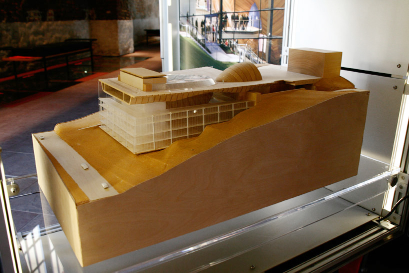
model of EMPAC on display at the ‘elements’ exhibition
image © designboom
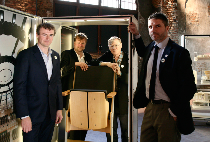
from left to right: casimir zdanius, andrew whalley, sir nicholas grimshaw and kurt wallner with the ‘spine concourse seating’
image © designboom
DB: what was it like to work with poltrona frau?
NG: that’s the whole thing of working with the factory. there’s a number of modifications we would like to do now. you can do them just like that on the factory floor.
CZ: that’s how we developed the planetarium chair,thinking about way of manufacturing using existing tooling to make it more feasible for a price point that was quite low, using it particularly with the upholstery.
KW: we’re not a typical manufacturer. we work more closely hand in hand with architects and designers in order to realize and make better what they design with engineering, with materials, and so on.
AW: kind of refine the design with respect to the manufacturer.
CZ: and also the expertise in figuring out the ergonomics of a chair, the curvature, the angles, where the loads are, that’s the expertise of the manufacturers. there’s a lot of back and forth. it’s a great way to work, opposed to beating something and having to work with contractors that are unfamiliar with processes such as those.
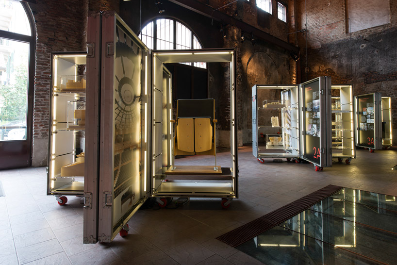
box 1 highlights the ‘EMPAC music hall’ at RPI, and the seats developed with poltrona frau
image courtesy of grimshaw architects
KW: coming back to the table, I have to say, I think one of the biggest compliments is that my people see many pieces of furniture throughout the years, but they said ‘this is something special’. this is really something interesting, something they have not seen around. I think it is nice. there’s still some areas where we can further improve it now, but I think it’s a really nice table.
AW: one of the nicest parts is that, as it’s cut out of a plate you can have a family of different options; brushed aluminium there or some kind of ply concept for a wooden one, a steel one.
NG: it’s all flat. it comes in a flat box. take it on the roof of your car.
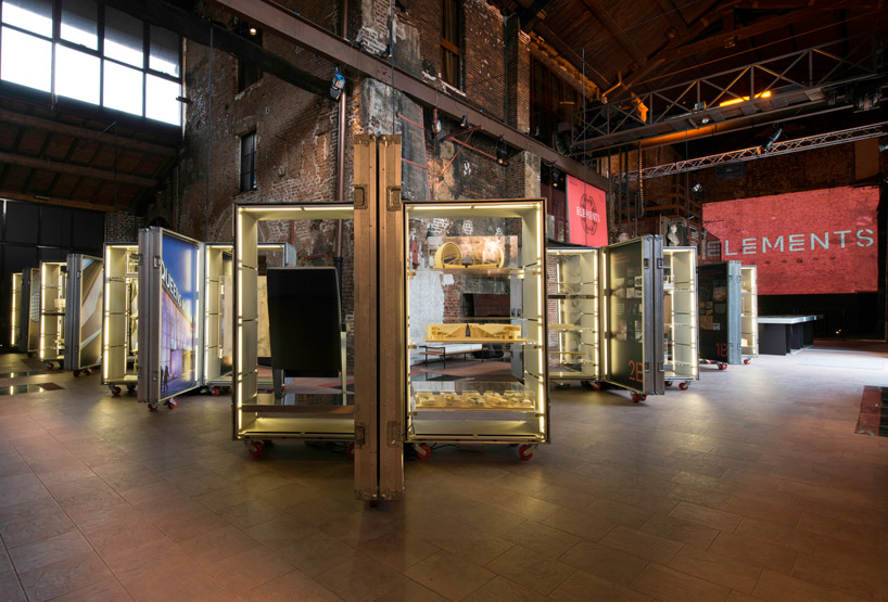
installation view of ‘elements’
image courtesy of grimshaw architects
DB: what’s the main idea behind the exhibition?
NG: we’re trying to get across the fact that we’re very interested in details and materials and so on. we’re not in the shape-making business, which some architects are these days. we recognize the process so we make things that are sympathetic to the manufacturing process.
AW: there’s a reason behind every shape and move. we did a roof in australia recently that has a curved and undulating form. the reason it does that is it captures the wind, and uses it to cool and condition the building.
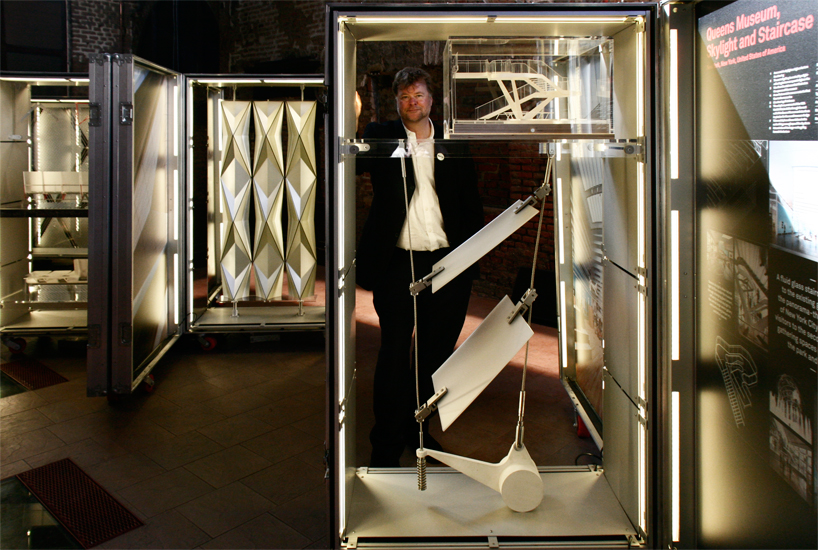
andrew whalley stands between 1:1 scale models of the queens museum ‘lantern’ and the ceiling of pulkovo international airport
image © designboom
after several collaborative projects between the two companies, poltrona frau invited grimshaw to develop the exhibition for milan design week. the furniture company chose the space, but let the architects have free range over what and how they wanted to display their works.
DB: how does it work having firms around the world? in how many projects is sir grimshaw’s involved?
AW: to put it in context, the office is 350 people. we have 200 in london and 100 or so in new york. it’s lots of teams doing lots of things at the same time. to ensure design quality we have regular design reviews. nick gets particularly involved in certain ones, and has been very involved with cas on the furniture. we use video. the great thing about london and new york is that they overlap half a day every day. almost every day there are meetings going on for half a day between london and new york, because as well as the design side, we split a lot of the operations. industrial design and a lot of our computer imagery side are based in new york, and other things are based in london. it’s a kind of dual office across the atlantic.
CZ: it’s really good for deadlines when you can tap into both resources.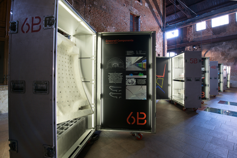
architectural models and industrial design elements were displayed in metal travel boxes
image courtesy of grimshaw architects
DB: how do you see the future of work, workspaces, and coworking spaces developing?
NG: it’s a fascinating developing field because it’s quite a crossroads in offices, really. some people think they ought to be much more like a home. you know, you have a nice rug, comfortable chairs, and so on. I wish you could do an open plan as well as individual offices. other people, particularly in germany, they’re very much going for individual offices with a door you can shut, and you’ve got a conference room if you want to have meetings with several people. it’s very unresolved still. the open plan became very popular, but it’s waning a bit again. it’s shifting a little bit back to the individual office.
KW: I think people are looking for a combination. I think the open concept is still very strong. within it they’re choosing to have more and more ‘cocoons’ where people can talk one on one, with three people, or have small informal meetings, so they create special spaces within open office areas. this is a very new trend now.
NG: pods. I think privacy areas in general are still important.
AW: we did that research center ten years ago in america. one of the reasons they were very keen on the design is that we had lots of small breakout spaces across it. also circulation, the president said that his best research doesn’t happen in the laboratories, it comes from different people mixing. so we had to mix up the departments and the circulation systems, so there are actually meeting spaces intertwined to get this idea of interchange.
NG: there are alot of manufacturing possibilities in that field. then there’s the home office, which is moving quite fast forward.
AW: yes, in america it’s quite popular, the home office with touchdown space. it’s the latest trend in NY, and is all done through an app on a phone. it’s particularly for transients. it charges $25/hour. sometimes it’s rented space within an office. it’s only been going a couple months, but it’s already taking off. they have full internet connection, coffee machine, water, snacks.
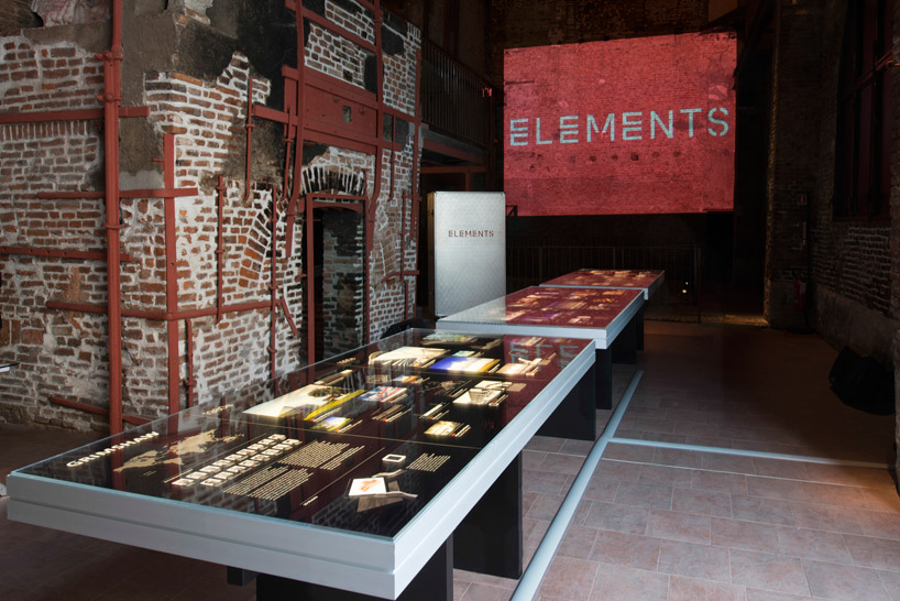
the light tables and travel box displays were designed by grimshaw’s new york office
image courtesy of grimshaw architects
DB: what advice do you have for young architects?
NG: it’s very tough these days, and it takes a long time. my advice would be to stick at it!
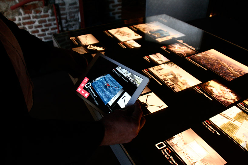
the elements app allows one to see the models, and tour buildings and projects, without risking damage during transport
image © designboom
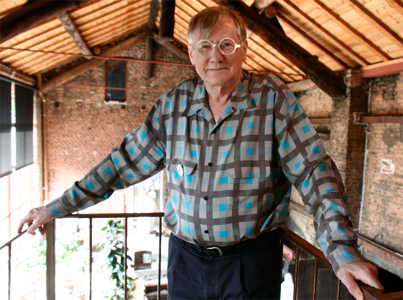
sir nicholas grimshaw, founder of grimshaw architects
portrait © designboom
Save
Save
